Create Icon Hover Effects Using CSS

Welcome to Code With Random blog. In this blog, we will explore how to create an Icon Hover Effect. To create the Icon Hover effect we are going to use simple HTML & CSS.
Hope you enjoy our blog so let’s start with a basic HTML structure for Icon Hover Effect.
We use these icon hover effects in almost all web pages we make and attach them to the footer of a webpage.
| Code by | _Coding_gyan |
| Project Download | Link Available Below |
| Language used | HTML and CSS |
| External link / Dependencies | Yes |
| Responsive | Yes |
100+ JavaScript Projects With Source Code ( Beginners to Advanced)
Html Code For Icon Hover Effect
<!DOCTYPE html>
<html lang="en">
<head>
<meta charset="UTF-8">
<meta http-equiv="X-UA-Compatible" content="IE=edge">
<meta name="viewport" content="width=device-width, initial-scale=1.0">
<title>Icons Hover Effect</title>
<link rel="stylesheet" href="style.css">
<link rel="stylesheet" href="https://cdnjs.cloudflare.com/ajax/libs/font-awesome/6.0.0-beta2/css/all.min.css" integrity="sha512-YWzhKL2whUzgiheMoBFwW8CKV4qpHQAEuvilg9FAn5VJUDwKZZxkJNuGM4XkWuk94WCrrwslk8yWNGmY1EduTA==" crossorigin="anonymous" referrerpolicy="no-referrer" />
</head>
<body>
<div class="container">
<div class="box">
<div class="icon instagram">
<i class="fab fa-instagram fa-2x"></i>
</div>
<p>Instagram</p>
</div>
<div class="box">
<div class="icon facebook">
<i class="fab fa-facebook fa-2x"></i>
</div>
<p>Facebook</p>
</div>
<div class="box">
<div class="icon twitter">
<i class="fab fa-twitter fa-2x"></i>
</div>
<p>Twitter</p>
</div>
<div class="box">
<div class="icon whatsapp">
<i class="fab fa-whatsapp fa-2x"></i>
</div>
<p>Whatsapp</p>
</div>
</div>
</body>
</html>
Our HTML document is ready, here we have created a simple structure for various icons of different social media applications. We are using a font awesome library for the icons.
Play Unlimited Quiz Of HTML, CSS, and JavaScript – Click Here
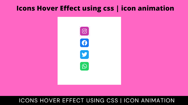
The output for our HTML document without CSS is available below.
Output Icon Hover Effects Html

Css Code Icon Hover Effects
Next, we will add style to the HTML structure. To add a hover effect to the social media icons we will use HTML :hover pseudo-class, which allows special styling for hover effects.
Create Simple Portfolio Website Using Html Css (Portfolio Source Code)
When the cursor hovers over an object the hover pseudo-class applies special style properties to it.
@import url('https://fonts.googleapis.com/css2?family=Poppins&display=swap');
*{
margin: 0;padding: 0;
box-sizing: border-box;
font-family: 'Poppins', sans-serif;
}
body{
display: flex;
justify-content: center;
align-items: center;
height: 100vh;
}
.box{
width: 55px;
height: 58px;
position: relative;
display: flex;
align-items: center;
overflow: hidden;
padding: 5px;
cursor: pointer;
margin: 0.6em;
transition: all .4s;
}
.box:hover{
width: 160px;
background: #c32aa3;
border-radius: 10px;
color: white;
box-shadow: 0 0 50px #b315917c;
}
.box:nth-child(2):hover{
background: #1877f2;
box-shadow: 0 0 50px #1876f285;
}
.box:nth-child(3):hover{
width: 130px;
background: #1da1f2;
box-shadow: 0 0 50px #1da0f280;
}
.box:nth-child(4):hover{
background: #25d366;
box-shadow: 0 0 50px #25d3657e;
}
p{
transform: translate(60px);
}
.box .icon{
position: absolute;
width: 50px;
height: 50px;
display: flex;
justify-content: center;
align-items: center;
color: white;
border-radius: 10px;
margin-right: 10px;
transition: all .4s;
}
.instagram{
background: #c32aa3;
}
.facebook{
background: #1877f2;
}
.twitter{
background: #1da1f2;
}
.whatsapp{
background: #25d366;
}
.box:hover .icon{
background: white;
box-shadow: 0 0 20px rgba(0, 0, 0, 0.26);
color: rgb(59, 59, 59);
}
Now we have completed our CSS section, Here is our updated output with CSS. Hope you like Icons Hover Effect, using CSS.
Final Output Icon Hover Effects
For more such awesome projects read our other blogs and gain knowledge in front-end development. Thank you
5+ HTML CSS project With Source Code
In this post, we learn how to create an Icons Hover Effect using simple HTML & CSS. If we made a mistake or any confusion, please drop a comment to reply or help you learn quickly.
Written by – Code With Random/Anki
Which code editor do you use for this Icon Hover Effects Using CSS coding?
I personally recommend using VS Code Studio, it’s straightforward and easy to use.
is this project responsive or not?
YES! this is a responsive project
ADVERTISEMENT
Do you use any external links to create this project?
Yes!
ADVERTISEMENT


mayuri chavan
tst
This comment has been removed by the author.
Amazing post brother
regards,
codewith_ayan
What is your responsibility