Progress Bar With Steps using HTML, CSS, and JavaScript

Hello coders! Welcome to the Codewithrandom blog. In this tutorial, We learn How to create a Progress Bar With Steps using HTML, CSS, and JavaScript. We Create Structure with Html and Give Styling with Css and For Main functionality using JavaScript.
I hope you enjoy this tutoria. So without wasting any time, let’s go to make Step Progress Bar project.
100+ JavaScript Projects With Source Code ( Beginners to Advanced)
What is Step Progress Bar?
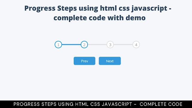
A step progress bar or multi-step progress bar is shows task in a step format, which is like step1 > step2 > step3, etc. It’s highly used in large websites in their form, like e-Commerce website, Social media website etc. In this step progress bar each bar indicates to it’s each step and it’s shows to a user how many it progress to reach the next. It is a very popular and interesting concept that you can find it every large website or webApp, while you creating account or download/upload content there.
Let’s build this amazing concept called step progress bar project. First start from HTML code.
| Project Name | Step Progress Bar |
| Code By | Code With Random/Anki |
| Project Download | Copy code from given code snippets |
| Language Used | HTML, CSS, and JavaScript |
| External Link / Dependencies | No |
| Responsive | No |
HTML Code of Step Progress Bar
Create HTML File Is Named Index.Html Then Copy All The HTML Code Given Below And Paste All Those Code Into Your Index.Html File.
<!DOCTYPE html>
<html lang="en">
<head>
<meta charset="UTF-8" />
<meta name="viewport" content="width=device-width, initial-scale=1.0" />
<link rel="stylesheet" href="style.css" />
<title>Progress Steps</title>
</head>
<body>
<div class="container">
<div class="progress-container">
<div class="progress" id="progress"></div>
<div class="circle active">1</div>
<div class="circle">2</div>
<div class="circle">3</div>
<div class="circle">4</div>
</div>
<button class="btn" id="prev" disabled>Prev</button>
<button class="btn" id="next">Next</button>
</div>
<script src="script.js"></script>
</body>
</html>
There is all the Html Code for the Step Progress Bar. Now, you can see output without Css and JavaScript. then we write Css For styling the Step Progress Bar and then we will write JavaScript Code for Progress Bar Steps Animation.
Read also
Portfolio Website using HTML and CSS (Source Code)
Html Output

CSS Code of Step Progress Bar
Create CSS file is named style.css then copy all the CSS code given below and paste all those code into your style.css file.
 @import url('https://fonts.googleapis.com/css?family=Muli&display=swap');
:root {
--line-border-fill: #3498db;
--line-border-empty: #e0e0e0;
}
* {
box-sizing: border-box;
}
body {
background-color: #f6f7fb;
font-family: 'Muli', sans-serif;
display: flex;
align-items: center;
justify-content: center;
height: 100vh;
overflow: hidden;
margin: 0;
}
.container {
text-align: center;
}
.progress-container {
display: flex;
justify-content: space-between;
position: relative;
margin-bottom: 30px;
max-width: 100%;
width: 350px;
}
.progress-container::before {
content: '';
background-color: var(--line-border-empty);
position: absolute;
top: 50%;
left: 0;
transform: translateY(-50%);
height: 4px;
width: 100%;
z-index: -1;
}
.progress {
background-color: var(--line-border-fill);
position: absolute;
top: 50%;
left: 0;
transform: translateY(-50%);
height: 4px;
width: 0%;
z-index: -1;
transition: 0.4s ease;
}
.circle {
background-color: #fff;
color: #999;
border-radius: 50%;
height: 30px;
width: 30px;
display: flex;
align-items: center;
justify-content: center;
border: 3px solid var(--line-border-empty);
transition: 0.4s ease;
}
.circle.active {
border-color: var(--line-border-fill);
}
.btn {
background-color: var(--line-border-fill);
color: #fff;
border: 0;
border-radius: 6px;
cursor: pointer;
font-family: inherit;
padding: 8px 30px;
margin: 5px;
font-size: 14px;
}
.btn:active {
transform: scale(0.98);
}
.btn:focus {
outline: 0;
}
.btn:disabled {
background-color: var(--line-border-empty);
cursor: not-allowed;
}
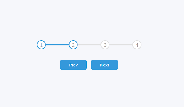
Now we have completed our Styling Of Step Progress Bar. Here is our updated output HTML + CSS.
Ecommerce Website Using HTML, CSS, & JavaScript (Source Code)
HTML + CSS Output

50+ HTML, CSS & JavaScript Projects With Source Code
Now add JavaScript Code for the Step Progress bar Animation When User Click Next Button.
JavaScript Code of Step Progress Bar
after completing HTML and CSS part, Create JavaScript File Is Named main.js Then Copy All The JavaScript Code Given Below And Paste All Those Code Into Your Main.js File.
const progress = document.getElementById('progress')
const prev = document.getElementById('prev')
const next = document.getElementById('next')
const circles = document.querySelectorAll('.circle')
let currentActive = 1
next.addEventListener('click', () => {
currentActive++
if(currentActive > circles.length) {
currentActive = circles.length
}
update()
})
prev.addEventListener('click', () => {
currentActive--
if(currentActive < 1) {
currentActive = 1
}
update()
})
function update() {
circles.forEach((circle, idx) => {
if(idx < currentActive) {
circle.classList.add('active')
} else {
circle.classList.remove('active')
}
})
const actives = document.querySelectorAll('.active')
progress.style.width = (actives.length - 1) / (circles.length - 1) * 100 + '%'
if(currentActive === 1) {
prev.disabled = true
} else if(currentActive === circles.length) {
next.disabled = true
} else {
prev.disabled = false
next.disabled = false
}
}
Final Output Of Step Progress bar

Portfolio Website using HTML and CSS (Source Code)
Now we have completed our Step Progress bar. Here is our updated output with JavaScript. Hope you like the Step Progress bar. you can see the output video and project screenshots. See our other blogs and gain knowledge in front-end development.
Thank you
In this post, we learn how to Create a Step Progress bar with HTML, CSS, & JavaScript. If we made a mistake or any confusion, please drop a comment to reply or help you in easy learning.
Written by – Code With Random/Anki
ADVERTISEMENT
What Is Step Progress Bar?
A Step Progress Bar Or Multi-Step Progress Bar Is Shows Task In A Step Format, Which Is Like Step1 > Step2 > Step3, Etc. It’s Highly Used In Large Websites In Their Form, Like E-Commerce Website, Social Media Website Etc. In This Step Progress Bar Each Bar Indicates To It’s Each Step And It’s Shows To A User How Many It Progress To Reach The Next. It Is A Very Popular And Interesting Concept That You Can Find It Every Large Website Or WebApp, While You Creating Account Or Download/Upload Content There….
ADVERTISEMENT
How to create Step Progress Bar using HTML, CSS, and JavaScript
This Tutorial, We Learn How To Create A Step Progress Bar Using HTML, CSS, And JavaScript. We Use Simple HTML, CSS, And JavaScript For This Project. A Step Progress Bar Or Multi-Step Progress Bar Is Shows Task In A Step Format, Which Is Like Step1 > Step2 > Step3 etc.
ADVERTISEMENT
Create HTML File Is Named Index.Html Then Copy All The HTML Code Given Below And Paste All Those Code Into Your Index.Html File.
ADVERTISEMENT


