Create Hamburger Menu Using Pure CSS Only
Hello Coder! In this article, we learn how to Create Hamburger Menu Using HTML and CSS Only. A CSS Hamburger Menu, also known as a navbar, is a graphic representation of a website’s menu header. It typically contains links to a website’s home page, about page, contact page, and other important sites. Typically, the navbar is a fixed element that is always displayed on a webpage, regardless of how far down or up the user scrolls.

Introduction Of Hamburger Menu:-
We’ll first define a hamburger selection. Three parallel lines that form the shape of a cheeseburger make up the hamburger symbol. When we click on that icon, a responsive navbar opens up to provide ease of use inside the website.
| Code by | Erik Terwan |
| Project Download | Link Available Below |
| Language used | HTML and CSS |
| External link / Dependencies | No |
| Responsive | Yes |
Hamburger Menu Html Code:-
<nav role="navigation">
<div id="menuToggle">
<!--
A fake / hidden checkbox is used as click reciever,
so you can use the :checked selector on it.
-->
<input type="checkbox" />

<!--
Some spans to act as a hamburger.

They are acting like a real hamburger,
not that McDonalds stuff.
-->
<span></span>
<span></span>
<span></span>

<!--
Too bad the menu has to be inside of the button
but hey, it's pure CSS magic.
-->
<ul id="menu">
<a href="#"><li>Home</li></a>
<a href="#"><li>About</li></a>
<a href="#"><li>Info</li></a>
<a href="#"><li>Contact</li></a>
<a href="https://erikterwan.com/" target="_blank"><li>Show me more</li></a>
</ul>
</div>
</nav>
The nav> tag will be used to create the structure for our hamburger menu. Next, we’ll create a container for the navigation bar using the div tag with the id “toggle,” and finally, using the input type checkbox, we’ll create a checkbox button for switching between the navigation bar and the hamburger menu.
We will now make an unorder list with the id “menu” using the unorder list, and we will add the li> tag to the anchor tag inside of it to create the hyper-list items.
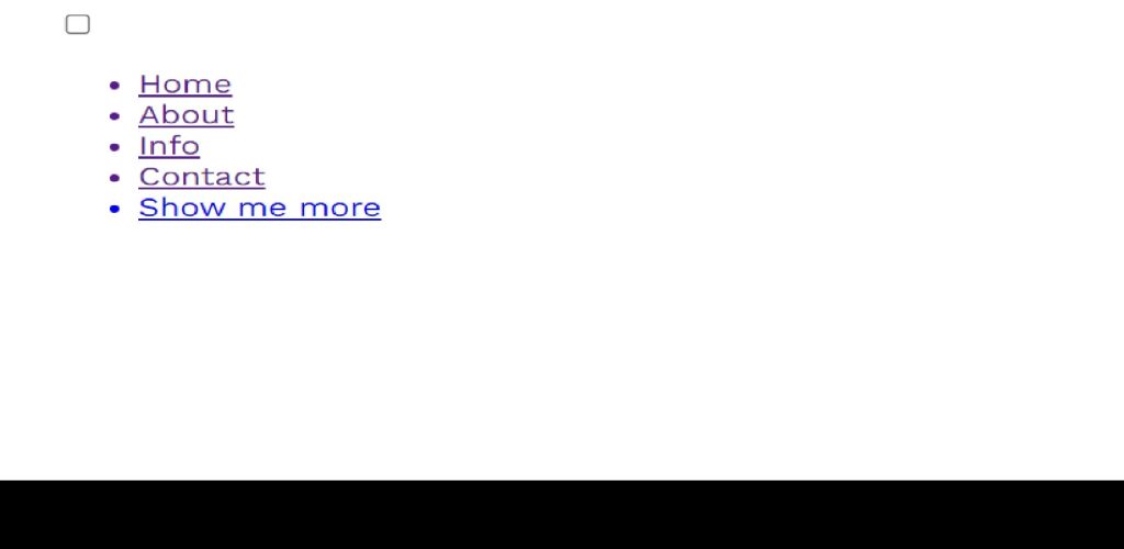
That’s all we need to do to give our navbar structure, so let’s look at the outcomes.
Pure Css Hamburger Menu Code:-
/*
 * Made by Erik Terwan
 * 24th of November 2015
 * MIT License
 *
 *
 * If you are thinking of using this in
 * production code, beware of the browser
 * prefixes.
 */

body
{
  margin: 0;
  padding: 0;

  /* make it look decent enough */
  background: #232323;
  color: #cdcdcd;
  font-family: "Avenir Next", "Avenir", sans-serif;
}

#menuToggle
{
  display: block;
  position: relative;
  top: 50px;
  left: 50px;

  z-index: 1;

  -webkit-user-select: none;
  user-select: none;
}

#menuToggle a
{
  text-decoration: none;
  color: #232323;

  transition: color 0.3s ease;
}

#menuToggle a:hover
{
  color: tomato;
}


#menuToggle input
{
  display: block;
  width: 40px;
  height: 32px;
  position: absolute;
  top: -7px;
  left: -5px;

  cursor: pointer;

  opacity: 0; /* hide this */
  z-index: 2; /* and place it over the hamburger */

  -webkit-touch-callout: none;
}

/*
 * Just a quick hamburger
 */
#menuToggle span
{
  display: block;
  width: 33px;
  height: 4px;
  margin-bottom: 5px;
  position: relative;

  background: #cdcdcd;
  border-radius: 3px;

  z-index: 1;

  transform-origin: 4px 0px;

  transition: transform 0.5s cubic-bezier(0.77,0.2,0.05,1.0),
              background 0.5s cubic-bezier(0.77,0.2,0.05,1.0),
              opacity 0.55s ease;
}

#menuToggle span:first-child
{
  transform-origin: 0% 0%;
}

#menuToggle span:nth-last-child(2)
{
  transform-origin: 0% 100%;
}

/*
 * Transform all the slices of hamburger
 * into a crossmark.
 */
#menuToggle input:checked ~ span
{
  opacity: 1;
  transform: rotate(45deg) translate(-2px, -1px);
  background: #232323;
}

/*
 * But let's hide the middle one.
 */
#menuToggle input:checked ~ span:nth-last-child(3)
{
  opacity: 0;
  transform: rotate(0deg) scale(0.2, 0.2);
}

/*
 * Ohyeah and the last one should go the other direction
 */
#menuToggle input:checked ~ span:nth-last-child(2)
{
  transform: rotate(-45deg) translate(0, -1px);
}

/*
 * Make this absolute positioned
 * at the top left of the screen
 */
#menu
{
  position: absolute;
  width: 300px;
  margin: -100px 0 0 -50px;
  padding: 50px;
  padding-top: 125px;

  background: #ededed;
  list-style-type: none;
  -webkit-font-smoothing: antialiased;
  /* to stop flickering of text in safari */

  transform-origin: 0% 0%;
  transform: translate(-100%, 0);

  transition: transform 0.5s cubic-bezier(0.77,0.2,0.05,1.0);
}

#menu li
{
  padding: 10px 0;
  font-size: 22px;
}

/*
 * And let's slide it in from the left
 */
#menuToggle input:checked ~ ul
{
  transform: none;
}
Step1: We’ll set the padding and margin to “zero” using the body element selector, and we’ll set the background to “black” using the background property. The font family property will be used to add a new font inside our body and make it to be “Avenir Next” while the font colour is set to “grey.”
Simple Portfolio Website Using Html And Css With Source Code
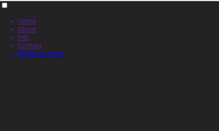
Step2: Now, using the Id tag Selector (#menuToggle), we’ll style our navbar. We will set the show to “block” and the “relative” using the property,tion property. We will also include an additional 50 pixels from the top and left attributes. To add styling to the list items, we will similarly use the hover property and change the colour to “Tomato” for each item.
Infinite Autoplay Carousel using HTML,CSS and JavaScript
The height and width will now be set to 33 pixels and 4 pixels, respectively, using the span tag to make the display as a block. We will set the boundary radius to 3 pixels using the border radius property.

100+ JavaScript Projects With Source Code ( Beginners to Advanced)
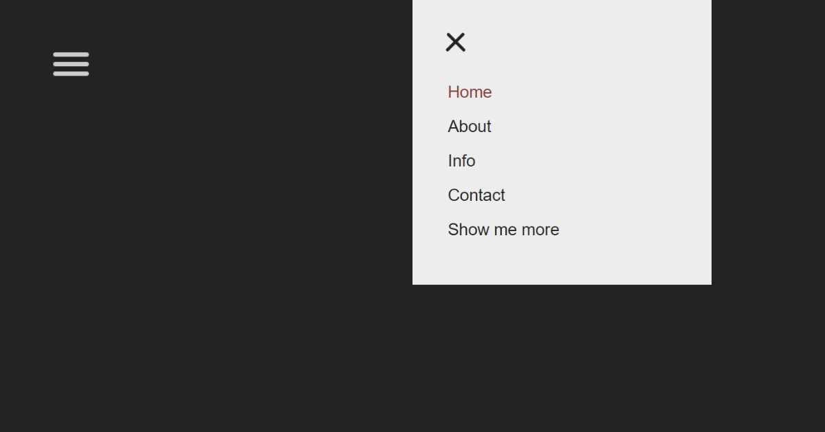
Your final output would be:
And that’s it. You’ve successfully made a hamburger menu with CSS Only!
Video Output:
Final Output Of Css Only Hamburger Menu:-
We have completed our Hamburger Menu Using Pure CSS. Hope you like the Responsive Hamburger Menu, you can see output project screenshots. See our other blogs and gain knowledge in front-end development.
Restaurant Website Using HTML and CSS
Thank You And Happy Learning
Written by – Code With Random/Anki
code by – mutedblues
What is a navigation bar?
A Navigation bar is a section generally found on the top of the website which provide an user an ease of use .It provides number of links which helps user to move through the different section of the website.
What is the main purpose of the navigation bar?
A navigation bar’s main purpose is to make it easier for website visitors to browse. The navigation bar makes it simple for the user to obtain information.The navigation bar provides user to acess the different section inside the website easily.
