CSS Grid vs CSS Flexbox
CSS Grid and CSS Flexbox are web layout technologies that have been highly desired for years. They possess the ability to expand, shrink, center, re-order and align the objects on a webpage.
Despite their superficial similarities, they are used for completely different jobs and tackle completely different sets of problems.
There are many layout instances where you might utilize either one to accomplish the desired layout design. However, there are many cases when one is better suited than the other.
Create Spotify Clone Using HTML CSS &JavaScript
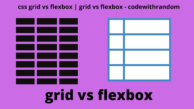
Flexbox is One Dimensional, Grid is Two Dimensional
Since the days when tables were used for layout, components are arranged as rows and columns on the webpage. This is also the foundation of both flexbox and grid.
Flexbox works best when the goal is to arrange elements in a single row or column. This is because flexbox elements are essentially pushed along a single axis and then wrap or do not wrap accordingly.
Although flexbox can create rows and columns by allowing elements to wrap, there is no way to control where elements end up declaratively. Hence, in the flexbox, elements are arranged in a one-dimensional plane.
Whereas, Grid is the best option to arrange objects in several rows and columns. In grid layout, we can determine the size of rows and columns (if we want to) and then explicitly place items in both rows and columns. Hence, a grid layout is well suited to arrange objects in a two-dimensional layout.
Aspect Ratio Calculator using HTML, CSS &JavaScript
Flexbox Wraps vs Grid Wraps
Both layout models have the option of wrapping the items to a new row, in case the overall width of the items inside the container exceeds the container’s width. However, they approach wrapping in a different manner.
If we enable a flex container to wrap, when the flex items fill a row, they will wrap down onto another row. Since flexbox is one-dimensional, when objects are pushed into a new row or column, they lose the context of the previous row or column.
CSS Grid can also wrap (if auto-filling is enabled) in the sense that objects can fill a row and then migrate to the next row. Unlike flexbox, here elements will fall along the same grid lines as the other elements
In other words, in a Grid layout, items do not lose their context when pushed down because they are still part of the previously created grid. Here, grid lines will guide the placement of the items.
Flexbox is the right choice for forms, for example, a subscribe form with three elements (email, name, send), because you want each element to take up as much space as possible as the screen shrinks or expands.
CSS Grid works better when you want all of your pushed items to maintain the same width, such as when making an image gallery
Grid is Container-Based, Flexbox is Content-Based
A Flexbox layout is content-based, as it is calculated after its content is loaded. In flexbox, the size of a cell (a flex-item) is defined inside the flex-item itself. Let’s use an example to understand this, here we are creating a row.
<div class="row">
<div>1</div>
<div>2</div>
<div>3</div>
<div>4</div>
</div>
Styling the flexbox:
.row {
margin: 20px auto;
max-width: 300px;
display: flex;
}
.row > div {
border: 1px dashed gray;
flex: 1 1 auto; /* Size of items defined inside items */
text-align: center;
padding: 12px;
}
In the above code, we defined the size of the cells inside the flex item and not in the flex container (i.e. “row” div). The flex property is shorthand to set flex-grow, flex-shrink, and flex-basis properties in one statement.
On the other hand, CSS Grid is container-based, it requires you to define your layout first. The layout is calculated regardless of what you place inside the containers. Let’s look at our example again, except that we’ll now style it with Grid.
ADVERTISEMENT
Styling using grid layout:
ADVERTISEMENT
.row {
margin: 20px auto;
max-width: 300px;
display: grid;
grid-template-columns: 1fr 1fr 1fr 1fr; /* Size of items defined inside container */
}
.row div {
border: 1px dashed gray;
text-align: center;
padding: 12px;
}
In the grid layout, the output is exactly the same as in the Flexbox example. However, the size of the items is not defined inside the grid items, but in the grid container.
ADVERTISEMENT
Grid is better at overlapping.
ADVERTISEMENT
In order to get elements to overlap in flexbox, you’ll need to look at traditional techniques like negative margins, transforms, and absolute positioning. Whereas, in the grid layout, we can place the overlapping items on overlapping grid lines or even within the same precise grid cell
ADVERTISEMENT
Flexbox can push things away.
Flexbox has a unique feature where you can use margin-right: auto; on an element and if there is available room then it will push everything else as far as it can go.
Calendar using HTML, CSS & JavaScript (Leaf-Loos Calendar)
Conclusion
Flexbox is a good choice if your web layout only consists of rows or columns. However, if you have a complex, multi-row, and multi-column layout, then CSS Grid gives you better design abilities.
Furthermore, don’t believe you have to choose between CSS Grid and Flexbox. You can utilize CSS Grid for the main layout of your website, but Flexbox for specific sections. Both methods tackle layout problems in different ways, but there’s no reason they can’t work together to build the website you want.
In this blog post, we learn CSS Grid and Flexbox with complete source code. I hope you got some ideas about Grid and Flexbox.


