Create Portfolio Website Using HTML and CSS

Well, today I’ll be making a visually delicious Portfolio Website Using Html and CSS. In this article, you get completed code and an explanation about the portfolio website using Html and CSS.
What is a portfolio website?
Well, everyone needs websites and web applications nowadays. So there are many opportunities for you if you work as a web developer. But if you want to get a web developer job, you’ll need a good portfolio website to showcase your skills and experience. A developer portfolio website provides relevant information to potential employers about your skills, experience, and projects you’ve worked on. You can consider it to be your online résumé.
Here is Some More Article on Portfolio Website Code:-
Personal Portfolio Website Using HTML & CSS With Source Code
Portfolio Website using HTML and CSS (Source Code)
Portfolio Website Using HTML CSS And JAVASCRIPT ( Source Code)
Portfolio Website Using HTML ,CSS ,Bootstrap and JavaScript
| Code by | Akshat Sharma |
| Project Download | Link Available below |
| Language used | HTML and CSS |
| External link / Dependencies | No |
| Responsive | No |
Portfolio Website With Only Html and Css:-
So, our ingredients for this Portfolio Website will be HTML and CSS. I’m assuming you have a basic knowledge of both. When you actually want to deploy this portfolio website, you’ll need to work on the backend so that viewers can click and navigate to the desired pages.
But today is all about looks, i.e., the front end! Even JavaScript remains out of the scope because I want you to know how HTML and CSS alone can shine as great website makers (and also cause I want to keep this beginner-friendly).
You Can Also Checkout 50+ Html, Css, and JavaScript Project With Code👇
50+ HTML, CSS and JavaScript Projects With Source Code
Video Tutorial Of Portfolio Website Using Html And CSS:-
Note: I love using the VS Code IDE for building my projects and I’ll recommend it to you as well. It comes with a number of extensions to ease your code writing and formatting. It’s not related to this blog but hey, free advice is no harm right? Download it from here.
So, without further ado, let’s hop right into our recipe!
Gym Website Using HTML ,CSS and JavaScript (Source Code)
First and foremost, we need to make the backbone of our website, an HTML file. I made the HTML file and named it ‘index.html’. Since we’ll be using CSS as well, in the same folder I made a CSS file, named ‘styles.css’. In index.html, we need to give the following lines of code.
Portfolio Website HTML Code:-
<!DOCTYPE html>
<html lang="en">
<head>
<meta http-equiv="X-UA-Compatible" content="IE=edge">
<meta name="viewport" content="width=device-width, initial-scale=1.0">
<link rel="stylesheet" href="./styles.css">
<link rel="preconnect" href="https://fonts.googleapis.com">
<link rel="preconnect" href="https://fonts.gstatic.com" crossorigin>
<link rel="preconnect" href="https://fonts.googleapis.com">
<link rel="preconnect" href="https://fonts.gstatic.com" crossorigin>
<link href="https://fonts.googleapis.com/css2?family=Lato:wght@100;400;700&family=Poppins:wght@200&display=swap"
rel="stylesheet">
<link href="https://fonts.googleapis.com/css2?family=Poppins:wght@200&display=swap" rel="stylesheet">
<title>Portfolio</title>
</head>
<body>
</body>
</html>
If you’re using VS Code and have an HTML extension installed, you just need to type ‘!’ and press enter. If you’re not, feel free to copy-paste these lines.
Discussing them in this article is not necessary, just know that they let the browser know you’re trying to run a webpage. Also, they are importing all the CSS you’ll be writing in ‘styles.css’.
Ecommerce Website Using HTML, CSS, and JavaScript (Source Code)
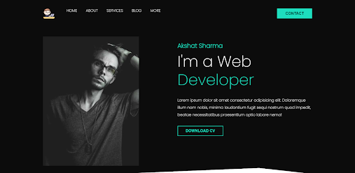
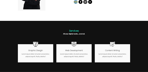
Now take a look at what we’re building.

ADVERTISEMENT
I know, I know, it’s a masterpiece, isn’t it? And no, I am not the handsome guy in the picture… I look a lot better. Anyway now look only at the top.
ADVERTISEMENT
ADVERTISEMENT

ADVERTISEMENT
This is the navigation bar. It’s like a must-have on all your websites. So, we’ll make this first. Make sure to write the code between the opening and closing body tags (<body></body>).
ADVERTISEMENT
Snake Game Using HTML,CSS and JavaScript With Source Code
<body>
   <header>
     <div class="container">
       <nav class="flex items-centre justify-between">
           <div class="left flex justfiy-right">
           <div class="logo">
             <img src="./images/logo.png" width="50px" alt="logo">
           </div>
           <div>
             <a href="#">Home</a>
             <a href="#">About</a>
             <a href="#">Services</a>
             <a href="#">Blog</a></li>
             <a href="#">More</a>
           </div>
         </div>
         <div class="right">
           <button class="btn btn-primary">Contact</button>
         </div>
       </nav>
     </div>
   </header>
The logo I used was downloaded from a website. Relax, it’s royalty free. In fact, all the icons and images in this blog are downloaded. While there’s no denying that these icons and pictures play a huge part in your website’s appearance, my goal was to tell you how to incorporate these pictures in your site and not to spend hours in Photoshop designing my own beautiful and ‘original’ icons. But whenever you make a website, it’s your duty to include visually appealing images, that too original ones. If you’re following this tutorial, try to take out some time and get your own logo. You can make one here or simply download it from here. You’re welcome.
So this is what our nav bar looks for now:

Don’t worry. You’ll get exactly what was advertised, just follow along. Let’s put in that model’s image and the text we want to display.
<div class="hero flex items-centre justify-between">
<div class="left flex-1 justify-center">
<img src="./images/main-img.png" alt="Profile">
</div>
<div class="right flex-1">
<h6>Akshat Sharma</h6>
<h1>I'm a Web<br> <span>Developer</span></h1>
<p>Lorem ipsum dolor sit amet consectetur adipisicing elit. Doloremque illum nam nobis, minima
laudantium fugit sequi nostrum quod impedit, beatae necessitatibus praesentium optio labore
nemo!</p>
<div>
<button class="btn btn-secondary">DOWNLOAD CV</button>
</div>
</div>
</div>
Unless your name is Akshat Sharma, which makes us name twins, by the way, make sure to change the name you’re displaying in the <h6> tag.
You should also replace the Lorem Ipsum text with something more suitable. In fact, any text that is being displayed is subject to change as per your wish.

By now, you’re probably itching to use CSS. I originally planned to keep the styling at last but it is important for the developer to know how his/her website is looking at any given time to make further changes. Let’s dive into CSS right away!
10+ HTML CSS Projects With Source Code
A piece of advice: Your CSS file will go on forever if you keep writing in one. That’s why I made two files, a ‘styles.css’, for styling all our classes and elements, and a ‘utilities.css’, for defining styles we might need for more than one element. You’ll see as we continue.
@import 'utilities.css';
:root{
--primary: rgb(29, 221, 189);
--bgDark: rgb(12, 12, 12);
--white: rgb(250, 250, 250);
--secondary: rgb(0, 59, 50);
--bgLight: rgb(190, 181, 181);
}
This is the beginning of ‘styles.css’ Notice we need to import ‘utilities.css’ to incorporate all the styling we’re doing in that. I decided on a color scheme beforehand so that I don’t keep breaking my flow thinking of colors.
Weather App Using Html, Css, And JavaScript
I declared variables corresponding to the colors I’ll need using the ‘: root’. CSS understands colors only as RGB values. These values, corresponding to their respective colors, are impossible to remember.
The HTML CSS Support extension for VS Code helped me select my colors easily. See? Cool IDEs always help. In case you’re not able to use that, you can get your color’s RGB, HSV, or hexadecimal value from here.
CSS Code For Portfolio:-
*{
padding: 0;
margin: 0;
box-sizing: border-box;
-webkit-font-smoothing: antialiased;
}
header{
background-color: var(--bgDark);
clip-path: polygon(0 0, 100% 0, 100% 100%, 73% 94%, 0 100%);
}
header nav .left a{
color: var(--white);
text-decoration: none;
margin-right: 2rem;
text-transform: uppercase;
transition: all .2s ease;
}
header nav .left a:hover{
color: var(--primary);
}
header nav {
padding: 2rem 0;
}
header nav .logo{
margin-right: 3rem;
}
This is the CSS for the header and navigation bar and the code goes in ‘styles.css’. And this is the product:
Black is my favorite color! It’s a real lifesaver when you have no clue how you want your background to be. Take a look at the CSS for the ‘hero’ class now.
Image Text Reveal On Hover Effect Using HTML & CSS
body{
font-family: 'Poppins', sans-serif;
}
.container{
max-width: 1152px;
padding: 0 15px;
margin: 0 auto;
}
.hero{
padding-top: 2rem;
padding-bottom: 3rem;
}
.hero .left img{
width: 400px;
}
.hero .right {
color: var(--white);
margin-top: -7rem;
}
.hero .right h6{
font-size: 1.6rem;
color: var(--primary);
margin-bottom: 0.5rem;
}
.hero .right h1{
font-size: 4rem;
font-weight: 100;
line-height: 1.2;
margin-bottom: 2rem;
}
.hero .right h1 span{
color: var(--primary);
}
.hero .right p{
line-height: 1.9;
margin-bottom: 2rem;
}
Did you notice how I avoid using pixel values as much as possible? Thing is, pixels are absolute units. Changing other values have no effect on px values and this makes it pretty antiquated. ’em’ and ‘rem’, however, change their values with respect to the change in parent or root elements. It makes them responsive. Read more about the differences here. The explanation’s pretty good.
Now to work on those buttons and the overall alignment we’ll type our magic spell, the one you call CSS. This one goes in our ‘utilities.css’. Open the file and type the following:
.flex{
display: flex;
}
.items-centre{
align-items: center;
}
.justify-between{
justify-content: space-between;
}
.justify-center{
justify-content: center;
}
.justify-right{
justify-content: right;
}
.btn{
padding: 0.6rem 2rem;
font-size: 1rem;
font-weight: 600;
border: 2px solid transparent;
outline: none;
cursor: pointer;
text-transform: uppercase;
transition: all .2s ease;
}
.btn-primary{
background-color: var(--primary);
color: var(--secondary);
margin-top: -15rem;
}
.btn-primary:hover{
background: transparent;
border-color: var(--primary);
color: var(--primary);
}
.flex-1{
flex: 1;
}
.btn-secondary{
background: transparent;
color: var(--primary);
border-color: var(--primary);
}
.btn-secondary:hover{
background: var(--primary);
color: var(--secondary);
}
The end product? Here it is!
<section class="about">
<div class="container flex items-centre">
<div class="left flex-1 justify-right">
<img src="./images/man2.png" height="400px" alt="profile pic">
</div>
<div class="right flex-1">
<h1>About <span>Me</span></h1>
<h3>Hello! I'm Akshat Sharma.</h3>
<p>Lorem ipsum dolor sit amet consectetur adipisicing elit. Atque adipisci distinctio obcaecati aliquid,
quia tempora quis optio repudiandae officia earum?
Lorem ipsum dolor sit amet consectetur, adipisicing elit.
</p>
<div class="socials">
<a href="#"><img src="./images/website.png" width="40px"></a>
<a href="#"><img src="./images/facebook.png" width="40px"></a>
<a href="#"><img src="./images/instagram.png" width="40px"></a>
<a href="#"><img src="./images/media-player.png" width="40px"></a>
</div>
</div>
</div>
</section>
It is imperative for you to understand how ‘px’, ’em’, and ‘rem’ works. And what’s a better way of learning than to try it out yourself? Play with these values and understand the difference. Change them according to the look you desire and don’t even worry about messing up the code. You can come back here again and again. Whether you want to copy-paste the code or understand how it works, we’ve got you covered.

Though not extraordinary, this design resonates with the formal vibe you’d want to give to your website.
 section{
padding: 6rem;
}
section.about h1{
margin-bottom: 1rem;
font-size: 1.6rem;
font-weight: 600;
}
section.about h1 span{
color: var(--primary);
}
section.about h3{
font-size: 1rem;
margin-bottom: 1rem;
font-weight: 600;
}
section.about p{
font-family: 'Lato', sans-serif;
color: var(--secondary);
line-height: 1.9rem;
margin-bottom: 2rem;
}
section.about .socials{
display: flex;
}
section.about .socials a{
display: flex;
align-items: center;
justify-content: center;
width: 35px;
margin-right: 0.8rem;
border-radius: 50%;
}
section.about .socials a:hover{
background: var(--primary);
}
This CSS code goes in the ‘styles.css’. It handles the margins and paddings individually, but we don’t have to do much as our previously defined classes already handled most of the layout process.
To make our website look a little responsive, I use the ‘: hover’ selector a lot. I’ve used it on all our buttons and social media icons. Basically, it defines what happens when the cursor points to or ‘hovers’ over the specified element. A little color transition is enough to breathe life into our webpage.
Well, this does smell nice! We’ll now be working on the last part, though certainly not the least. Although your CV is a true record of your skills and achievements, we need your services to be visible to the viewer at a glance.
Define another section in the ‘index.html’ and type in the code as follows:
<section class="services">
<div class="container">
<h1 class="services-head">Services</h1>
<p>All your digital needs... covered.</p>
<div class="card-grid">
<div class="card">
<img src="./images/graphic-design.png">
<h2>Graphic Desgin</h2>
<p>Lorem ipsum dolor sit amet consectetur, adipisicing elit. Nulla, debitis?</p>
</div>
<div class="card">
<img src="./images/world-wide-web.png">
<h2>Web Development</h2>
<p>Lorem ipsum dolor sit amet consectetur, adipisicing elit. Nulla, debitis?</p>
</div>
<div class="card">
<img src="./images/blogger.png">
<h2>Content Writing</h2>
<p>Lorem ipsum dolor sit amet consectetur, adipisicing elit. Nulla, debitis?</p>
</div>
</div>
</div>
</section>
Bold is beautiful, sure. But this is too loud, and, in fact, a disgrace to our development skills. Let’s do the aligning and styling and make it look a little subtle.
Now even though flexbox is an awesome tool to help us with layouts, we have one more trick up our sleeve. This, my friends, is called the CSS Grid Layout, or simply, the Grid. Simply put, the grid is our trump card in handling layouts and designs. In fact, it has the responsive touch we need for our sites. I know how much you love reading long documents, so here you go! There are a number of YouTube tutorials to learn from as well, so go explore!
Our ‘styles.css’ just needs the following block of code now.
section.services{
background: rgb(17, 17, 17)
}
.services-head{
color: rgb(10, 9, 9);
text-align: center;
margin-bottom: 1rem;
line-height: 0.5rem;
color: var(--primary);
}
.services-head + p{
color: var(--white);
font-family: 'Lato', sans-serif;
margin-bottom: 1rem;
text-align: center;
margin-bottom: 6rem;
font-weight: 400;
}
.card img{
width: 50px;
background:white;
}
section.services .card-grid{
display: grid;
grid-template-columns: repeat(3,1fr);
column-gap: 2rem;
}
section.services .card-grid .card{
background: var(--white);
padding: 3rem 2rem;
position: relative;
text-align: center;
transition: all .2s ease;
}
section.services .card-grid .card img{
position: absolute;
top: -1.5rem;
left: 50%;
transform: translateX(-50%);
color: var();
}
section.services .card-grid .card h2{
font-weight: 600;
font-size: 1.2rem;
margin-bottom: 0.5rem;
}
section.services .card-grid .card p{
font-family: 'Lato', sans-serif;
color: var(--seconday);
line-height: 1.6;
}
section.services .card-grid .card:hover{
background: var(--primary);
}
section.services .card-grid .card:hover h2{
color: var(--white);
}
section.services .card-grid .card:hover p{
color: var(--white);
}
And my dear friends, we did it! No really. That’s all. Our beautiful Portfolio Website is ready to be shown off to the world.
Live Preview Of Portfolio Website Using Html and Css:-
[su_button url=”https://drive.google.com/drive/folders/1FiU8HAuptAKgO96Nz1sYFfwiH9uGsoHh?usp=sharing” target=”blank” style=”flat” size=”11″ center=”yes” icon=”icon: download”]DOWNLOAD NOW[/su_button]
Our cuisine is finally prepared! This was fun, was it not? The entire code and its end product are all yours now. Change the colors, and the properties, and feel free to mess it up as much as you want. I mean that’s the best way to learn anything, trust me. Feel free to ask me as many doubts as you want in the comments below. Alternatively, you could reach out to me on Instagram. I like my DMs filled.
-Akshat Sharma
FAQ For Portfolio Website Using Html and Css.
Which code editor do you use for Card Glow Effects On Hover coding?
I personally recommend using VS Code Studio, it’s straightforward and easy to use.
is this project responsive or not?
Yes! this is a responsive project
Do you use any external links to create this project?
No!


![15+ Music Players Using JavaScript [ Demo + Code ] Read more about the article 15+ Music Players Using JavaScript [ Demo + Code ]](https://www.codewithrandom.com/wp-content/uploads/2022/11/codewithrandom42-300x157.png)


Wwwwooo
how to dowload source code