Create Claymorphism Design Using HTML and CSS
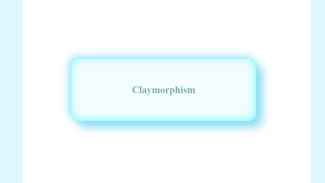
Heyy, learners so today’s project is the Claymorphism Design Card Using Html and Css. Yes you heard it right it is Claymorphism, it is not Glassmorphism. So Glassmorphism, a look which is similar to glass, looks like that material is made up of glass. Similarly, a material that looks like it is made up of clay is Claymorphism.
Live Preview Of Claymorphism Design
HTML Code (Create Layout Of The Website):-
Inside the body tag, I added a div class named card and inside that an anchor tag instead of an anchor u can use a button also.
Portfolio Website using HTML and CSS (Source Code)
<!DOCTYPE html>
<html lang="en">
    <head>
        <meta charset="UTF-8" />
        <meta http-equiv="X-UA-Compatible" content="IE=edge" />
        <meta name="viewport" content="width=device-width, initial-scale=1.0" />
        <title>Document</title>
    </head>
    <body>
        <div class="card"><a href="#">Claymorphism</a></div>
    </body>
</html>
CSS Code( Styling of the layout ):-
While styling we should take care that it should look like it is made up of clay. For it we try it to make it look smoother so we applied backdrop-filter: blur property makes it smooth and gives box-shadow to the card div and also the border-radius which is also really important to make it look smoother.
10+ HTML CSS Projects For Beginners with Source Code
* {
    margin: 0;
    padding: 0;
}
body {
    width: 100vw;
    height: 100vh;
    display: flex;
    justify-content: center;
    align-items: center;
    background-color: rgba(155, 155, 247, 0.13);
}
.card {
    display: flex;
    justify-content: center;
    align-items: center;
    background-color: rgba(139, 224, 248, 0.3);
    height: 30vh;
    width: 50vw;
    border-radius: 25px;
    box-shadow: 20px 20px 25px rgba(78, 202, 240, 0.589),
        -5px -5px 25px rgba(61, 203, 247, 0.555),
        -2px -2px 25px rgba(0, 252, 252, 0.534) inset;
    border: 1px solid rgb(145, 243, 243);
    backdrop-filter: blur(15px);
}
a {
    font-size: 30px;
    font-weight: 900;
    color: rgba(7, 90, 90, 0.5);
    text-shadow: rgba(115, 238, 238, 0.795);
    text-decoration: none;
}
I hope you liked it Wait, Did you still not implement it So why are you waiting, go and implement it now.


