Neon Text With Glow Effect Using CSS
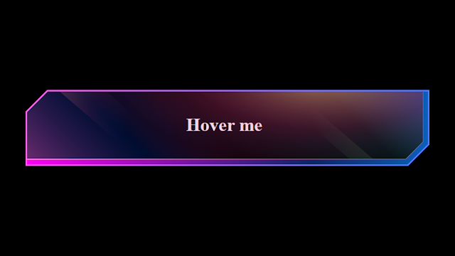
Heyy.. learners, Today we are going to create Neon Text With Glow Effect. So we learn a small and easy project which looks so good using only Html and Css. So First before learning it Let’s take a look at it.
Live Preview Of Neon Text With Glow Effect
100+ JavaScript Projects With Source Code ( Beginners to Advanced)
HTML Code (Neon Text Structure):-
Just simply you can use the button but I used an anchor tag in place of the anchor tag you can use a button, I have made two divs one for the outer and the second for the inner portion as you can see upside down in the live server A color which is rotating.
<!DOCTYPE html>
<html lang="en">
    <head>
        <meta charset="UTF-8" />
        <meta http-equiv="X-UA-Compatible" content="IE=edge" />
        <meta name="viewport" content="width=device-width, initial-scale=1.0" />
        <title>Neon Text With Glow Effect</title>
    </head>
    <body>
        <div class="outer">
            <div class="inner"><a href="#">Hover me</a></div>
        </div>
    </body>
</html>
CSS(Styling the Neon Text):-
We have used simple styling methods like flexbox I give the dimensions of the inner and outer div as same but give padding to the outer so there is a differentiation between the outer and inner div and give color to the outer div and applied filter:hue rotate property.
Ecommerce Website Using HTML, CSS, & JavaScript (Source Code)
       body{
            width:100vw;
            height:100vh;
            display:flex;
            justify-content: center;
            align-items:center;
            background-color: black;
        }
        .outer{
width:300px;
height:50px;

border-radius:10px;
padding:5px;


        }
        .outer:hover{
            animation-name:rotate;
            animation-iteration-count:infinite;
            animation-duration:1s;
            animation-delay: 0ms;
            background-color: rgb(23, 248, 248);

        }
        .outer:hover a{
            color:aqua;

        }
@keyframes rotate {
    from{

        filter: hue-rotate(0deg);
    }
    to{
        filter:hue-rotate(360deg);
    }
}
        .inner{
            width:100%;
            height:100%;
            display:flex;
            justify-content: center;
            align-items:center;
            background-color: black;
            border-radius:10px;

        }
        a{
            color:white;
            text-decoration:none;
            font-weight: 900;
            font-size:25px;

        }
I hope you liked the neon text with the glow effect Using CSS. Wait, Did you still not implement it So why are you waiting, go and implement it now.
10+ HTML CSS Projects For Beginners with Source Code
If you faced any difficulty feel free to comment down your problems and If you really liked it, please show your love in the comment section this really motivates a blogger to provide more such content.
Written by @Himanshu Singh.


