Parallax Photo Carousel Using Html and Css
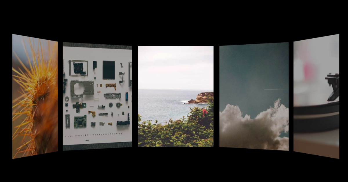
Hello Coder! Welcome to the Codewithrandom blog. In this blog, we learn how we create a Parallax Photo Carousel Using Html, Css, and JavaScript. this is complete 3D Parallax Animation Photo Carousel Using JavaScript libraries.
I hope you enjoy our blog so let’s start with a basic HTML structure for a Parallax Photo Carousel.
Live Preview Of Parallax Photo Carousel Using CSS:-
HTML Code For Parallax Carousel:-
<div class="stage">
    <div class="container">
        <div class="ring">
            <div class="img"></div>
            <div class="img"></div>
            <div class="img"></div>
            <div class="img"></div>
            <div class="img"></div>
            <div class="img"></div>
            <div class="img"></div>
            <div class="img"></div>
            <div class="img"></div>
            <div class="img"></div>
        </div>
    </div>
</div>
Using the div tag with class stage,” we will construct the primary container for our parallax effect. Next, using the div tag with classimage, we will create the container for the image. The div tag will also be used to build the container for our various image files.
Restaurant Website Using HTML And CSS With Source Code
There is all HTML code for the Parallax Photo Carousel. Now, you can see output without CSS, then we write css & javascript for the Parallax Photo Carousel.
Html Code Output
html,
body,
.stage,
.ring,
.img {
    width: 100%;
    height: 100%;
    transform-style: preserve-3d;
    user-select: none;
}
html,
body,
.stage {
    overflow: hidden;
    background: #000;
}
div,
svg {
    position: absolute;
}
.container {
    perspective: 2000px;
    width: 300px;
    height: 400px;
    left: 50%;
    top: 50%;
    transform: translate(-50%, -50%);
}
We’ll set the width to “100%” using the multiple tag selector (html, body, stage, ring, image), and the height to “100%” using the height property. We will now style our CSS and maintain 3D using the transform attribute.
100+ HTML,CSS and JavaScript Projects With Source Code ( Beginners to Advanced)
Now, we’ll set the overflow property to “hidden” and the background property to “black” to make the overflow invisible.
We’ll use the div tag svg to establish the position as “absolute,” the class selector (.container) to set the perspective as “2000 px,” and the width property to set the width and height to 300 and 400 pixels, respectively.
Additionally, we will translate the image from all angles using the translate property to produce a parallax effect.
JavaScript Code For Parallax Carousel:-
//https://cdnjs.cloudflare.com/ajax/libs/gsap/3.6.1/gsap.min.js
//https://cdnjs.cloudflare.com/ajax/libs/zepto/1.2.0/zepto.min.js

let xPos = 0;
gsap.timeline()
    .set(".ring", { rotationY: 180, cursor: "grab" }) //set initial rotationY so the parallax jump happens off screen
    .set(".img", {
        // apply transform rotations to each image
        rotateY: (i) => i * -36,
        transformOrigin: "50% 50% 500px",
        z: -500,
        backgroundImage: (i) =>
            "url(https://picsum.photos/id/" + (i + 32) + "/600/400/)",
        backgroundPosition: (i) => getBgPos(i),
        backfaceVisibility: "hidden",
    })
    .from(".img", {
        duration: 1.5,
        y: 200,
        opacity: 0,
        stagger: 0.1,
        ease: "expo",
    })
    .add(() => {
        $(".img").on("mouseenter", (e) => {
            let current = e.currentTarget;
            gsap.to(".img", {
                opacity: (i, t) => (t == current ? 1 : 0.5),
                ease: "power3",
            });
        });
        $(".img").on("mouseleave", (e) => {
            gsap.to(".img", { opacity: 1, ease: "power2.inOut" });
        });
    }, "-=0.5");
$(window).on("mousedown touchstart", dragStart);
$(window).on("mouseup touchend", dragEnd);
function dragStart(e) {
    if (e.touches) e.clientX = e.touches[0].clientX;
    xPos = Math.round(e.clientX);
    gsap.set(".ring", { cursor: "grabbing" });
    $(window).on("mousemove touchmove", drag);
}
function drag(e) {
    if (e.touches) e.clientX = e.touches[0].clientX;
    gsap.to(".ring", {
        rotationY: "-=" + ((Math.round(e.clientX) - xPos) % 360),
        onUpdate: () => {
            gsap.set(".img", { backgroundPosition: (i) => getBgPos(i) });
        },
    });
    xPos = Math.round(e.clientX);
}
function dragEnd(e) {
    $(window).off("mousemove touchmove", drag);
    gsap.set(".ring", { cursor: "grab" });
}
function getBgPos(i) {
    //returns the background-position string to create parallax movement in each image
    return (
        100 -
        (gsap.utils.wrap(
            0,
            360,
            gsap.getProperty(".ring", "rotationY") - 180 - i * 36
        ) /
            360) *
            500 +
        "px 0px"
    );
}
The background position attribute will be used in this instance to create the parallax effect inside our project utilising a straightforward javascript code. To give the project a correct parallax effect, we’ll rotate the image and set the position attribute to the background position, which will change when the mouse touches and drags the screen.
We have used several fundamental JavaScript notions here; after reading the code, you will fully comprehend the idea.
How to Create a Snake Game using Python
Final Output Of Parallax Photo Carousel:-
Video Output:
Now we have completed our javascript section, Here is our updated output with javascript. Hope you like the Parallax Photo Carousel. you can see the output video and project screenshots. See our other blogs and gain knowledge in front-end development. Thank you !
In this post, we learn how to create a Parallax Photo Carousel using simple HTML & CSS, and javascript. If we made a mistake or any confusion, please drop a comment to reply or help you in easy learning.
Written by – Code With Random/Anki
Codepen by – Tom Miller
What is the parallax effect?
In a web design trend called parallax scrolling effect, background content (such as a picture) scrolls more slowly than foreground content. To compare websites with and without parallax scrolling, click on the URLs below.
What is the purpose of parallax effect?
The website makes use of parallax effects to give it a modern, responsive look. To create the parallax effect, CSS motion concepts are applied.


How do you link the css and javascript