Create Stacked Cards UI Using Pure HTML and CSS
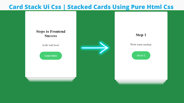
Hello and thank you for visiting the codewithrandom site. In this article, we will use HTML and CSS to build a Stacked Card user interface. A stacked card user interface is a beginner project that teaches the developer about various CSS principles.
.png)
A stacked UI card project is one in which numerous cards are stacked on top of one another. In this project, we will make various cards and stack them one on top of the other, so that when the user selects the first tag, it is replaced by the second card, and so on.
50+ HTML, CSS & JavaScript Projects With Source Code
I hope you enjoy our blog so let’s start with a basic Html Structure for the Stacked Cards.
| Code by | Cameron Leslie |
| Project Download | Link Available Below |
| Language used | HTML and CSS |
| External link / Dependencies | No |
| Responsive | Yes |
HTML Code For Stacked Cards
Below is the HTML Source code for Stacked Cards. You can copy this code into your HTML file.
<div card-stack>
<input id="card-0" name="card-set" type="radio" checked/>
<div card>
<div class="content">
<h2>Steps to Frontend Success</h2>
<p>A life well lived.</p>
<label for="card-1">Learn More</label>
</div>
</div>
<input id="card-1" name="card-set" type="radio"/>
<div card>
<div class="content">
<h2>Step 1</h2>
<p>Write some markup.</p>
<label for="card-2">Go to 2</label>
</div>
</div>
<input id="card-2" name="card-set" type="radio" />
<div card>
<div class="content">
<h2>Step 2</h2>
<p>Write some CSS.</p>
<label for="card-3">Go to 3</label>
</div>
</div>
<input id="card-3" name="card-set" type="radio" />
<div card>
<div class="content">
<h2>Step 3</h2>
<p>Look up stuff on MDN.</p>
<label for="card-4">Go to 4</label>
</div>
</div>
<input id="card-4" name="card-set" type="radio" />
<div card>
<div class="content">
<h2>Step 4</h2>
<p>Switch Pre-Processors. Because things are starting to get complicated.</p>
<label for="card-5">Go to 5</label>
</div>
</div>
<input id="card-5" name="card-set" type="radio" />
<div card>
<div class="content">
<h2>Step 5</h2>
<p>Thow out your work start over, becasuse this time you definately choose the right framework.</p>
<label for="card-6">Go to 6</label>
</div>
</div>
<input id="card-6" name="card-set" type="radio" />
<div card>
<div class="content">
<h2>Step 6</h2>
<p>Break down and cry.</p>
<label for="card-7">Go to 7</label>
</div>
</div>
<input id="card-7" name="card-set" type="radio" />
<div card>
<div class="content">
<h2>Step 7</h2>
<p>Curl up in fetal position.</p>
<label for="card-8">Go to 8</label>
</div>
</div>
<input id="card-8" name="card-set" type="radio" />
<div card>
<div class="content">
<h2>Step 8</h2>
<p>Write more CSS to cover up your already bad CSS.</p>
<label for="card-0">Start Over</label>
</div>
</div>
</div>
We will now add structure to our stack card by using the <div> tag to make the container for our card stack. Within it, we will create a radio input using the <input > tag with type radio, and then we will make card content using the div tag with class content, and within it, we will add the heading using the <h2> tag selector.
Portfolio Website using HTML and CSS (Source Code)
Similarly, we will make multiple cards Effects by combining the input tag with a div tag to contain the content. Using this technique, we will make 8 different cards, each with a different piece of content. We will build the framework for our card stack.
There is all the Html Code for the Stacked Cards. Now, you can see output without CSS, then we write CSS for the Stacked Cards Effect.
Output


CSS Code For Stacked Cards
Use this component to create a stacking gallery of cards: on scroll, the cards get fixed and their scale value is modified to create the stack. The below is the code of CSS for creating the Stacked Cards.
[card-stack] {
will-change: transform;
position: relative;
width: 20rem;
margin-left: auto;
margin-right: auto;
margin-top: 1rem;
}
[name="card-set"] {
display: none;
}
[name="card-set"]:checked + [card] {
display: flex;
opacity: 1;
filter: blur(0);
transform: translateY(0) scale(1);
transition: transform 1s, opacity 1s, filter 0.25s;
transition-delay: 0.3s;
z-index: 0;
}
[name="card-set"]:checked + [card] ~ [card] {
z-index: -1;
display: flex;
opacity: 0.9;
filter: blur(1px);
transform: translateY(1.2rem) scale(0.95);
transition: transform 1.5s, opacity 1.5s, filter 0.5s;
transition-delay: 0.4s;
}
[name="card-set"]:checked + [card] ~ [card] ~ [card] {
z-index: -2;
display: flex;
opacity: 0.7;
filter: blur(2px);
transform: translateY(2.4rem) scale(0.9);
transition: transform 2s, opacity 2s, filter 1.5s;
transition-delay: 0.5s;
}
[name="card-set"]:checked + [card] ~ [card] ~ [card] ~ [card] {
z-index: -3;
display: flex;
opacity: 0.5;
filter: blur(3px);
transform: translateY(3.6rem) scale(0.85);
transition: transform 2.5s, opacity 2.5s, filter 2s;
transition-delay: 0.7s;
}
[name="card-set"]:checked + [card] ~ [card] ~ [card] ~ [card] ~ [card] {
z-index: -4;
display: flex;
opacity: 0;
filter: blur(4px);
transform: translateY(5rem) scale(0.8);
transition: transform 3s, opacity 3s, filter 2.5s;
transition-delay: 0.8s;
}
[card] {
display: flex;
will-change: filter opacity transform;
position: absolute;
top: 0;
width: 100%;
background-color: white;
opacity: 0;
transform: translateY(0) translateX(calc(-100% - 1rem)) scale(1);
transition: transform 0.5s, opacity 0.2s 0.3s, filter 0.1s;
transition-timing-function: ease-in;
box-shadow: 0 0.2rem 0 rgba(0, 0, 0, .2);
border-radius: 5px;
justify-content: center;
align-items: center;
z-index: 1;
min-height: 50vh;
}
[card]::before {
content: '';
display: block;
padding-bottom: 130%;
}
[card] .content {
display: flex;
flex-direction: column;
align-items: center;
justify-content: space-around;
padding: 2rem;
text-align: center;
}
[card] label {
color: white;
display: inline-block;
padding: 1rem 2rem;
margin: 1rem;
background-color: #47cf73;
border-radius: 200px;
user-select: none;
}
[card] label:hover {
background-color: #6fda92;
}
[card] label:active {
background-color: #248c46;
}
body {
background: #248c46;
}
We will pick card stack with the square selector and set the position to “relative” with the position property. The breadth of the stack is set to “20 px,” and the left and right margins are set to “auto” using the margin property.
Ecommerce Website Using HTML, CSS, & JavaScript (Source Code)
Using the checked CSS property, we will now change the display of the other card to none. When the user checks one of the cards, the display is made to flex and the opacity is set to “1”. Similarly, we will build the same system, use the checked property, and blur and hide all the other cards until the checked property is true.
Also to add some styling using the body tag selector inside it using the background property we will set the background as “dark green”.
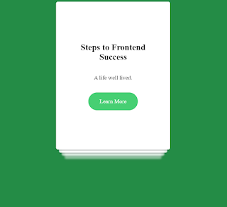
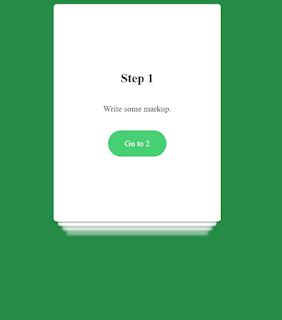
Now we have completed our Stacked Cards Project. Here is our final updated output HTML + CSS.
10+ Javascript Projects For Beginners With Source Code
Final Output Of Stacked Cards UI HTML and CSS
Video Output Of Stacked Cards UI CSS:
Now we have completed our Stacked Cards. Here is our updated output with HTML and CSS. Hope you like the Stacked Cards Project. you can see output project screenshots. See our other blogs and gain knowledge in front-end development.
100+ JavaScript Projects With Source Code ( Beginners to Advanced)
Thank you!
ADVERTISEMENT
In this posts we learnt how to create Stacked Cards using HTML and CSS. If we made a mistake or any confusion, please drop a comment to reply or help you in easy learning. You can explorer more about CSS Effects yo add the interactive UI in cards.
ADVERTISEMENT
Written by – Code With Random/Anki
code by – Cameron Leslie
ADVERTISEMENT
Which code editor do you use for Stacked Cards coding?
I personally recommend using VS Code Studio, it’s straightforward and easy to use.
ADVERTISEMENT
What is Stacked Card?
A stacked UI card project is one in which numerous cards are stacked on top of one another. In this project, we will make various cards and stack them one on top of the other, so that when the user selects on the first tag, it is replaced by the second card, and so on.
ADVERTISEMENT
What is the main HTML required to create the card structure?
Using the <div> tag to create the main container for the card then inside it using the <h1> and <p> tag we will add the structure of our card.
