Create List Items Hover Effects Using CSS
Welcome to The CodeWithRandom blog. In this blog, we learn how to create List Items Hover Effects Using CSS. We use HTML Code For Creating List Items and CSS For List Items Hover Effects.
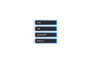
List Items Hover Effects Project Preview👇
| Code by | N/A |
| Project Download | Link Available Below |
| Language used | HTML and CSS |
| External link / Dependencies | No |
| Responsive | Yes |
Hope you enjoy our blog so let’s start with a basic HTML structure for the List Items Hover Effects.
HTML Code For List items hover CSS
<!DOCTYPE html>
<html lang="en">
    <head>
        <meta charset="UTF-8" />
        <meta http-equiv="X-UA-Compatible" content="IE=edge" />
        <meta name="viewport" content="width=device-width, initial-scale=1.0" />
        <title>List Design</title>
        <link rel="stylesheet" href="style.css" />
    </head>
    <body>
        <div class="container">
            <ul>
                <li>HTML</li>
                <li>CSS</li>
                <li>JAVASCRIPT</li>
                <li>NODE JS</li>
            </ul>
        </div>
    </body>
</html>
There is all HTML Code for the List Items Hover Effects. Now, you can see output without CSS, then we write CSS for our List Items Hover Effects.
100+ JavaScript Projects With Source Code ( Beginners to Advanced)
Only HTML Code Output

CSS Code For List items hover CSS
@import url("https://fonts.googleapis.com/css2?family=Poppins&display=swap");
* {
    margin: 0;
    padding: 0;
    box-sizing: border-box;
    font-family: "Poppins", sans-serif;
}
body {
    display: flex;
    justify-content: center;
    align-items: center;
    height: 100vh;
}
ul li {
    width: 200px;
    height: 35px;
    display: flex;
    align-items: center;
    margin: 1.5em;
    cursor: pointer;
    padding: 1em;
    background: rgb(43, 43, 43);
    position: relative;
    color: white;
    border-radius: 5px;
}
ul li::before,
ul li::after {
    content: "";
    position: absolute;
    z-index: -1;
    border-radius: 5px;
    width: 105%;
    transition: all 0.4s;
}
ul li::before {
    left: 0%;
    height: 130%;
    background: linear-gradient(to right, #021B79, #0575E6);
}
ul li::after {
    left: -10%;
    height: 120%;
    background: #ffffff56;
    backdrop-filter: blur(10px);
    box-shadow: 0 0 20px rgba(0, 0, 0, 0.164);
}
ul li:hover::before {
    transform: translateX(-2.5%);
}
ul li:hover::after {
    transform: translateX(15%);
}
Now we have completed our CSS List Items Hover Effects. Here is our updated output With HTML and CSS Code.
Final Output Of CSS List Items Hover Effects
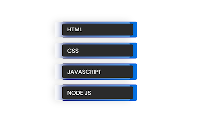
Hope you like the list items hover effect. You can see the output video and project screenshots. See our other blogs and gain knowledge in front-end development.
Create Rock Paper Scissors Game Using JavaScript
Thank you.
In this post, we learn how to create a list items hover effect using HTML and CSS. If we made a mistake or any confusion, please drop a comment to reply or help you in easy learning.
Written by – Code With Random/Anki
Which code editor do you use for this List Items Hover Effects coding?
I personally recommend using VS Code Studio, it’s straightforward and easy to use.
is this project responsive or not?
Yes! this is a responsive project
Do you use any external links to create this project?
No!
