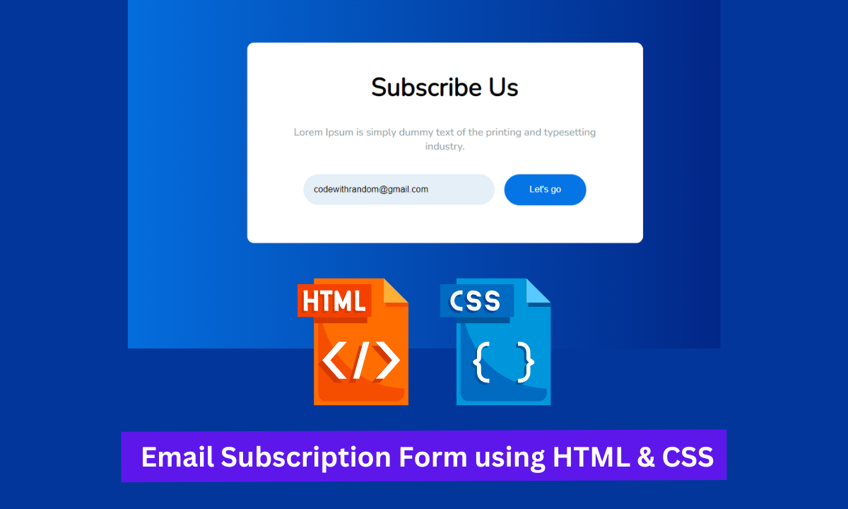
Hello there, Coders. In this article, we will use HTML and CSS to create a responsive email subscription form. In this project, we will create a box-type form with the main heading of our webpage, an email input box, and a submit button.
Using this form the user will be able to subscribe to the website with his email id. The user will be notified whenever some content is updated and uploaded to the website.
How to create responsive email subscription form using HTML and CSS ?
This project is designed for newcomers. This project will show you how to use HTML and CSS to add a subscription to our website.
I hope you have a clear vision for the project.
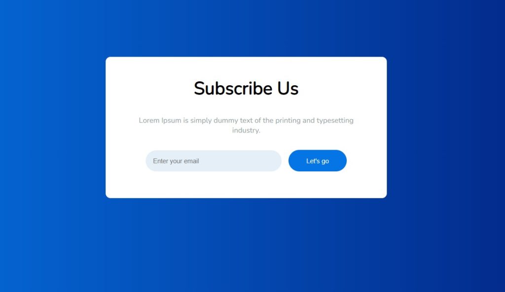
Let’s have a look at our Email Subscription Form.👇
Step1: Lets Start with adding some Basic HTML.
The HTML is hypertext markup language is the main structure of our webpage which will help us to display our content to the browser.
All the HTML document must start with <!doctypehtml> this helps the browser to understand the code written follows the lastest HTML format.
The HTML document itself begin With <html> and end with </html>.
The content that will be displayed in the brower comes under the body section <body></body>.Inside the body tag main content lies.
<!DOCTYPE html>
<html lang="en" dir="ltr">
  <head>
    <meta charset="utf-8" />
    <meta name="viewport" content="width=device-width, initial-scale=1.0" />
    <title>Subscription Form</title>
    <link rel="stylesheet" href="style.css" />
  <body>
    <section class="wrapper">
      <div class="content">
        <header>
          <h1>Subscribe Us</h1>
        </header>
        <section>
          <p>
            Lorem Ipsum is simply dummy text of the printing and typesetting industry.
          </p>
        </section>
        <footer>
          <input type="email" placeholder="Enter your email">
          <button type ="submit">Let's go</button>
        </footer>
      </div>
    </section>
  </body>
</html>
First, we make a section with the class (.wrapper) that will wrap around the heading of our subscription form. Then we’ll make a div tag with our header section for the heading of our subscription form. The heading of our subscription page will be added using the H1 tag.
Now, we’ll add the content to our subscription form with the paragraph tag.
Using the footer tag, we will now add an email input box and a submit button.
Now we have the added the basic structure of our webpage . Let’s us take a look at our HTML output.
100+ Front-end Projects for Web developers (Source Code)
Html Code Output Email Subscription Form
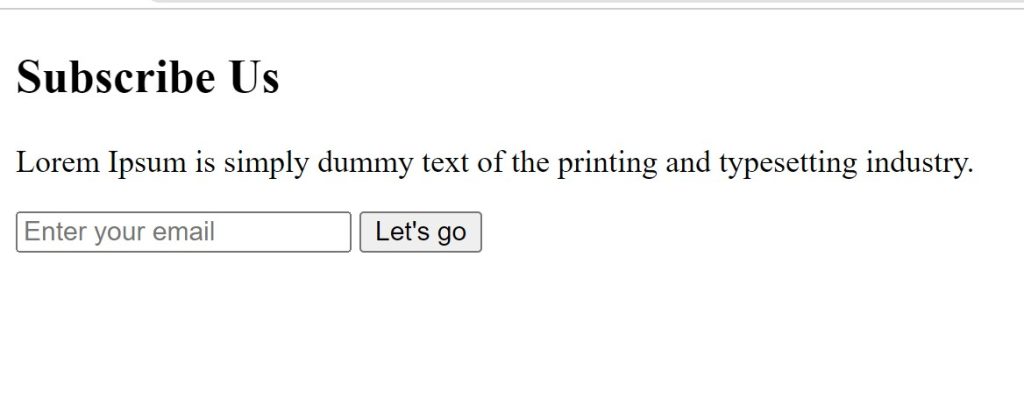
Before the code, you just need to add the CSS link to our HTML file so that we add styling to our website:
<link rel="stylesheet" href="./style.css">
Keep note that you must add this link under the head tag .
Step2: Adding the CSS Code.
Cascading Style Sheets (CSS) is a markup language for describing the presentation of a document written in HTML or XML. CSS, like HTML and JavaScript, is a key component of the World Wide Web.
Now we will look at our CSS code.
@import url('https://fonts.googleapis.com/css?family=Nunito');

:root {
  --start-color: #0575E6;
  --end-color: #021B79;
  --p-color: #929DA6;
  --button-background: #0575E6;
  --input-background: #e4eff8;
  --radius-50: 50px;
  --padding-15: 15px;
}

body {
  margin: 0;
  padding: 0;
  height: 100vh;
  background: var(--start-color);
  background: linear-gradient(to right, var(--start-color), var(--end-color)) no-repeat;
  font-family: 'Nunito', sans-serif;
}

.wrapper {
  width: 100%;
  height: 100%;
  display: flex;
  justify-content: center;
  align-items: center;
}

.wrapper .content {
  background: #fff;
  padding: 40px;
  width: 100%;
  max-width: 500px;
  min-width: 200px;
  border-radius: 10px;
  text-align: center;
}

.wrapper .content header h1 {
  font-size: 230%;
  margin-top: 0;
}
.wrapper .content section {
  color: var(--p-color);
  font-size: 15px;
}
.wrapper .content footer {
  padding: var(--padding-15);
}
.wrapper .content footer input {
  border: unset;
  background-color: var(--input-background);
  padding: var(--padding-15);
  font-size: 13px;
  border-radius: var(--radius-50);
  width: 250px;
}
.wrapper .content footer button {
  background-color: var(--button-background);
  color: #fff;
  border: unset;
  width: 120px;
  border-radius: var(--radius-50);
  padding: var(--padding-15);
  margin-left: 10px;
  cursor: pointer;
}

.wrapper .content footer input:focus, .wrapper .content footer button:focus {
  outline: none;
}

@media screen and (max-width: 720px) {
  .wrapper .content {
    margin-right: 20px !important;
    margin-left: 20px !important;
    padding: var(--padding-15);
  }
  .wrapper .content footer input {
    width: 200px;
    margin-bottom: 10px;
  }
}
After we’ve added the CSS code, we’ll go over it step by step. To save time, you can simply copy this code and paste it into your IDE. Let us now examine our code step by step.
Step1: First, we’ll import the Google Font so that we can use it in our styling. Using the root element (html), we will now set the start colour, end colour, and colour for our paragraph. In addition, we set the background colour for our input and button.
@import url('https://fonts.googleapis.com/css?family=Nunito');

:root {
  --start-color: #0575E6;
  --end-color: #021B79;
  --p-color: #929DA6;
  --button-background: #0575E6;
  --input-background: #e4eff8;
  --radius-50: 50px;
  --padding-15: 15px;
}
Step2: We will now set the margin and padding to zero using the body tag. Height can also be expressed as (“100 vh”). Here, the background colour is a linear gradient to the right; it is inherited from the root element. “Nunito” is the name of the font family.
body {
  margin: 0;
  padding: 0;
  height: 100vh;
  background: var(--start-color);
  background: linear-gradient(to right, var(--start-color), var(--end-color)) no-repeat;
  font-family: 'Nunito', sans-serif;
}Step3:We will add the width and height as “100%” using the (.wrapper) class. We also added the “flex” display type. The items are aligned in the “center,” and the content is also justified at the center. Now, we’ll use the (.content) class to change the background colour of our content to white. The padding at the top and bottom is set to “40px,” and the width is set to “100%.” We also set the maximum width for our content so that it cannot be wider than “500px” and cannot be narrower than “200px.” We also set the border radius to “10 px,” and the text is center.
ADVERTISEMENT
.wrapper {
  width: 100%;
  height: 100%;
  display: flex;
  justify-content: center;
  align-items: center;
}

.wrapper .content {
  background: #fff;
  padding: 40px;
  width: 100%;
  max-width: 500px;
  min-width: 200px;
  border-radius: 10px;
  text-align: center;
}Step4:We’ll now add the style to our heading. We set the font size to “230%” and the top margin to “zero” in this case. We will now add the font colour “dark grey” to our paragraph and set the font size to 15px using the section tag.
ADVERTISEMENT
.wrapper .content section {
  color: var(--p-color);
  font-size: 15px;
}
Step5:We’ll now style the input box and button on our subscription form with the footer. To fit our input box, we have defined the border as unset, and the background colour is taken from the root element. Our input box has a font size of 13 pixels. The border radius is also calculated from the root element, where the radius variable was defined. Our input box will be 250 pixels.
ADVERTISEMENT
.wrapper .content footer {
  padding: var(--padding-15);
}
.wrapper .content footer input {
  border: unset;
  background-color: var(--input-background);
  padding: var(--padding-15);
  font-size: 13px;
  border-radius: var(--radius-50);
  width: 250px;
}Step6:We’ll style the button on our subscription form now. Our button’s background colour is added from our root element, where we defined the background colour for our button. Our text inside the button is written in “white” font colour . The cursor was also defined as a pointer.
ADVERTISEMENT
.wrapper .content footer button {
  background-color: var(--button-background);
  color: #fff;
  border: unset;
  width: 120px;
  border-radius: var(--radius-50);
  padding: var(--padding-15);
  margin-left: 10px;
  cursor: pointer;
}

.wrapper .content footer input:focus, .wrapper .content footer button:focus {
  outline: none;
}
Step7: Now we’ll add the main styling to our responsive webpage; we’ll add the media query and set the maximum width. If the content width exceeds the defined width, the margin and padding of our content change to match the defined margin within our media query. For our input box, the width is also set to 200px, with a bottom margin of 10px.
ADVERTISEMENT
@media screen and (max-width: 720px) {
  .wrapper .content {
    margin-right: 20px !important;
    margin-left: 20px !important;
    padding: var(--padding-15);
  }
  .wrapper .content footer input {
    width: 200px;
    margin-bottom: 10px;
  }
}
Now we have completed our css code and below👇here is the output after styling our webpage.
Final Output Of Subscription form

The project is now finished, we have added the 3d image rotation with HTML and CSS. Now look at the live preview.
Output:
Now We have Successfully created the subcription form using HTML and CSS . You can use this project directly by copying into your IDE. WE hope you understood the project , If you any doubt feel free to comment!!
If you find out this Blog helpful, then make sure to search code with random on google for Front End Projects with Source codes and make sure to Follow the Code with Random Instagram page.
