Hello Coders👨💻!! In this article, we will see how we can create a Personal Portfolio Website using HTML, CSS, and Bootstrap. Personal portfolio sites must be consistent and maintained throughout your career. It provides a convenient way for potential clients to view your work while also allowing you to expand on your skills, experiences, and services.
Create a Portfolio Website Using HTML, CSS, and Bootstrap
This site [Personal Portfolio] has four sections on one page: Home, Portfolio, About, and Contact, and each section is attractive and eye-catching.
A portfolio can be thought of as a digital resume that showcases the user’s talent to the client. A portfolio is a website that developers use to showcase their skills in the market so that they can be hired based on their skill set.
50+ HTML, CSS & JavaScript Projects With Source Code
Let’s take a look at our portfolio project

This portfolio is fully responsive, and anyone can view it using any device, whether it is a mobile phone, tablet, or desktop. This article will teach us how to create this website using HTML, CSS, Bootstrap, and a little JavaScript. You will learn about the CSS and JavaScript frameworks (Bootstrap and Jquery) in this project, which will help you build a faster and more responsive website.
Restaurant Website Using HTML And CSS With Source Code
We will be discussing our project step by step :
Step1: To begin with , we will import our bootstrap from the official bootstrap website using the import link into the head section of our HTML.
<link rel='stylesheet' href='https://maxcdn.bootstrapcdn.com/bootstrap/3.3.5/css/bootstrap.min.css'>
    <link rel='stylesheet' href='https://maxcdn.bootstrapcdn.com/font-awesome/4.5.0/css/font-awesome.min.css'>

    <script src="https://code.jquery.com/jquery-1.12.0.min.js"></script>
    <script src="https://maxcdn.bootstrapcdn.com/bootstrap/3.3.6/js/bootstrap.min.js" integrity="sha384-0mSbJDEHialfmuBBQP6A4Qrprq5OVfW37PRR3j5ELqxss1yVqOtnepnHVP9aJ7xS" crossorigin="anonymous"></script>
Step2: We’ll start with our portfolio’s header and work our way down to the portfolio navbar. To use Bootstrap in our navbar, we will use the Bootstrap class that has already been defined in our HTML elements. If you want to learn more about how we can add the navbar bootstrap class, please visit the bootstrap navbar docs.
NavbarDocs
<!-- Start Navigation Bar -->
   <nav class="navbar navbar-default navbar-fixed-top">
     <div class="container">
       <!-- Brand and toggle get grouped for better mobile display -->
       <div class="navbar-header">
         <button type="button" class="navbar-toggle collapsed" data-toggle="collapse" data-target="#bs-example-navbar-collapse-1" aria-expanded="false">
           <span class="sr-only">Toggle navigation</span>
           <span class="icon-bar"></span>
           <span class="icon-bar"></span>
           <span class="icon-bar"></span>
         </button>
         <span class="navbar-brand">Hasham Babar</span>
       </div>

       <!-- Collect the nav links, forms, and other content for toggling -->
       <div class="collapse navbar-collapse" id="bs-example-navbar-collapse-1">
         <ul class="nav navbar-nav">
           <li class="active"><a href="#home">Home <span class="sr-only">(current)</span></a></li>
         </ul>

         <ul class="nav navbar-nav navbar-right">
           <li><a href="#portfolio-link">Portfolio</a></li>
           <li><a href="#about-link">About</a></li>
           <li><a href="#contact-link">Contact</a></li>
         </ul>
       </div><!-- /.navbar-collapse -->
     </div><!-- /.container-fluid -->
   </nav>
   <!-- End Navagation Bar -->
Restaurant Website Using HTML and CSS
Step3:Now we’ll add our hero section, where we’ll write the introduction to our website. First, we’ll add a heading and a paragraph with the HTML tag, followed by the background image with CSS and the Font Awesome icon with with <a> tag . Using Bootstrap, we will make the h1 and paragraph tags responsive.
<!-- Start Splash Section  -->
    <a class="anchor" id="home"></a>
    <div id="splash" class="container-fluid">
      <div class="row">
        <div class="col-lg-12 text-center">
          <h1>Hasham Babar</h1>
          <hr />
          <p>
            Full Stack Developer / Software Test Analyst
          </p>
          <p>
            <a href="https://github.com/hash004" target="_blank"><i class="fa fa-github-square fa-2x"></i></a>
            <a href="https://uk.linkedin.com/in/hashambabar" target="_blank"><i class="fa fa-linkedin-square fa-3x"></i></a>
            <a href="https://twitter.com/hash004" target="_blank"><i class="fa fa-twitter-square fa-2x"></i></a>
          </p>
        </div>
      </div>
    </div>
    <!-- End Splash Section  -->
#splash{
  background-image: url(https://raw.githubusercontent.com/hash004/freecodecamp/master/portfolioPage/images/home.jpg);
  background-size: cover;
  background-position: center;
  height: 100%;
  margin-top: 50px;
  padding-top: 15%;
  padding-bottom: 50px;
  color: #fff;
  font-size: 3em;
  text-shadow: 0px 4px 3px rgba(0,0,0,0.4),
               0px 8px 13px rgba(0,0,0,0.5),
               0px 18px 23px rgba(0,0,0,0.1);
}

  #splash h1{
    font-size: 2em;
  }

  #splash a{
    color: #fff;
  }

  #splash a:hover{
    color: #e7e7e7;
  }
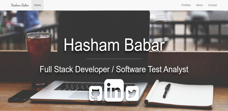
Step4 : We will add a portfolio section which we contain our skills and porject section if you have any skills or any project you can add them in this particular section . Here we will add our project in form of card using bootstrap . We have added a grid system in which we will add 3 column in a row which are responsive if the screen size increase the number of colum increase or decrease accordingly.
If you want to learn more about the grid system and card in bootstrap, click on the link below.
<a class="anchor" id="portfolio-link"></a>
    <div id="portfolio" class="container-fluid">
      <div class="row">
        <div class="col-lg-12 text-center">
          <h1>Portfolio</h1>
          <hr />
          <div class="container">
            <div class="row">
              <div class="col-lg-4">
                <div class="thumbnail">
                  <a href="https://codepen.io/hash004/full/obKJvY" target="_blank">
                    <div class="thumbnail-hover text-center">
                      <i class="fa fa-eye fa-4x"></i>
                    </div>
                    <img class="img-responsive" src="https://raw.githubusercontent.com/hash004/freecodecamp/master/portfolioPage/images/projects/tribute-page.png" alt="bruce-lee-tribute-page">
                  </a>
                  <div class="caption">
                    <h3>Tribute Page</h3>
                    <p>Using Bootstrap to build a simple tribute page</p>
                  </div>
                </div>
              </div>
              <div class="col-lg-4">
                <div class="thumbnail">
                  <a href="#" target="_blank">
                    <div class="thumbnail-hover text-center">
                      <i class="fa fa-eye fa-4x"></i>
                    </div>
                    <img class="img-responsive" src="https://images.unsplash.com/photo-1430931071372-38127bd472b8?crop=entropy&dpr=2&fit=crop&fm=jpg&h=275&ixjsv=2.1.0&ixlib=rb-0.3.5&q=50&w=400">
                  </a>
                  <div class="caption">
                    <h3>Placeholder</h3>
                    <p>Placeholder project desciption goes here</p>
                  </div>
                </div>
              </div>
              <div class="col-lg-4">
                <div class="thumbnail">
                  <a href="#" target="_blank">
                    <div class="thumbnail-hover text-center">
                      <i class="fa fa-eye fa-4x"></i>
                    </div>
                    <img src="https://images.unsplash.com/photo-1426260193283-c4daed7c2024?crop=entropy&dpr=2&fit=crop&fm=jpg&h=250&ixjsv=2.1.0&ixlib=rb-0.3.5&q=50&w=400">
                  </a>
                  <div class="caption">
                    <h3>Placeholder</h3>
                    <p>Placeholder project desciption goes here</p>
                  </div>
                </div>
              </div>
            </div>
            <div class="row">
              <div class="col-lg-4">
                <div class="thumbnail">
                  <a href="#" target="_blank">
                    <div class="thumbnail-hover text-center">
                      <i class="fa fa-eye fa-4x"></i>
                    </div>
                    <img src="https://images.unsplash.com/photo-1429728479567-9c51fb49813e?crop=entropy&dpr=2&fit=crop&fm=jpg&h=300&ixjsv=2.1.0&ixlib=rb-0.3.5&q=50&w=400">
                  </a>
                  <div class="caption">
                    <h3>Placeholder</h3>
                    <p>Placeholder project desciption goes here</p>
                  </div>
                </div>
              </div>
              <div class="col-lg-4">
                <div class="thumbnail">
                  <a href="#" target="_blank">
                    <div class="thumbnail-hover text-center">
                      <i class="fa fa-eye fa-4x"></i>
                    </div>
                    <img src="https://images.unsplash.com/photo-1422480723682-a694a43341fb?crop=entropy&dpr=2&fit=crop&fm=jpg&h=275&ixjsv=2.1.0&ixlib=rb-0.3.5&q=50&w=400">
                  </a>
                  <div class="caption">
                    <h3>Placeholder</h3>
                    <p>Placeholder project desciption goes here</p>
                  </div>
                </div>
              </div>
              <div class="col-lg-4">
                <div class="thumbnail">
                  <a href="#" target="_blank">
                    <div class="thumbnail-hover text-center">
                      <i class="fa fa-eye fa-4x"></i>
                    </div>
                    <img src="https://images.unsplash.com/photo-1451968362585-6f6b322071c7?crop=entropy&dpr=2&fit=crop&fm=jpg&h=225&ixjsv=2.1.0&ixlib=rb-0.3.5&q=50&w=400">
                  </a>
                  <div class="caption">
                    <h3>Placeholder</h3>
                    <p>Placeholder project desciption goes here</p>
                  </div>
                </div>
              </div>
            </div>
          </div>
        </div>
      </div>
    </div>
    <!-- End portfolio Section  -->
Step5: Now we’ll make the “about” section. The H1 tag will be used to create the heading of our “about” section.
Ecommerce Website Using Html Css And Javascript Source Code
In this about section, we will use bootstrap grid system to create two columns; one column will contain the display picture, and the second will contain some about me content.
<a class="anchor" id="about-link"></a>
    <div id="about" class="container-fluid text-center">
          <h1>About</h1>
          <hr />
          <div class="container">
            <div class="row row-eq-height">
              <!-- <div class="col-lg-1"></div> -->
              <div class="col-lg-3">
                <img class="img-responsive img-circle center-block" src="https://avatars0.githubusercontent.com/u/2758955" alt="Hasham-Babar" />
              </div>
              <div id="white-bg" class="col-lg-8">
                <p>
                   Computer Science Graduate. Full Stack Developer. Qualified Software Test Analyst with 5 years of practical experience.


                </p>
              </div>
            </div>
          </div>
    </div>
    <!-- End About Section -->
#about{
  background-image: url(https://raw.githubusercontent.com/hash004/freecodecamp/master/portfolioPage/images/about.jpg);
  background-position: center;
  background-size: cover;
  height: 100%;
  padding-bottom: 50px;
  color: #fff;
}

  #about h1{
    font-size: 5em;
    text-shadow: 0px 4px 3px rgba(0,0,0,0.4),
                 0px 8px 13px rgba(0,0,0,0.5),
                 0px 18px 23px rgba(0,0,0,0.1);
  }

  #about p{
    font-size: 1.5em;
    text-align: justify;
  }

  #about img{
    padding: 10px;
    /*max-width: 180px;*/
  }

#white-bg{
  /*background-color: rgba(0,0,0, 0.5);
  border-radius: 20px;
  margin-right: 10px;*/
  float: left;
  display: inline-block;
  vertical-align: middle;
  padding: 6% 2%;
}
Step6: Now we’ll add the final section to our portfolio, in which we’ll first use the fontawesome icon to add social links like Instagram, Github, and so on, and then we’ll simply embed the map by setting up your location in Google Maps and then embedding in our portfolio. Finally, we’ll include an email icon with a link to our email address so that anyone who clicks on it can contact us.
<!-- Start Contact Section -->
    <a class="anchor" id="contact-link"></a>
    <div id="contact" class="container-fluid text-center">
      <h1>Contact</h1>
      <hr />
      <div class="container">
        <div class="row">
          <div class="col-lg-4">
            <h2>Social</h2>
            <a href="https://twitter.com/hash004">
              <span class="fa-stack fa-3x">
                <i class="fa fa-circle fa-stack-2x"></i>
                <i class="fa fa-twitter fa-stack-1x fa-inverse"></i>
              </span>
            </a>
            <a href="https://uk.linkedin.com/in/hashambabar">
              <span class="fa-stack fa-3x">
                <i class="fa fa-circle fa-stack-2x"></i>
                <i class="fa fa-linkedin fa-stack-1x fa-inverse"></i>
              </span>
            </a>
            <a href="https://github.com/hash004">
              <span class="fa-stack fa-3x">
                <i class="fa fa-circle fa-stack-2x"></i>
                <i class="fa fa-github-alt fa-stack-1x fa-inverse"></i>
              </span>
            </a>
            <a href="https://www.freecodecamp.com/hash004">
              <span class="fa-stack fa-3x">
                <i class="fa fa-circle fa-stack-2x"></i>
                <i class="fa fa-fire fa-stack-1x fa-inverse"></i>
              </span>
            </a>
          </div>
          <div class="col-lg-4">
            <h2>Location</h2>
            <address>
              Leeds,
              West Yorkshire,
              England
            </address>
            <div class="embed-responsive embed-responsive-4by3">
              <iframe class="embed-responsive-item" src="https://www.google.com/maps/embed?pb=!1m18!1m12!1m3!1d18850.876504441596!2d-1.5490997490371672!3d53.800885330574815!2m3!1f0!2f0!3f0!3m2!1i1024!2i768!4f13.1!3m3!1m2!1s0x48793e4ada64bd99%3A0x51adbafd0213dca9!2sLeeds%2C+West+Yorkshire!5e0!3m2!1sen!2suk!4v1456749335815" width="600" height="450" frameborder="0" style="border:0" allowfullscreen></iframe>
            </div>
          </div>
          <div class="col-lg-4">
            <h2>Communication</h2>
            <a href="mailto:[email protected]">
              <span class="fa-stack fa-3x">
                <i class="fa fa-circle fa-stack-2x"></i>
                <i class="fa fa-envelope fa-stack-1x fa-inverse"></i>
              </span>
            </a>
          </div>
        </div>
      </div>
    </div>
    <!-- End Contact Section -->
Step7: In this step we wil ad some functionality or animation to our portfolio using jquery which is a javascript framework . The main use of this framework is to decrease the length of our code. Here in this we have added a function to our navbar in which we will add the click function in which we have created a toggle function to add or remove the active class.
Responsive Navbar With Hamburger Menu Using HTML and CSS
$(document).ready(function(){
        $(".navbar-nav li").click(function(){
          $(".navbar-nav li").removeClass("active");
          $(this).addClass("active");
        }
        );

        $('.navbar-nav a').click(function(event){
            event.preventDefault();
            $('html, body').animate({
                scrollTop: $( $.attr(this, 'href') ).offset().top
            }, 500);
        });

      }
      );
Final Output Of Portfolio Website Using HTML ,CSS and Bootstrap:-
Live Preview Of Portfolio Website:-
Now We have Successfully created a responsive portfolio website using Bootstrap. You can use this project directly by copying it into your IDE. We hope you understood the project, If you have any doubts feel free to comment!!
5+ HTML CSS project With Source Code
If you find out this Blog helpful, then make sure to search Codewithrandom on Google for Front End Projects with Source codes and make sure to Follow the Code with Random Instagram page.
What to do to set the background in the center in this HTML program?
To set the background in the middle in this HTML program, we have to use this syntax :- background-position: center;
How to change text color in our program using HTML and CSS ?
To change the colour of text in HTML and CSS program, you will have to update something in the CSS and HTML program.
here is HTML code:- <p>This is a paragraph with some text</p>
This is a paragraph with some text.
and here is css code:- p {color: yellow; /* Set the text color to yellow */}
Now your text colour is change.
