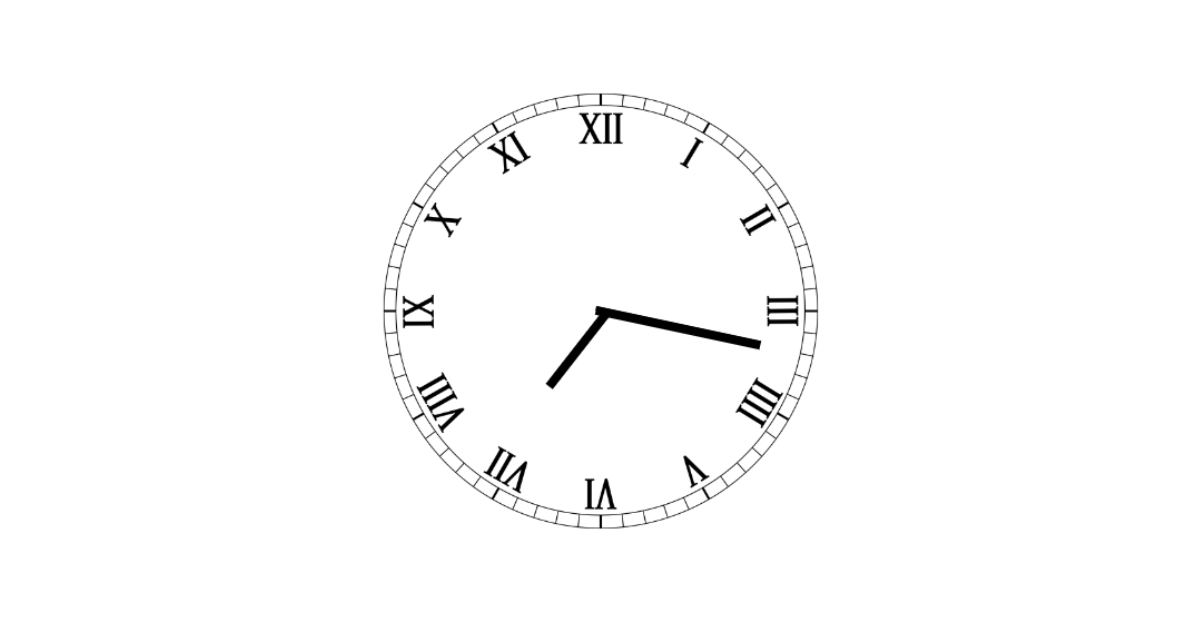
Hey Guys , In Today’s Blog We are going to see How to create an Analog Clock Using HTML , CSS and JAVA SCRIPT. For that the respective sources codes were given below along with the respective preview of output section. So you can make use of that.
Create Analog Clock using HTML, CSS and JavaScript
Now The Project is going to create and for that we are first adding an HTML Code.
HTML CODE :
<!DOCTYPE html>
<html lang="en">

<head>
  <meta charset="UTF-8">
  <title>Analog Clock</title>

</head>

<body>
  <div class="clock">
    <div class="clock-face">
      <div class="hand hour-hand"></div>
      <div class="hand min-hand"></div>
      <div class="hand second-hand"></div>
    </div>
  </div>
  </script>
</body>

</html>
Here Comes the HTML Code. In This First we adding an div class with a name “clock” and then inside then the sub divisions were added. There are three sub-divisions with a separate class name and those are used for relying on Hour , Minute and Seconds Purpose.
So We have completed the HTML Code. Now We can go for CSS to add a time clock design using properties.
10+ Javascript Project Ideas For Beginners( Project Source Code)
CSS CODE:
body {
  background: transparent;
  background-color: transparent;
}
.clock {
  width: 60vh;
  height: 60vh;
  border-radius: 50%;
  margin: 20vh auto;
  display: flex;
  position: relative;
}

.clock-face {
  width: 55vh;
  height: 55vh;
  border-radius: 50%;
  position: absolute;
  top: 2.5vh;
  left: 2.5vh;
  background: url('https://github.com/umarcbs/AnalogCLock/blob/master/clock-face2.png?raw=true');
  background-size: 100% 100%;
}

.hand {
  width: 35%;
  height: 6px;
  background-color: black;
  position: absolute;
  top: 49.5%;
  left: 17.5%;
  transform-origin: 95%;
  transform: rotate(90deg);
  transition: all 0.05s;
  transition-timing-function: cubic-bezier(0.1, 2.7, 0.58, 1);
}

.second-hand {
  height: 3px;
}

.hour-hand {
  width: 20%;
  left: 31.8%;
  top: 50%;
}
The CSS code is Added Now. In this First We fixing the background color and background to transparent using body section. Then we calling the div class that contains the name “CLOCK” and adding the circle format for displaying the time inside of it. Which is the first step of displaying an clock.
Now the Second part involves in adding of time numbers in Roman format and for that we are using the second div class. Alternatively the width and height were fixed along with background image that contains roman numbers. and the position of the roman numbers were fixed absolute to the previous content using position property.
body {
  background: transparent;
  background-color: transparent;
}
.clock {
  width: 60vh;
  height: 60vh;
  border-radius: 50%;
  margin: 20vh auto;
  display: flex;
  position: relative;
}

.clock-face {
  width: 55vh;
  height: 55vh;
  border-radius: 50%;
  position: absolute;
  top: 2.5vh;
  left: 2.5vh;
  background: url('https://github.com/umarcbs/AnalogCLock/blob/master/clock-face2.png?raw=true');
  background-size: 100% 100%;
}
In Third part of CSS , We are adding three arrows one for hour , two for minute and three for seconds and their height of arrows is also differed when compared with other. The properties involved in it are common like width , height , background color , top , left , etc… Additionally transformation property is added for making animations on arrow like the hour runs after minute likewise…
.hand {
  width: 35%;
  height: 6px;
  background-color: black;
  position: absolute;
  top: 49.5%;
  left: 17.5%;
  transform-origin: 95%;
  transform: rotate(90deg);
  transition: all 0.05s;
  transition-timing-function: cubic-bezier(0.1, 2.7, 0.58, 1);
}
Now The Last Part involves in adding of height to a specific arrow that is represented has minute and Hour.
Age Calculator Using Javascript
.second-hand {
  height: 3px;
}

.hour-hand {
  width: 20%;
  left: 31.8%;
  top: 50%;
}
The CSS code is now completed. So we can go for Java Script to make that arrows to move with current network time.
JAVASCRIPT CODE:
const secondHand = document.querySelector('.second-hand');
const minHand = document.querySelector('.min-hand');
const hourHand = document.querySelector('.hour-hand');

function setDate() {
  const now = new Date();

  const second = now.getSeconds();
  const secondsDegree = ((360/60) * second) + 90;
  secondHand.style.transition = secondsDegree === 90 ? 'all 0s' : 'all 0.05s';
  secondHand.style['transition-timing-function'] = 'cubic-bezier(0.1, 2.7, 0.58, 1)';
  secondHand.style.transform = `rotate(${secondsDegree}deg)`;

  const min = now.getMinutes()
  const minsDegree = ((360/60) * min) + 90;
  minHand.style.transform = `rotate(${minsDegree}deg)`;
  minHand.style.transition = minsDegree === 90 ? 'all 0s' : 'all 0.05s';
  minHand.style['transition-timing-function'] = 'cubic-bezier(0.1, 2.7, 0.58, 1)';
  minHand.style.transform = `rotate(${minsDegree}deg)`;

  const hour = now.getHours();
  // to give a realistic hour hand (minsDegree/12 - 8) was added to normal hoursDegree.
  // this serves to ofset the hour hand gradually as the minute hand moves
  // the -8 counters the +90 offset of the original minsDegree
  const hoursDegree = ((360/12) * hour) + 90 + (minsDegree/12 - 8);
  hourHand.style.transform = `rotate(${hoursDegree}deg)`;
  hourHand.style.transition = hoursDegree === 90 ? 'all 0s' : 'all 0.05s';
  hourHand.style['transition-timing-function'] = 'cubic-bezier(0.1, 2.7, 0.58, 1)';
  hourHand.style.transform = `rotate(${hoursDegree}deg)`;
}

setInterval(setDate, 1000);
Now In the First part of JS we are calling out the the div classes that contains the time to be represented using the JS query Selector Property.
In the Second Part, We are adding an function for setting the current date using java script object property. Now getting the seconds and setting it to run through out the clock. Using style-transition and style-transform the arrow of second starts run.
const secondHand = document.querySelector('.second-hand');
const minHand = document.querySelector('.min-hand');
const hourHand = document.querySelector('.hour-hand');

function setDate() {
  const now = new Date();

  const second = now.getSeconds();
  const secondsDegree = ((360/60) * second) + 90;
  secondHand.style.transition = secondsDegree === 90 ? 'all 0s' : 'all 0.05s';
  secondHand.style['transition-timing-function'] = 'cubic-bezier(0.1, 2.7, 0.58, 1)';
  secondHand.style.transform = `rotate(${secondsDegree}deg)`;
In the Third part , We are again calling out the minute and setting the minute to move slowly one by one after the seconds arrow completes one round.
ADVERTISEMENT
const min = now.getMinutes()
  const minsDegree = ((360/60) * min) + 90;
  minHand.style.transform = `rotate(${minsDegree}deg)`;
  minHand.style.transition = minsDegree === 90 ? 'all 0s' : 'all 0.05s';
  minHand.style['transition-timing-function'] = 'cubic-bezier(0.1, 2.7, 0.58, 1)';
  minHand.style.transform = `rotate(${minsDegree}deg)`;
The Line “const minsDegree = ((360/60) * min) + 90;” is used for moving arrows one by one after the clockwise completion of second.
ADVERTISEMENT
ADVERTISEMENT
Now The Last part contains the same exact has minute but here the minute should complete one clockwise direction to move the arrow (Hour) to next number. So the given line of code below makes this explanation.
ADVERTISEMENT
const hour = now.getHours();
  // to give a realistic hour hand (minsDegree/12 - 8) was added to normal hoursDegree.
  // this serves to ofset the hour hand gradually as the minute hand moves
  // the -8 counters the +90 offset of the original minsDegree
  const hoursDegree = ((360/12) * hour) + 90 + (minsDegree/12 - 8);
  hourHand.style.transform = `rotate(${hoursDegree}deg)`;
  hourHand.style.transition = hoursDegree === 90 ? 'all 0s' : 'all 0.05s';
  hourHand.style['transition-timing-function'] = 'cubic-bezier(0.1, 2.7, 0.58, 1)';
  hourHand.style.transform = `rotate(${hoursDegree}deg)`;
}

setInterval(setDate, 1000);
ADVERTISEMENT
The Specific line “const hoursDegree = ((360/12) * hour) + 90 + (minsDegree/12 – 8);” represents the moving of arrow that contain hour.
Hoorah! , We have successfully completed the project by adding the respective source codes. And Hence we can make a additional review of our project in the mentioned output section.
FINAL OUTPUT:
Now We have Successfully created our Analog Clock Using HTML , CSS and JavaScript. You can use this project for your personnel needs and the respective lines of code are given with the code pen link mentioned below.
100+ Front-end Projects for Web developers (Source Code)
If you find out this Blog helpful, then make sure to search code with random on google for Front End Projects with Source codes and make sure to Follow the Code with Random Instagram page.
REFER CODE – Umar Faaroq
WRITTEN BY – Ragunathan


