Hello, Coders! In this tutorial, we’ll demonstrate how to create an animated Instagram logo using HTML and CSS. Everybody is aware that any software must have an icon to indicate its purpose. Therefore, Instagram is a social networking platform that enables users to communicate with their friends, family, and other acquaintances. We made the decision to create an animated Instagram logo.
Create an Animated Instagram Logo/Icon Using HTML and CSS Code

This project is completely accessible to beginners. This post will walk you through creating the Instagram logo step-by-step. This project will assist you in making your own icons, which you can subsequently use in your portfolios. If you read this post carefully, you will learn how to create an Instagram symbol without any difficulty. Once you have a firm grasp of the project, you may create other icons on your own.
10+ HTML CSS Projects For Beginners with Source Code
| Code by | Alexey |
| Project Download | Link Available Below |
| Language used | HTML and CSS |
| External link / Dependencies | No |
| Responsive | No |
Hope this gives you a general overview of the project. We shall cover this project in detail in our post.
Step1: Adding Some Basic HTML.
HTML stands for HyperText Markup Language. This is a markup language. Its main job is to give our project structure. We will provide our project structure by utilising this markup language. So let’s look at our HTML code.
Restaurant Website Using HTML and CSS
<!DOCTYPE html>
<html>

<head>
  <link rel="stylesheet" href="style.css" />
  <title>Instagram logo</title>
</head>

<body>
  <a id="instagram" href="https://codewithrandom.com/" target="_blank">
    <i id="logo"></i>
  </a>
</body>

</html>- First, we’ll include a link to our CSS file’s external file in the HTML head section.
- Now that we have a link to our logo in the body section, we can arrange our website using the <i> tag with the id “logo” .
- Right now, the output is blank, so we’ll add some temporary material to it to let you understand that we’ve introduced a structure to our webpage.

Now we added a basic structure to our webpage. Now using the CSS will be adding our main style to our webpage.
Portfolio Website Using HTML CSS And JAVASCRIPT ( Source Code)
Step2: Adding CSS
*,
*::before,
*::after {
    -webkit-box-sizing: border-box;
    -moz-box-sizing: border-box;
    box-sizing: border-box;
}

html,
body {
    margin: 0;
    padding: 0;
    background: rgb(238, 238, 238);
}

a#instagram {
    top: 0;
    left: 0;
    right: 0;
    bottom: 0;
    margin: auto;
    position: absolute;
    display: block;
    width: 144px;
    height: 144px;
    outline: none;
    -webkit-border-radius: 32px;
    -moz-border-radius: 32px;
    border-radius: 32px;
    background: -webkit-radial-gradient(32% 106%, circle cover, rgb(255, 225, 125) 0%, rgb(255, 205, 105) 10%, rgb(250, 145, 55) 28%, rgb(235, 65, 65) 42%, transparent 82%), -webkit-linear-gradient(-45deg, rgb(35, 75, 215) 12%, rgb(195, 60, 190) 58%);
    background: -moz-radial-gradient(32% 106%, circle cover, rgb(255, 225, 125) 0%, rgb(255, 205, 105) 10%, rgb(250, 145, 55) 28%, rgb(235, 65, 65) 42%, transparent 82%), -moz-linear-gradient(-45deg, rgb(35, 75, 215) 12%, rgb(195, 60, 190) 58%);
    background: -ms-radial-gradient(32% 106%, circle cover, rgb(255, 225, 125) 0%, rgb(255, 205, 105) 10%, rgb(250, 145, 55) 28%, rgb(235, 65, 65) 42%, transparent 82%), -ms-linear-gradient(-45deg, rgb(35, 75, 215) 12%, rgb(195, 60, 190) 58%);
    background: -o-radial-gradient(32% 106%, circle cover, rgb(255, 225, 125) 0%, rgb(255, 205, 105) 10%, rgb(250, 145, 55) 28%, rgb(235, 65, 65) 42%, transparent 82%), -o-linear-gradient(-45deg, rgb(35, 75, 215) 12%, rgb(195, 60, 190) 58%);
    background: radial-gradient(circle farthest-corner at 32% 106%, rgb(255, 225, 125) 0%, rgb(255, 205, 105) 10%, rgb(250, 145, 55) 28%, rgb(235, 65, 65) 42%, transparent 82%), linear-gradient(135deg, rgb(35, 75, 215) 12%, rgb(195, 60, 190) 58%);
    -webkit-animation: animation 3.5s linear infinite;
    -moz-animation: animation 3.5s linear infinite;
    -ms-animation: animation 3.5s linear infinite;
    -o-animation: animation 3.5s linear infinite;
    animation: animation 3.5s linear infinite;
}

a#instagram i#logo {
    top: 0;
    left: 0;
    right: 0;
    bottom: 0;
    margin: auto;
    position: absolute;
    display: block;
    width: 106px;
    height: 106px;
    border: 9.8px solid rgb(255, 255, 255);
    -webkit-border-radius: 30px;
    -moz-border-radius: 30px;
    border-radius: 30px;
}

a#instagram i#logo::before {
    content: "";
    top: 0;
    left: 0;
    right: 0;
    bottom: 0;
    margin: auto;
    position: absolute;
    display: block;
    width: 54.8px;
    height: 54.8px;
    border: 9.8px solid rgb(255, 255, 255);
    -webkit-border-radius: 27.4px;
    -moz-border-radius: 27.4px;
    border-radius: 27.4px;
}

a#instagram i#logo::after {
    content: "";
    top: 8.6px;
    right: 8.6px;
    position: absolute;
    display: block;
    width: 12.8px;
    height: 12.8px;
    background: rgb(255, 255, 255);
    -webkit-border-radius: 6.4px;
    -moz-border-radius: 6.4px;
    border-radius: 6.4px;
}

@-webkit-keyframes animation {
    0%,
    100% {
        -webkit-transform: scale(1);
    }
    50% {
        -webkit-transform: scale(3.5);
    }
    ;
}

@-moz-keyframes animation {
    0%,
    100% {
        -moz-transform: scale(1);
    }
    50% {
        -moz-transform: scale(3.5);
    }
    ;
}

@-ms-keyframes animation {
    0%,
    100% {
        -ms-transform: scale(1);
    }
    50% {
        -ms-transform: scale(3.5);
    }
    ;
}

@-o-keyframes animation {
    0%,
    100% {
        -o-transform: scale(1);
    }
    50% {
        -o-transform: scale(3.5);
    }
    ;
}

@keyframes animation {
    0%,
    100% {
        transform: scale(1);
    }
    50% {
        transform: scale(3.5);
    }
    ;
}
To add this animation, we’ll utilise some simple CSS code. It will be simple for you to understand and attempt to incorporate your style, which will assist you clarify your concepts. The CSS will be explained step by step.
100+ JavaScript Projects With Source Code ( Beginners to Advanced)
Step1: We will add the box sizing as “border-box” to our content using the universal selector.
We will add “zero” margin and “zero” padding to our page using the body tag selector. We have also applied the colour “smoke white” for the background.
*,
*::before,
*::after {
    -webkit-box-sizing: border-box;
    -moz-box-sizing: border-box;
    box-sizing: border-box;
}

html,
body {
    margin: 0;
    padding: 0;
    background: rgb(238, 238, 238);
}
Step2: We will design our anchor element using the id selector. As well as setting the location to “absolute” and the display to “block,” the margin is set to “zero.” There are “144 px” for both the width and the height. We specified “32 px” as the border radius. As a gradient colour, we added the backdrop colour (type circle).
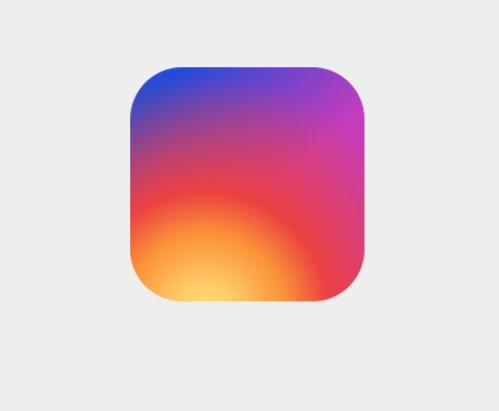
We intially set the backgorund color of our instgram icon.
Step3:The style will now be added to our <i> tag utilising the ID selector (logo). We’ll include the exact same style that we did for our anchor tag. Now, with a border radius of 30 pixels, we will add a 9.8-pixel-wide solid-white border to our logo.

Step4: Now that our logo is ready, we’ll put a circle inside of it. To do this, we’ll set the margin to “auto,” the top, bottom, left, and right spacing to “zero,” and the display to “block.” The border radius is “27.4px” while the width and height are both “54.8px.”
Create A Travel Website Using HTML & CSS
a#instagram i#logo::before {
    content: "";
    top: 0;
    left: 0;
    right: 0;
    bottom: 0;
    margin: auto;
    position: absolute;
    display: block;
    width: 54.8px;
    height: 54.8px;
    border: 9.8px solid rgb(255, 255, 255);
    -webkit-border-radius: 27.4px;
    -moz-border-radius: 27.4px;
    border-radius: 27.4px;
}

a#instagram i#logo::after {
    content: "";
    top: 8.6px;
    right: 8.6px;
    position: absolute;
    display: block;
    width: 12.8px;
    height: 12.8px;
    background: rgb(255, 255, 255);
    -webkit-border-radius: 6.4px;
    -moz-border-radius: 6.4px;
    border-radius: 6.4px;
}
Step5: Now we will add the animation to our instagram logo for that we have added keyframe. Using the transform property inside keyframe we will add the scale property to scale our instagram logo at 0%,100%,50%.
Ecommerce Website Using HTML, CSS, & JavaScript (Source Code)
Codepen Preview Of Animated Instagram logo using HTML and CSS
Now We have Successfully created our Animated Instagram logo using HTML and CSS . You can use this project directly by copying into your IDE. WE hope you understood the project , If you any doubt feel free to comment!!
If you find out this Blog helpful, then make sure to search code with random on google for Front End Projects with Source codes and make sure to Follow the Code with Random Instagram page.
Which code editor do you use for this Animated Instagram Logo coding?
I personally recommend using VS Code Studio, it’s straightforward and easy to use.
is this project responsive or not?
No! this is not a responsive project
ADVERTISEMENT
Do you use any external links to create this project?
No!
ADVERTISEMENT
