Dragon Ball Radar Using HTML And CSS
Radar when we listen to this word the first thing that strikes our mind is our physics classes in secondary school where we were introduced to this word in a matter of frequency. Radar is basically used in the air activity detection or in warships to detect missile or object which causes distraction or danger.
But now let’s not get that deep let us come back to our front-end development learning, there is nothing that we as developers can’t code it. we’ll receive many errors but that correct us and tell us not to repeat those mistake. So today we’ll code the Radar Project using the scripting language HTML & CSS.
Today We’ll see how to make Dragon Ball Radar Using HTML And CSS with complete source code so you just easily copy and paste it into your project.
Hello Coders!!! I welcome you all to Codewithrandom with this fresh and new blog which will help us to learn how to make the radar ball using HTML & CSS.
HTML Code for Dragon Ball Radar
<div class="main">
    <div class="randar-box">
      <input type="checkbox" checked class="randar-checkbox">
      <div class="randar-top"></div>
      <div class="randar-top-body"></div>
      <div class="randar-content">
        <div class="rander-ball"></div>
        <div class="rander-ball"></div>
        <div class="rander-ball"></div>
        <div class="rander-ball"></div>
        <div class="rander-pos"></div>
      </div>
    </div>
  </div>
In this HTML Code, we have defined the structure of the radar ball in which we have used the div function and added all the necessary designs which will help us to create the radar project. Now let’s style the project using Cascading Stylesheet which will help us to give the look of the real radar which is seen in Warships & Fighter jets.
50+ Html ,Css & Javascript Projects With Source Code
CSS Code for Dragon Ball Radar
*{
  padding:0;
  margin:0;

}
*,*::before, *::after {
    box-sizing: border-box;
}
.main {
  width: 100%;
  min-height: 100vh;
  padding: 0px 0;
  text-align: center;
  overflow: hidden;
  background-image: linear-gradient(
      23deg,
      rgba(202, 202, 202, 0.02) 0%,
      rgba(202, 202, 202, 0.02) 13%,
      transparent 13%,
      transparent 80%,
      rgba(11, 11, 11, 0.02) 80%,
      rgba(11, 11, 11, 0.02) 100%
    ),
    linear-gradient(
      42deg,
      rgba(98, 98, 98, 0.02) 0%,
      rgba(98, 98, 98, 0.02) 36%,
      transparent 36%,
      transparent 77%,
      rgba(252, 252, 252, 0.02) 77%,
      rgba(252, 252, 252, 0.02) 100%
    ),
    linear-gradient(
      286deg,
      rgba(202, 198, 158, 0.02) 0%,
      rgba(173, 173, 173, 0.02) 2%,
      transparent 2%,
      transparent 12%,
      rgba(59, 59, 59, 0.02) 12%,
      rgba(59, 59, 59, 0.02) 100%
    ),
    linear-gradient(
      77deg,
      rgba(87, 87, 87, 0.02) 0%,
      rgba(87, 87, 87, 0.02) 18%,
      transparent 18%,
      transparent 55%,
      rgba(247, 247, 247, 0.02) 55%,
      rgba(247, 247, 247, 0.02) 100%
    ),
    linear-gradient(135deg, rgb(189, 82, 75),rgb(230, 240, 180));
    display: flex;
    align-items: center;
    justify-content: center;
    flex-flow: row wrap;
}

.randar-box {
  width: 360px;
  height: 360px;
  position: relative;
  display: flex;
  align-items: center;
  justify-content: center;
  margin-top: 40px;

  --green: hsl(134, 34%, 38%);
  --line-color: #212121;
}

.randar-content {
  position: relative;
  width: 320px;
  height: 320px;
  border-radius: 50%;
  border: 15px solid rgb(243, 236, 236);
  /* box-shadow: -1px -1px 0 #333333, -1px 1px 0 #333333, 1px -1px 0 #333333,
    1px 1px 0 #333333; */

  background:
  radial-gradient( #afadad 50%, #0a0a0a),
  repeating-linear-gradient(
      90deg,
      hsla(291, 0%, 66%, 0.05) 0px,
      hsla(291, 0%, 66%, 0.05) 1px,
      transparent 1px,
      transparent 100px
    ),
    repeating-linear-gradient(
      0deg,
      hsla(291, 0%, 66%, 0.05) 0px,
      hsla(291, 0%, 66%, 0.05) 1px,
      transparent 1px,
      transparent 100px
    ),
    repeating-linear-gradient(
      0deg,
      var(--line-color) 0px,
      var(--line-color) 1px,
      transparent 1px,
      transparent 25px
    ),
    repeating-linear-gradient(
      90deg,
      var(--line-color) 0px,
      var(--line-color) 1px,
      transparent 1px,
      transparent 25px
    ),
    linear-gradient(135deg, var(--green), var(--green));
    background-position-x: 20px;
    background-position-y: 7px;
    background-blend-mode: soft-light;
    will-change: transform;
}
.randar-content::before {
  content: "";
  display: block;
  width: 296px;
  height: 296px;
  border-radius: 50%;
  position: absolute;
  border: 1px solid #355555;
  left: 50%;
  top: 50%;
  transform: translate(-50%, -50%);
  box-shadow: inset 0 0 20px 2px #333, 0 0 12px #999;
}
.randar-content::after {
  content: "";
  background: linear-gradient(var(--green) 0%, black 60%),linear-gradient(-90deg, black 50%, var(--green) 50%);
  background-blend-mode: darken;
  position: absolute;
  width: 290px;
  height: 290px;
  margin-left: -145px;
  margin-top: -145px;
  left: 50%;
  top: 50%;
  border-radius: 50%;
  will-change: opacity;
  opacity: 0.15;
  z-index: 88;
}
.rander-pos {
  width: 0;
  height: 0;
  position: absolute;
  border-width: 12px 10px;
  border-style: solid;
  border-color: transparent transparent #ca4828 transparent;
  left: 50%;
  top: 50%;
  margin-left: -10px;
  margin-top: -18px;
}

.rander-ball {
  width: 10px;
  height: 10px;
  background: #f7f459;
  position: absolute;
  border-radius: 50%;
  box-shadow: 0px 0px 5px #ecea68;
  animation: flash 3.1s linear infinite;
}

.rander-ball:nth-of-type(1) {
  left: 189px;
  top: 94px;
}

.rander-ball:nth-of-type(2) {
    left: 58px;
    top: 65px;
}

.rander-ball:nth-of-type(3) {
    left: 56px;
    top: 78px;
}
.rander-ball:nth-of-type(4) {
  left: 104px;
  top: 228px;
}

.randar-top {
  width: 22px;
  height: 40px;
  position: absolute;
  top: 0;
  top: -25px;
  background-image: linear-gradient(-45deg,#f7f1f1,#c5bcbc);
  /* box-shadow: -2px -2px 8px #f2f2f2, 2px -2px 8px #f2f2f2; */
  transform: translateY(0px);
  transition: 0.2s all;
}
.randar-top::before {
  content: "";
  display: block;
  width: 38px;
  height: 18px;
  position: absolute;
  left: 50%;
  margin-left: -19px;
  border-radius: 12px 12px 2px 2px;
  top: -4px;
  background: white;
  background-image: linear-gradient(-45deg,#f7f1f1,#c4c4c4);
  cursor: pointer;
  z-index: 9;
}
/* .randar-top:active {
  transform: translateY(10px);
} */

.randar-checkbox{
    position: absolute;
    width: 30px;
    height: 30px;
    z-index: 99;
    top: -30px;
    opacity: 0;
    cursor: pointer;
}

.randar-top-body{
    display: block;
    width: 40px;
    height: 40px;
    border-bottom-left-radius: 30px;
    border-bottom-right-radius: 30px;
    transform: translateX(-50%) translateY(-65%);
    background-color: #efefef;
    background-image: radial-gradient( #f1e9e9, #ebe6e6);
    box-shadow: inset 10px -10px 10px 2px #d6d2d2;
    cursor: pointer;
    position: absolute;
    left: 50%;
    top: 30px;
}
.randar-top-body::before {
  height: 0;
  width: 0;
  border-bottom: 40px solid #d6d2d2;
  border-left: 10px solid transparent;
  left: -10px;
  content: "";
  position: absolute;
}
.randar-top-body::after {
  height: 0;
  width: 0;
  border-bottom: 40px solid #ebe6e6;
  border-right: 10px solid transparent;
  content: "";
  position: absolute;
  right: -10px;
}


.randar-content .rander-ball,
.randar-content .rander-pos{
    display: none;
}
.randar-content::after{
    background-blend-mode: unset;
}

.randar-checkbox:checked,
.randar-checkbox:checked+.randar-top{
  transform: translateY(10px);
}

.randar-checkbox:checked~.randar-content .rander-ball,
.randar-checkbox:checked~.randar-content .rander-pos{
    display: block;
}

.randar-checkbox:checked~.randar-content::after{
    background-blend-mode: darken;
    animation: scan 5s linear infinite;
}


@keyframes flash {
  0%,
  50%,
  to {
    opacity: 1;
  }

  25%,
  75% {
    opacity: 0.1;
  }
}

@keyframes scan {
  from {
    transform: rotate(0deg);
  }
  to {
    transform: rotate(360deg);
  }
}
In this CSS code, we have styled all the radar designs which are called in the HTML code each design has given an RGB(red, green, blue) value. So that it some of the designs don’t look the same there must be differences in the shade. And then we have given each object a respective position so that it looks like a real radar detection in which it gives real look.
Portfolio Website using HTML and CSS (Source Code)
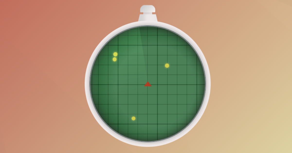
And lastly, we have added the animation which will rotate just like the radar does and detects the activity which is happening in the surrounding. Let us see the final output of the Radar project using HTML& CSS.
Final Output Dragon Ball Radar Html Css
We have successfully created our Dragon Ball Radar Using HTML And CSS you can use this project for your personal needs and the respective lines of code are given with the code pen link mentioned above.
100+ JavaScript Projects With Source Code ( Beginners to Advanced)
If you find out this Blog helpful, then make sure to search code with random on google for Front End Projects with Source codes and make sure to Follow the Code with Random Instagram page.
Thank You And Keep Learning!!
Written By – Harsh Sawant
Code By – @jsmask


