Aspect Ratio Calculator using HTML, CSS & JavaScript
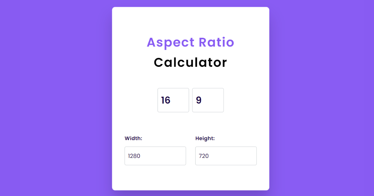
Hello everyone. Welcome to today’s tutorial on Codewithrandom. We’ll learn how to make Aspect Ratio Calculator which will give width and height as per the ratio that is basically used in walls while fitting some canvas or paintings. In Today’s session, We will use HTML, CSS, and JavaScript to complete this Aspect Ratio Calculator Project.
Project Description
Step 1
The HTML (Hypertext Markup Language) will help us to create the structure for the list with some necessary attributes and elements to make Aspect Ratio Calculator Project.
Step 2
Then we will use CSS (Cascading Stylesheet) which will help us to style or design the project with suitable padding and alignment in the Aspect Ratio Calculator Project.
Step 3
At last we will use JS (JavaScript) which will add a logic to make the Aspect Ratio Calculator Project responsive from the user end.
I hope you have got an idea about the project.
HTML Code for Aspect Ratio Calculator
First we’ll start with creating the structure of the Aspect Ratio Calculator project for that as you can see the above code we have used all the necessary elements & attributes to setup the structure. Let us know code the CSS part to add styling and aligned the tags.
<html lang="en">
    <head>
        <meta name="viewport" content="width=device-width, initial-scale=1.0" />
        <title>Aspect Ratio Calculator</title>
        <!-- Google Fonts-->
        <link
            href="https://fonts.googleapis.com/css2?family=Poppins:wght@400;600&display=swap"
            rel="stylesheet"
        />
        <!-- Stylesheet -->
        <link rel="stylesheet" href="style.css" />
    </head>
    <body>
        <div class="container">
            <h2>
                <span>Aspect Ratio</span>
                Calculator
            </h2>
            <div class="wrapper-1">
                <input type="number" id="ratio-width" value="16" />
                <input type="number" id="ratio-height" value="9" />
            </div>
            <div class="box">
                <div class="wrapper-2">
                    <label for="width">Width:</label>
                    <input type="number" id="width" value="1280" />
                </div>
                <div class="wrapper-3">
                    <label for="height">Height:</label>
                    <input type="number" id="height" value="720" />
                </div>
            </div>
        </div>
        <!-- Script -->
        <script src="script.js"></script>
    </body>
</html>
CSS Code for Aspect Ratio Calculator
Second comes the CSS code in which we have styled for the structure we have padded as well as aligned the Aspect Ratio Calculator project so that it is properly situated and doesn’t get messy with suitable CSS elements. Now lets code the JavaScript part to make responsive.
Portfolio Website using HTML and CSS (Source Code)
* {
    padding: 0;
    margin: 0;
    box-sizing: border-box;
    font-family: "Poppins", sans-serif;
}
body {
    background-color: #895cf3;
}
.container {
    width: 500px;
    background-color: #ffffff;
    padding: 80px 40px;
    position: absolute;
    transform: translate(-50%, -50%);
    top: 50%;
    left: 50%;
    border-radius: 10px;
    box-shadow: 0 30px 45px rgba(18, 8, 39, 0.2);
}
h2 {
    text-align: center;
    font-size: 40px;
    line-height: 1.6;
    font-weight: 600;
    letter-spacing: 2px;
}
h2 span {
    color: #895cf3;
}
.wrapper-1 {
    display: flex;
    justify-content: center;
    align-items: center;
    margin: 50px 0 70px 0;
    gap: 10px;
}
.wrapper-1 input {
    width: 100px;
    font-size: 30px;
    font-weight: 600;
}
input {
    padding: 15px 10px;
    border: 1px solid #bbc0c5;
    border-radius: 5px;
    color: #170444;
    outline: none;
}
input:focus {
    border: 2px solid #895cf3;
}
label {
    color: #170444;
    font-weight: 600;
    letter-spacing: 0.6px;
}
.box {
    display: flex;
    justify-content: space-between;
    gap: 30px;
}
.wrapper-2,
.wrapper-3 {
    display: flex;
    flex-direction: column;
    gap: 15px;
}
.wrapper-2 input,
.wrapper-3 input {
    width: 100%;
    font-size: 18px;
}
JavaScript Code for Aspect Ratio Calculator
Last stage of the project the JavaScript in which we have added the logical and coded as per the requirement with some conditions. We have defined the Width & Height in the script and then to make it responsive we have added that in the eventlistener. Let us see the Final Output of the project Aspect Ratio Calculator using HTML, CSS & JavaScript (Source Code).
100+ JavaScript Projects With Source Code ( Beginners to Advanced)
let ratioWidth = document.getElementById("ratio-width");
let ratioHeight = document.getElementById("ratio-height");
let width = document.getElementById("width");
let height = document.getElementById("height");

let calculateWidth = () => {
    let aspectRatio = ratioWidth.value / ratioHeight.value;
    width.value = parseFloat((height.value * aspectRatio).toFixed(2));
};

let calculateHeight = () => {
    let aspectRatio = ratioWidth.value / ratioHeight.value;
    height.value = parseFloat((width.value / aspectRatio).toFixed(2));
};

height.addEventListener("input", calculateWidth);
width.addEventListener("input", calculateHeight);
ratioHeight.addEventListener("input", calculateHeight);
ratioWidth.addEventListener("input", calculateHeight);
Final Output Aspect Ratio Calculator
We have Successfully created our Aspect Ratio Calculator using HTML, CSS & JavaScript (Source Code). You can use this project for your personal needs and the respective lines of code are given with the code pen link mentioned above.
5+ HTML CSS Projects With Source Code
If you find out this Blog helpful, then make sure to search code with random on google for Front End Projects with Source codes and make sure to Follow the Code with Random Instagram page.
Code Idea – codingartist
Written By – Harsh Sawant
Code By – @harshh9


