Animated Wavy Header Using HTML & CSS
Hello, Coders!! In this tutorial, we’ll use HTML and CSS to make an animated wavy header. To construct our wavy header, we will use simple HTML and CSS ideas.

When you visit any website, the first thing you will notice is the header, therefore a nice header for a website is as important as the body content, so in this post, we will create an animated wavy header using our CSS skills. We used SVGs in our project to add that wavy look, but before we began, we needed to understand what SVGs were and how we could use them in our project.
What is SVG?
A Scalable Vector Graphic (SVG) is a distinct image format. Unlike other types, SVGs do not rely on unique pixels to create the graphics you see. Instead, they employ “vector” data.
SVGs generate images that can be scaled to any resolution, which is beneficial for web design and a range of other applications.
I hope you have a general idea of what the project entails. In our article, we will go over this project step by step.
Step1: Adding HTML Markup
<!DOCTYPE html>
<html lang="en">

<head>
    <meta charset="UTF-8" />
    <meta http-equiv="X-UA-Compatible" content="IE=edge" />
    <meta name="viewport" content="width=device-width, initial-scale=1.0" />
    <link rel="stylesheet" href="style.css" />
    <title>Animated Wavy Header</title>
</head>

<body>
    <header>
        <h1 class="logo">
            Foodies
        </h1>
        <nav>
            <button>Home</button>
            <button>About</button>
            <button>Menu</button>
            <button>Contact</button>
        </nav>
        <button class="order-online">Order Online</button>
    </header>
    <div>
        <svg class="waves" xmlns="http://www.w3.org/2000/svg" xmlns:xlink="http://www.w3.org/1999/xlink"
            viewBox="0 24 150 28" preserveAspectRatio="none" shape-rendering="auto">
            <defs>
                <path id="gentle-wave" d="M-160 44c30 0 58-18 88-18s 58 18 88 18 58-18 88-18 58 18 88 18 v44h-352z" />
            </defs>
            <g class="parallax">
                <use xlink:href="#gentle-wave" x="48" y="0" fill="rgba(140,255,140,0.7" />
                <use xlink:href="#gentle-wave" x="48" y="3" fill="rgba(140,255,140,0.5)" />
                <use xlink:href="#gentle-wave" x="48" y="5" fill="lightgreen" />
                <use xlink:href="#gentle-wave" x="48" y="7" fill="green" />
            </g>
        </svg>
    </div>
</body>

</html>
We will create two separate HTML and CSS files in our code editor to ensure optimal code organisation. HTML and CSS will be used to construct our login form. Add the CSS link to our HTML now.
<link rel="stylesheet" href="style.css" />
Adding the Structure for our Header:
Every website is divided into three parts: the header, the main body, and the footer. In our project, we will create the header section and the structure of our wavy header with the help of HTML elements.
- Now using the header tag we will create a header section inside which using basic html elements we will add the structure of our header.
- We will insert our website’s logo into our header section using the h1 tag.
- Using the <nav> tag, we’ll now construct menu item links for that. We will add the navbar, and under our nav tag, we will build the Home, About, Menu, and Contact buttons using the button.
- We will add the svg link and class within our svg element using svg tags (<g>); we will include the calm moment in our header.
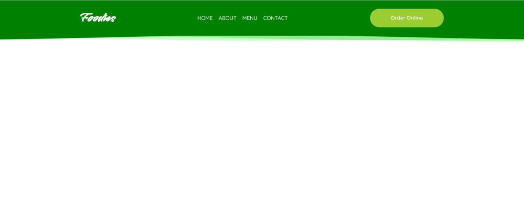
Let’s have a look at our header now that we’ve added structure of our header.
50+ HTML, CSS & JavaScript Projects With Source Code
Output:

Step2: Styling the Header(CSS)
Let’s concentrate on how we can style our header. I’ll highlight some key points to remember when styling.
@import url("https://fonts.googleapis.com/css2?family=Smooch&display=swap");
@import url("https://fonts.googleapis.com/css2?family=Quicksand&display=swap");
@import url("https://fonts.googleapis.com/css2?family=Montserrat:wght@500&display=swap");
@import url("https://fonts.googleapis.com/css2?family=Indie+Flower&display=swap");
body {
  margin: 0;
}
header {
  position: fixed;
  width: 100%;
  top: 0;
  display: flex;
  justify-content: space-evenly;
  place-items: center;
  background-color: green;
  z-index: 2;
}
.logo {
  font-family: smooch;
  color: white;
  font-size: 2.2em;
}
header nav button {
  background-color: transparent;
  border: 0;
  font-family: quicksand;
  color: white;
  text-transform: uppercase;
  font-size: 0.9em;
  cursor: pointer;
  transition-delay: 0s;
  transition-duration: 1s;
}
header nav button:hover {
  color: yellowgreen;
  transform: translate(0px, -4px);
  text-shadow: 0 6px 6px rgba(0, 0, 0, 1);
}
.order-online {
  width: 200px;
  height: 50px;
  border-radius: 25px;
  border: 0;
  background-color: yellowgreen;
  color: white;
  font-family: montserrat;
  cursor: pointer;
  transition: 0.6s;
}
.order-online:hover {
  transform: translate(0px, -4px);
  box-shadow: 0 6px 6px rgba(0, 0, 0, 0.2);
}

/* WAVES BENEATH HEADER */

.waves {
  transform: rotate(180deg) scale(1, 0.2);
  position: relative;
  width: 100%;
  height: 15vh;
  margin-bottom: -7px; /*Fix for safari gap*/
  min-height: 100px;
  max-height: 150px;
  margin-top: 53px;
}
.parallax > use {
  animation: move-forever 25s cubic-bezier(0.55, 0.5, 0.45, 0.5) infinite;
}
.parallax > use:nth-child(1) {
  animation-delay: -2s;
  animation-duration: 4s;
}
.parallax > use:nth-child(2) {
  animation-delay: -3s;
  animation-duration: 7s;
}
.parallax > use:nth-child(3) {
  animation-delay: -4s;
  animation-duration: 10s;
}
.parallax > use:nth-child(4) {
  animation-delay: -5s;
  animation-duration: 17s;
}
@keyframes move-forever {
  0% {
    transform: translate3d(-90px, 0, 0);
  }
  100% {
    transform: translate3d(85px, 0, 0);
  }
}
Default Styling:
We’ll use the @import url method to import numerous new fonts for our header via Google’s import link.
The padding, margin, and box size will then be adjusted to “border box” using the body selector.
Styling Header:
Now, we’ll use the header tag selector to set the position to “fixed,” and we’ll use the width attribute to set the width to 100%. The display is set to “flex,” and we will justify the information with the justify-content attribute so that it has equal weight. We’ll use the background-color property to make our header’s background colour “green.”
header {
  position: fixed;
  width: 100%;
  top: 0;
  display: flex;
  justify-content: space-evenly;
  place-items: center;
  background-color: green;
  z-index: 2;
}

Step1:We styled our header’s logo using the class selector (.logo). Using the font-family property, we will set the font family to “smooch” and change the font colour from black to white. Our logo’s font size is set to 2.2 rem by default.
.logo {
  font-family: smooch;
  color: white;
  font-size: 2.2em;
}
Step2: We’ll add styling to our button now, and we’ll do it with the button tag selector. First, we’ll make the button’s background “transparent,” and then we’ll use the font-family property to make the font family “quicksand.” We will modify the button text from all lowercase to all uppercase and set the pointer to “cursor” using the pointer.
Ecommerce Website Using HTML, CSS, & JavaScript (Source Code)
ADVERTISEMENT
We’ll also add a hover effect to buttons, so that when a user hovers over one, the background colour changes to “yellow-green” with some text shadow.
ADVERTISEMENT
header nav button {
  background-color: transparent;
  border: 0;
  font-family: quicksand;
  color: white;
  text-transform: uppercase;
  font-size: 0.9em;
  cursor: pointer;
  transition-delay: 0s;
  transition-duration: 1s;
}
header nav button:hover {
  color: yellowgreen;
  transform: translate(0px, -4px);
  text-shadow: 0 6px 6px rgba(0, 0, 0, 1);
}
ADVERTISEMENT
Step3:Using the class selector “.order-online,” we will now style our “order online” button. We will adjust the width and height to 200px and 50px, respectively, and add some 25px edges to our order online button using the border-radius attribute. We’ll change the background colour to “yellow-green,” and the font colour to white.
ADVERTISEMENT
.order-online {
  width: 200px;
  height: 50px;
  border-radius: 25px;
  border: 0;
  background-color: yellowgreen;
  color: white;
  font-family: montserrat;
  cursor: pointer;
  transition: 0.6s;
}
.order-online:hover {
  transform: translate(0px, -4px);
  box-shadow: 0 6px 6px rgba(0, 0, 0, 0.2);
}

ADVERTISEMENT
Step4: We only need to add the wavy effect to our header now, and to do so, we will rotate our waves to 180 degrees using the class selector (.waves) and the transform property, with the position set to relative, the width set to 100%, and the height set to 15 px.
Now, we’ll add the animation to each of the child parallax elements with the child property, and we’ll add the frames with the keyframe. As a result, you’ll notice a wavy effect in our header.
10+ Javascript Projects For Beginners With Source Code
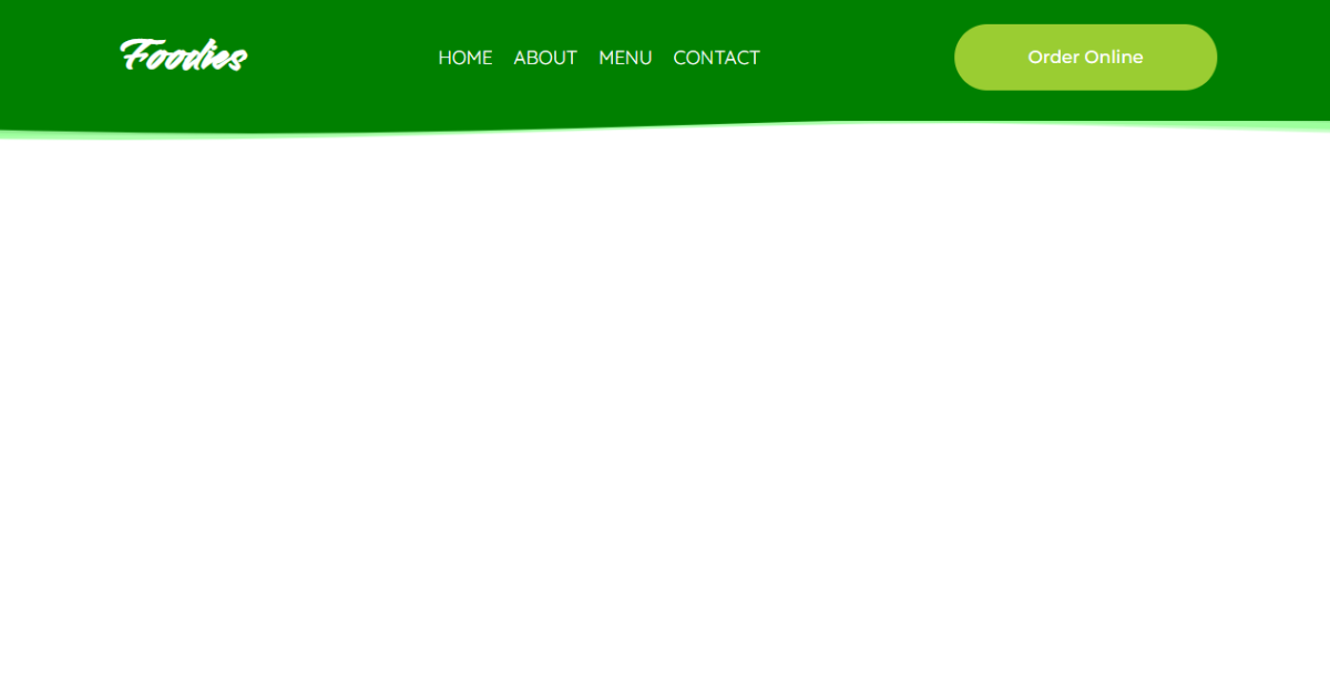
Now we’ve completed our wavy header using HTML , CSS . I hope you understood the whole project. Let’s take a look at our Live Preview.
Output:
Live Preview Of our wavy header using HTML , CSS
Now We have Successfully created our wavy header using HTML , CSS. You can use this project directly by copying into your IDE. WE hope you understood the project , If you any doubt feel free to comment!!
If you find out this Blog helpful, then make sure to search code with random on google for Front End Projects with Source codes and make sure to Follow the Code with Random Instagram page.


