What is Flexbox in CSS? Learn flexbox With Example
Hello Coder, today I’ll explain all you need to know to start using a CSS Flexbox. We learn how to use flexbox and where to use it. We give examples with code so you learn easily what is flexbox.
Basics
Alright, let’s dive into the tutorial now. Flex is a display type that enables cards or any div to appear beside each other in a row. There are certain properties of flexbox that make it famous such as its responsiveness and more. Let’s see how to use the basic flex display followed by other properties.
We first add the HTML code below:
<div class="flex-box">
<div>1</div>
<div>2</div>
<div>3</div>
</div>
Then, we add the CSS code below:
.flex-box {
display: flex;
}
.flex-box > div {
background:white;
box-shadow: rgba(0, 0, 0, 0.24) 0px 3px 8px;
margin: 10px;
border-radius:10px;
padding: 20px;
font-size: 30px;
}
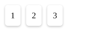
The output would look like this:
If you observe the CSS code, you will understand that we only added a display of flex for our flexbox. Below it, we styled the boxes by giving them padding, color, and more. The main code necessary here is the display: flex; Next, we will look at the properties of flex to make it better.
5+ HTML CSS Projects With Source Code
1. Flex Direction
The flex-direction property determines whether you would like the flex to arrange from left to right, right to left, top to bottom, or bottom to top. Below is the code for all these 4 directions. The row is horizontal and Column is vertical.
flex-direction:row;
flex-direction:row-reverse;
flex-direction:column;
flex-direction:column-reverse;
For example, I will be using the flex-direction: column in the photo below. The output would look like this:
2. Flex Grow
In this property, we can grow our flex boxes in a row to fill up the row completely if necessary. In other words, it defines how much space each flexbox should take up. For example, we can make one out of 3 flex-boxes to grow even more longer. A perfect example would be the image below.
Now that you understand the concept, you will need to add this block of code below to enable it in our CSS file.
div:nth-of-type(1) {flex-grow: 1;}
div:nth-of-type(2) {flex-grow: 3;}
div:nth-of-type(3) {flex-grow: 1;}3. Flex Wrap
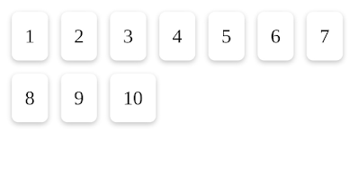
By default, flexbox will try its best to fit into one tray/row/column. However, we can set extra flexboxes to move down/side into another tray by using the flex-wrap property. The image below explains it even more.
flex-wrap: wrap;
4. Flex-flow
In this property, the flex-direction and flex-box properties are combined together. The default value of this property is row no-wrap. The image below is used for an example of flex-flow: column wrap.
ADVERTISEMENT
ADVERTISEMENT
The code would look like this:
ADVERTISEMENT
.flex-box {
display: flex;
flex-flow: column wrap;
}
5. Flex
ADVERTISEMENT
Now that you have learned the 4 common properties, you will understand this property pretty well too. This property is a shorthand property (an easier line of code) to execute flexbox properties. For example, we can add the code of flex: 1
Browser Support
Now that you have learned flexbox, you might feel like using it in all of your projects. However, flexbox is only supported in some browsers. Flexbox works in modern browsers but does not work in Internet Explorer 10 or earlier versions. Thus, you might want to keep that in mind. But besides that, I believe you should definitely try using flexbox.
This tutorial is just on the basics of flexbox. There are many more properties on flexbox. If you’re interested in part 2 of this tutorial, do comment down below.
Thank You!
If you have any doubts, uncertainties, or suggestions, do comment down below or you can email me at [email protected]. I hope this flexbox tutorial was useful for all of you and I would like to thank Code with Random for giving me the chance to write here. I hope to see you all in future posts. Goodbye!

