3D Card Hover Effect Using HTML, CSS, and JavaScript

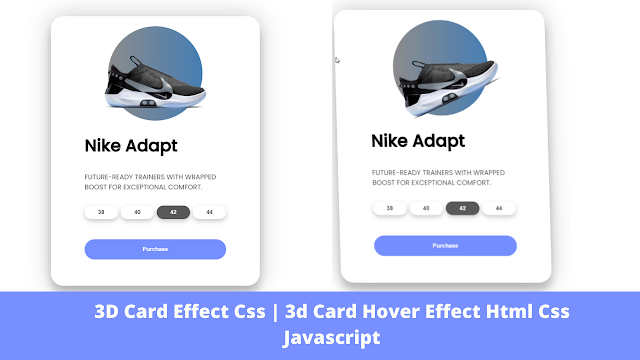
Welcome to the Codewithrandom blog. In this blog, we learn how to create 3D Card Hover Effect Using HTML, CSS, and JavaScript. We use HTML, CSS, and JavaScript for this project.
I hope you enjoy our blog so let’s start with a basic HTML Structure for the 3D Card Hover Effect.
HTML Code of 3D Card Hover Effect
Copy all the HTML Code of 3D card hover project, and paste It in you HTML file called index.html
| Project Name | 3D Card Hover |
| Code By | Code With Random/Anki |
| Project Download | CodePen Link Given Below |
| Language Used | HTML, CSS, and JavaScript |
| External Link / Dependencies | no |
| Responsive | No |
HTML Code Of 3D Card Hover Effect
Copy All The HTML Code Of 3D Card Hover Project, And Paste It In You HTML File Called Index.Html
<!DOCTYPE html>
<html lang="en">
<head>
<meta charset="UTF-8"/>
<meta http-equiv="X-UA-Compatible" content="IE=edge"/>
<meta name="viewport" content="width=device-width, initial-scale=1.0" />
<title>3D Card Effect</title>
<link rel="title-icon" href="https://encrypted-tbn0.gstatic.com/images?q=tbn:ANd9GcQ5KHEqHBg0ZW5QpboPhxu6y3Pu5L12k_G2Xg&usqp=CAU" />
<link rel="stylesheet" href="https://fonts.googleapis.com/css2?family=Poppins:wght@400;500&display=swap"/>
<link rel="stylesheet" href="./style.css">
</head>
<body>
<div class="container">
<div class="card">
<div class="sneaker">
<div class="circle"></div>
<img src="./images/nike-shoe.png" alt="Nike">
</div>
<div class="info">
<h1 class="title">Nike Adapt</h1>
<h3>FUTURE-READY TRAINERS WITH WRAPPED BOOST FOR EXCEPTIONAL COMFORT.</h3>
<div class="sizes">
<button>38</button>
<button>40</button>
<button class="active">42</button>
<button>44</button>
</div>
<div class="purchase">
<button>Purchase</button>
</div>
</div>
</div>
</div>
<script src="App.js"></script>
</body>
</html>
There is all the Html Code for the 3D Card Hover Effect. Now, you can see an output with Css and JavaScript. then we write Css and JavaScript for this project.
50+ HTML, CSS &; JavaScript Projects With Source Code
Only Html Code Output

CSS Code For 3D Card Hover Effect
Copy all the CSS Code of 3D card hover project, and paste It in you CSS file called style.css
* {
margin: 0;
padding: 0;
box-sizing: border-box;
}
body {
font-family: "Poppins", sans-serif;
min-height: 100vh;
display: flex;
align-items: center;
justify-content: center;
perspective: 1000px;
}
.container {
width: 50%;
display: flex;
justify-content: center;
align-items: center;
padding-top: 10px;
padding-bottom: 10px;
}
.card {
transform-style: preserve-3d;
height: 40rem;
width: 31rem;
border-radius: 30px;
padding: 0rem 5rem;
box-shadow: 0 20px 20px rgba(0, 0, 0, 0.2), 0px 0px 50px rgba(0, 0, 0, 0.2);
}
.sneaker {
min-height: 35vh;
display: flex;
align-items: center;
justify-content: center;
}
.sneaker img {
width: 16rem;
z-index: 2;
transition: all 1s ease-out;
}
.circle {
margin-top: 20px;
width: 14rem;
height: 14rem;
background: linear-gradient(
to right,
rgba(102, 101, 101, 0.75),
rgba(8, 83, 156, 0.75)
);
position: absolute;
border-radius: 50%;
z-index: 1;
}
.info h1 {
font-size: 2.5rem;
padding: 1.5rem 0rem;
transition: all 0.75s ease-out;
}
.info h3 {
font-size: 1rem;
padding-top: 0.5rem;
margin-bottom: 2rem;
color: #585858;
font-weight: lighter;
transition: all 0.75s ease-out;
}
.sizes {
display: flex;
justify-content: space-between;
transition: all 0.75s ease-out;
}
.sizes button {
padding: 0.5rem 2rem;
background: none;
border: none;
box-shadow: 0px 5px 10px rgba(0, 0, 0, 0.2);
border-radius: 30px;
cursor: pointer;
font-weight: bold;
color: #585858;
}
button.active {
background: #585858;
color: white;
}
.purchase {
margin-top: 3rem;
transition: all 0.75s ease-out;
}
.purchase button {
width: 100%;
padding: 1rem 0rem;
background: #768fff;
border: none;
color: white;
cursor: pointer;
border-radius: 30px;
font-weight: bolder;
}
HTML + CSS Updated Output Of 3D Card Hover Effect

JavaScript Code For 3D Card Hover Effect
//Movement Animation to happean
const card = document.querySelector(".card");
const container = document.querySelector(".container");
//Items
const title = document.querySelector(".title");
const sneaker = document.querySelector(".sneaker img");
const purchase = document.querySelector(".purchase");
const description = document.querySelector(".info h3");
const sizes = document.querySelector(".sizes");
//Moving Animation Event
container.addEventListener("mousemove", (e) => {
let xAxis = (window.innerWidth / 2 - e.pageX) / 25;
let yAxis = (window.innerHeight / 2 - e.pageY) / 25;
card.style.transform = `rotateY(${xAxis}deg) rotateX(${yAxis}deg)`;
});
//Animate In
container.addEventListener("mouseenter", (e) => {
card.style.transition = "none";
//Popout
title.style.transform = "translateZ(150px)";
sneaker.style.transform = "translateZ(200px) rotateZ(-25deg)";
description.style.transform = "translateZ(125px)";
sizes.style.transform = "translateZ(100px)";
purchase.style.transform = "translateZ(75px)";
});
//Animate Out
container.addEventListener("mouseleave", (e) => {
card.style.transition = "all 0.5s ease";
card.style.transform = `rotateY(0deg) rotateX(0deg)`;
//Popback
title.style.transform = "translateZ(0px)";
sneaker.style.transform = "translateZ(0px) rotateZ(0deg)";
description.style.transform = "translateZ(0px)";
sizes.style.transform = "translateZ(0px)";
purchase.style.transform = "translateZ(0px)";
});
Portfolio Website using HTML and CSS (Source Code)
Final Output

100+ JavaScript Projects With Source Code ( Beginners to Advanced)
Now that we have completed our 3D Card Hover Effect. Here is our updated output with Html, Css, and JavaScript. Hope you like the 3D Card Hover Effect Project. you can see the output video and project screenshots. See our other blogs and gain knowledge in front-end development.
Thank you!
In this post, we learn how to create 3D Card Hover Effect Using HTML, CSS, and JavaScript. If we made a mistake or any confusion, please drop a comment to reply or help you in easy learning.
Written by – Code With Random/Anki
How to create 3D Card Hover Effect using HTML, CSS, and JavaScript
We Learn How To Create The 3D Card Hover Effect. We Use HTML, CSS, And JavaScript For This Project.


