Create Wave Backgrounds Using HTML & CSS
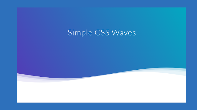
This tutorial will show you how to create an animation’s wave background using HTML and CSS. Since this project is brand-new, we tried using very little code to add a wave background to it.
Hello, Coder We have finished many projects using HTML and CSS to increase our proficiency. Every task we accomplished had one and only one goal: to assist newcomers who desired to develop their abilities through hands-on training.
100+ JavaScript Projects With Source Code ( Beginners to Advanced)
Many developers use wave background in the header pages many developers use wave background in the footer. So let’s create wave background html css coding.
| Code by | Goodkatz |
| Project Download | Link Available Below |
| Language used | HTML and CSS |
| External link / Dependencies | No |
| Responsive | YES |
Video Tutorial Of Wave Background Css
Hope you enjoy our blog so let’s start with a basic HTML structure for the Simple Waves background Css.
Html Code Wave Background
<!--Hey! This is the original version
of Simple CSS Waves-->
<div class="header">
<!--Content before waves-->
<div class="inner-header flex">
<!--Just the logo.. Don't mind this-->
<h1>Simple CSS Waves</h1>
</div>
<!--Waves Container-->
<div>
<svg class="waves" xmlns="http://www.w3.org/2000/svg" xmlns:xlink="http://www.w3.org/1999/xlink"
viewBox="0 24 150 28" preserveAspectRatio="none" shape-rendering="auto">
<defs>
<path id="gentle-wave" d="M-160 44c30 0 58-18 88-18s 58 18 88 18 58-18 88-18 58 18 88 18 v44h-352z" />
</defs>
<g class="parallax">
<use xlink:href="#gentle-wave" x="48" y="0" fill="rgba(255,255,255,0.7" />
<use xlink:href="#gentle-wave" x="48" y="3" fill="rgba(255,255,255,0.5)" />
<use xlink:href="#gentle-wave" x="48" y="5" fill="rgba(255,255,255,0.3)" />
<use xlink:href="#gentle-wave" x="48" y="7" fill="#fff" />
</g>
</svg>
</div>
<!--Waves end-->
</div>
<!--Header ends-->
<!--Content starts-->
<!--Content ends-->
- The div tag has been added first. which identifies a block-level tag (block level means it will take up one whole line). It will serve as a container for our wave effect.
- We’ll similarly construct two more div tags with the same class (Wave) We will apply these wavy effects to our homepage using this class.
Create Music Player Using HTML, CSS and JavaScript Code
All that’s required is for us to provide structure to our webpage. There is nothing on our webpage even if we look at our output right now. There won’t be anything except a white page so we will be adding temporary text to our webpage. The wave effect will be added using CSS.
Now lets a look at our structure.
There is all html code for the wave background css. Now, you can see output without css, then we write css for the wave background css.
Output wave background css
CSS code For Wave Background
@import url(//fonts.googleapis.com/css?family=Lato:300:400);
body {
margin:0;
}
h1 {
font-family: 'Lato', sans-serif;
font-weight:300;
letter-spacing: 2px;
font-size:48px;
}
p {
font-family: 'Lato', sans-serif;
letter-spacing: 1px;
font-size:14px;
color: #333333;
}
.header {
position:relative;
text-align:center;
background: linear-gradient(60deg, rgba(84,58,183,1) 0%, rgba(0,172,193,1) 100%);
color:white;
}
.logo {
width:50px;
fill:white;
padding-right:15px;
display:inline-block;
vertical-align: middle;
}
.inner-header {
height:65vh;
width:100%;
margin: 0;
padding: 0;
}
.flex { /*Flexbox for containers*/
display: flex;
justify-content: center;
align-items: center;
text-align: center;
}
.waves {
position:relative;
width: 100%;
height:15vh;
margin-bottom:-7px; /*Fix for safari gap*/
min-height:100px;
max-height:150px;
}
.content {
position:relative;
height:20vh;
text-align:center;
background-color: white;
}
/* Animation */
.parallax > use {
animation: move-forever 25s cubic-bezier(.55,.5,.45,.5) infinite;
}
.parallax > use:nth-child(1) {
animation-delay: -2s;
animation-duration: 7s;
}
.parallax > use:nth-child(2) {
animation-delay: -3s;
animation-duration: 10s;
}
.parallax > use:nth-child(3) {
animation-delay: -4s;
animation-duration: 13s;
}
.parallax > use:nth-child(4) {
animation-delay: -5s;
animation-duration: 20s;
}
@keyframes move-forever {
0% {
transform: translate3d(-90px,0,0);
}
100% {
transform: translate3d(85px,0,0);
}
}
/*Shrinking for mobile*/
@media (max-width: 768px) {
.waves {
height:40px;
min-height:40px;
}
.content {
height:30vh;
}
h1 {
font-size:24px;
}
}
Using the html and body tag selector we will be adding height to “100%” to our webpage .
Now using the body tag we will be adding a gradient background color to our webpage. To add gradient background we will be using the Background property in which we will define the type of gradient here we will be adding the “radial gradient” and adding a ellipse effect at the center of our webpge we have added 3,4 color to add the gradient effect to our webpage.Using the overflow property we also added the hidden property to hide the data overflow.
Interest Calculator using HTML, CSS and JavaScript
We’ll now give our wave container some style by utilising the class selector (.ocean). We choose to have a 100% width and a 5% height. Our position is likewise set to absolute. Adding bottom and setting it to zero has filled in all of the empty space from the bottom while leaving some space. To our wave container’s background, we also put “a shade of blue and green.”
The animation code is specified by the @keyframes rule.By gradually switching from one set of CSS styles to another, the animation is produced. A variety of CSS styles can be changed throughout the animation.
Indicate the percentage change in style, or use the phrases “from” and “to,” which are equivalent to 0% and 100%. 0% indicates the start of the animation and 100% indicates its conclusion.
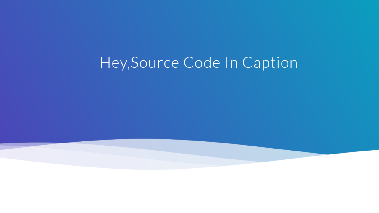
Now we have completed our CSS section for wave background. Here is our final updated output wave background CSS.
[su_button id=”download” url=”https://drive.google.com/drive/folders/1n18RfQyvCi–io7R9Qe7AnHwdWugfsJX?usp=sharing” target=”blank” style=”3d” size=”11″ wide=”yes” center=”yes” icon=”icon: download”]DOWNLOAD CODE NOW[/su_button]
Final Output wave background Css

Now we have completed our CSS section Wave Background, Here is our updated output with Wave Background CSS. Hope you like the Wave Background CSS, you can see output project screenshots. See our other blogs and gain knowledge in front-end development.
Thank you.
ADVERTISEMENT
Ecommerce Website Using Html Css And Javascript Source Code
ADVERTISEMENT
In this post, we learn how to create a Wave Background CSS using simple HTML & CSS. If we made a mistake or any confusion, please drop a comment to reply or help you in easy learning.
ADVERTISEMENT
Written by – Code With Random/Anki
ADVERTISEMENT
code by – Goodkatz
ADVERTISEMENT
FAQ For Wave Background Css
Which code editor do you use for this Wave Backgrounds project coding?
I personally recommend using VS Code Studio, it’s straightforward and easy to use.
is this project responsive or not?
Yes! this project is a responsive project.
Do you use any external links to create this project?
No!
