Text Over Image On Hover Using HTML and CSS
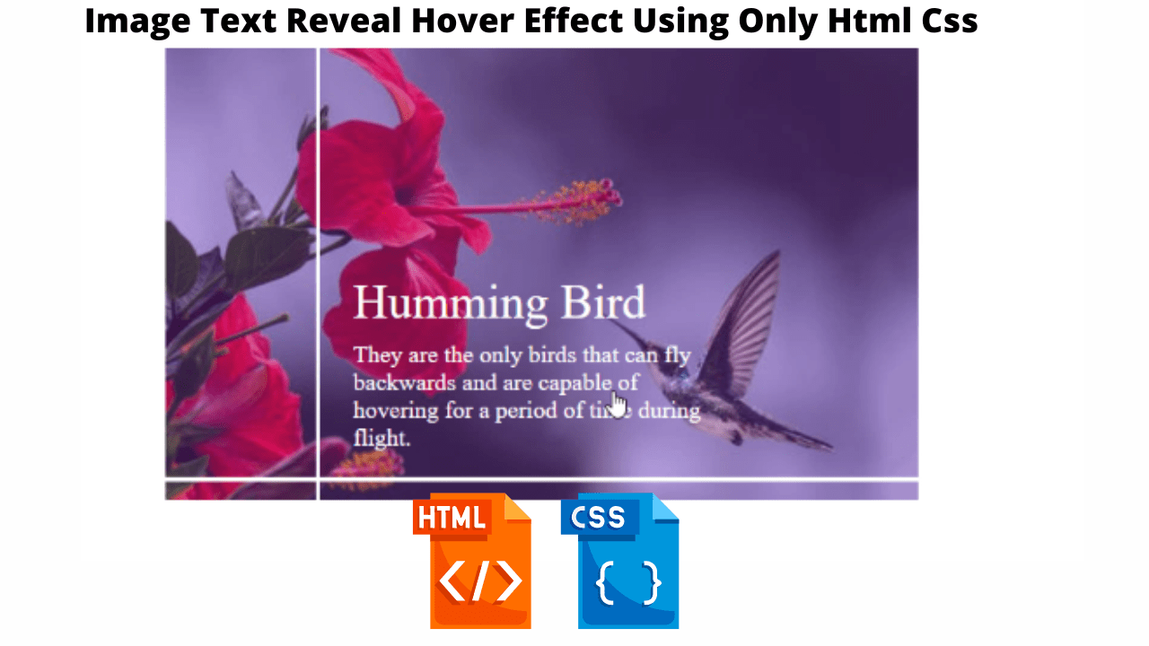
Hello Coder! Welcome to the codewithrandom blog. In This Project We Create An Text Over the Image On Hover, It’s Similar To A Box Hovercard Effect And Then Text Reveals on Hover. So we make this Text Over the Image On Hover using HTML and CSS.

It is a project that is suitable for beginners; this kind of effect is called an “overlay effect,” and the text is concealed inside the picture until the user hovers over it.
50+ HTML, CSS and JavaScript Projects With Source Code
| Code by | Ritika Agrawal |
| Project Download | Link Available Below |
| Language used | HTML and CSS |
| External link / Dependencies | No |
| Responsive | Yes |
So let’s write html Code For Image Text Reveal On Hover Effect.
Html Code For Image Text Reveal On Hover
<!DOCTYPE html>
<html lang="en">

<head>
  <meta charset="UTF-8">
  <meta http-equiv="X-UA-Compatible" content="IE=edge">
  <meta name="viewport" content="width=device-width, initial-scale=1.0">
  <title>Reveal | What You Want</title>
  <link rel="stylesheet" href="style.css">
</head>
<body>
  <div class="image_container">
    <img src="https://res.cloudinary.com/djix6uusx/image/upload/v1659354179/humming_bird_bzcaf5.jpg" />
    <span class="title">Humming Bird</span>
    <span class="description"
      >They are the only birds that can fly backwards and are capable of
      hovering for a period of time during flight.</span
    >
    <span class="line top"></span>
    <span class="line left"></span>
  </div>
</body>

</html>
first of all, using the div tag with class image container we will create a container for the image and inside it using the <img> we will add an image inside using the URL, and using the span tag we will add a small description inside our image container also we will create two span tag to add two lines in our image.
Restaurant Website Using HTML And CSS With Source Code
This is our all-required Html code for image text reveal on the hover effect. We use images and some text but we use a span tag instead of paragraph text for images.
In this code, we use css selector :hover and it’s very important for this project. We make this mobile-friendly and also, we use media queries for responsiveness. We use animation, also so we remove the cursor from the image box and text hidden in an animation. That’s it for this project, you can see the preview below and make this project your way.
ADVERTISEMENT
ADVERTISEMENT
ADVERTISEMENT
ADVERTISEMENT
ADVERTISEMENT
Now, this is only the Html update output then we write css code for image styling and hover reveal functionality.
Create Resume/CV Website Using HTML and CSS (Source Code)
Html Code Updated Output

Css Code Image Text Reveal On Hover
*,
:before,
:after {
  margin: 0;
  padding: 0;
  box-sizing: border-box;
}

body {
  height: 100vh;
  display: flex;
  justify-content: center;
  align-items: center;
}

.image_container {
  position: relative;
  width: 95%;
  max-width: 500px;
  height: min(70vw, 300px);
  cursor: pointer;
}

img {
  width: 100%;
  height: 100%;
  object-fit: cover;
}

.image_container:before {
  content: "";
  position: absolute;
  top: 0;
  left: 0;
  width: 100%;
  height: 100%;
  background-color: hsl(271, 76%, 53%);
  transform: scale(0);
  transition: all 800ms linear;
  transform-origin: 0 50%;
  z-index: 2;
  opacity: 0.3;
}

.image_container:hover:before {
  transform: scale(1);
}

span {
  position: absolute;
  color: #fff;
  opacity: 0;
  transition: all 800ms linear;
  z-index: 3;
}

.title {
  font-size: 2rem;
  left: 25%;
  top: 50%;
}

.description {
  font-size: 1rem;
  left: 25%;
  top: 65%;
  width: 50%;
}

.image_container:hover span {
  opacity: 1;
}

.line {
  left: 0;
  top: 0;
  position: absolute;
  background: #fff;
  transition: all 800ms linear;
}

.top {
  width: 3px;
  height: 0;
  left: 20%;
}

.image_container:hover .top {
  height: 100%;
}

.left {
  width: 0;
  height: 3px;
  top: 95%;
}

.image_container:hover .left {
  width: 100%;
}

@media (max-width: 424px) {
  .title {
    font-size: 1.5rem;
    left: 25%;
    top: 50%;
  }

  .description {
    font-size: 0.8rem;
    left: 25%;
    top: 65%;
    width: 50%;
  }
}
Ecommerce Website Using HTML, CSS, and JavaScript (Source Code)
Step1:We will set the padding and margin to “zero” using the universal selector, and we will set the box sizing attribute to “border-box” for the box sizing.
The body will now have formatting added using the body tag selector. We will use the height property to set the height to 100 vh, the display property to set the display to “flex,” and the rationalize content property to center the content justification.
*,
   :before,
   :after {
     margin: 0;
     padding: 0;
     box-sizing: border-box;
   }

   body {
     height: 100vh;
     display: flex;
     justify-content: center;
     align-items: center;
   }
Step2: Now we will add the styling to our image using the image tag selector we will add the styling to our image the width and the height is set as “100%” and also using the object-fit property we will set the image property to cover.
Now using the puesdo class element we will set the position as “absolute” and using the width and height property we will set the before puesdo class width and height as “100%”.
img {
  width: 100%;
  height: 100%;
  object-fit: cover;
}

.image_container:before {
  content: "";
  position: absolute;
  top: 0;
  left: 0;
  width: 100%;
  height: 100%;
  background-color: hsl(271, 76%, 53%);
  transform: scale(0);
  transition: all 800ms linear;
  transform-origin: 0 50%;
  z-index: 2;
  opacity: 0.3;
}

.image_container:hover:before {
  transform: scale(1);
}

span {
  position: absolute;
  color: #fff;
  opacity: 0;
  transition: all 800ms linear;
  z-index: 3;
}

.title {
  font-size: 2rem;
  left: 25%;
  top: 50%;
}

.description {
  font-size: 1rem;
  left: 25%;
  top: 65%;
  width: 50%;
}

.image_container:hover span {
  opacity: 1;
}

.line {
  left: 0;
  top: 0;
  position: absolute;
  background: #fff;
  transition: all 800ms linear;
}

.top {
  width: 3px;
  height: 0;
  left: 20%;
}
Step3: Using the hover property we will add a hover effect to our image and to the text we will sadd the hover effect on the image as the user will hover over the image the
The CSS selector hover is used in this code, which is crucial for the undertaking. Additionally, we make this adaptable and mobile-friendly by using media queries. By using animation, we can conceal words and remove the cursor from the image box.
Additionally, we will make use of the media query property and change the maximum width to 424px in order to make our image more responsive. The image size will reduce as the screen size falls below the specified screen width.
100+ HTML,CSS and JavaScript Projects With Source Code ( Beginners to Advanced)
CSS output:

That’s it for this project, you can see the preview below and make this project your way.
Final Output Of Text Over Image On Hover


Video Output Of Text Over Image On Hover:
Hope you like this project, we create your own and use this project in any project as a part project like the reviews section, and contact form. If you need any more project-related frontend. Visit our homepage and you get 100+ projects💝.
Create Quiz App Using HTML, CSS & JavaScript
if you have any confusion Comment below or you can contact us by filling out our contact us form from the home section. 🤞🎉
Code By – Ritika Agrawal
written by – Codewithrandom
Which code editor do you use for Image Text Reveal On Hover Effect coding?
I personally recommend using VS Code Studio, it’s straightforward and easy to use.
What is an Overlay Effect?
An effect that is applied over a picture is called an overlay effect. The hidden text inside the picture will be revealed along with animation as the user hovers over it.
How to acheive an overlay effect?
We will apply the hover property over a picture to create an overlay effect. By using the hover property, we can either change the text’s opacity to 1 or its display to block.


