Create Collapse Sidebar Menu Using Html and JavaScript
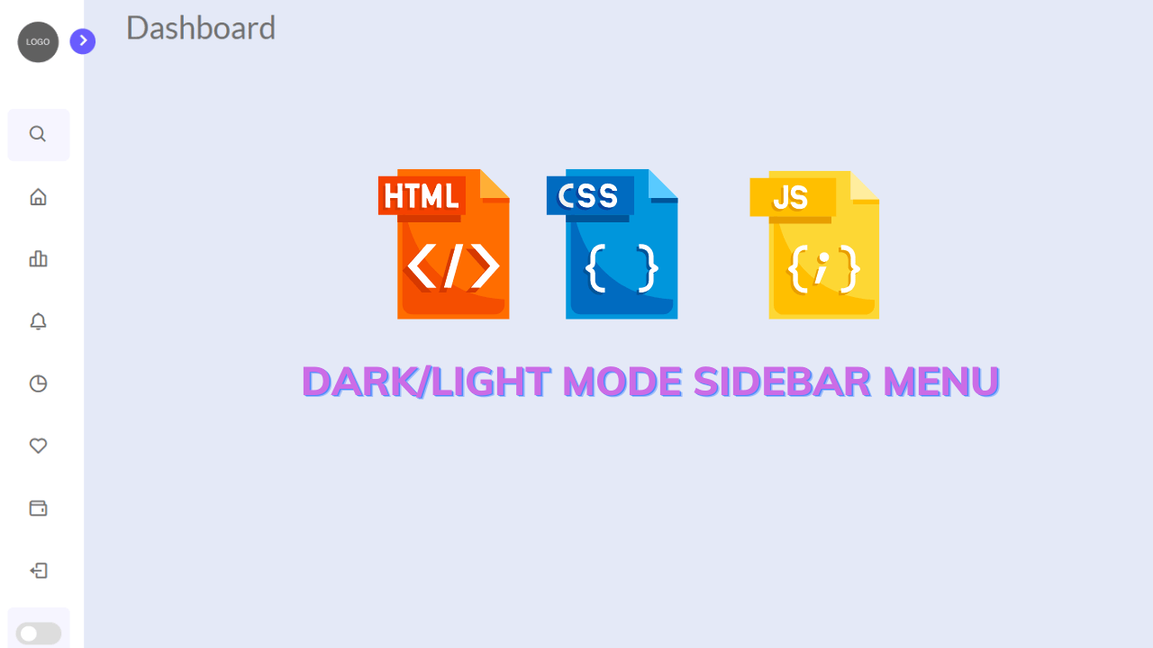
Hello learners, a very warm welcome to Codewithrandom. In Today’s blog in this article, we are going to Create a Collapse / Expand Sidebar Menu Using JavaScript. A very interesting and impressive new feature for our project is a Dark/light Mode Sidebar Menu Design.
Now learner do you have any idea that the Dark/light Mode Sidebar Menu Using Html, Css, And, and Javascript is nothing but another way of creating our webpage navbar it is generally in the horizontal form. It could be on any side of the right or left side of web pages.
For something similar, we are going to design the Dark/light Mode Sidebar Menu by ourselves.
50+ HTML, CSS & JavaScript Projects With Source Code
As we can see in the project preview how the thing is organized in a single container.
Following is the feature of our project:-
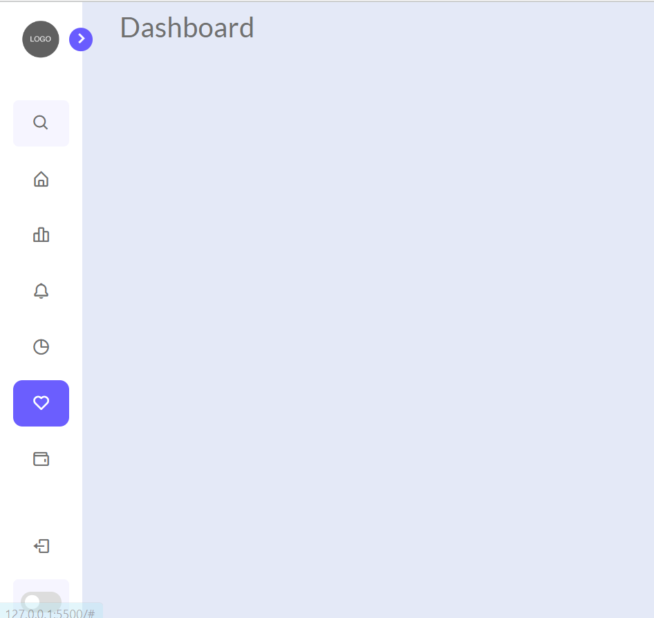
As you can see there is a sidebar on the left side of web pages and there is also a similar navbar like we used to see in the vertical navbar.
Although it has some more functionality or a better user interface.
We have a Google mode for light and dark mode switch with a stretchable feature.
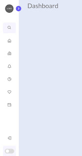
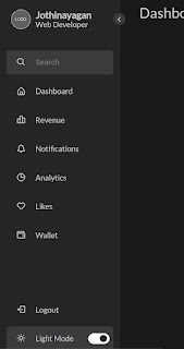
By default, our sidebar will look like above but after stretching and switching to the dark mode functionality we have some like this.
Sidebar Html Code:-
Website design is done using HTML. The fundamental concepts of HTML, such as div, span, header tags, anchor tags, and semantic tags, should have been covered by now.
As you can see from the project preview, symbols are used on the website; consequently, in this case, we are using boxicons’ icons.
Responsive Gym Website Using HTML ,CSS & JavaScript
Several websites, including fontawesome, ionicons, bootstrap icons, etc., offer free bundles of icon sets as alternatives to boxicons.
We have the following part in the html section.
First, we have a menu with the sidebar hidden.
All of the navigation links and toggle links are located within the menu, and a logo is located at the top.
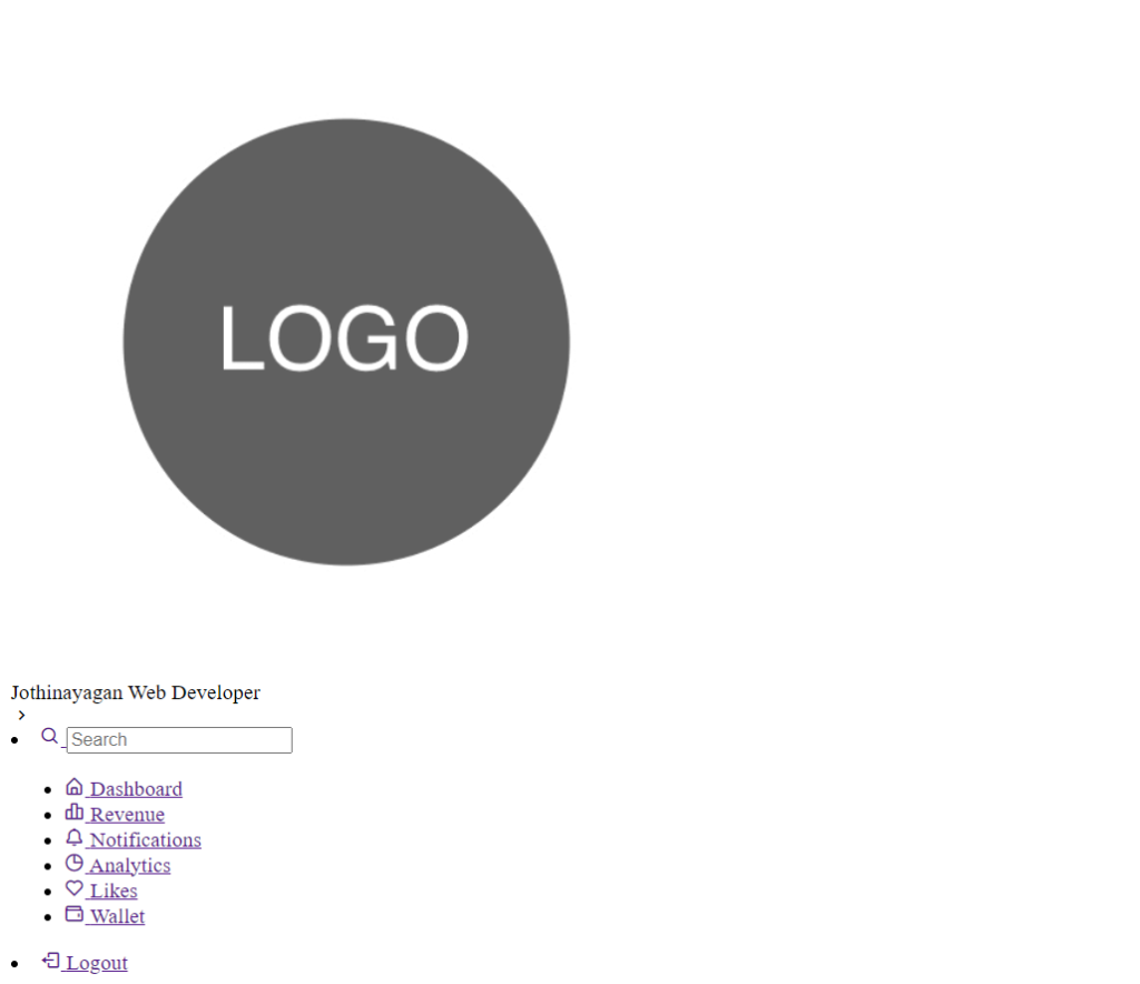
Go through the code below and execute it in your IDE or wherever you previously designed only html without css styling.
<html>
    <html lang="en">
        <head>
            <meta charset="utf-8" />
            <meta
                name="viewport"
                content="width=device-width, initial-scale=1, shrink-to-fit=no"
            />
            <!-- Boxicons CSS -->
            <link
                href="https://unpkg.com/[email protected]/css/boxicons.min.css"
                rel="stylesheet"
            />
            <title>Dashboard</title>
        </head>
        <body>
            <nav class="sidebar close">
                <header>
                    <div class="image-text">
                        <span class="image">
                            <img
                                src="https://www.adaptivewfs.com/wp-content/uploads/2020/07/logo-placeholder-image.png"
                                alt="logo"
                            />
                        </span>
                        <div class="text header-text">
                            <span class="name">Jothinayagan</span>
                            <span class="profession">Web Developer</span>
                        </div>
                    </div>
                    <i class="bx bx-chevron-right toggle"></i>
                </header>
                <div class="menu-bar">
                    <div class="menu">
                        <li class="search-box">
                            <a href="#">
                                <i class="bx bx-search icon"></i>
                                <input type="search" placeholder="Search" />
                            </a>
                        </li>
                        <ul class="menu-links">
                            <li class="nav-link">
                                <a href="#">
                                    <i class="bx bx-home-alt icon"></i>
                                    <span class="text nav-text">Dashboard</span>
                                </a>
                            </li>
                            <li class="nav-link">
                                <a href="#">
                                    <i class="bx bx-bar-chart-alt-2 icon"></i>
                                    <span class="text nav-text">Revenue</span>
                                </a>
                            </li>
                            <li class="nav-link">
                                <a href="#">
                                    <i class="bx bx-bell icon"></i>
                                    <span class="text nav-text"
                                        >Notifications</span
                                    >
                                </a>
                            </li>
                            <li class="nav-link">
                                <a href="#">
                                    <i class="bx bx-pie-chart-alt icon"></i>
                                    <span class="text nav-text">Analytics</span>
                                </a>
                            </li>
                            <li class="nav-link">
                                <a href="#">
                                    <i class="bx bx-heart icon"></i>
                                    <span class="text nav-text">Likes</span>
                                </a>
                            </li>
                            <li class="nav-link">
                                <a href="#">
                                    <i class="bx bx-wallet icon"></i>
                                    <span class="text nav-text">Wallet</span>
                                </a>
                            </li>
                        </ul>
                    </div>
                    <div class="bottom-content">
                        <li class="nav-link">
                            <a href="#">
                                <i class="bx bx-log-out icon"></i>
                                <span class="text nav-text">Logout</span>
                            </a>
                        </li>
                        <li class="mode">
                            <div class="moon-sun">
                                <a href="#">
                                    <i class="bx bx-sun icon sun"></i>
                                    <i class="bx bx-moon icon moon"></i>
                                </a>
                            </div>
                            <span class="mode-text text">Dark Mode</span>
                            <div class="toggle-switch">
                                <span class="switch"></span>
                            </div>
                        </li>
                    </div>
                </div>
            </nav>
            <section class="home"><div class="text">Dashboard</div></section>
        </body>
    </html>
</html>
first of all, using the nav tag, we will create the main container for our sidebar, and then, using the header tag, we will add the header to our navbar inside that, using the div tag, we will add a logo using the image tag, and then, using the <div> tag with class “text,” we will create the section to add the text inside our header using the span tag, we will create the container inside which we will add the text, and then, using the box icons.
Restaurant Website Using HTML and CSS
Now that we have added the collection of menu items to our sidebar using the unorder list, we will section off space for the dashboard text using the <section> tag.
Html Output:
Sidebar Css Code:-
Css is used for styling here we are using basic css properties like border-box,flex-box, and transform property.
100+ JavaScript Projects With Source Code ( Beginners to Advanced)
By css, we will design our container and will bring in the left side, and then we will set the width for the container after setting the basic property we will design each and every part of the html content.
ADVERTISEMENT
The below code will analyze you more. So just add in your html half-complete file and wait to watch some magic.
ADVERTISEMENT
@import url("https://fonts.googleapis.com/css2?family=Lato&display=swap");
* {
    margin: 0;
    padding: 0;
    box-sizing: border-box;
}
:root {
    /* Colors */
    --body-color: #e4e9f7;
    --sidebar-color: #fff;
    --primary-color: #695cfe;
    --primary-color-light: #f6f5ff;
    --toggle-color: #ddd;
    --text-color: #707070; /* Transition */
    --tran-02: all 0.2s ease;
    --tran-03: all 0.3s ease;
    --tran-04: all 0.3s ease;
    --tran-05: all 0.3s ease;
}
body {
    font-family: "Lato", sans-serif;
    height: 100vh;
    background: var(--body-color);
    transition: var(--tran-05);
}
body.dark {
    --body-color: #18191a;
    --sidebar-color: #242526;
    --primary-color: #3a3b3c;
    --primary-color-light: #3a3b3c;
    --toggle-color: #fff;
    --text-color: #ccc;
} /* sidebar */
.sidebar {
    position: fixed;
    top: 0;
    left: 0;
    height: 100%;
    width: 250px;
    padding: 10px 14px;
    background: var(--sidebar-color);
    transition: var(--tran-05);
    z-index: 1;
}
.sidebar.close {
    width: 88px;
}
.sidebar.close .text {
    display: none;
} /* Reusable CSS */
.sidebar .text {
    font-size: 16px;
    font-weight: 500;
    color: var(--text-color);
    transition: var(--tran-04);
    white-space: nowrap;
}
.sidebar .image {
    min-width: 60px;
    display: flex;
    align-items: center;
    justify-content: center;
}
.sidebar header {
    position: relative;
}
.sidebar li {
    display: flex;
    align-items: center;
    height: 50px;
    margin-top: 10px;
    list-style: none;
}
.sidebar li .icon {
    display: flex;
    align-items: center;
    justify-content: center;
    min-width: 60px;
    font-size: 20px;
}
.sidebar li .icon,
.sidebar li .text {
    color: var(--text-color);
}
.sidebar li a {
    height: 100%;
    width: 100%;
    display: flex;
    align-items: center;
    border-radius: 10px;
    text-decoration: none;
    transition: var(--tran-04);
}
.sidebar li a:hover {
    background: var(--primary-color);
    transition: var(--tran-02);
}
.sidebar li a:hover .icon,
.sidebar li a:hover .text {
    color: var(--sidebar-color);
}
body.dark .sidebar li a:hover .icon,
body.dark .sidebar li a:hover .text {
    color: var(--text-color);
}
.sidebar .image-text img {
    width: 60px;
    border-radius: 6px;
}
.sidebar .search-box {
    background: var(--primary-color-light);
    border-radius: 6px;
    transition: var(--tran-05);
}
.search-box input {
    height: 100%;
    width: 100%;
    border: none;
    outline: none;
    background: var(--primary-color-light);
    border-radius: 6px;
    font-size: 16px;
    font-weight: 500;
    color: var(--text-color);
}
.sidebar header .image-text {
    display: flex;
    align-items: center;
}
header .image-text .header-text {
    display: flex;
    flex-direction: column;
}
.header-text .name {
    font-size: 20px;
    font-weight: 700;
}
.header-text .profession {
    margin-top: -2px;
}
.sidebar header .toggle {
    position: absolute;
    top: 50%;
    right: -25px;
    transform: translatey(-50%) rotate(180deg);
    height: 25px;
    width: 25px;
    background: var(--primary-color);
    display: flex;
    align-items: center;
    justify-content: center;
    border-radius: 50%;
    color: var(--sidebar-color);
    font-size: 22px;
    transition: translatey(--tran-03);
}
.sidebar.close header .toggle {
    transform: translatey(-50%);
}
body.dark .sidebar header .toggle {
    color: var(--text-color);
}
.sidebar .menu {
    margin-top: 25px;
}
.sidebar .menu-bar {
    /* background: red; */
    height: calc(100% - 50px);
    display: flex;
    flex-direction: column;
    justify-content: space-between;
}
.menu-bar .mode {
    position: relative;
    border-radius: 6px;
    background: var(--primary-color-light);
}
.menu-bar .mode .moon-sun {
    height: 50px;
    width: 60px;
    display: flex;
    align-items: center;
}
.menu-bar .mode i {
    position: absolute;
    transform: var(--text-03);
}
.menu-bar .mode i.sun {
    opacity: 0;
}
body.dark .menu-bar .mode i.sun {
    opacity: 1;
}
body.dark .menu-bar .mode i.moon {
    opacity: 0;
}
.menu-bar .mode .toggle-switch {
    position: absolute;
    right: 0;
    display: flex;
    align-items: center;
    justify-content: center;
    height: 100%;
    min-width: 60px;
    cursor: pointer;
    border-radius: 6px;
    background: var(--primary-color-light); /* transition: var(--tran-05); */
}
.toggle-switch .switch {
    position: relative;
    height: 22px;
    width: 44px;
    border-radius: 25px;
    background: var(--toggle-color);
}
.switch::before {
    content: "";
    position: absolute;
    height: 15px;
    width: 15px;
    border-radius: 50%;
    top: 50%;
    left: 5px;
    transform: translatey(-50%);
    background: var(--sidebar-color);
    transition: var(--tran-03);
}
body.dark .switch::before {
    left: 24px;
}
.home {
    position: relative;
    height: 100vh;
    left: 250px;
    width: calc(100% - 250px);
    transition: var(--tran-05);
}
.home .text {
    font-weight: 500;
    font-size: 30px;
    color: var(--text-color);
    padding: 8px 40px;
}
.sidebar.close ~ .home {
    left: 88px;
    height: 100vh;
    width: calc(100% - 88px);
}
Now that we’ve included our CSS code in our article, let’s go over it step by step.
ADVERTISEMENT
Google Homepage Clone Using HTML and CSS
ADVERTISEMENT
Step1:First, we set the margin, padding, and box size to border box using the universal selection. Then, we will specify (:root) and predefine the color and font styling inside the CSS using Puesdo class, and simply import the styling using the Puesdo class selector.
ADVERTISEMENT
Then, we will import the background color from the Pusedo class using the background property of the body tag and assign the font family to “Lato” and the body’s height to “100vh” using the height property of the body tag.
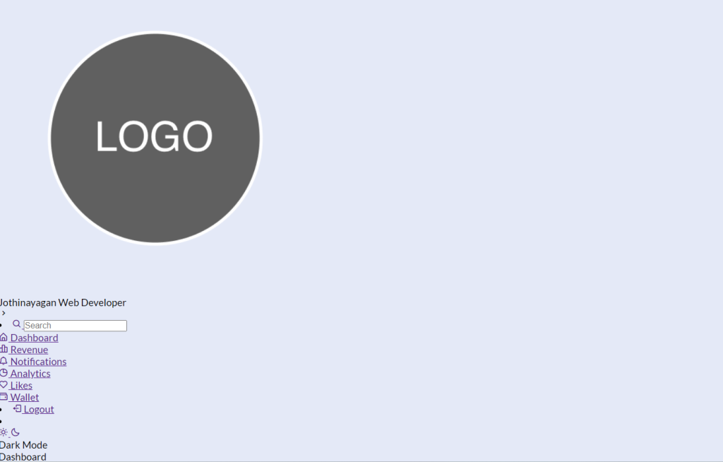
Step2: Now we will adding the style to our sidebar first of all we will set the position as fixed and using the top and left property we will set the position as “zero” and using the height property we will set the height as “100%” and width as 250px.
Responsive Resume/CV Website Using HTML & CSS
Then we will just add the styling to the elements inside our sidebar using the child class selector we will set the display of our image flex and align it to the center,similarly we also added the styling to the image and using the hover property we also added a hover property as the user hover over the element the background color changes.
Javascript Sidebar Code:-
By css, we will design our container and will bring in the left side, and then we will set the width for the container after setting basic properties we will design each and every part of the html content.
The below code will analyze you more. So just add in your html half-complete file and wait to watch some magic.
const body = document.querySelector("body");
const sidebar = document.querySelector("nav");
const toggle = document.querySelector(".toggle");
const searchBox = document.querySelector(".search-box");
const modeSwitch = document.querySelector(".toggle-switch");
const modeText = document.querySelector(".mode-text");
toggle.addEventListener("click", () => {
    sidebar.classList.toggle("close");
});
searchBox.addEventListener("click", () => {
    sidebar.classList.remove("close");
});
modeSwitch.addEventListener("click", () => {
    body.classList.toggle("dark");
    modeText.innerText = body.classList.contains("dark")
        ? "Light Mode"
        : "Dark Mode";
});
We will choose the body, navigation, toggles, search box, and toggle switch inside of javascript using the document query-selector technique. Using the document, we will choose every HTML part. We will add the click event using the toggle button to toggle between the dark mode and light mode by using the queryselector() technique and the addEventListener. When the user selects the button, the dark mode activates and a class is added.
Video Output Of Sidebar Menu Using JavaScript:-
Live Preview Of Sidebar Menu:-
By this blog… We have learned how we can Design a Sidebar project.
Now I’m looking for your reviews.
So, how was the blog, learners?
If you want a more crisp blog like this then please check our blog sites codewithrandom. Keep tuned with us because every day you will learn something new here.
Portfolio Website Using HTML ,CSS ,Bootstrap and JavaScript
I hope that I’m able to make you understand this topic and that you have learned something new from this blog. If you faced any difficulty feel free to drop a comment down your problems and if you liked it, please show your love in the comment section. This fills bloggers’ hearts with enthusiasm for writing more new blogs.
Written by @ankit kumar & Himanshu Singh
Code by @jothinayagan
What is a Sidebar
Users can keep some page elements accessible at all times thanks to sidebars, which are also convenient. Links, menu items, widgets, call-to-action buttons, display advertising, and other elements can all be placed there.
What should be included in a sidebar?
1.Search bar
2.Widgets
3.Social Media Icons
4.Section Links
