Day Night Transition Animation Using HTML and CSS
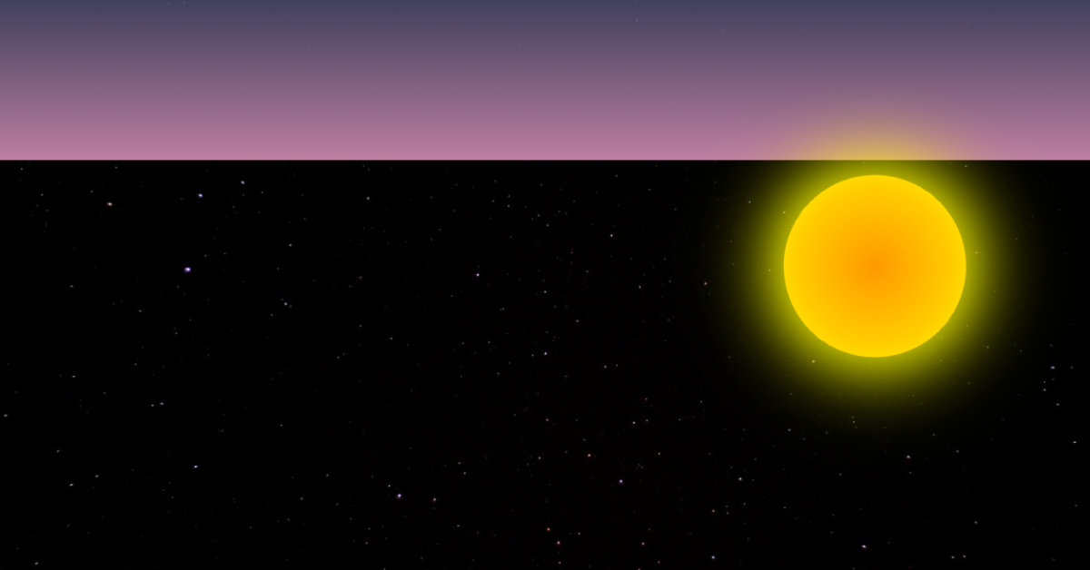
Hey Guys, In Today’s Blog We are going to see How to create a Day Night Transition Animation Using HTML and CSS. For that, the respective source codes were given below along with the respective preview of the output section. So you can make use of that.

Now The Project is going to create and for that, we are first adding an HTML Code.
How to make a Day Night transition animation using HTML and CSS?
Before we going to make this Day Night Transition Animation let’s talk about the folder structure of this project. First create a folder is named “Day Night Transition Animation” then inside this folder we take two files are called “index.html” and “style.css“. Awesome you have completed the folder structure for Day Night Transition Animation project, now let’s see the HTML code and copy and paste it in your index.html file.
| Code By | Dudley Storey |
| Project Download | Link Available Below |
| Language Used | HTML & CSS |
| External Link / Dependencies | No |
| Responsive | Yes |
HTML CODE:
Here, we’re using SVG and its properties to immediately add the day and night. The statement of the linear gradient with ID and layers followed. For the stop color, we are currently adding a number of RGB properties as well as animate properties for offset values with a length of 24 seconds and some values for them.
The Explanation for the above one is for Sun and Moon which changes with according to background color.
<svg xmlns="http://www.w3.org/2000/svg" width="100%" height="100%">
<linearGradient id="skyGradient" x1="0%" y1="0%" x2="0%" y2="100%">
  <stop stop-color="rgb(0,0,12)" offset="0%" id="zenith">
    <animate attributeName="stop-color" dur="24s" values="rgba(0,0,12,0);rgba(2,1,17,0);rgba(2,1,17,0);rgba(2,1,17,0);rgba(32,32,44,0.5);rgba(64,64,92,.8);rgb(74,73,105);rgb(117,122,191);rgb(130,173,219);rgb(148,197,248);rgb(183,234,255);rgb(144,223,254);rgb(87,193,235);rgb(45,145,194);rgb(36,115,171);rgb(30,82,142);rgb(30,82,142);rgb(21,66,119);rgba(22,60,82,0.8);rgba(7,27,38,.5);rgba(1,10,16,.3);rgba(9,4,1,0);rgba(0,0,12,0);rgba(0,0,12,0)"
    repeatCount="indefinite" />
    <animate attributeName="offset" dur="24s" values="0;.85;.6;.1;0;0;0;0;0;.01;0;0;0;0;0;0;0;0;0;0;.3,.5,.8,0"
    repeatCount="indefinite" />
  </stop>

  <stop stop-color="rgb(0,0,12)" offset="100%" id="horizon">
    <animate attributeName="stop-color" dur="24s" values="rgba(0,0,12,0);rgba(25,22,33,.3);rgba(32,32,44,.8);rgb(58,58,82);rgb(81,81,117);rgb(138,118,171);rgb(205,130,160);rgb(234,176,209);rgb(235,178,177);rgb(177,181,234);rgb(148,223,255);rgb(103,209,251);rgb(56,163,209);rgb(36,111,168);rgb(30,82,142);rgb(91,121,131);rgb(157,166,113);rgb(233,206,93);rgb(178,99,57);rgb(47,17,7);rgb(36,14,3);rgb(47,17,7);rgba(75,29,6,.4);rgba(21,8,0,0);rgba(0,0,12,0)"
    repeatCount="indefinite" />
  </stop>
</linearGradient>
<rect id="sky" x="0" y="0" width="100%" height="100%"  style="fill:url(#skyGradient)" />
</svg>
<div class="sun"></div>
Read also: 100+ JavaScript Projects With Source Code ( Beginners to Advanced)
HTML Output:

CSS CODE 1st:
After adding the HTML code, let’s copy the all CSS code and copy and paste it in your style.css file.
@keyframes suntrack {
  from { transform: rotate(.15turn); }
  to { transform: rotate(-.85turn); }
}

@keyframes sunpulse {
   from { box-shadow: 0 0 100px #ff0, 0 0 100px #ff0; }
  to { box-shadow: 0 0 50px #ff0, 0 0 75px #ff0;  }
}
body { margin: 0;
  background-color: #000;
  background-image: url(https://s3-us-west-2.amazonaws.com/s.cdpn.io/4273/starfield_stock_1.jpg);
  background-size:cover;
  position: relative;
  min-height: 100vh;
  overflow: hidden;
}
.sun {
  width: 15vw;
  height: 15vw;
  background: #ff0;
  background: radial-gradient(ellipse at center, #f90 0%,#fc0 60%,#ff0 100%);
  border-radius: 100%;
  position: absolute;
  bottom: -7vw;
  right: 7vw;
  transform-origin: -28vw 7vw;
  animation: suntrack 24s infinite forwards linear, sunpulse 2s alternate infinite;
}
.moon {
  background-image: url(https://s3-us-west-2.amazonaws.com/s.cdpn.io/4273/moon8.png);
  width: 15vw;
  height: 15vw;
  position: absolute;
  background-repeat: no-repeat;
  background-position: center;
  background-size: 90% 90%;
  border-radius: 100%;
  bottom: -7vw;
  right: 7vw;
  transform-origin: -28vw 7vw;
  animation: moontrack 24s infinite forwards linear;
  opacity: .8;
}
CSS CODE 2nd:
ADVERTISEMENT
In First part of CSS we are creating an body section and adding the following properties.
ADVERTISEMENT
ADVERTISEMENT
- Background – color
- Background-img
- Background-size
- Position
- Min-height
- Overflow
ADVERTISEMENT
This will make the background image to cover entire background and the size will be minimum 100vh and it is relative to all other contents which are going to add.
ADVERTISEMENT
50+ Html ,Css & Javascript Projects With Source Code
In Second Part of CSS, We are adding the following properties which given below for making the sun to bright during change in background colors.
.sun {
  width: 15vw;
  height: 15vw;
  background: #ff0;
  background: radial-gradient(ellipse at center, #f90 0%,#fc0 60%,#ff0 100%);
  border-radius: 100%;
  position: absolute;
  bottom: -7vw;
  right: 7vw;
  transform-origin: -28vw 7vw;
  animation: suntrack 24s infinite forwards linear, sunpulse 2s alternate infinite;
}
CSS CODE 3rd:
In Third Part , We are adding the following properties which given below for making the Moon to display when the background color is black.
.moon {
background-image: url(https://s3-us-west-2.amazonaws.com/s.cdpn.io/4273/moon8.png);
width: 15vw;
height: 15vw;
position: absolute;
background-repeat: no-repeat;
background-position: center;
background-size: 90% 90%;
border-radius: 100%;
bottom: -7vw;
right: 7vw;
transform-origin: -28vw 7vw;
animation: moontrack 24s infinite forwards linear;
opacity: .8;
}
Awesome! Now We have completed Our CSS code and also we finished our project by adding required source codes. So we can go for preview of our project mentioned in output section.
Video Output:
FINAL-OUTPUT Day Night Transition Animation Using HTML & CSS:
Now We have Successfully created our Day Night Transition Animation Using HTML and CSS. You can use this project for your personnel needs and the respective lines of code are given with the code pen link mentioned below.
If you find out this Blog helpful, then make sure to search code with random on google for Front End Projects with Source codes and make sure to Follow the Code with Random Instagram page.
REFER CODE- Dudley Storey
WRITTEN BY- Ragunathan
How to make a Day Night transition animation using HTML and CSS?
First Create A Folder Is Named “Day Night Transition Animation” Then Inside This Folder We Take Two Files Are Called “Index.Html” And “Style.Css“. Awesome You Have Completed The Folder Structure For Day Night Transition Animation Project, Now Let’s See The HTML Code And Copy And Paste It In Your Index.Html File….
Day Night transition animation CSS
let’s copy the all CSS code and copy and paste it in your style.css file.
What is the purpose of Day and Night Animation?
These kinds of effects are beneficial for learning and draw increasing amounts of traffic to education websites where students learn through play.


