How To Make Sliding Button In Css?
The switch button can be used to represent the on and off state for some functionalities. Sometimes the switch button can be used instead of radio buttons or checkboxes. In this tutorial, we will learn to create a toggle switch using CSS.
we will just create a basic structure for the Toggle Switch button. Here all we need to put a checkbox and a label to create an HTML document like below. We can do that by using the HTML label tag and HTML input type = checkbox.
50+ HTML, CSS and JavaScript Projects With Source Code
HTML Code For Sliding Button
<div class="custom-checkbox">
  <input id="status"
         type="checkbox"
         name="status">
  <label for="status">
    <div class="status-switch"
         data-unchecked="Off"
         data-checked="On">
    </div>
  </label>
</div>
Hopefully, the markup speaks for itself but here are some points if you’re not sure what’s going on above:
- We wrap everything in a
divwhich we’ll use to set an overall height and width for our Toggle Switch - There is a checkbox
inputwhich we’ll hide with our CSS styles, the main content will be inside thelabelelement (which itself has a furtherdivinside it) - Specifying the
input‘s id inside theforattribute of thelabelthe element allows the user to check/uncheck the checkboxinputelement by clicking thelabelelement - The
divinside thelabelhas two data attributes (data-uncheckedanddata-checked) which will form the text for the two states of our slide toggle
Initially, I had tried using two radio button inputs for the slide Toggle Switch with each representing either an on or off state.
Create Resume/CV Website Using HTML and CSS (Source Code)
However, I only got so far with this approach before the styling became a nightmare so I decided to change the radios for a single checkbox which made everything much easier.
As the slide Toggle Switch can only have two states; either ‘checked’ or ‘unchecked’, it makes more sense to use a checkbox.
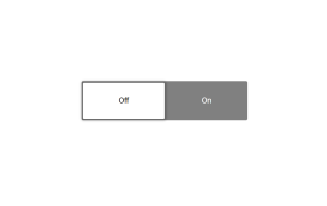
HTML Code Output

You Might Like This:
- Multiple Choice Quiz
- Create Social Media Icon Hover
- Portfolio Website Using Html And Css
- Word Guessing Game in HTML CSS & JavaScript
- Dark Mode Toggle Button
Css Code For Sliding Button
* {
  box-sizing: border-box;
}

html,
body {
  height: 100%;
}

body {
  display: flex;
  justify-content: center;
  align-items: center;
  font-family: Helvetica, Arial, sans-serif;
}

.custom-checkbox {
  width: 340px;
  height: 80px;
}
.custom-checkbox input#status {
  display: none;
}
.custom-checkbox input#status + label {
  height: 100%;
  width: 100%;
}
.custom-checkbox input#status + label > .status-switch {
  cursor: pointer;
  width: 100%;
  height: 100%;
  position: relative;
  background-color: grey;
  color: white;
  transition: all 0.5s ease;
  padding: 3px;
  border-radius: 3px;
}
.custom-checkbox input#status + label > .status-switch:before, .custom-checkbox input#status + label > .status-switch:after {
  border-radius: 2px;
  height: calc(100% - 6px);
  width: calc(50% - 3px);
  display: flex;
  align-items: center;
  position: absolute;
  justify-content: center;
  transition: all 0.3s ease;
}
.custom-checkbox input#status + label > .status-switch:before {
  background-color: white;
  color: black;
  box-shadow: 0 0 4px 4px rgba(0, 0, 0, 0.2);
  left: 3px;
  z-index: 10;
  content: attr(data-unchecked);
}
.custom-checkbox input#status + label > .status-switch:after {
  right: 0;
  content: attr(data-checked);
}
.custom-checkbox input#status:checked + label > .status-switch {
  background-color: #40c253;
}
.custom-checkbox input#status:checked + label > .status-switch:after {
  left: 0;
  content: attr(data-unchecked);
}
.custom-checkbox input#status:checked + label > .status-switch:before {
  color: #40c253;
  left: 50%;
  content: attr(data-checked);
}
The styling of the Toggle Switch could be done in plain CSS however, using SCSS makes working with the hierarchy of elements easier.
CSS code is used to make an attractive HTML component. This CSS property is used to make the style on the toggle switch.
We will hide the default checkbox and add a slider to it.
- Use the
positionproperty to position the slider with respect to the switch. - Add the
heightandwidthto the Toggle Switch. - Add a different
background-colorto the slider to display the on-off state. - Use the
transformproperty to add slide effect to the Toggle Switch
We can use other CSS properties to customize the Toggle Switch accordingly.We use the button property to add customization to our buttons, allowing us to add a variety of design, such as a hover effect.We use the button property to add customization to our buttons, allowing us to add a variety of design, such as a hover effect.
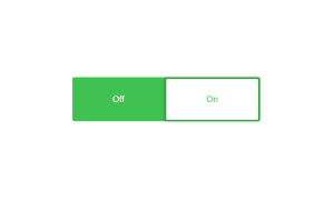
Final Output Of Css Sliding Button


If you enjoyed reading this Toggle Switch by using HTML and CSS post and have found it useful for you, then please give share it with your friends, and follow me to get updates on my upcoming posts. You can connect with me on Instagram.
if you have any confusion regarding Toggle Switch by using HTML and CSS Comment below or you can contact us by filling out our contact us form from the home section.
written by – Ninja_webTech
What is the use of toggle Switch?
The greatest use of toggle switches is to modify the preferences and functional states of a system. Toggle switches can be used in lieu of two checkboxes or two radio buttons to let users choose between two opposing states.
How to Create Toggle Switch Using HTML & CSS?
The main html element and the input type “checkbox” are used to make a toggle switch, and we can style it using the class selector.


