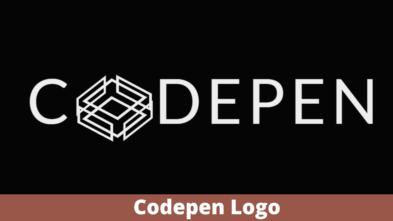
Logo Animation CSS Codepen
Responsive Logo Animation CSS Codepen
Live Preview Of Logo Animation CSS Codepen:-
HTML Code For Logo Animation:-
As We know there are six faces in a cuboid so we make six div tags for six faces.
As span is an inline container, we used span for writing codepen where instead of o we inserted a cuboid class named span tag and then added styling to it.
<h1 class="logo">
    <span>c</span>
    <span class="cuboid">
        <span class="cuboid-face cuboid-face-front"></span>
        <span class="cuboid-face cuboid-face-back"></span>
        <span class="cuboid-face cuboid-face-top"></span>
        <span class="cuboid-face cuboid-face-bottom"></span>
        <span class="cuboid-face cuboid-face-left"></span>
        <span class="cuboid-face cuboid-face-right"></span>
    </span>
    <span>depen</span>
</h1>
First, we’ll construct a heading with the class logo using the h1> tag, and then we’ll use the span tag to create six different cuboid shapes inside of that heading. Finally, we’ll defer the codepen using the span> element.
In this, we can see that the codepen of ‘O’ is missing…
Logo Animation CSS Code-:
As Our layout is completed now we need to style the layout and change the divs used for 6 faces to convert into rectangular faces for that we give the same height and width to the opposite faces and style the div using CSS selectors. Hope you know about CSS selectors. We use “.” for the class-CSS selector.
Restaurant Website Using HTML And CSS With Source Code
In this tutorial, we are using some basic concepts of CSS for styling like border-box, animations,preserve-3d, calc and transform properties.
The transform-style the property specifies how nested elements are rendered in 3D space.
preserve 3d-Specifies that child elements will preserve its 3D position.
The transform the property applies a 2D or 3D transformation to an element. This property allows you to rotate, scale, move, skew, etc., elements.
The calc() function performs a calculation to be used as the property value.
| translateX(x) | Defines a translation, using only the value for the X-axis | |
| translateY(y) | Defines a translation, using only the value for the Y-axis | |
| translateZ(z) | Defines a 3D translation, using only the value for the Z-axis |
| rotateX(angle) | Defines a 3D rotation along the X-axis |
| rotateY(angle) | Defines a 3D rotation along the Y-axis | |
| rotateZ(angle) | Defines a 3D rotation along the Z-axis |
You Might Like This:
- Advance Multi Step Form
- Responsive Flat Pricing Card
- Password Generator
- QR Code generator using JavaScript
In this, we want to design the logo of the ‘O’ letter which we want to make a cuboid with the help of css.
/* Base Styles */
* {
    box-sizing: border-box;
}
body {
    display: flex;
    justify-content: center;
    align-items: center;
    height: 100vh;
    background-color: #050505;
    overflow: hidden;
}
.logo {
    font-family: "Lato", Arial, sans-serif;
    font-size: calc(1em + 12vw);
    letter-spacing: 0.08em;
    color: #eee;
    text-transform: uppercase;
    white-space: nowrap;
    user-select: none;
} /* Cuboid Positioning */
.cuboid,
.cuboid-face {
    display: inline-block;
}
.cuboid {
    font-size: 0.75em;
    position: relative;
    height: 0.5em;
    width: 1em;
    vertical-align: middle;
    transform-style: preserve-3d;
    transform: rotateX(-40deg) rotateY(-45deg);
    animation: rotateCuboid 3s ease-in-out infinite;
}
.cuboid-face {
    position: absolute;
    top: 0;
    width: 100%;
    height: 100%;
    border: 0.08em solid #eee;
}
.cuboid-face-top,
.cuboid-face-bottom {
    height: 1em;
}
.cuboid-face-front {
    transform: translateZ(0.5em);
    animation: faceFront 3s ease-in-out infinite;
}
.cuboid-face-back {
    transform: rotateY(180deg) translateZ(0.5em);
    animation: faceBack 3s ease-in-out infinite;
}
.cuboid-face-left {
    transform: rotateY(-90deg) translateZ(0.5em);
    animation: faceLeft 3s ease-in-out infinite;
}
.cuboid-face-right {
    transform: rotateY(90deg) translateZ(0.5em);
    animation: faceRight 3s ease-in-out infinite;
}
.cuboid-face-top {
    transform: rotateX(90deg) translateZ(0.5em);
}
.cuboid-face-bottom {
    transform: rotateX(-90deg);
} /* Animations */
@keyframes faceFront {
    50% {
        transform: translateZ(0.7em);
    }
}
@keyframes faceBack {
    50% {
        transform: rotateY(180deg) translateZ(0.7em);
    }
}
@keyframes faceLeft {
    50% {
        transform: rotateY(-90deg) translateZ(0.7em);
    }
}
@keyframes faceRight {
    50% {
        transform: rotateY(90deg) translateZ(0.7em);
    }
}
@keyframes rotateCuboid {
    100% {
        transform: rotateX(-40deg) rotateY(-405deg);
    }
}
Step1: We will use the body tag selector to change the box sizing to “border-box” and the display to “flex” using the universal selector (*). The content will be justified to the middle using the justify-content property, and the height will be set to “100vh” using the justify-height property.In order to make the overflow “hidden,” we will also use the overflow attribute.
* {
    box-sizing: border-box;
}

body {
    display: flex;
    justify-content: center;
    align-items: center;
    height: 100vh;
    background-color: #050505;
    overflow: hidden;
}Step2:The font family property will now be set to “Lato,” the font height property will be set to 1 em, and the letter spacing property will be used to add a 0.88 em letter spacing. All of these changes will be made using the class selector (.logo).
Ecommerce Website Using HTML, CSS, and JavaScript (Source Code)
Now that the display is set to “inline-block,” we will style the cuboid by setting the typeface size to “0.75em” and the width to “1em” using the font-size property and the class selector, respectively. The transform, rotate, and translate properties in our codepen will be used to style each of the cuboid sides in a similar manner.
.logo {
    font-family: "Lato", Arial, sans-serif;
    font-size: calc(1em + 12vw);
    letter-spacing: 0.08em;
    color: #eee;
    text-transform: uppercase;
    white-space: nowrap;
    user-select: none;
}

/* Cuboid Positioning */

.cuboid,
.cuboid-face {
    display: inline-block;
}

.cuboid {
    font-size: 0.75em;
    position: relative;
    height: 0.5em;
    width: 1em;
    vertical-align: middle;
    transform-style: preserve-3d;
    transform: rotateX(-40deg) rotateY(-45deg);
    animation: rotateCuboid 3s ease-in-out infinite;
}

.cuboid-face {
    position: absolute;
    top: 0;
    width: 100%;
    height: 100%;
    border: 0.08em solid #eee;
}

.cuboid-face-top,
.cuboid-face-bottom {
    height: 1em;
}

.cuboid-face-front {
    transform: translateZ(0.5em);
    animation: faceFront 3s ease-in-out infinite;
}

.cuboid-face-back {
    transform: rotateY(180deg) translateZ(0.5em);
    animation: faceBack 3s ease-in-out infinite;
}

.cuboid-face-left {
    transform: rotateY(-90deg) translateZ(0.5em);
    animation: faceLeft 3s ease-in-out infinite;
}

.cuboid-face-right {
    transform: rotateY(90deg) translateZ(0.5em);
    animation: faceRight 3s ease-in-out infinite;
}

.cuboid-face-top {
    transform: rotateX(90deg) translateZ(0.5em);
}

.cuboid-face-bottom {
    transform: rotateX(-90deg);
}

/* Animations */

@keyframes faceFront {
    50% {
        transform: translateZ(0.7em);
    }
}

@keyframes faceBack {
    50% {
        transform: rotateY(180deg) translateZ(0.7em);
    }
}

@keyframes faceLeft {
    50% {
        transform: rotateY(-90deg) translateZ(0.7em);
    }
}

@keyframes faceRight {
    50% {
        transform: rotateY(90deg) translateZ(0.7em);
    }
}

@keyframes rotateCuboid {
    100% {
        transform: rotateX(-40deg) rotateY(-405deg);
    }
}
Logo Animation CSS Codepen Output:-

You can see the CSS output of the code:-
What is a Codepen?
For front-end designers and coders, there is a social development environment called CodePen. Create and publish a website, display your accomplishments, create test cases for learning and debugging, and get inspired.
ADVERTISEMENT
Which property is used to add Animation?
Using the animation and keyframes properties, we give our logo some animation.
ADVERTISEMENT
