Product Quick View Pop-up Animation Using CSS and JavaScript

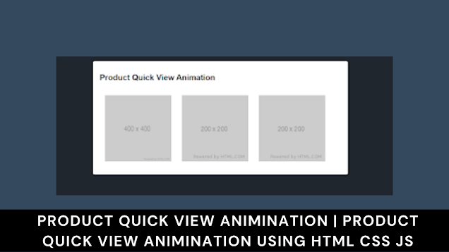
Product Quick View Animation
Hello Coders! Welcome to the Codewithrandom.In this blog, we create Product Quick View Pop-up Animation Using Html, Css, and JavaScript.
Before that first, you should know what is Product quick view. The product quick view is a model window and we see more information about the product. We Use Html, Css, and JavaScript ( JQuery) Code For Product Quick View Animation.
| Code by | zarik93 |
| Project Download | Link Available Below |
| Language used | HTML, CSS and JavaScript |
| External link / Dependencies | Yes |
| Responsive | No |

The usees and example of quick product quick view is…
- Access the main product information.
2. It like animation.
3. It is like 3D effect.
For eg:- If you want to show product in quick view then with the image of the product in left side display price or information.
So Let start to create the Product quick view…..
HTML Code For Product Quick View Animation:-
<!DOCTYPE html>
<html lang="en" dir="ltr">
    <head>
        <meta charset="utf-8" />
        <title>Product Quick View</title>
        <link rel="stylesheet" href="style.css" />
        <script src="https://cdn.jsdelivr.net/npm/[email protected]/dist/vue.min.js"></script>
        <script src="https://cdnjs.cloudflare.com/ajax/libs/animejs/2.2.0/anime.min.js"></script>
        <meta name="viewport" content="width=device-width, initial-scale=1.0" />
           </head>
    <body>
<div id="app">
  <div class="header">
    <h1 class="title">
      Product Quick View Animation
    </h1>
  </div>
  <div class="main">
    <div class="preview-pane">
      <product-list
        :products="products"
        :viewer-open="viewer.open"
        @open="open" />
    </div>
  </div>
  <transition
    v-on:before-enter="beforeEnter"
    v-on:enter="enter"
    v-on:after-enter="afterEnter"
    v-on:enter-cancelled="enterCancelled"

    v-on:before-leave="beforeLeave"
    v-on:leave="leave"
    v-on:after-leave="afterLeave"
    v-on:leave-cancelled="leaveCancelled"
  >
    <viewer
      :product="viewer.product"
      v-show="viewer.open"
      @close="close"/>
  </transition>
</div>


<template id="product-list">
  <div class="preview-grid">
     <figure class="preview-image"
        :class="{'is-hidden': openProductId === prod.id}"
        v-for="prod in products">
        <img
          :src="prod.thumb">
         <div class="preview-image-overlay">
            <button type="button"
              @click="open($event, prod)">
              Quick View
            </button>
         </div>
    </figure>
  </div>
</template>

<template id="productviewer">
  <div class="viewer" ref="box">
    <div class="viewer-left">
       <img :src="product.thumb" alt="">
    </div>
    <div class="viewer-right">
      <button class="button close is-pulled-right" @click="close">
        <span class="icon">X</span>
      </button>
    </div>
  </div>
</template>

  <!-- Javascript here -->

  <script src="index.js"></script>
    </body>
</html>
In our html file, we will add a few crucial links before adding the framework for our product’s quick animation. The links to those files need to be added inside the head area because in this project we used the vue min and anime js to add the animation to our product quick animation, along with the css and javascript.
<link rel="stylesheet" href="style.css" />
<script src="https://cdn.jsdelivr.net/npm/[email protected]/dist/vue.min.js"></script>
<script src="https://cdnjs.cloudflare.com/ajax/libs/animejs/2.2.0/anime.min.js"></script>
It’s time to finish adding the framework to our product fast view. We will make the container for our product first using the div tag and the classapp attribute, and we will add the heading for our product view next using the h1 attribute.
The product structure will then be added with the aid of Vue elements, and we’ll build three distinct product cards for our project using the Vue defined class. All that was needed was that, so let’s look at our project now that the result has been created.
Portfolio Website using HTML and CSS (Source Code)
Html Code Output Of Product Quick View Animation

CSS Code For Product Quick View Animation:-
body {
    background: #20262e;
    padding: 0;
    margin: 0;
    font-family: Helvetica;
    font-size: 14px;
}
#app {
    background: #fff;
    max-width: calc(100%-1rem);
    width: 100%;
    margin: 1rem auto;
    border-radius: 4px;
    padding: 20px;
    transition: all 0.2s;
    box-sizing: border-box;
    display: flex;
    flex-direction: column;
}
.header, .controls {
    display: flex;
    flex-direction: row;
    justify-content: space-between;
}
.main {
    margin-top: 0.5rem;
}
.preview-grid {
    display: flex;
    flex-direction: row;
    flex-wrap: wrap;
}
.preview-grid img {
    max-width: 200px;
    max-height: 200px;
}
.file {
    border-radius: 3px;
    border: 1px solid #dbdbdb;
    background-color: #f5f5f5;
    padding: 0.5rem;
    cursor: pointer;
    display: block;
}
.file:hover {
    background-color: #eee;
    transition: 50ms background-color linear;
}
input[type="file"] {
    display: none;
}
.preview-image {
    margin: 1rem;
    position: relative;
}
.preview-image.is-hidden::after {
    content: '';
    position: absolute;
    top: 0;
    bottom: 0;
    left: 0;
    right: 0;
    background-color: #fff;
    z-index: 888;
}
.preview-image:hover img {
    opacity: 0.5;
}
.preview-image:hover .preview-image-overlay {
    opacity: 1;
}
.preview-image .preview-image-overlay {
    opacity: 0;
    position: absolute;
    top: 0;
    left: 0;
    right: 0;
    bottom: 0;
    display: flex;
    justify-content: center;
    align-items: center;
}
.viewer {
    width: 200px;
    height: 200px;
    position: fixed;
    bottom: 0;
    right: 0;
    opacity: 0;
    z-index: 999;
}
.viewer > div {
    position: absolute;
    top: 0;
    bottom: 0;
    left: 0;
    right: 0;
    width: 100%;
}
.viewer > div.viewer-left {
    border: 1px solid aliceblue;
    z-index: 999;
}
.viewer > div.viewer-left > img {
    height: 100%;
    width: 100%;
}
.viewer > div.viewer-right {
    background: #fff;
    border: 1px solid aliceblue;
}
input, button, .button {
    padding: 0.5rem;
    border-radius: 3px;
    border: 1px solid #dbdbdb;
}
button, .button {
    cursor: pointer;
}
button.is-text, .button.is-text {
    border: none;
    text-decoration: none;
    color: initial;
}
button.close, .button.close {
    border: none;
    background: transparent;
}
.is-pulled-right {
    float: right;
}
.has-margin {
    margin: 1rem;
}
.title {
    font-size: 1.5rem;
}
.text-right {
    text-align: right;
}
@media (min-width: 768px) {
    #app {
        width: 75%;
   }
}
@media (min-width: 1024px) {
    #app {
        width: 50%;
   }
}
Step1 : We will now style our product display body using the body tag selector. The background will be changed to white, and the padding and margin properties will be used to change them from the browser’s default margin to zero. Finally, the font family property will be used to change the font family to “Helevtica.”
10+ HTML CSS Projects With Source Code
We will now apply styling to our product card using the id selector (#app). Using the width property, we will set the width to 100%, and the border-radius property, we will set the border radius to 4 px. The background is made to be grey. We will now make the display as flexible using the display property, with the flex direction set to column-wise.
$radius: 3px;
$alto: #dbdbdb;
$wild-sand: #f5f5f5;


body {
  background: #20262E;
  padding: 0;
  margin: 0;
  font-family: Helvetica;
  font-size: 14px;

}

#app {
  background: #fff;
  max-width: calc(100%-1rem);
  width: 100%;
  margin: 1rem auto;
  border-radius: 4px;
  padding: 20px;
  transition: all 0.2s;
  box-sizing: border-box;
  display: flex;
  flex-direction: column;
}Step2:Using the class selector, we will now style the image and numerous other components. We’ll increase the font size, and by utilising the margin and padding properties, we’ll give our picture a margin. We will style the brief animation of our product using the picture and the justify context property as well.
.header, .controls {
  display: flex;
  flex-direction: row;
  justify-content: space-between;
}

.main {
  margin-top: .5rem;
}

.preview-grid {
  display: flex;
  flex-direction: row;
  flex-wrap: wrap;

  img {
    max-width: 200px;
    max-height: 200px;
  }
}

.file {
   border-radius: $radius;
   border: 1px solid $alto;
   background-color: $wild-sand;
   padding: .5rem;
   cursor: pointer;
   display: block;

   &:hover {
     background-color: #eee;
     transition: 50ms background-color linear;
   }
}

input[type="file"] {
  display: none;
}

.preview-image {
  margin: 1rem;
  position: relative;

  &.is-hidden::after {
    content: '';
    position: absolute;
    top: 0;
    bottom: 0;
    left: 0;
    right: 0;
    background-color: #fff;
    z-index: 888;
  }

  &:hover {
    img {
      opacity: 0.5;
    }
    .preview-image-overlay {
      opacity: 1;
    }
  }

  .preview-image-overlay {
    opacity: 0;
    position: absolute;
    top: 0;
    left: 0;
    right: 0;
    bottom: 0;
    display: flex;
    justify-content: center;
    align-items: center;
  }
}Step3:Using the class selector (.viewer), we will now build a viewer class with dimensions of 200 pixels in height and 100 pixels in width. The position property will now be set to “fixed,” and the z index property’s value will be set to “999” to observe everything in the front.
ADVERTISEMENT
Restaurant Website Using HTML And CSS With Source Code
ADVERTISEMENT
To add responsiveness to our product quick animation, we will now use the media query attribute. Depending on the screen size, we’ll fix the width at 50% and 75%. When the screen size is small, the width will be set to 50%, and when it is big enough, the width will be set to 75%.
ADVERTISEMENT
.viewer {
  width: 200px;
  height: 200px;
  position: fixed;
  bottom: 0;
  right: 0;
  opacity: 0;
  z-index: 999;

  >div {
    position: absolute;
    top: 0;
    bottom: 0;
    left: 0;
    right: 0;
    width: 100%;

    &.viewer-left {
      border: 1px solid aliceblue;
      z-index: 999;
      >img {
        height: 100%;
        width: 100%;
      }
    }


    &.viewer-right {
      background: #fff;
      border: 1px solid aliceblue;
    }
  }
}


input, button, .button {
  padding: .5rem;
  border-radius: $radius;
  border: 1px solid $alto;
}

button, .button {
  cursor: pointer;

  &.is-text {
    border: none;
    text-decoration: none;
    color: initial;
  }

  &.close {
    border: none;
    background: transparent;
  }
}

.is-pulled-right {
  float: right;
}

.has-margin {
  margin: 1rem;
}

.title {
  font-size: 1.5rem;
}

.text-right {
  text-align: right;
}

@media (min-width: 768px) {
  #app {
    width: 75%;
  }
}

@media (min-width: 1024px) {
  #app {
    width: 50%;
  }
}
100+ HTML,CSS and JavaScript Projects With Source Code ( Beginners to Advanced)
ADVERTISEMENT
Html + Css Code Output Of Product Quick View Animation
ADVERTISEMENT

JavaScript Code For Product Quick View Animation:-
const productList = Vue.component("product-list", {
  template: "#product-list",
  props: {
    products: {
      type: Array,
      required: true,
    },
    viewerOpen: {
      type: Boolean,
      required: false,
      default: false,
    },
  },
  data() {
    return {
      openProductId: null,
    };
  },
  methods: {
    open(e, product) {
      this.openProductId = product.id;
      const pos = e.target.parentNode.getBoundingClientRect();
      this.$emit("open", {
        product: product,
        bounds: pos,
      });
    },
  },
  watch: {
    viewerOpen(newVal) {
      if (!newVal) {
        // 1450 is the duration of the leave transition
        // doing it shortly before to prevent any jerkiness
        setTimeout(() => {
          this.openProductId = null;
        }, 1400);
      }
    },
  },
});

const viewer = Vue.component("viewer", {
  template: "#productviewer",
  props: {
    offsetY: {
      type: Number,
      required: true,
    },
    offsetX: {
      type: Number,
      required: true,
    },
    product: {
      type: Object,
      required: true,
    },
  },
  mounted() {
    console.log("mounted");
  },
  methods: {
    close() {
      console.log("closed");
      this.$emit("close");
    },
  },
  watch: {
    offsetX(newVal) {
      console.log("new val: ", newVal);
    },
  },
});

new Vue({
  el: "#app",
  components: {
    productList,
    viewer,
  },
  data: {
    viewer: {
      animation: null,
      open: false,
      openTran: null,
      expandTran: null,
      offsetX: 0,
      offsetY: 0,
      initialWidth: 0,
      product: {
        id: "",
      },
    },
    products: [
      {
        id: "Glue Stick",
        thumb: "https://via.placeholder.com/400x400",
        images: ["https://via.placeholder.com/405x405"],
      },
      {
        id: "Paper",
        thumb: "https://via.placeholder.com/200x200",
        images: ["https://via.placeholder.com/405x405"],
      },
      {
        id: "Pencil",
        thumb: "https://via.placeholder.com/200x200",
        images: ["https://via.placeholder.com/405x405"],
      },
    ],
  },
  computed() {},
  mounted() {},
  methods: {
    close() {
      console.log("closed");
      this.viewer.open = false;
    },
    open({ product, bounds }) {
      this.viewer.product = product;
      this.viewer.offsetY = bounds.top;
      this.viewer.offsetX = bounds.left;
      this.viewer.initialWidth = bounds.width;
      this.viewer.initialHeight = bounds.height;
      this.viewer.open = true;
    },
    beforeEnter(el) {
      el.style.top = `${this.viewer.offsetY}px`;
      el.style.left = `${this.viewer.offsetX}px`;
    },
    enter(el, done) {
      const offsetX = this.viewer.offsetX;
      const offsetY = this.viewer.offsetY;
      // slide the product view to the center
      const windowWidth = window.innerWidth;
      const windowHeight = window.innerHeight;
      const windowCenterX = (windowWidth - this.viewer.initialWidth * 2) / 2;
      const windowCenterY = (windowHeight - this.viewer.initialHeight * 2) / 2;
      const ani = anime({
        targets: el,
        top: [this.viewer.offsetY, windowCenterY],
        left: [this.viewer.offsetX, windowCenterX],
        opacity: 1,
        width: `${this.viewer.initialWidth * 2}px`,
        height: `${this.viewer.initialHeight * 2}px`,
        easing: "easeInOutQuad",
      });

      ani.complete = done;
    },
    afterEnter(el) {
      // slide the product view apart
      const ani = anime.timeline();
      ani
        .add({
          targets: ".viewer-left",
          left: "-50%",
          easing: "easeInOutCirc",
          offset: 0,
        })
        .add({
          targets: ".viewer-right",
          left: "50%",
          easing: "easeInOutCirc",
          offset: 0,
        });

      /* set margin auto, top 0, left 0
        this keeps the box centered on resize
        but can't be used before animation because it prevents
        animating from the product image position */
      ani.complete = function () {
        el.style.cssText += "margin: auto; top: 0; left: 0;";
      };
    },
    enterCancelled() {},
    beforeLeave(el) {
      /* remove margin and set top and left back to offsets
      so animation can be done back to product image position */
      const windowWidth = window.innerWidth;
      const windowHeight = window.innerHeight;
      const windowCenterX = (windowWidth - this.viewer.initialWidth * 2) / 2;
      const windowCenterY = (windowHeight - this.viewer.initialHeight * 2) / 2;
      el.style.top = `${windowCenterY}px`;
      el.style.left = `${windowCenterY}px`;
      el.style.margin = "";
    },
    leave(el, done) {
      const windowWidth = window.innerWidth;
      const windowHeight = window.innerHeight;
      const windowCenterX = (windowWidth - this.viewer.initialWidth * 2) / 2;
      const windowCenterY = (windowHeight - this.viewer.initialHeight * 2) / 2;
      // slide the product view together
      const ani = anime.timeline();
      ani
        .add({
          targets: ".viewer-left",
          left: 0,
          easing: "easeInOutCirc",
          duration: 500,
          offset: 0,
        })
        .add({
          targets: ".viewer-right",
          left: 0,
          easing: "easeInOutCirc",
          duration: 500,
          offset: 0,
        })
        .add({
          targets: ".viewer",
          top: [windowCenterY, this.viewer.offsetY],
          left: [windowCenterX, this.viewer.offsetX],
          width: `${this.viewer.initialWidth}px`,
          height: `${this.viewer.initialHeight}px`,
          easing: "easeInOutQuad",
          offset: 450,
        });

      ani.complete = done;
    },
    afterLeave() {},
    leaveCancelled() {},
  },
});
We added the function to our product card view inside of our javascript by utilising the vue framework idea. In the product card view, we have first shown the entire product card size in a square shape. Then, with the help of the hover property, as the user hovers over the product, the quick view button will be displayed to the user.
Finally, with the help of the quick button, we will add an event listener as the user clicks on the button, and the viewer of the card will scale the size.
Dinosaur/Dino Game Using HTML and JavaScript (Source Code)
Final Output Of Product Quick View Animation
In this, we want to add a template which is a product list. In this code, the box will come and inside the box, the quick view button is there when you click on the button the product image and information will come like product information and price, etc.
Finally! Your Product’s quick animation Using Html, Css, And JavaScript is done. Now you can add images and details of products with quick access. Hope you guys understand and like it. If there is any doubt comments in the comment box…..
Thank you!
Written by:- Sayali Kharat
Which code editor do you use for Product Quick View Animation coding?
I personally recommend using VS Code Studio, it’s straightforward and easy to use.
What is a product card?
A product card is a particular page that contains all the precise details about your product. Customers are more likely to buy your product when they have a greater understanding of its features.
What is the purpose of a product Card?
A product card provides the website a better and more understated appearance. Additionally, product cards offer a wealth of information in a condensed space, aiding in website administration.


