How to Create Button in CSS?
Hello Coder! Welcome to the Codewithrandom blog. In this article, we learn how to create a basic button to advance Css Buttons.
Many times there is a need for various buttons on our webpage for example while creating any form where submit or reset is required or we want any action to be performed in a single click so we usually require a button to do so. A button tag in HTML is a clickable button that contains text, images, etc.
Use the button tag to add a clickable button to an HTML form on your website. The <button>…/button> tag can contain content such as text or an image.
100+ HTML,CSS and JavaScript Projects With Source Code ( Beginners to Advanced)
For a <button> tag, the type property must always be specified. Different default types are used by other browsers for the button element.
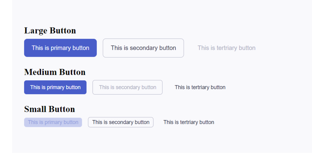
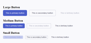
In this image, you can see no. of buttons created of different sizes and types. Now let’s see how we can proceed step by step to add buttons to our page.
STEP 1: ADDING HTML TO THE FILE
HyperText Markup Language, or HTML. This language uses markup. Our project’s structure is primarily provided by it. We will make use of this markup language to offer the structure of our project. Let’s examine our HTML code now.
<!DOCTYPE html>

<head>
        <link href="style.css" rel="stylesheet" />

<body>
        <div class="container">
                <div class="wrapper">
                        <h2>Large Button</h2>
                        <div class="	">
                                <button class="btn-primary btn-lg">
                                        This is primary button
                                </button>
                                <button class="btn-secondary btn-lg">
                                        This is secondary button
                                </button>
                                <button class="btn-tertriary btn-lg" disabled>
                                        This is tertriary button
                                </button>
                        </div>
                </div>
                <div class="wrapper">
                        <h2>Medium Button</h2>
                        <div class="	">
                                <button class="btn-primary btn-md">
                                        This is primary button
                                </button>
                                <button class="btn-secondary btn-md" disabled>
                                        This is secondary button
                                </button>
                                <button class="btn-tertriary btn-md">
                                        This is tertriary button
                                </button>
                        </div>
                </div>
                <div class="wrapper">
                        <h2>Small Button</h2>
                        <div class="	">
                                <button class="btn-primary btn-sm" disabled>
                                        This is primary button
                                </button>
                                <button class="btn-secondary btn-sm">
                                        This is secondary button
                                </button>
                                <button class="btn-tertriary btn-sm">
                                        This is tertriary button
                                </button>
                        </div>
                </div>
        </div>
</body>
</head>

</html>
So, in this code we have created two classes using a div tag, first is the “container” and then inside is the ” wrapper” class. A heading “Large Button” is made using <h2></h2> tag.
10+ Javascript Projects For Beginners With Source Code
After that, using the <button></button> tag 3 different buttons were created which had 3 different texts respectively. In the third button, the keyword disabled is used which shows that the functionality would not be performed when the web page would be loaded.Then the same thing is repeated for <h2></h2> “Medium Button” and <h2></h2>”Small button” .
STEP 2: ADDING CSS TO THE FILE
Cascading Style Sheet, or CSS. It is a widely used language on the web to construct HTML tags. Web design uses JavaScript, HTML, and CSS. Web designers can apply a style to HTML tags with its assistance. Now to apply a style to our buttons we will add CSS to our work.
:root{
    /* Primary Color */
    --blue-200: #C8CEEF;
    --blue-300: #929EDF;
    --blue-400: #495DC9;
    --blue-500: #3A4AA1;

    /* Neutral Color */
    --neutral-50: #ffffff;
    --neutral-100: #F9F9FC;
    --neutral-300: #ACADC1;
    --neutral-600: #26273B;

    /* Font Variable */
    --ff-poppins: "Poppins", sans-serif;

    --fs-md: 1rem;
    --fs-sm: 14px;
    --lh-normal: 1.5;
}

* {
  margin: 0;
  padding: 0;
  box-sizing: border-box;
}

body {
  background: var(--neutral-50);
  line-height: var(--lh-normal);
    font-size: 1rem;
    font-family: var(--fs-poppins);
}

/* Component Setup */

button {
    border: 0;
    display: flex;
    flex-direction: column;
    line-height: var(--ls-normal);
    align-items: center;
    border-radius: 6px;
}

button:focus {
    outline: none;
}


.btn-primary {
    background-color: var(--blue-400);
    color: var(--neutral-50);
}

.btn-primary:hover, .btn-primary:focus {
    background-color: var(--blue-500);
}

.btn-primary:hover {
    transition: background-color ease-out .2s;
}

button.btn-primary:disabled, button.btn-primary[disabled] {
    background-color: var(--blue-200);
    color: var(--blue-300);
}

.btn-secondary {
    border: 1px solid;
    border-color: var(--neutral-300);
}

.btn-secondary:hover, .btn-secondary:focus {
    border-color: var(--blue-400);
}

.btn-secondary:hover {
    transition: border-color ease-out .2s;
}

button.btn-secondary:disabled {
    border: 1px solid var(--neutral-300);
}

.btn-secondary, .btn-tertriary {
    background-color: transparent;
    color: var(--neutral-600);
}

.btn-secondary:hover, .btn-secondary:focus,
.btn-tertriary:hover, .btn-tertriary:focus {
    color: var(--blue-400);
}

.btn-secondary:hover, .btn-tertriary:hover {
    transition: color ease-in-out .2s;
}

button.btn-secondary:disabled,
button.btn-tertriary:disabled,
button.btn-tertriary[disabled] {
    color: var(--neutral-300);
}

.btn-lg {
    padding: 12px 20px;
    border-radius: 8px;
    font-size: var(--fs-md);
}

.btn-md {
    padding: 8px 16px;
}

.btn-sm {
    padding: 2px 10px;
}

.btn-md, .btn-sm {
    font-size: var(--fs-sm);
    border-radius: 6px;
}

/* Content Setup */
.container {
    width: 64em;
    margin: auto;
    padding: 3em 2em;
    background-color: var(--neutral-100);
}

.container .wrapper {
    width: 100%;
    display: flex;
    flex-direction: column;
    justify-content: center;
}

.wrapper {
    margin-top: 1.25em;
    margin-bottom: 1.25em;
    gap: .25em
}

.wrapper > div {
    align-items: center;
    display: flex;
    gap: 16px;
}
We’ll go over the CSS code step by step after we’ve added it. You can just copy this code and paste it into your IDE to save time. Let’s now step-by-step analyze our code.
Now let us see the step-by-step explanation of CSS in styling the buttons.
:root{
    /* Primary Color */
    --blue-200: #C8CEEF;
    --blue-300: #929EDF;
    --blue-400: #495DC9;
    --blue-500: #3A4AA1;

    /* Neutral Color */
    --neutral-50: #ffffff;
    --neutral-100: #F9F9FC;
    --neutral-300: #ACADC1;
    --neutral-600: #26273B;

    /* Font Variable */
    --ff-poppins: "Poppins", sans-serif;

    --fs-md: 1rem;
    --fs-sm: 14px;
    --lh-normal: 1.5;
}

* {
  margin: 0;
  padding: 0;
  box-sizing: border-box;
}

body {
  background: var(--neutral-50);
  line-height: var(--lh-normal);
    font-size: 1rem;
    font-family: var(--fs-poppins);
}
In this CSS file first root selector is used, The root element of a tree that represents the document corresponds to the: root CSS pseudo-class. With the exception of its greater specificity, the selector: root in HTML stands in for the <html> element. In this selector, we fixed our button’s color and font.
Creating A Password Generator Using Javascript
After that using a universal selector margin and padding were set to 0 and box-sizing to border-box which is to adjust the elements in a default way on the web page not leaving much space between the element and margin. Border -box instructs the browser to take into account any border and padding in the width and height values you supply for an element.
Then the properties of the body were set according to how we wanted to display our page’s content. Background i.e. neutral -50, line height i.e. normal, and font family i.e. Poppins was styled using var(), Also the font size was set to 1rem. The var() CSS method can be used to replace any portion of the value of another property with the value of a custom property, sometimes known as a “CSS variable.”
/* Component Setup */

button {
    border: 0;
    display: flex;
    flex-direction: column;
    line-height: var(--ls-normal);
    align-items: center;
    border-radius: 6px;
}

button:focus {
    outline: none;
}


.btn-primary {
    background-color: var(--blue-400);
    color: var(--neutral-50);
}

.btn-primary:hover, .btn-primary:focus {
    background-color: var(--blue-500);
}

.btn-primary:hover {
    transition: background-color ease-out .2s;
}

button.btn-primary:disabled, button.btn-primary[disabled] {
    background-color: var(--blue-200);
    color: var(--blue-300);
}

.btn-secondary {
    border: 1px solid;
    border-color: var(--neutral-300);
}

.btn-secondary:hover, .btn-secondary:focus {
    border-color: var(--blue-400);
}

.btn-secondary:hover {
    transition: border-color ease-out .2s;
}

button.btn-secondary:disabled {
    border: 1px solid var(--neutral-300);
}

.btn-secondary, .btn-tertriary {
    background-color: transparent;
    color: var(--neutral-600);
}

.btn-secondary:hover, .btn-secondary:focus,
.btn-tertriary:hover, .btn-tertriary:focus {
    color: var(--blue-400);
}

.btn-secondary:hover, .btn-tertriary:hover {
    transition: color ease-in-out .2s;
}

button.btn-secondary:disabled,
button.btn-tertriary:disabled,
button.btn-tertriary[disabled] {
    color: var(--neutral-300);
}
Now, let us finally do the component setup using CSS.
- Using the button as a selector, the border was set to 0 and the display was set to flex so that it could adjust the elements according to the interface of a particular device. Here the flex direction is set to the column. The alignment of the items is in the center Adding to it the border radius of a button is set as 6px. These can be changed according to the user’s convenience.
- The element’s outline attribute adds a line around it outside of the boundary. It doesn’t reduce an element’s width, such as a border, in any way. The outline is set as none.
CSS for the primary button
- btn- primary is the class for the button which was defined as the primary one. Its background color and color are set as blue and neutral respectively using var().
- Then in the next step the hover and focus properties of this primary button i.e. btn-primary class set the background color as blue- 500 using var().
- Instead of having property changes happen instantly, transition properties enable elements to have values change gradually over a predetermined time. Therefore, we may go right for the transition property to switch between background colors, here in this code we have set this property on our primary button when we hover over that particular button it will change its background color from blue-400 to blue 500, you can run this and understand how it works.
- As explained above some of the functionality of the buttons is disabled and the third primary button which is the smaller one has its properties disabled with background color blue 200 and color blue 300
CSS for secondary and tertiary button
- btn- secondary is the class for the button which was defined as the secondary one. Its border and border color are set as of 1px solid and neutral-300 respectively using var().
- Then in the next step the hover and focus properties of this primary button i.e. btn-secondary class set the border color as blue- 400 using var().
- Now here comes the transition, we have set this property on our secondary button when we hover over that particular button it will change its border color to blue-400 you can run this and understand how it works.
- As explained above some of the functionality of the buttons are disabled, here the second secondary button which is the medium one has its properties disabled with its border 1px solid of color neutral-300.
- As we know that btn- secondary is for secondary class and btn-tertriary for tertiary class so their background color is set as transparent 600 and color is neutral 300.
- The focus and hover properties of both the btn- secondary and btn- tertriary are set to color blue-400
- Now in the transition, we have set this property on our secondary and tertriary button when we hover over them button it will change its color to blue
- As done above one of the buttons are disabled so here the second secondary button and first tertriary button are kept disabled with color neutral 300
.btn-lg {
    padding: 12px 20px;
    border-radius: 8px;
    font-size: var(--fs-md);
}

.btn-md {
    padding: 8px 16px;
}

.btn-sm {
    padding: 2px 10px;
}

.btn-md, .btn-sm {
    font-size: var(--fs-sm);
    border-radius: 6px;
}

/* Content Setup */
.container {
    width: 64em;
    margin: auto;
    padding: 3em 2em;
    background-color: var(--neutral-100);
}

.container .wrapper {
    width: 100%;
    display: flex;
    flex-direction: column;
    justify-content: center;
}

.wrapper {
    margin-top: 1.25em;
    margin-bottom: 1.25em;
    gap: .25em
}

.wrapper > div {
    align-items: center;
    display: flex;
    gap: 16px;
}
Moving further in CSS , properties of different buttons would be again modified a bit
50+ Html ,Css & Javascript Projects With Source Code
- btn-lg is the class for large-sized buttons in which padding is set as 12px 20px, border-radius as 8px and font-size
- btn-md is the class for medium-sized buttons in which padding is set as 8px 16px.
- btn-sm is the class for small-sized buttons in which padding is set as 2px 10px.
- Then for btn-md and btn-sm i.e. medium-sized and small-sized button font size and border size are set as 6px.
CSS For content set up
- Here in the CSS selector container we have set the following properties width: 64em; margin: auto; padding: 3em 2em; background-color: var(–neutral-100);
- Then in the container and wrapper, we added properties width: 100%; display: flex; flex-direction: column; justify-content: center;
- Modifying the wrapper class a little bit margin-top: 1.25em; margin-bottom: 1.25em; gap: .25em
- Using the Parent-child selector method we set the following properties align-items: center; display: flex; gap: 16px;
We have successfully created different buttons using HTML and CSS. You can use this project directly by copying it into your IDE. We hope you understood the project. If you have any doubts then feel free to comment them down!!
ADVERTISEMENT
Follow: Codewithrandom
ADVERTISEMENT
Written by: Aditi Tiwari
ADVERTISEMENT
Code by: Soffi filianto(link N/A)
ADVERTISEMENT
