Glassmorphism Css Card background | Glassmorphism Effect Css
Learners, In this article we are going to design a very interactive and impressive project which is a Glassmorphism Card background with detailed functionality.
Learners, Do you know there is a Glassmorphism property in CSS. Let me tell you what this is a kind of designing property in which we mostly focus on content designing as it should be in transparent form so what background should clearly visibly.
In this Blog we will card with Glassmorphism property as you will get two learning in one as you will learn how we can design card if you know then no issue and along with how we set Glassmorphism.
Similarly, we are going to clone a whether app by ourselves 😉.
Hey learners..!
Welcome to our 🎊 today’s blog with code with random. In this blog, we gonna learn how we can design a Glassmorphism Card background project Using HTML CSS JAVASCRIPT.
I hope you must have got an idea about the project.
Let’s have a look at our project.
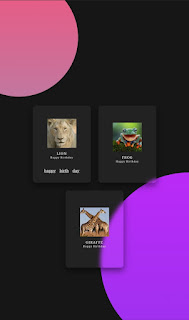
As you are looking in the project preview how the thing is organized in the single container.
Following is the feature of our project:-
- Like we have three cards within the container but our background is clearly visible. This is what our Glassmorphism effect is.
- We have added a hover effect on the card as well whenever you will hover on the card it will preview a happy birthday message.
HTML SECTION
Here I’m not going to add a structure of the HTML file from scratch, I will just paste the body part, it is so because the body is the main part of our designing a browser.
We have the following part in the HTML section.
- First, we have a container that will enclose all other parts of the whether project.
- Then we have 3card with similar functionality as images with content that is replicated in all three cards.
Go through the below code 👇 and run it in your IDE or where you used to design just HTML without CSS styling.
 <body>
      <section>
           <div class="container">
                <div class="card">
                     <div class="content">
                          <div class="imgBx">
       <img src ="https://i.postimg.cc/Qx6S8Nt4/OIP.jpg">
                          </div>
                          <div class="contentBx">
                               <h3>Lion<br><span>Happy Birthday</span></h3>
                          </div>
                     </div>
                     <ul class="sci">
                          <li>
                               <a href="">happy</a>
                          </li>
                          <li>
                               <a href="">birth</a>
                          </li>
                          <li>
                               <a href="">day</a>
                          </li>
                     </ul>
                </div>
                <div class="card">
                     <div class="content">
                          <div class="imgBx">
                               <img src="https://i.postimg.cc/bJTkmLSC/th.jpg">
                          </div>
                          <div class="contentBx">
                               <h3>Frog<br><span>Happy Birthday</span></h3>
                          </div>
                     </div>
                     <ul class="sci">
                          <li>
                               <a href="">happy</a>
                          </li>
                          <li>
                               <a href="">birth</a>
                          </li>
                          <li>
                               <a href="">day</a>
                          </li>
                     </ul>
                </div>
                <div class="card">
                     <div class="content">
                          <div class="imgBx">
                               <img src="https://i.postimg.cc/TwYp3xh0/th.jpg">
                          </div>
                          <div class="contentBx">
                               <h3>Giraffe<br><span>Happy Birthday</span></h3>
                          </div>
                     </div>
                     <ul class="sci">
                          <li>
                               <a href="">happy</a>
                          </li>
                          <li>
                               <a href="">birth</a>
                          </li>
                          <li>
                               <a href="">day</a>
                          </li>
                     </ul>
                </div>
           </div>
      </section>
 </body>
CSS SECTION
By CSS we will design our container and will bring in the center and then we will design our corner blog and most important will set Glassmorphism property to the cards and will design all the images and content within the card.
The Below code will analyze you more👇. So just add in your HTML half complete file and wait to watch some magic.
 * {
     margin: 0;
     padding: 0;
  }
  body {
     display: flex;
     justify-content: center;
     align-items: center;
     flex-wrap: wrap;
     background: #161616;
     min-height: 100vh;
  }
  section::before {
     content: '';
     position: absolute;
     top: 0;
     left: 0;
     width: 100%;
     height: 100%;
     background: linear-gradient(#DA22FF, #9733EE);
     clip-path: circle(30% at right 70%);
  }
  section::after {
     content: '';
     position: absolute;
     top: 0;
     left: 0;
     width: 100%;
     height: 100%;
     background: linear-gradient(#E55D87, #5FC3E4);
     clip-path: circle(20% at 10% 10%);
  }
  .container {
     position: relative;
     z-index: 1;
     display: flex;
     justify-content: center;
     align-items: center;
     flex-wrap: wrap;
     margin: 40px 0;
  }
  .container .card {
     position: relative;
     width: 300px;
     height: 400px;
     background: rgba(255, 255, 255, 0.05);
     margin: 20px;
     box-shadow: 0 15px 35px rgba(0, 0, 0, 0.5);
     border-radius: 15px;
     display: flex;
     justify-content: center;
     align-items: center;
     backdrop-filter: blur(10px);
  }
  .container .card .content {
     position: relative;
     display: flex;
     justify-content: center;
     align-items: center;
     flex-direction: column;
     transition: 0.5s;
  }
  .container .card:hover .content {
     transform: translateY(-20px);
  }
  .container .card .content .imgBx {
     position: relative;
     width: 150px;
     height: 150px;
     overflow: hidden;
  }
  .container .card .content .imgBx img {
     position: absolute;
     top: 0;
     left: 0;
     width: 100%;
     height: 100%;
     object-fit: cover;
  }
  .container .card .content .contentBx h3 {
     color: #fff;
     text-transform: uppercase;
     letter-spacing: 2px;
     font-weight: 500;
     font-size: 18px;
     text-align: center;
     margin: 20px 0 10px;
     line-height: 1.1em;
  }
  .container .card .content .contentBx h3 span {
     font-size: 12px;
     font-weight: 300;
     text-transform: initial;
  }
  .container .card .sci {
     position: absolute;
     bottom: 50px;
     display: flex;
  }
  .container .card .sci li {
     list-style: none;
     margin: 0 10px;
     transform: translateY(40px);
     transition: 0.5s;
     opacity: 0;
  }
  .container .card:hover .sci li {
     transform: translateY(0px);
     opacity: 1;
  }
  .container .card .sci li a {
     color: #fff;
     font-size: 20px;
  }
A live preview of our project is attached below refer to this codepen
See the Pen Glassformism card background effect and hover by Adrian Beria (@Radinax) on CodePen.
By this blog… We have learned how we can design a Glassmorphism Card background Project HTML CSS JAVASCRIPT.
Now I’m looking for your reviews.
So, How was the blog 😁, Learners!
If you want a more crisp blog like this then please check our Blogs sites CodewithRandom. keep tuned with us because every day you will learn something new here.😊
I hope that I’m able to make you understand this topic and that you have learned something new from this blog. If you faced any difficulty feel free to drop a comment down your problems and if you liked it, please show your love in the comment section. This fills bloggers’ hearts with enthusiasm for writing more new blogs.
You can follow me on Instagram
Written by @Ankit kumar
Code by @Radinax


