Responsive Navbar Using HTML and CSS
Hey, learners. Today we will see the different types of navbars and at last, we will make them responsive. I will be showing two types of nav that we can use on a webpage, for an e-commerce store, or for any sort of project that requires a navbar.
Why?
The reason we use the navbar is for the accessibility of navigation links within the page or to some part of the page. In other cases, we also use it to navigate outside our page.
We refer to the navbar as the footer if present at the bottom of the screen. The terms are just the use of accessibility for all users.
We will talk about accessibility in another article.
The footer contains copyrights, more links to external pages, and such.
How?
HTML has provided a unique tag called the nav tag which specifies the screen readers and other tools that there is a nav mentioned in the webpage and can be accessed. We might not notify the difference directly in most cases but it is good to follow the usage of navbars.
If this is your first time making a navbar. Then you are at the right place.
Let us begin.
We will first make a nav that we all are familiar with and do the other two navbars modifying the code.
1)Logo at left, links at right.
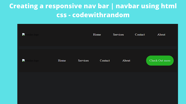
We have all seen this and, it is the most common type of navbar. At the end of the code, it will look like this.
Making any navbar is easy if we know the basics of moving around the elements and know the flex property. The rest of the styling lies with our creativity.
Ecommerce Website Using HTML, CSS, & JavaScript (Source Code)
So, this simple navbar code is as follows.
First, create a simple nav tag, and a logo for the page, and then add an unordered list with any choice of list items in it. Change the CSS accordingly later on.
<nav class="nav1">
    <div class="logo"><img src="LogoNew.png" alt="watches logo" /></div>
    <ul class="ul1">
        <li class="li1"><a href="">Home</a></li>
        <li class="li1"><a href="">Services</a></li>
        <li class="li1"><a href="">Contact</a></li>
        <li class="li1"><a href="">About</a></li>
    </ul>
</nav>
The codepen output will also be shown at the end of each navbar code and at last we will implement one navbar as responsive.
Then let us create the basic CSS of the navbar.
 * {
     margin: 0;
     padding: 0;
     font-family: "poppins", sans-serif;
    }
    body {
     background-color: #1c1d1f;
    }

.nav1 {
display: flex;
justify-content: space-between;
padding: 20px;
background-color: rgba(24, 21, 21, 0.705);
align-items: center;
}

img {
width: 400px;
}

.ul1 {
display: flex;
gap: 30px;
font-size: 1.2em;
padding-right: 20px;
}

.li1 {
list-style: none;
padding: 20px;
width: 70px;
text-align: center;
border-radius: 30px;
}
Let us now break down the code. Don’t worry. It is simple than it is in length. First, we are giving the body background color.
Then the nav is made as flex and, here lies the most crucial part. We can control how elements are positioned in the flex using the justify-content property.
100+ JavaScript Projects With Source Code ( Beginners to Advanced)
For the whole article, we will use the same.
Then the padding and align-center property to set nav elements along the axis correctly. Similar properties are applied to the “.ul1” and it is given a gap of 30px.
The list items are given padding of 20px and a border radius of 30px to create extra space around them, to display the hover effect smoothly.
The last part includes removing the text style of the list items, changing their color, and making them change the background on hover.
.li1:hover {
    background-color: rgb(52, 194, 52);
    border-radius: 30px;
    transition: 0.4s;
    color: #fff;
}
.ul1 .li1 a {
    text-decoration: none;
    color: rgb(236, 233, 233);
}
2)Logo to left, main links to center, and a dropdown list to the right :
In this style of the navbar, we add a dropdown list basically a ul with some items when we click on a text that will disappear when clicked anywhere on the nav.
Let’s have a glance at the output first and then build it.
So, the specialty of this type of navbar is that it can hold more accessible items in a dropdown manner and, the navbar will not get congested.
ADVERTISEMENT
Portfolio Website Using HTML CSS And JAVASCRIPT ( Source Code)
ADVERTISEMENT
The code:
ADVERTISEMENT
First up let us use the same HTML code we used for the first navbar and add an anchor tag for the text of the dropdown list and add another unordered list with the extra items we require.
ADVERTISEMENT
<nav class="nav2" onclick="over()">
    <div class="logo"><img src="LogoNew.png" alt="watches logo" /></div>
    <ul class="ul2">
        <li class="li2"><a href="">Home</a></li>
        <li class="li2"><a href="">Services</a></li>
        <li class="li2"><a href="">Contact</a></li>
        <li class="li2"><a href="">About</a></li>
    </ul>
    <a class="link-down" href="#" onmouseover="down()">Check Out more</a>
</nav>
<ul class="other" id="ul-down">
    <li><a href="">CSS tricks</a></li>
    <li><a href="">Pure CSS Hamburger Menu</a></li>
    <li><a href="">HTML Portfolio</a></li>
    <li><a href="">And More...</a></li>
</ul>
Explanation:
ADVERTISEMENT
Here, we have created a second nav with an onclick event. The reason will be explained shortly. The same code for the nav from the first navbar was used. The new things added are the anchor tag for the text and, an unordered list to appear when clicked.
Let’s now see the CSS part for it. Most of the styling remains the same, so we will divide it into two parts, the basic styling and the styling for the drop-down.
Basic-styling:
.nav2 {
    display: flex;
    justify-content: space-between;
    padding: 20px;
    background-color: rgba(24, 21, 21, 0.705);
    align-items: center;
}
.ul1,
.ul2 {
    display: flex;
    gap: 20px;
    font-size: 1.2em;
    padding-right: 20px;
}
.li1,
.li2 {
    list-style: none;
    padding: 20px;
    width: 70px;
    text-align: center;
    border-radius: 30px;
}
.li1:hover,
.li2:hover {
    background-color: rgb(52, 194, 52);
    border-radius: 30px;
    transition: 0.4s;
    color: #fff;
}
.ul1 .li1 a,
.ul2 .li2 a {
    text-decoration: none;
    color: rgb(236, 233, 233);
}
.link-down {
    text-decoration: none;
    color: rgb(206, 216, 224);
    font-size: 1.2em;
    padding: 20px;
    background-color: rgb(36, 175, 36);
    border-radius: 30px;
}
.link-down:hover {
    color: #fff;
}
Drop-Down styling:
For the drop-down, we will use a border for the bottom of each list item. Initially, the opacity is 0 and the display is set to none. Only when clicking on the text it should appear.
.other {
     background-color: #fff;
     width: 200px;
     height: 259px;
     float: right;
     position: relative;
     top: -20px;
     left: -20px;
     opacity: 0%;
     display: none;
    }
    .other li {
     padding: 20px;
     border-bottom: 2px solid rgb(170, 164, 164);
     list-style: none;
     text-align: center;
    }

.other li a:hover {
color: rgb(36, 175, 36);
}
.other li a {
text-decoration: none;
color: rgb(2, 2, 2);
}
The JS part for it.
10+ Javascript Projects For Beginners With Source Code
Here in the JS part, we use two simple functions and change the style of the required elements using the HTML DOM methods.
 <script>
   function down() {
    document.getElementById("ul-down").style.opacity = "100%";
    document.getElementById("ul-down").style.display = "block";
   }

function over() {
document.getElementById("ul-down").style.display = "none";
}
</script>The reason I have included the script tag above the nav tag is that, before we interact with the menu of the page, we need to load the JS part.
We will end the article by making it responsive and, then explain the descriptive part of another nav type.
Making One of the nav responsive:
Restaurant Website Using HTML and CSS
Let’s make the first nav responsive to mobile devices and other small-screen devices.
To keep it simple, we will use the drop-down from the second navbar as the drop-down for the first navbar when it is responsive.
So, when the navbar is responsive, we need an icon to get the links in the navbar.
For that, we shall use the font awesome icon menu bars. and style it so, it is invisible when normal.
<div class="bar-ico">
    <i class="fas fa-bars fa-2x bars" onmouseover="down()"></i>
</div>
.bar-ico {
     display: none;
    }

i {
color: white;
position: relative;
right: 10px;
}@media screen and (max-width: 620px) {
.ul1 {
display: none;
}
.bar-ico {
display: block;
}
.nav1img {
width: 200px;
}
}
@media screen and (max-width: 870px) {
.nav1img {
width: 200px;
}
.nav1 {
gap: 50px;
}
.nav2 {
display: none;
}Now, the explanation. We are telling that when the screen width is less than 870 px, disable the second nav and decrease the width of the logo.(the image is given a class=”nav1img”), increase the gap between logo and nav-items.
We are also mentioning that when the width is less than 620px, decrease the image width more and make the nav links go display:none , make the icon class i.e, .bar-ico visible.
Let us see the codepen part of it.
50+ HTML, CSS & JavaScript Projects With Source Code
(codepen part is glitching and needs to be done, DONT PUBLISH)
So, the third type of nav is the one where every nav link can have a drop-down and it is especially used when that particular link leads to more useful info within the page or related pages.
This is the end of the article where we talk about the different types of basic navs that can be created and used for different scenarios. This is just a beginner-friendly tutorial and can be done in many other ways.
Thank you.
Written By: Aneesh Malapaka.


