3D Rotating Image Gallery using HTML, CSS, and JavaScript
Welcome to the Codewithrandom blog. In this blog, we will learn how to create 3D Rotating Image Gallery using HTML, CSS, and JavaScript. We hope that, you will learn something new and unique.
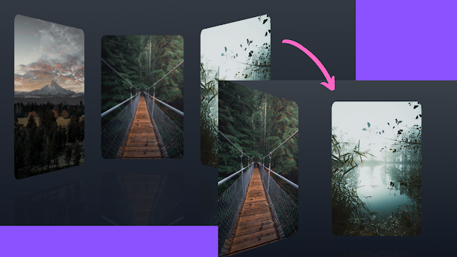
3D Rotating Image Gallery is a gallery UI, where images are 3D rotating when user scroll on it. It is a eye catchy UI design, which enhance a website Frontend UI. So this the tutorial of How to create 3D Rotating Image Gallery using HTML, CSS, and JavaScript.
How do you make a 3D Image rotate in CSS?
You can easily rotate Image or any other elements by using a CSS property called rotate3d() this CSS transforming function which transform an element to rotate3d, you have to add some values inside the backet “( )” like: rotate3d(x, y, z, a)
- “x” Is a number which describe the x-coordinate
- “y” is a number which describe the y-coordinate
- “z” is a number which describe the z-coordinate
- “a” is a angel which represent the rotation angel
Preview of the 3D Rotating Image Gallery
| project name | 3D Rotating Image Gallery |
| Code By | Julien Sulpis |
| Written By | Code With Random/Anki |
| Project Download | CodePen link given below |
| Language Used | HTML, CSS, and JavaScript |
| External Link / Dependencies | yes |
| Responsive | N/A |
HTML Code of 3D Rotating Image Gallery
Here is the Html code of the 3D Rotating Image Gallery. HTML code has only one line code of <main> tag. Now, you can see output without Css and JavaScript Code.
Copy the HTML code and paste it in your index.html file.
<main></main>

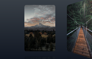
Blank Output With Blank Html Tag
CSS Code of 3D Rotating Image Gallery
* {
margin: 0;
padding: 0;
box-sizing: border-box;
}
body {
height: 100vh;
perspective: 800px;
overflow: hidden;
display: grid;
place-items: center;
background: linear-gradient(#3a4149, #111722);
}
main {
position: relative;
transform-style: preserve-3d;
width: 50vmin;
height: 75vmin;
transition: all 500ms cubic-bezier(0.4, 0, 0.2, 1);
}
img {
width: 100%;
height: 100%;
object-fit: cover;
transition: all 300ms cubic-bezier(0.4, 0, 0.2, 1);
}
article {
position: absolute;
inset: 0;
-webkit-box-reflect: below 50px linear-gradient(transparent, rgba(255, 255, 255, 0.15));
}
article button {
border: 0;
outline: 0;
cursor: pointer;
width: 100%;
height: 100%;
overflow: hidden;
border-radius: 5%;
transition: all 300ms cubic-bezier(0.4, 0, 0.2, 1);
}
article button:focus-visible {
box-shadow: 0 0 0 3px cyan;
}
article button:focus {
box-shadow: 0 0 0 3px cyan;
}
article button:focus:not(:focus-visible) {
box-shadow: none;
}
article button:hover, article button:focus, article button:hover img, article button:focus img {
transform: scale(1.07);
}
50+ Html ,Css & Javascript Projects With Source Code
Output after adding CSS
/**
* Initially the elements are positioned in front of the camera.
* We define here the transformations to position them in the scene.
* When clicking on an item, we apply the inversed transformation but on the main container to "zoom" on the item
*/
const articles = new Map([
["6392322", { tx: "-90%", tz: "-70vmin", ry: "60deg" }],
["1761279", { tz: "-110vmin" }],
["1679772", { tx: "90%", tz: "-70vmin", ry: "-60deg" }]
]);
window.addEventListener("load", () => {
const main = document.querySelector("main");
for (const [id, { tx, tz, ry }] of articles.entries()) {
main.appendChild(makeArticleElement(id, tx, tz, ry));
}
document.addEventListener("click", ({ target }) => {
const targetId = target.closest("article")?.id;
let [itx, itz, iry] = [0, 0, 0]; // inversed transformation to apply to the main element
if (targetId && main.dataset.focus !== targetId) {
// zoom in
const { tx, tz, ry } = articles.get(targetId) || {};
[itx, itz, iry] = [tx, tz, ry].map(inverseTransformation);
main.setAttribute("data-focus", targetId);
} else {
// zoom out
main.removeAttribute("data-focus");
}
main.style.transform = `rotateY(${iry}) translate3d(${itx}, 0, ${itz})`;
});
});
// e.g. turn "90%" into "-90%" or "-10vmin" into "10vmin"
function inverseTransformation(transform) {
if (!transform) return 0;
const [_, value, unit] = transform.match(/(-?d+)(.*)/);
return `${-Number(value)}${unit}`;
}
function makeArticleElement(id, tx = 0, tz = 0, ry = 0) {
const img = document.createElement("img");
img.src = `https://images.pexels.com/photos/${id}/pexels-photo-${id}.jpeg?auto=compress&cs=tinysrgb&dpr=1&w=500`;
const button = document.createElement("button");
button.appendChild(img);
const element = document.createElement("article");
element.id = id;
element.style.transform = `translate3d(${tx}, 0, ${tz}) rotateY(${ry})`;
element.appendChild(button);
return element;
}
Final output of 3D Rotating Image Gallery
Now that we have completed our 3D Rotating Image Gallery with Rotating Images. Here is our updated output with Html, Css, and JavaScript. Hope you like the 3D Rotating Image Gallery. You can see the output video, you can test as your project too on codepen preview.
In this post, we learn how to create a 3D Rotating Image Gallery using HTML, CSS, and JavaScript. If we made a mistake or any confusion, please drop a comment to reply or help you in easy learning.
Thank you!
Written by – Code With Random/Anki
Code by – Julien Sulpis
How Do You Make A 3D Image Rotate In CSS?
You Can Easily Rotate Image Or Any Other Elements By Using A CSS Property Called Rotate3d() This CSS Transforming Function Which Transform An Element To Rotate3d, You Have To Add Some Values Inside The Backet “( )” Like: Rotate3d(X, Y, Z, A)
3D Rotating Image Gallery
3D Rotating Image Gallery Is A Gallery UI, Where Images Are 3D Rotating When User Scroll On It. It Is A Eye Catchy UI Design, Which Enhance A Website Frontend UI. So This The Tutorial Of How To Create 3D Rotating Image Gallery Using HTML, CSS, And JavaScript.
3D Rotate In CSS
You Can Easily Rotate Image Or Any Other Elements By Using A CSS Property Called Rotate3d() This CSS Transforming Function Which Transform An Element To Rotate3d, You Have To Add Some Values Inside The Backet “( )” Like: Rotate3d(X, Y, Z, A)
“X” Is A Number Which Describe The X-Coordinate
“Y” Is A Number Which Describe The Y-Coordinate
“Z” Is A Number Which Describe The Z-Coordinate
“A” Is A Angel Which Represent The Rotation Angel
