Flipping Card Effect| Flipping Card Using HTML CSS Javascript
Learners, In this article we are going to design Flipping Card Effect. Like in some web pages you must have interacted with a layout where on the front side you are able to see some image or half-written content but at the end, it gives instruction that plz hover it or form know more click on the arrow button. This is one of the components of web pages using the flip card method that helps us to place more content in less place and also make it interactive.
Learner, I’m sure you are putting pressure on your head about what this is all about so don’t worry within the moment you will be attached with a project preview that will make more clearance on your mind😉.
Hey learners..!
Welcome to our 🎊 today’s blog with code with random. In this blog, we gonna learn how we can design a Flipping Card Effect Project Using HTML CSS JAVASCRIPT.
Let’s have a look at our project.
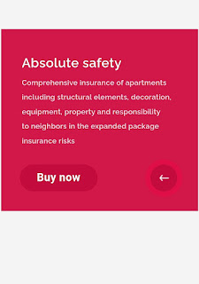
As you are looking in the project preview this is the front page of the card and at the right corner, there is an arrow button if you will hover on it then the card will show flip behavior, and the back page will preview with awesome arrow animation.
This is the back cover content of the card.
HTML SECTION
Here I’m not going to add a structure of the HTML file from scratch, I will just paste the body part, it is so because the body is the main part of our designing a browser.
We have the following part in the HTML section.
- First, we have a container that will enclose all other parts of the whether project.
- Within the container, we have div with flip_box. Which contain both front content and back content.
- Then at the end, we have a separate div for containing arrow animation.
Go through the below code 👇 and run it in your IDE or where you used to design just HTML without CSS styling.
 <div class='container'>
  <div class='flip_box'>
   <div class='front'>
    <p class='f_title'>Property insurance</p>
    <p class='f_subline'>Pack</p>
    <h1 class='f_headline'>Absolute safety</h1>
   </div>
   <div class='back'>
    <h1 class='b_headline'>Absolute safety</h1>
    <p class='b_text'>Comprehensive insurance of apartments<br />including structural elements, decoration,<br /> equipment, property and responsibility<br />to neighbors in the expanded package<br />insurance risks</p>
    <button class='b_button'><span>Buy now</span></button>
   </div>
  </div>
  <div class='r_wrap'>
   <div class='b_round'></div>
   <div class='s_round'>
    <div class='s_arrow'></div>
   </div>
  </div>
 </div>
CSS SECTION
By CSS we will design our container and will bring it in the center and then we will set the width for both the containable div and will place them one after another so that only the front part of the card will preview.
The Below code will analyze you more👇. So just add in your HTML half complete file and wait to watch some magic.
 * {
  margin: 0 auto;
  padding: 0;
 }
 *:focus {
  outline: none;
 }
 body {
  margin-top: 70px;
  background-color: #f4f4f4;
  font-family: 'Raleway', sans-serif;
  font-size: 62.5%;
  -webkit-font-smoothing: antialiased;
  -moz-osx-font-smoothing: grayscale;
 }
 h1,
 p,
 a,
 span {
  color: #fff;
  letter-spacing: 0.02em;
  font-weight: 600;
 }
 h1,
 p,
 a {
  padding-left: 40px;
 }
 h1 {
  font-size: 2.5em;
 }
 p {
  font-size: 1.5em;
  line-height: 25px;
 }
 button {
  border: 0;
  border-radius: 26px;
  padding-bottom: 2px;
 }
 span {
  font-size: 1.6em;
 }
 .container,
 .flip-box,
 .front,
 .back {
  width: 380px;
  height: 350px;
 }
 .container,
 .flip_box {
  position: relative;
 }
 .front,
 .back {
  position: absolute;
  -webkit-backface-visibility: hidden;
  -moz-backface-visibility: hidden;
  backface-visibility: hidden;
 }
 .container {
  -moz-transform: perspective(1200px);
  -webkit-perspective: 1200px;
  perspective: 1200px;
 }
 .flip_box {
  transition: all 0.5s ease-out;
  -webkit-transform-style: preserve-3d;
  -moz-transform-style: preserve-3d;
  transform-style: preserve-3d;
 }
 .front {
  background-color: #024395;
  background-image: url('https://img-fotki.yandex.ru/get/194550/29644339.5/0_d6c5f_c9f15850_orig');
 }
 .f_title {
  padding-top: 30px;
 }
 .f_subline {
  padding-top: 205px;
  color: #B1D4E8;
 }
 .f_headline {
  line-height: 23px;
 }
 .back {
  background-color: #D21849;
  -webkit-transform: rotateY(180deg);
  -moz-transform: rotateY(180deg);
  -ms-transform: rotateY(180deg);
  transform: rotateY(180deg);
 }
 .b_headline {
  padding-top: 50px;
 }
 .b_text {
  font-size: 1.4em;
  line-height: 28px;
  padding-top: 10px;
  opacity: 0.85;
 }
 .b_button {
  position: absolute;
  left: 36px;
  bottom: 38px;
  width: 150px;
  height: 52px;
  background-color: #C30C3D;
  transition: all 0.3s;
 }
 .b_button:hover {
  background-color: #E30143;
 }
 .flipped {
  -webkit-transform: rotateY(-180deg);
  -moz-transform: rotateY(-180deg);
  -ms-transform: rotateY(-180deg);
  transform: rotateY(-180deg);
 }
 .r_wrap {
  position: absolute;
  right: 40px;
  bottom: 38px;
 }
 .b_round,
 .s_round {
  position: absolute;
  right: 0px;
  bottom: 0px;
  width: 52px;
  height: 52px;
  border-radius: 50%;
  background-color: #D21849;
  transition: all 0.2s linear;
 }
 .b_round {
  opacity: 0;
  background-color: #D21849;
 }
 .b_round_hover {
  transform: scale(1.37);
  opacity: 0.4;
 }
 .b_round_back_hover {
  background-color: #F60044;
 }
 .s_round_click {
  transform: scale(1.7);
 }
 .s_round_back {
  background-color: #C30C3D;
 }
 .s_arrow {
  width: 52px;
  height: 52px;
  background-image: url('https://img-fotki.yandex.ru/get/194549/29644339.5/0_d6c60_1d7815f0_orig');
  background-color: transparent;
  transition: all 0.35s linear;
 }
 .s_arrow_rotate {
  transform: rotate(-180deg);
 }
Javascript section
In the Javascript part, we will add magic logic as initially when our page will be loaded then only our front part of the card will preview with awesome designing and if any user interect with card and hover on the arrow icon then from the moment card will flip and preview the back side of the card.
For observing this magic for this project then you should add the js file with the rest of the HTML and CSS file and enjoy this project and deploy it on Github.
 $(document).ready(function() {
  var s_round = '.s_round';
  $(s_round).hover(function() {
   $('.b_round').toggleClass('b_round_hover');
   return false;
  });
  $(s_round).click(function() {
   $('.flip_box').toggleClass('flipped');
   $(this).addClass('s_round_click');
   $('.s_arrow').toggleClass('s_arrow_rotate');
   $('.b_round').toggleClass('b_round_back_hover');
   return false;
  });
  $(s_round).on('transitionend', function() {
   $(this).removeClass('s_round_click');
   $(this).addClass('s_round_back');
   return false;
  });
 });
A live preview of our project is attached below refer to this codepen
See the Pen Flipping card by Sergey Nikishkin (@nikishkin) on CodePen.
By this blog… We have learned how we can design a Flipping Card Effect Project HTML CSS JAVASCRIPT.
Now I’m looking for your reviews.
So, How was the blog 😁, Learners!
If you want a more crisp blog like this then please check our Blogs sites CodewithRandom. keep tuned with us because every day you will learn something new here.😊
I hope that I’m able to make you understand this topic and that you have learned something new from this blog. If you faced any difficulty feel free to drop a comment down your problems and if you liked it, please show your love in the comment section. This fills bloggers’ hearts with enthusiasm for writing more new blogs.
You can follow me on Instagram
Written by @Ankit kumar
Code by @nikishkin
.png)


