Animated Login Form Using HTML and CSS
Welcome, Coders! Here we are at codewithrandom again. In this blog post, we create an Animated Login Form Using Html And Css With Source Code.
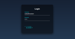
In this lesson, we’ll create an animated login form Using HTML and CSS. We have a username and password input field with floating placeholder animation.
I’m confident you’ll be disappointed by the animated version we produce. Since it can be difficult to make mobile-responsive forms, we also used responsive design to build this form, so this article also contains responsive code.
I hope you enjoy our blog so let’s start with a basic html structure for the Login Form.
| Code by | Soufiane Khalfaoui HaSsani |
| Project Download | Link Available Below |
| Language used | HTML and CSS |
| External link / Dependencies | No |
| Responsive | No |
Animated Login Form Html Code:-
<div class="login-box">
<h2>Login</h2>
<form>
<div class="user-box">
<input type="text" name="" required="">
<label>Username</label>
</div>
<div class="user-box">
<input type="password" name="" required="">
<label>Password</label>
</div>
<a href="#">
<span></span>
<span></span>
<span></span>
<span></span>
Submit
</a>
</form>
</div>
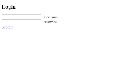
There is all the Html code for the animated Login Form. Now, you can see output without CSS, then we write CSS for the Animated Login Form.
Restaurant Website Using HTML And CSS With Source Code
Output:-
Animated Login Form Css Code:-
html {
height: 100%;
}
body {
margin:0;
padding:0;
font-family: sans-serif;
background: linear-gradient(#141e30, #243b55);
}
.login-box {
position: absolute;
top: 50%;
left: 50%;
width: 400px;
padding: 40px;
transform: translate(-50%, -50%);
background: rgba(0,0,0,.5);
box-sizing: border-box;
box-shadow: 0 15px 25px rgba(0,0,0,.6);
border-radius: 10px;
}
.login-box h2 {
margin: 0 0 30px;
padding: 0;
color: #fff;
text-align: center;
}
.login-box .user-box {
position: relative;
}
.login-box .user-box input {
width: 100%;
padding: 10px 0;
font-size: 16px;
color: #fff;
margin-bottom: 30px;
border: none;
border-bottom: 1px solid #fff;
outline: none;
background: transparent;
}
.login-box .user-box label {
position: absolute;
top:0;
left: 0;
padding: 10px 0;
font-size: 16px;
color: #fff;
pointer-events: none;
transition: .5s;
}
.login-box .user-box input:focus ~ label,
.login-box .user-box input:valid ~ label {
top: -20px;
left: 0;
color: #03e9f4;
font-size: 12px;
}
.login-box form a {
position: relative;
display: inline-block;
padding: 10px 20px;
color: #03e9f4;
font-size: 16px;
text-decoration: none;
text-transform: uppercase;
overflow: hidden;
transition: .5s;
margin-top: 40px;
letter-spacing: 4px
}
.login-box a:hover {
background: #03e9f4;
color: #fff;
border-radius: 5px;
box-shadow: 0 0 5px #03e9f4,
0 0 25px #03e9f4,
0 0 50px #03e9f4,
0 0 100px #03e9f4;
}
.login-box a span {
position: absolute;
display: block;
}
.login-box a span:nth-child(1) {
top: 0;
left: -100%;
width: 100%;
height: 2px;
background: linear-gradient(90deg, transparent, #03e9f4);
animation: btn-anim1 1s linear infinite;
}
@keyframes btn-anim1 {
0% {
left: -100%;
}
50%,100% {
left: 100%;
}
}
.login-box a span:nth-child(2) {
top: -100%;
right: 0;
width: 2px;
height: 100%;
background: linear-gradient(180deg, transparent, #03e9f4);
animation: btn-anim2 1s linear infinite;
animation-delay: .25s
}
@keyframes btn-anim2 {
0% {
top: -100%;
}
50%,100% {
top: 100%;
}
}
.login-box a span:nth-child(3) {
bottom: 0;
right: -100%;
width: 100%;
height: 2px;
background: linear-gradient(270deg, transparent, #03e9f4);
animation: btn-anim3 1s linear infinite;
animation-delay: .5s
}
@keyframes btn-anim3 {
0% {
right: -100%;
}
50%,100% {
right: 100%;
}
}
.login-box a span:nth-child(4) {
bottom: -100%;
left: 0;
width: 2px;
height: 100%;
background: linear-gradient(360deg, transparent, #03e9f4);
animation: btn-anim4 1s linear infinite;
animation-delay: .75s
}
@keyframes btn-anim4 {
0% {
bottom: -100%;
}
50%,100% {
bottom: 100%;
}
}
First, we’ll use the html tag selector to set the height to 100%. Next, we’ll use the body tag selector to set the padding and margin to zero. Finally, we’ll use the font family property to set the font family to sans-serif. Finally, we’ll use the background property to set the background to a linear gradient of the colours blue and black.
Snake Game Using HTML,CSS and JavaScript With Source Code
html {
  height: 100%;
}
body {
  margin:0;
  padding:0;
  font-family: sans-serif;
  background: linear-gradient(#141e30, #243b55);
}
Now, using the class selector (.login-box), we will fix the position to absolute, and using the top and left properties, we will leave a 50% space from the top and left. We’ll set the breadth of our login form to 400px using the width property.
We’ll use the hover attribute to add styling to our button. Along with that, we are going to add the hover property to the button. Using the keyframe, we are also going to animate the boundary around the button.
.login-box {
  position: absolute;
  top: 50%;
  left: 50%;
  width: 400px;
  padding: 40px;
  transform: translate(-50%, -50%);
  background: rgba(0,0,0,.5);
  box-sizing: border-box;
  box-shadow: 0 15px 25px rgba(0,0,0,.6);
  border-radius: 10px;
}

.login-box h2 {
  margin: 0 0 30px;
  padding: 0;
  color: #fff;
  text-align: center;
}

.login-box .user-box {
  position: relative;
}

.login-box .user-box input {
  width: 100%;
  padding: 10px 0;
  font-size: 16px;
  color: #fff;
  margin-bottom: 30px;
  border: none;
  border-bottom: 1px solid #fff;
  outline: none;
  background: transparent;
}
.login-box .user-box label {
  position: absolute;
  top:0;
  left: 0;
  padding: 10px 0;
  font-size: 16px;
  color: #fff;
  pointer-events: none;
  transition: .5s;
}

.login-box .user-box input:focus ~ label,
.login-box .user-box input:valid ~ label {
  top: -20px;
  left: 0;
  color: #03e9f4;
  font-size: 12px;
}

.login-box form a {
  position: relative;
  display: inline-block;
  padding: 10px 20px;
  color: #03e9f4;
  font-size: 16px;
  text-decoration: none;
  text-transform: uppercase;
  overflow: hidden;
  transition: .5s;
  margin-top: 40px;
  letter-spacing: 4px
}

.login-box a:hover {
  background: #03e9f4;
  color: #fff;
  border-radius: 5px;
  box-shadow: 0 0 5px #03e9f4,
              0 0 25px #03e9f4,
              0 0 50px #03e9f4,
              0 0 100px #03e9f4;
}

.login-box a span {
  position: absolute;
  display: block;
}

.login-box a span:nth-child(1) {
  top: 0;
  left: -100%;
  width: 100%;
  height: 2px;
  background: linear-gradient(90deg, transparent, #03e9f4);
  animation: btn-anim1 1s linear infinite;
}

@keyframes btn-anim1 {
  0% {
    left: -100%;
  }
  50%,100% {
    left: 100%;
  }
}

.login-box a span:nth-child(2) {
  top: -100%;
  right: 0;
  width: 2px;
  height: 100%;
  background: linear-gradient(180deg, transparent, #03e9f4);
  animation: btn-anim2 1s linear infinite;
  animation-delay: .25s
}

@keyframes btn-anim2 {
  0% {
    top: -100%;
  }
  50%,100% {
    top: 100%;
  }
}

.login-box a span:nth-child(3) {
  bottom: 0;
  right: -100%;
  width: 100%;
  height: 2px;
  background: linear-gradient(270deg, transparent, #03e9f4);
  animation: btn-anim3 1s linear infinite;
  animation-delay: .5s
}

@keyframes btn-anim3 {
  0% {
    right: -100%;
  }
  50%,100% {
    right: 100%;
  }
}

.login-box a span:nth-child(4) {
  bottom: -100%;
  left: 0;
  width: 2px;
  height: 100%;
  background: linear-gradient(360deg, transparent, #03e9f4);
  animation: btn-anim4 1s linear infinite;
  animation-delay: .75s
}

@keyframes btn-anim4 {
  0% {
    bottom: -100%;
  }
  50%,100% {
    bottom: 100%;
  }
}
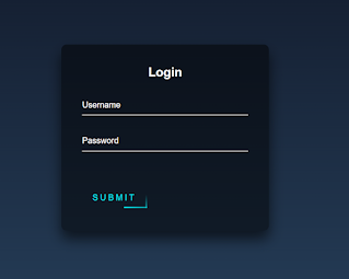
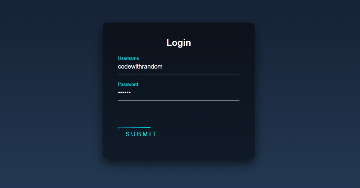
Now we have completed our Animated Login Form. Here is our final updated output HTML CSS.
100+ HTML,CSS and JavaScript Projects With Source Code ( Beginners to Advanced)
Final Output Of Animated Login Form Using Html and Css:-

Portfolio Website using HTML and CSS (Source Code)
Here is our updated output with CSS. I hope you like the Animated Login Form. You can see output project screenshots. See our other blogs and gain knowledge in front-end development.
ADVERTISEMENT
Video Output Animated Login Form:
Thank you!
ADVERTISEMENT
In this post, we learn how to create an Animated Login Form Using HTML and CSS. If we made a mistake or any confusion, please drop a comment to reply or help you learn easily.
ADVERTISEMENT
Written by – Code With Random/Anki
ADVERTISEMENT
Code by – Soufiane Khalfaoui HaSsani
ADVERTISEMENT
Which code editor do you use for this Animated Login Form coding?
I personally recommend using VS Code Studio, it’s straightforward and easy to use.
What is a login form?
Login forms are a type of authentication that most websites use to grant access to the genuine user by entering their login information, which enables them to grant access to the individual.
What is an Animation?
A gradual style shift is made possible by an animation for an element. The number of times you can modify a CSS property is up to you. The keyframes for the animation must be specified before using CSS animation. What styles an element will have at particular moments are stored in keyframes.



The sumit tag is not clickable and css not working after form tag. [ .login-box form a{
….
} ]
same me not working css or style.css ?