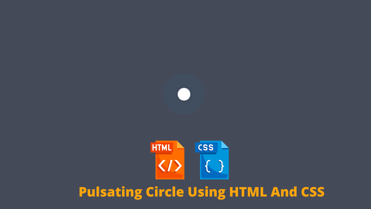
Create Circle Animation Using HTML And CSS
Hey Guys, Welcome To Our Blog, In Today’s Blog We Are Going To See How To Create An Circle Animation Using HTML and CSS.
A Pulsating is a type of animation in which it may blink infinitely like an loading screen to show the pulsating effects. Here we do that effect in a circle , so that’s why it is Pulsating Circle. And that is going to done with HTML and CSS.
So, Let’s Begin Our Pulsating Circle Animation Project By Adding The Source Codes. For That, First, We Are Using The Html Code.
50+ HTML, CSS & JavaScript Projects With Source Code
HTML Code For Circle Animation
<div class="pulsating-circle"></div>
Here we simply add one line of code to perform pulsating effect and that’s why there is no content were given. We just creating an div class with a name (pulsating-circle) then closing the div tag.
Ecommerce Website Using Html Css And Javascript
These line will be called by name in CSS and the Pulsating Circle animation were performed on it. So for that we are using the CSS code which is mentioned below.
CSS Code For Circle Animation
body {
    background: #454a59;
}

.pulsating-circle {
  position: absolute;
  left: 50%;
  top: 50%;
  transform: translateX(-50%) translateY(-50%);
  width: 30px;
  height: 30px;

  &:before {
    content: '';
    position: relative;
    display: block;
    width: 300%;
    height: 300%;
    box-sizing: border-box;
    margin-left: -100%;
    margin-top: -100%;
    border-radius: 45px;
    background-color: #01a4e9;
    animation: pulse-ring 1.25s cubic-bezier(0.215, 0.61, 0.355, 1) infinite;
  }

  &:after {
    content: '';
    position: absolute;
    left: 0;
    top: 0;
    display: block;
    width: 100%;
    height: 100%;
    background-color: white;
    border-radius: 15px;
    box-shadow: 0 0 8px rgba(0,0,0,.3);
    animation: pulse-dot 1.25s cubic-bezier(0.455, 0.03, 0.515, 0.955) -.4s infinite;
  }
}

@keyframes pulse-ring {
  0% {
    transform: scale(.33);
  }
  80%, 100% {
    opacity: 0;
  }
}

@keyframes pulse-dot {
  0% {
    transform: scale(.8);
  }
  50% {
    transform: scale(1);
  }
  100% {
    transform: scale(.8);
  }
}
The First Step is We just adding background in the body section and then we calling out the div class name and applying the circle method by adding top , left, width, height and then a transforming property for animation.
body {
    background: #454a59;
}

.pulsating-circle {
  position: absolute;
  left: 50%;
  top: 50%;
  transform: translateX(-50%) translateY(-50%);
  width: 30px;
  height: 30px;
The Second Step is We are adding the animation of ring which is the center of circle will start blinking so that it performs some animate related to pulsating.
For that , we are using width and height for size, margin and padding for alignments, a background color , display property for straight line which is block and lastly the animation name with respective values for specific animation effect with timing (infinite).
Create Simple Portfolio Website Using Html Css (Portfolio Source Code)
Now we adding the animation using the keyframes property by placing some certain rules which here is percentage and fixing the animation using transform property and the value for it by scale. But here we have to mention some value inside scale so the animate will effect according the values entered.
But Foremost Thing is These are going to be done in the Before:: property which means they will be executed before when another additional effects is also added.
&:before {
    content: '';
    position: relative;
    display: block;
    width: 300%;
    height: 300%;
    box-sizing: border-box;
    margin-left: -100%;
    margin-top: -100%;
    border-radius: 45px;
    background-color: #01a4e9;
    animation: pulse-ring 1.25s cubic-bezier(0.215, 0.61, 0.355, 1) infinite;
  }

@keyframes pulse-ring {
  0% {
    transform: scale(.33);
  }
  80%, 100% {
    opacity: 0;
  }
}
Gym Website Using HTML and CSS With Source Code
In the Third step the outer circle gets animated and it will be diminished when reaches end and it will be performed infinite times.
The procedure used here is as similar has the second step but some values might be change. And Instead of before here we have used after:: so this specific animation will perform after another animation has done.
&:after {
    content: '';
    position: absolute;
    left: 0;
    top: 0;
    display: block;
    width: 100%;
    height: 100%;
    background-color: white;
    border-radius: 15px;
    box-shadow: 0 0 8px rgba(0,0,0,.3);
    animation: pulse-dot 1.25s cubic-bezier(0.455, 0.03, 0.515, 0.955) -.4s infinite;
  }
}
@keyframes pulse-dot {
  0% {
    transform: scale(.8);
  }
  50% {
    transform: scale(1);
  }
  100% {
    transform: scale(.8);
  }
}
Now We have completed the project by adding the respective source codes for it and we are able to see the project preview in the below Output Section.
Final Output Of Pulsating Circle Animation Using HTML And CSS
Live Preview Of Pulsating Circle Animation Using HTML And CSS
ADVERTISEMENT
Now We have Successfully created our Pulsating Circle Animation Using HTML and CSS. You can use this project for your personnel needs and the respective lines of code are given with the code pen link mentioned below.
ADVERTISEMENT
100+ JavaScript Projects With Source Code ( Beginners to Advanced)
ADVERTISEMENT
If you find out this Blog helpful, then make sure to search codewithrandom on google for Front End Projects with Source codes and make sure to Follow the Code with Random Instagram page.
ADVERTISEMENT
REFER CODE – Peeke
ADVERTISEMENT
WRITTEN BY – Ragunathan S


