Number Ticker Using HTML & CSS
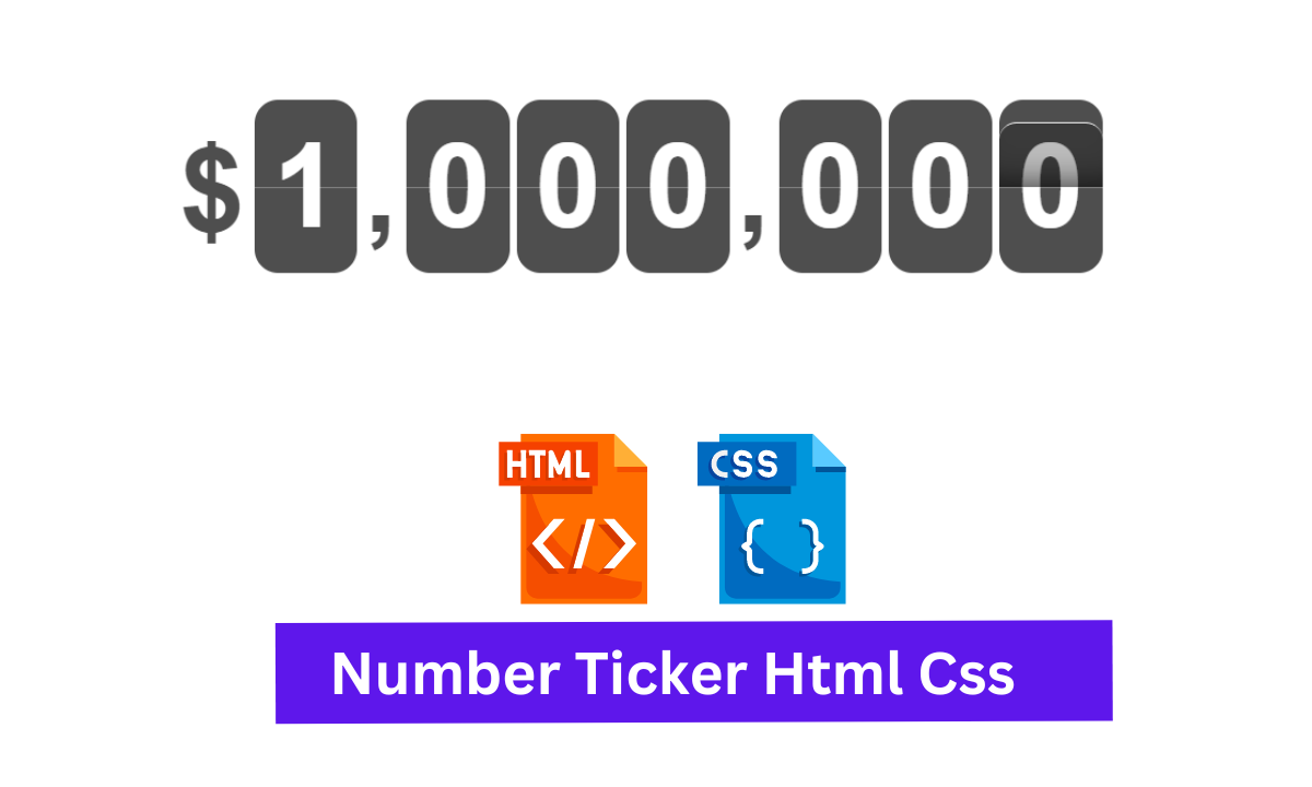
Hey Guys, Welcome To Our Blog, In Today’s Blog We Are Going To See How To Create An Number Ticker Using HTML & CSS. The Number Ticker is simply an animation performed on a number in between.
Here the animation is performed on the last digit which may look like a change in the digit. So this is the project we are going to create.
We’ll show you Number Ticker Using HTML & CSS with complete source code available for you so you just copy and paste it into your project.
So, Let’s Begin Our Number Ticker Project By Adding The Source Codes. For That, First, We Are Using The Html Code.
HTML CODE For Number Ticker
<body>
  <div class="ticker">
    <span class="ticker-symbol">$</span>
    <span class="ticker-number">1</span>
    <span class="ticker-symbol">,</span>
    <span class="ticker-number">0</span>
    <span class="ticker-number">0</span>
    <span class="ticker-number">0</span>
    <span class="ticker-symbol">,</span>
    <span class="ticker-number">0</span>
    <span class="ticker-number">0</span>
    <span class="ticker-number">0</span>
  </div>
</body>
Here We have inserted the HTML Code Successfully. Simply we just create a div class with a name ticker and add span tags with separate names and values for making animate on the last digit. Then closing the div tag as well as the body tag.
CSS CODE For Number Ticker
* {
  box-sizing: border-box;
  -webkit-font-smoothing: antialiased
}

body {
  font-family: Helvetica, sans-serif;
  padding: 2rem;
}

// Dark Gray
$color-base:              #4e4e4e;

// Colors
//=====================================================
.ticker {
  font-size: 5rem;
  font-weight: bold;
  margin: 0 auto;
}

@keyframes ticker-flip {
  0% {
    background-color: transparent;
    border-radius: 1rem 1rem 0 0;
    border-top: .01rem solid #fff;
    box-shadow: inset 0 -2rem 2rem -2rem rgba(#000, .75);
    top: 0;
    bottom: 50%;
  }
  50% {
    border-radius: 0 0 0 0;
    background-color: darken(#4e4e4e, 50%);
    border-bottom: 0;
    border-top: .2rem solid lighten(#4e4e4e, 50%);
    box-shadow: inset 0 0 0 0 rgba(#000, .75);
    top: 50%;
    bottom: 50%;
  }
  51% {
    background-color: lighten(#4e4e4e, 30%);
    border-bottom: .2rem solid lighten(#4e4e4e, 50%);
    border-top: 0;
  }
  100% {
    background-color: transparent;
    border-bottom: .01rem solid #000;
    border-radius: 0 0 1rem 1rem;
    box-shadow: inset 0 2rem 2rem -2rem rgba(#000, .75);
    top: 50%;
    bottom: 0;
  }
}

.ticker-number {
  border-radius: 1rem;
  color: #fff;
  background-color: $color-base;
  display: inline-block;
  float: left;
  margin-right: .3rem;
  padding: .8rem;
  position: relative;
  &:last-child {
    margin-right: 0;
  }
  &:after {
    content: '';
    border-bottom: 1px solid rgba(#fff, .3);
    display: block;
    margin-bottom: 2px;
    position: absolute;
      top: 50%;
      right: 0;
      left: 0;
  }
  &:last-child:before {
    animation: ticker-flip .5s linear .5s infinite;
    border-radius: 1rem 1rem 0 0;
    content: '';
    overflow: hidden;
    position: absolute;
      top: 0;
      right: 0;
      bottom: 50%;
      left: 0;
  }
}

.ticker-symbol {
  color: $color-base;
  float: left;
  margin-right: .4rem;
  padding: 1rem 0;
}
The First Step in CSS is adding the properties in the * and body sections. The properties were font family, border, and box-sizing which makes changes in fonts, borders, and layout. The Second Step is just calling out the div class name ticker and adding the font size and weight of the font with margin, So the ticker contents may get changes in font size, weight, and margins. The Code for the above steps.
* {
  box-sizing: border-box;
  -webkit-font-smoothing: antialiased
}

body {
  font-family: Helvetica, sans-serif;
  padding: 2rem;
}

// Dark Gray
$color-base:              #4e4e4e;

// Colors
//=====================================================
.ticker {
  font-size: 5rem;
  font-weight: bold;
  margin: 0 auto;
}
Now The Third Step is there are separate span class names entered one is “symbol” and “number” so for that we add separate properties one contains properties using child and parent, after:: properties, and another simply direct properties. The One that contains the child and parent, after:: properties were given as code down below.
.ticker-number {
  border-radius: 1rem;
  color: #fff;
  background-color: $color-base;
  display: inline-block;
  float: left;
  margin-right: .3rem;
  padding: .8rem;
  position: relative;
  &:last-child {
    margin-right: 0;
  }
  &:after {
    content: '';
    border-bottom: 1px solid rgba(#fff, .3);
    display: block;
    margin-bottom: 2px;
    position: absolute;
      top: 50%;
      right: 0;
      left: 0;
  }
  &:last-child:before {
    animation: ticker-flip .5s linear .5s infinite;
    border-radius: 1rem 1rem 0 0;
    content: '';
    overflow: hidden;
    position: absolute;
      top: 0;
      right: 0;
      bottom: 50%;
      left: 0;
  }
}
The Other one which is simple and direct properties is also given as code down below.
.ticker-symbol {
  color: $color-base;
  float: left;
  margin-right: .4rem;
  padding: 1rem 0;
}
Now we have done with adding styling to the contents. So lastly we are going to add animate properties with values that go one by one which impact makes changes in the last digit. We just call out the animation name and make adding of properties like background color, radius, top and bottom, shadow, etc… with the required values. For that, the code is given down below.
@keyframes ticker-flip {
  0% {
    background-color: transparent;
    border-radius: 1rem 1rem 0 0;
    border-top: .01rem solid #fff;
    box-shadow: inset 0 -2rem 2rem -2rem rgba(#000, .75);
    top: 0;
    bottom: 50%;
  }
  50% {
    border-radius: 0 0 0 0;
    background-color: darken(#4e4e4e, 50%);
    border-bottom: 0;
    border-top: .2rem solid lighten(#4e4e4e, 50%);
    box-shadow: inset 0 0 0 0 rgba(#000, .75);
    top: 50%;
    bottom: 50%;
  }
  51% {
    background-color: lighten(#4e4e4e, 30%);
    border-bottom: .2rem solid lighten(#4e4e4e, 50%);
    border-top: 0;
  }
  100% {
    background-color: transparent;
    border-bottom: .01rem solid #000;
    border-radius: 0 0 1rem 1rem;
    box-shadow: inset 0 2rem 2rem -2rem rgba(#000, .75);
    top: 50%;
    bottom: 0;
  }
}
Now The HTML & CSS is done adding. So it’s time to move on to make a preview of our project which is given in the Output Section.
Final Output Of Number Ticker
50+ Html, Css &Javascript Projects With Source Code
Now We have Successfully created our Number Ticker Using HTML & CSS. You can use this project for your personnel needs and the respective lines of code are given with the code pen link mentioned below.
If you find out this Blog helpful, then make sure to search code random on google for Front End Projects with Source codes and make sure to Follow the Code with Random Instagram page.
Thank You And Happy Learning!!!
WRITTEN BY – Ragunathan S


