Box Shadow Generator using HTML, CSS & JavaScript
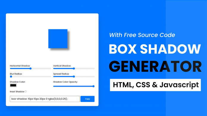
Hello, today we’re going to learn how to use HTML, CSS & JavaScript to create a Box Shadow Generator. By following these instructions, you can simply make this Box Shadow Generator in HTML, CSS & JavaScript. Simply by adhering to the procedures mentioned below, you will be able to develop this amazing Box Shadow Generator.

This project will is good for beginners and help them to build their front-end development skills. In Today’s session, We will use HTML, CSS, and JavaScript to complete this Box Shadow Generator Project.
Project Description
Step 1
The HTML (Hypertext Markup Language) will help us to create the structure for the list with some necessary attributes and elements to make Box Shadow Generator Project.
Step 2
Then we will use CSS (Cascading Stylesheet) which will help us to style or design the project with suitable padding and alignment in the Box Shadow Generator Project.
Step 3
At last we will use JS (JavaScript) which will add a logic to make the Box Shadow Generator Project functioning from the user end.
I hope you have got an idea about the project.
HTML Code for Box Shadow Generator
<html lang="en">
  <head>
    <meta name="viewport" content="width=device-width, initial-scale=1.0" />
    <title>Box Shadow Generator</title>
    <!-- Google Font -->
    <link
      href="https://fonts.googleapis.com/css2?family=Poppins&display=swap"
      rel="stylesheet"
    />
    <!-- Stylesheet -->
    <link rel="stylesheet" href="style.css" />
  </head>
  <body>
    <div class="container">
      <div class="result">
        <div id="element"></div>
      </div>
      <div class="sliders">
        <div class="slider-wrapper">
          <label for="h-shadow">Horizontal Shadow:</label>
          <input type="range" id="h-shadow" max="100" min="-100" value="0" />
        </div>
        <div class="slider-wrapper">
          <label for="v-shadow">Vertical Shadow:</label>
          <input type="range" id="v-shadow" max="100" min="-100" value="0" />
        </div>
        <div class="slider-wrapper">
          <label for="blur-radius">Blur Radius:</label>
          <input type="range" id="blur-radius" max="100" min="0" value="0" />
        </div>
        <div class="slider-wrapper">
          <label for="spread-radius">Spread Radius:</label>
          <input type="range" id="spread-radius" max="50" min="-50" value="0" />
        </div>
        <div class="slider-wrapper">
          <label for="shadow-color">Shadow Color:</label>
          <input type="color" id="shadow-color" />
        </div>
        <div class="slider-wrapper">
          <label for="shadow-color-opacity">Shadow Color Opacity:</label>
          <input
            type="range"
            id="shadow-color-opacity"
            max="1"
            min="0"
            step="0.1"
            value="1"
          />
        </div>
        <div class="input-wrapper">
          <label for="shadow-inset">Inset Shadow:</label>
          <input type="checkbox" id="shadow-inset" />
        </div>
      </div>
      <div class="code-wrapper">
        <textarea rows="2" id="code"></textarea>
        <button onclick="copyCode()">Copy</button>
      </div>
    </div>
    <!-- Script -->
    <script src="script.js"></script>
  </body>
</html>
First we’ll start with creating the structure of the Box Shadow Generator project for that as you can see the above code we have used all the necessary elements & attributes to setup the structure. Let us know code the CSS part to add styling and aligned the tags.
CSS Code for Box Shadow Generator
50+ HTML, CSS & JavaScript Projects With Source Code
* {
  padding: 0;
  margin: 0;
  box-sizing: border-box;
  font-family: "Poppins", sans-serif;
}
body {
  background-color: #0075ff;
}
.container {
  background-color: #ffffff;
  padding: 30px;
  position: absolute;
  transform: translate(-50%, -50%);
  left: 50%;
  top: 50%;
  width: 80vmin;
  border-radius: 10px;
  box-shadow: 0 20px 40px rgba(2, 42, 83, 0.2);
}
.result {
  padding: 150px 0;
}
#element {
  height: 50px;
  width: 50px;
  position: relative;
  background-color: #0075ff;
  margin: auto;
}
.sliders {
  display: grid;
  grid-template-columns: 6fr 6fr;
  gap: 20px 15px;
}
.slider-wrapper {
  display: flex;
  flex-direction: column;
  justify-content: space-between;
}
input[type="range"] {
  width: 100%;
}
.code-wrapper {
  display: grid;
  grid-template-columns: 10fr 2fr;
  gap: 5px;
  margin-top: 20px;
}
textarea {
  resize: none;
  padding: 5px;
  border: 1px solid black;
  border-radius: 5px;
}
.code-wrapper button {
  background-color: #0075ff;
  border-radius: 5px;
  border: none;
  color: #ffffff;
}
Second comes the CSS code, which is mentioned above in that we have styled for the structure we have padded as well as aligned the Box Shadow Generator project so that it is properly situated and doesn’t get messy with suitable CSS elements. Now we have created the structure using HTML and styled the webpage using CSS its time to add the functionality using JavaScript in this project.
JavaScript Code for Box Shadow Generator
let elem = document.getElementById("element");
let code = document.getElementById("code");
let inputs = document.querySelectorAll(".sliders input");

inputs.forEach((inp) => inp.addEventListener("input", generateShadow));

function generateShadow() {
  let hShadow = document.getElementById("h-shadow").value;
  let vShadow = document.getElementById("v-shadow").value;
  let blurRadius = document.getElementById("blur-radius").value;
  let spreadRadius = document.getElementById("spread-radius").value;
  let shadowColor = document.getElementById("shadow-color").value;
  let shadowColorOpacity = document.getElementById(
    "shadow-color-opacity"
  ).value;
  let shadowInset = document.getElementById("shadow-inset").checked;

  //Using ternary operator to check if inset checkbox is checked or not.
  //If checked we add the inset prefix
  //Else no inset prefix is added
  let boxShadow = shadowInset
    ? `inset ${hShadow}px ${vShadow}px ${blurRadius}px ${spreadRadius}px ${hexToRgba(
        shadowColor,
        shadowColorOpacity
      )}`
    : `${hShadow}px ${vShadow}px ${blurRadius}px ${spreadRadius}px ${hexToRgba(
        shadowColor,
        shadowColorOpacity
      )}`;
  elem.style.boxShadow = boxShadow;
  code.textContent = `box-shadow: ${boxShadow};`;
}

//Converting Hex value to rgba
function hexToRgba(shadowColor, shadowColorOpacity) {
  let r = parseInt(shadowColor.substr(1, 2), 16);
  let g = parseInt(shadowColor.substr(3, 2), 16);
  let b = parseInt(shadowColor.substr(5, 2), 16);
  return `rgba(${r},${g},${b},${shadowColorOpacity})`;
}

//Copy the generated code to clipboard
function copyCode() {
  code.select();
  document.execCommand("copy");
  alert("Code Copied To Clipboard");
}

//Call the generateShadow function on every page load
window.onload = generateShadow();
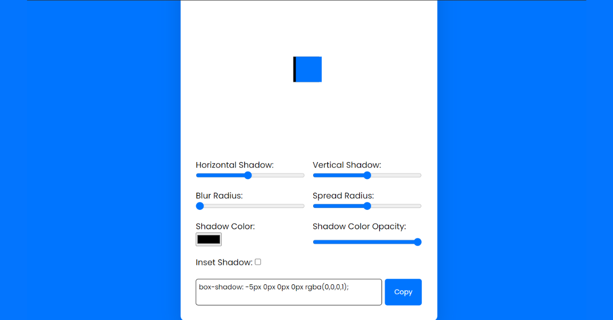
Last stage of the project the JavaScript in which we have added the logical and coded as per the requirement with some conditions. We have named all the required functions in terms of JavaScript so that it can be called later in the JavaScript code. Also there are some conditions which will help the project functioning. Let us see the Final Output of the project Box Shadow Generator using HTML, CSS & JavaScript (Source Code).
Output
Live Preview of Box Shadow Generator using HTML, CSS & JavaScript
See the Pen
Box Shadow by Harsh Sawant (@harshh9)
on CodePen.
Ecommerce Website Using HTML, CSS, & JavaScript (Source Code)
We have Successfully created our Box Shadow Generator using HTML, CSS & JavaScript (Source Code). You can use this project for your personal needs and the respective lines of code are given with the code pen link mentioned above.
If you find out this Blog helpful, then make sure to search code with random on google for Front End Projects with Source codes and make sure to Follow the Code with Random Instagram page.
Code Idea – codingartist
Written By – Harsh Sawant
Code By – @harshh9


