Create a Waterfall Layout using CSS
Hello, coders! Today, we’re going to make a Waterfall Layout using pure CSS. During this project, we’re going to be working with a property that is unknown to many developers, but extremely useful, since it is neutral and can be changed at any moment in the code.
What is WaterFall Layout ?
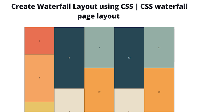
Waterfall layout is also known as Masonry layout, is a popular way to display different-sized images together using CSS. To use a masonry layout in a CSS grid, one of the grid axes needs to have the value masonry.
Here’s the small CodePen Preview before starting coding, if you’d like to check it out!
| Project Name | Waterfall Layout using CSS |
| Code By | Codewithemil |
| Project Download | CodePen Link Given |
| Language Used | HTML and CSS |
| External Link / Dependencies | No |
| Responsive | No |
HTML code of Waterfall Layout
Let’s start by arranging elements.
First of all, we’re going to be needing a UL (unordered list) element, and as many LI (list) elements as you want. I personally recommend you add 20, since that’s the number we’re going to be following in this tutorial.
Read Also:
<ul class="container">
  <li class="card --red">1</li>
  <li class="card --orange">2</li>
  <li class="card --yellow">3</li>
  <li class="card --green">4</li>
  <li class="card --dark">5</li>
  <li class="card --white">6</li>
  <li class="card --gray">7</li>
  <li class="card --orange">8</li>
  <li class="card --dark-gray">9</li>
  <li class="card --skin">10</li>
  <li class="card --brown">11</li>
  <li class="card --green">12</li>
  <li class="card --dark">13</li>
  <li class="card --white">14</li>
  <li class="card --gray">15</li>
  <li class="card --yellow">16</li>
  <li class="card --dark-gray">17</li>
  <li class="card --skin">18</li>
  <li class="card --brown">19</li>
  <li class="card --lime">20</li>
</ul>
So, we’re going to add the class “container” to the <ul>, while adding “card” and their respective colors as class to each one of the <li> elements.
As you may’ve noticed, each <li> element has its respective number written inside of it.
You may also have clue on how it’s going to look up to now; just a single unordered list, with 20 numbers arranged.
Read also:
Create A Travel Website Using HTML & CSS
(What we have up to now, just an unordered list with 20 list items)
CSS code of Waterfall Layout
Now, we’re gettin’ to the CSS. We’re going to be working with the column-count property, so let’s get to it
First of all, we’re going to be adding some default styles.
* {
  padding: 0;
  margin: 0;
  box-sizing: border-box;

  font-family: Poppins;
}

body {
  background: #484545;
  padding: 1px;
}
Output
(Preview of what we’ve until now)
Now we get to the interesting part; the container.
First of all, we’re going to be removing the list selector (dots) with the property list-style, and setting the value to none.
We’re going to set the margin between elements with the column-gap property. In my case, I like to set it to zero, but you can change it as much as you can. You can either use a default unit (normal, inherit, none, etc.), or choose a CSS unit.
Now, we’re going to add the star property of this project; column-count.
It is independent from every CSS layout system (Grid/Flexbox).
50+ HTML, CSS & JavaScript Projects With Source Code
ADVERTISEMENT
Column-count, as its name says, is in charge of dividing every item of a container onto the chosen number of columns.
In this case, we’re going to set the value to 5, since we want to have 5 columns. You can learn more about it here.
ADVERTISEMENT
So, let’s get to the code!
ADVERTISEMENT
* {
  padding: 0;
  margin: 0;
  box-sizing: border-box;
}

body {
  background: #484545;
  padding: 1px;
}

.container {
  list-style: none;
  column-gap: 0;
  column-count: 5;
}

.card {
  width: 100%;
  height: 400px;

  border: 1px solid #333;
  break-inside: avoid;

  display: flex;
  flex-direction: column;
  justify-content: center;
  align-items: center;
}
Output
ADVERTISEMENT
(Layout using column-count property)
ADVERTISEMENT
Next up we have the card. In this case, we’re going to be using the Flexbox layout, since it is easier to understand & use for this type of situations rather than grid.
We’re going to set a specific height and a specific width to our card, as well as a border.
We’re next going to use another new property; break-inside. This property declares how the parts should behave inside a previously-generated container. We’re going to give it the value avoid, so that, as its name says, we’ll avoid any break to be inserted within the main box. More info here.
Portfolio Website using HTML and CSS (Source Code)
Now, we should be adding the respective colors & heights for our different LI items. You can switch them up or even change the values; remember this is just a reference.
This is the code we’re going to be using (just colors & heights):
* {
  padding: 0;
  margin: 0;
  box-sizing: border-box;

  font-family: Poppins;
}

body {
  background: #484545;
  padding: 1px;
}

.container {
  list-style: none;
  column-gap: 0;
  column-count: 5;
}

.card {
  width: 100%;
  height: 400px;

  border: 1px solid #333;
  break-inside: avoid;

  display: flex;
  flex-direction: column;
  justify-content: center;
  align-items: center;
}

.--red {
  background: #E86F51;
  height: 200px;
}
.--orange {
  background: #F5A462;
  height: 350px;
}
.--yellow {
  background: #E8C468;
  height: 350px;
}
.--green {
  background: #2B9E91;
  height: 400px;
}
.--dark {
  background: #274754;
  height: 450px;
  color: #f6f6f6;
}
.--white {
  background: #EADFC9;
  height: 350px;
}
.--gray {
  background: #BFDBCF;
}
.--dark-gray {
  background: #93ADA4;
  height: 300px;
}
.--skin {
  background: #F3A14B;
  height: 350px;
}
.--brown {
  background: #DC7646;
  height: 400px;
}
.--lime {
  background: #8cc97f;
  height: 200px;
}
This should be our result up to now:
Optional Step
This is a completely optional step; make our layout responsive. We’re going to begin by adding some Media Queries. We will be using some common screen sizes. And, we’re going to be changing only the number of columns we’re having, not anything else.
Here’s the code:
@import url('https://fonts.googleapis.com/css2?family=Poppins:wght@400;500&display=swap');

* {
  padding: 0;
  margin: 0;
  box-sizing: border-box;

  font-family: Poppins;
}

body {
  background: #484545;
  padding: 1px;
}

.container {
  list-style: none;
  column-gap: 0;
  column-count: 5;
}

.card {
  width: 100%;
  height: 400px;

  border: 1px solid #333;
  break-inside: avoid;

  display: flex;
  flex-direction: column;
  justify-content: center;
  align-items: center;
}

.--red {
  background: #E86F51;
  height: 200px;
}
.--orange {
  background: #F5A462;
  height: 350px;
}
.--yellow {
  background: #E8C468;
  height: 350px;
}
.--green {
  background: #2B9E91;
  height: 400px;
}
.--dark {
  background: #274754;
  height: 450px;
  color: #f6f6f6;
}
.--white {
  background: #EADFC9;
  height: 350px;
}
.--gray {
  background: #BFDBCF;
}
.--dark-gray {
  background: #93ADA4;
  height: 300px;
}
.--skin {
  background: #F3A14B;
  height: 350px;
}
.--brown {
  background: #DC7646;
  height: 400px;
}
.--lime {
  background: #8cc97f;
  height: 200px;
}


@media (min-width: 320px) and (max-width: 759.5px) {
  .container {
    column-count: 2;
  }
}
@media (min-width: 760px) and (max-width: 979.5px) {
  .container {
    column-count: 3;
  }
}
@media (min-width: 980px) and (max-width: 1023.5px) {
  .container {
    column-count: 4;
  }
}
@media (min-width: 1024px) {
  .container {
    column-count: 5;
  }
}Conclusion
Hope you understood all the properties, values & layouts we used today. Have any questions? Don’t forget to ask them below! Or, you can contact me in my Instagram @codewithemil, or you can ask my superior @codewith_random.
Hangman Game using HTML, CSS & JavaScript
So that was it for today! Make sure to check out the other projects made by this amazing team.
¡Adiós amigos! Nos vemos pronto 🙂 —- (Bye friends! See you soon! 🙂 )
By: CodeWithEmil (Instagram, Twitter, CodePen)
Waterfall Layout using CSS
Today, we’re going to make a Waterfall Layout using pure CSS. During this project, we’re going to be working with a property that is unknown to many developers, but extremely useful, since it is neutral and can be changed at any moment in the code.
Here’s the small Preview before starting coding, if you’d like to check it out!
How to create Waterfall Layout using CSS?
Let’s Start creating Wterfall Layout using CSS By Arranging Elements.
First Of All, We’re Going To Be Needing A UL (Unordered List) Element, And As Many LI (List) Elements As You Want. I Personally Recommend You Add 20, Since That’s The Number We’re Going To Be Following In This Tutorial.


