Create Circular Border Using HTML And CSS (Source Code)
Hey Guys, Welcome To Our Blog, In Today’s Blog We Are Going To See How To Create An Circular Border Using HTML & CSS.
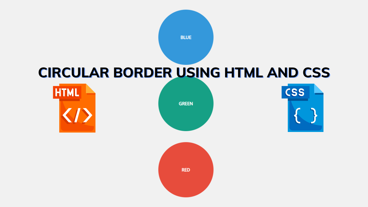
A circular border is nothing but in which the corners of the border might sink and looks curved or rounded that’s why it is referred to as Circular Border. Here we are creating a circle with a value inside and making it attractive using CSS. It is as same as the rounded border.
So, Let’s Begin Our Circular Border Project By Adding The Source Codes. For That, First, We Are Using The Html Code.
HTML CODE – Circular Border
<div id="content">
  <h1>CSS circles using border radius</h1>
  <div class="circle blue">Blue</div>
  <div class="circle green">Green</div>
  <div class="circle red">Red</div>
  <p class="feedback">Feedback welcomed via Twitter - <a href="http:/twitter.com/tomdurkin">@tomdurkin</a></p>
</div>
Here We just create a div class with a name and then we just add the contents to add a circular border. The contents are located inside the h1 tag and from then we add separate div classes with different names and add the value (Blue, Green, Red) in it.
Now we can make it styling by adding the CSS.
100+ Front-end Projects for Web developers (Source Code)
CSS CODE For Circular Border
body {
  font-family: "open sans", sans-serif;
  background: #f1f1f1;
}
#content {
  margin: 40px auto;
  text-align: center;
  width: 600px;
}
#content h1 {
  text-transform: uppercase;
  font-weight: 700;
  margin: 0 0 40px 0;
  font-size: 25px;
  line-height: 30px;
}
.circle {
  width: 200px;
  height: 200px;
  line-height: 200px;
  border-radius: 50%; /* the magic */
  -moz-border-radius: 50%;
  -webkit-border-radius: 50%;
  text-align: center;
  color: white;
  font-size: 16px;
  text-transform: uppercase;
  font-weight: 700;
  margin: 0 auto 40px;
}

.blue {
  background-color: #3498db;
}
.green {
  background-color: #16a085;
}
.red {
  background-color: #e74c3c;
}
.feedback {
  font-size: 14px;
  color: #b1b1b1;
}
Now we just added our CSS code. In this code, the first step involved is adding font family and background color to make attractive words and background. then we are aligning the whole content which is inside the div class by assigning values margin, width, and text-align to it. and lastly, we just make the h1 content to the upper case and fix font size and family to it then some margin for aligning and font-weight to make it stronger.
The code for the above explanation is down below.
body {
  font-family: "open sans", sans-serif;
  background: #f1f1f1;
}
#content {
  margin: 40px auto;
  text-align: center;
  width: 600px;
}
#content h1 {
  text-transform: uppercase;
  font-weight: 700;
  margin: 0 0 40px 0;
  font-size: 25px;
  line-height: 30px;
}
Now The second step involved is we are adding the main part which is the circular border by calling it and giving the values to make a circular border. The width and height of the border is added and then the border-radius which make sinks in the corners of the border and then lastly some values like font size, family, weight, margin to make the content align, and lastly some advanced border properties which are -Moz-border-radius: 50%;
-WebKit-border-radius: 50%;
The explanation code is down below.
.circle {
  width: 200px;
  height: 200px;
  line-height: 200px;
  border-radius: 50%; /* the magic */
  -moz-border-radius: 50%;
  -webkit-border-radius: 50%;
  text-align: center;
  color: white;
  font-size: 16px;
  text-transform: uppercase;
  font-weight: 700;
  margin: 0 auto 40px;
}
The Last step here we do is just add backgrounds for the created circles(Circular Borders) by mentioning separate class names and we just add a link after this for the reference along with some text and make the text look better and also link by the CSS. The Code has Been Given down.
.blue {
  background-color: #3498db;
}
.green {
  background-color: #16a085;
}
.red {
  background-color: #e74c3c;
}
.feedback {
  font-size: 14px;
  color: #b1b1b1;
}
Now We have Just Created Our project successfully.
So Let’s see our project Preview in the given output section.
FINAL OUTPUT Of Circular Border
Now We have Successfully created our Circular Border Using Simple HTML & CSS. You can use this project for your personnel needs and the respective lines of code are given with the code pen link mentioned below.
5+ HTML CSS project With Source Code
ADVERTISEMENT
If you find out this Blog helpful, then make sure to search code with random on google for Front End Projects with Source codes and make sure to Follow the Code with Random Instagram page.
ADVERTISEMENT
ADVERTISEMENT
REFER CODE – Fudime
ADVERTISEMENT
WRITTEN BY – Ragunathan S
ADVERTISEMENT


