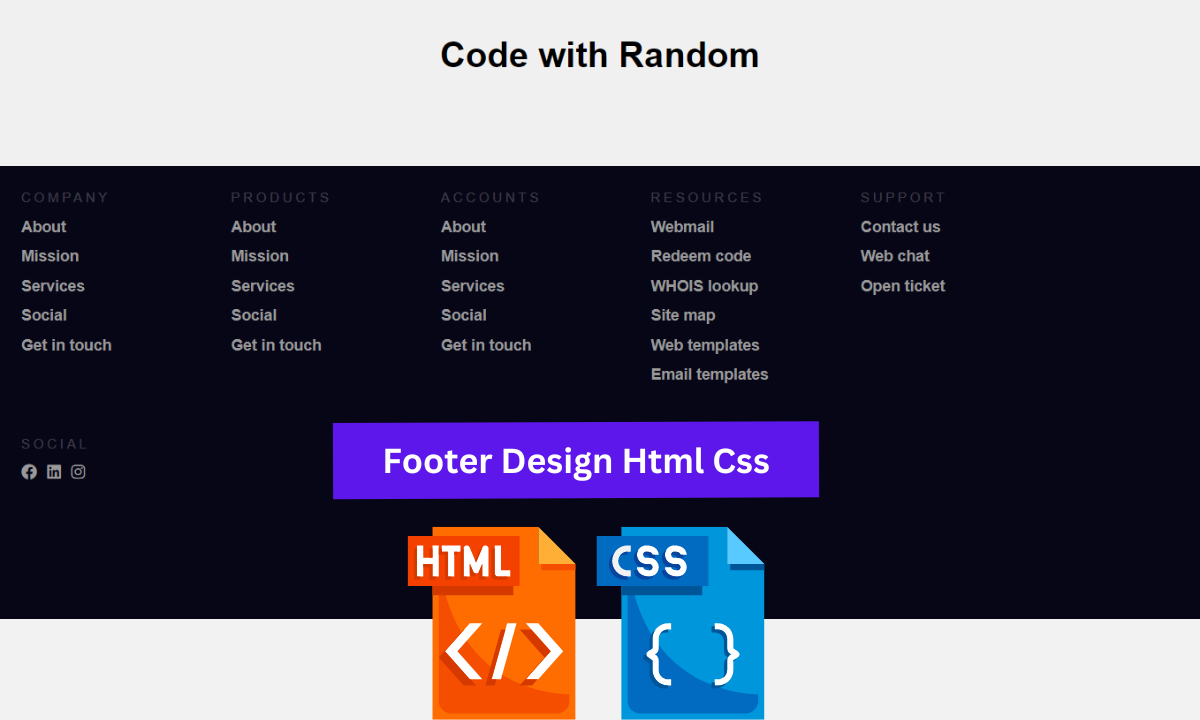
The responsive footer design adds to the beauty and impact of our website. The footer section is very important in making the structure of any website look nice and appealing.
How to make Responsive Footer using HTML and CSS?
Hello coders👩🏻💻!! In this article, I’ll show you how to make a responsive footer using HTML and CSS. We have a simple footer with some basic company information and some social media icons. You can include additional content of your choice.

I hope you must have got an idea about the project.
So, Let’s Begin the expandable content Project By Adding The Source Codes. first We Are Using The Html Code.
50+ HTML, CSS & JavaScript Projects With Source Code
Step1: Adding HTML code
HTML stands for Hyper Text Markup Language, and it provides structure to our website.
ALL HTML documents begin with <!doctype HTML>, which tells the browser that our code adheres to the most recent HTML version.
The HTML document begins with <html> and ends with </html>.
The main tag is <body>, where we will write all of our content that will be displayed on the browser later.
Now we’ll take a look at our HTML code.
<!DOCTYPE html>
<html>
  <head>
    <meta http-equiv="content-type" content="text/html; charset=utf-8" />
    <meta name="" content="" />
    <title>Responsive Footer</title>
    <link rel="stylesheet" href="style.css" />
    <script src="https://kit.fontawesome.com/1cf483120b.js" crossorigin="anonymous"></script>
  </head>
  <body>
    <div class="dummy_page">
      <h1>Code with Random</h1>
    </div>
    <!-- FOOTER START -->
    <div class="footer">
      <div class="contain">
        <div class="col">
          <h1>Company</h1>
          <ul>
            <li>About</li>
            <li>Mission</li>
            <li>Services</li>
            <li>Social</li>
            <li>Get in touch</li>
          </ul>
        </div>
        <div class="col">
          <h1>Products</h1>
          <ul>
            <li>About</li>
            <li>Mission</li>
            <li>Services</li>
            <li>Social</li>
            <li>Get in touch</li>
          </ul>
        </div>
        <div class="col">
          <h1>Accounts</h1>
          <ul>
            <li>About</li>
            <li>Mission</li>
            <li>Services</li>
            <li>Social</li>
            <li>Get in touch</li>
          </ul>
        </div>
        <div class="col">
          <h1>Resources</h1>
          <ul>
            <li>Webmail</li>
            <li>Redeem code</li>
            <li>WHOIS lookup</li>
            <li>Site map</li>
            <li>Web templates</li>
            <li>Email templates</li>
          </ul>
        </div>
        <div class="col">
          <h1>Support</h1>
          <ul>
            <li>Contact us</li>
            <li>Web chat</li>
            <li>Open ticket</li>
          </ul>
        </div>
        <div class="col social">
          <h1>Social</h1>
          <ul>
            <li>
                <i class="fa-brands fa-facebook"></i>
            </li>
            <li>
                <i class="fa-brands fa-linkedin"></i>
            </li>
            <li>
                <i class="fa-brands fa-instagram"></i>
            </li>
          </ul>
        </div>
        <div class="clearfix"></div>
      </div>
    </div>
    <!-- END OF FOOTER -->
  </body>
</html>
Gym Website Using HTML and CSS With Source Code
We all know that HTML code begins with some body and ends with a footer, so we’ve created some dummy content so that we can create our responsive footer.
First and foremost, we have created a main heading, or the dummy content of our webpage.
We’ve created the main container in this footer section, which contains all of the footer’s content. We have created various columns that contain various details such as company, products, services, and social; all of these columns were created using basic HTML tags. An unordered list was used to create a list of services and products in this case.
In order to have a social media icon on the page, you must first add this link to your html header section.
<script src=”https://kit.fontawesome.com/1cf483120b.js” crossorigin=”anonymous”></script>
We simply added another div tag with our social media icons. The icon used here is from @fontawesome. Simply search for the icon you want to add to your website, copy the HTML code, and paste it into the footer section.
Simple Portfolio Website Using Html And Css With Source Code
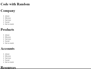
Now let’s have a look at our footer without any added styling .
Output:
ADVERTISEMENT
So we have added the HTML tags and Their contents, Now it’s time to make it attractive by adding the CSS code.
ADVERTISEMENT
Step2: CSS Code For Footer Design Using
Cascading Style Sheets (CSS) is a markup language for describing the presentation of a document written in HTML or XML. CSS, like HTML and JavaScript, is a key component of the World Wide Web.
ADVERTISEMENT
Now we will look at our CSS code.
ADVERTISEMENT
body {
  margin: 0;
  padding: 0;
  font-family: Arial, Helvetica, Sans-serif;
  background-color: #070617;
}
.dummy_page {
  height: 200px;
  width: 100%;
  background-color: #f0f0f0;
  text-align: center;
  box-sizing: border-box;
  padding: 60px 0px;
}
/* STYLES SPECIFIC TO FOOTER  */
.footer {
  width: 100%;
  position: relative;
  height: auto;
  background-color: #070617;
}
.footer .col {
  width: 190px;
  height: auto;
  float: left;
  box-sizing: border-box;
  -webkit-box-sizing: border-box;
  -moz-box-sizing: border-box;
  padding: 0px 20px 20px 20px;
}
.footer .col h1 {
  margin: 0;
  padding: 0;
  font-family: inherit;
  font-size: 12px;
  line-height: 17px;
  padding: 20px 0px 5px 0px;
  color: rgba(255, 255, 255, 0.2);
  font-weight: normal;
  text-transform: uppercase;
  letter-spacing: 0.25em;
}
.footer .col ul {
  list-style-type: none;
  margin: 0;
  padding: 0;
}
.footer .col ul li {
  color: #999999;
  font-size: 14px;
  font-family: inherit;
  font-weight: bold;
  padding: 5px 0px 5px 0px;
  cursor: pointer;
  transition: 0.2s;
  -webkit-transition: 0.2s;
  -moz-transition: 0.2s;
}
.social ul li {
  display: inline-block;
  padding-right: 5px !important;
}
.fa-brands{
  font-size: 1.5rem;
}

.footer .col ul li:hover {
  color: #ffffff;
  transition: 0.1s;
  -webkit-transition: 0.1s;
  -moz-transition: 0.1s;
}
.clearfix {
  clear: both;
}
@media only screen and (min-width: 1280px) {
  .contain {
    width: 1200px;
    margin: 0 auto;
  }
}
@media only screen and (max-width: 1139px) {
  .contain .social {
    width: 1000px;
    display: block;
  }
  .social h1 {
    margin: 0px;
  }
}
@media only screen and (max-width: 950px) {
  .footer .col {
    width: 33%;
  }
  .footer .col h1 {
    font-size: 14px;
  }
  .footer .col ul li {
    font-size: 13px;
  }
}
@media only screen and (max-width: 500px) {
  .footer .col {
    width: 50%;
  }
  .footer .col h1 {
    font-size: 14px;
  }
  .footer .col ul li {
    font-size: 13px;
  }
}
@media only screen and (max-width: 340px) {
  .footer .col {
    width: 100%;
  }
}
Now that we’ve included our CSS code in our article, let’s go over it step by step.
ADVERTISEMENT
100+ JavaScript Projects With Source Code ( Beginners to Advanced)
Step1:First, we chose our body tag and set the margin and padding to zero, as well as the font family to Arial and the background colour to black. Then we styled our dummy page, defining the height as 200px and width as 100%, with a background colour of white and box-sizing of border box,” and we also gave our dummy page top and bottom padding.
body {
  margin: 0;
  padding: 0;
  font-family: Arial, Helvetica, Sans-serif;
  background-color: #070617;
}
.dummy_page {
  height: 200px;
  width: 100%;
  background-color: #f0f0f0;
  text-align: center;
  box-sizing: border-box;
  padding: 60px 0px;
}
Step2: The (.footer) class is now used to style our footer, with width set to 100% and height set to auto. We also defined its position as “relative”with black background. Now we’ll style the footer column heading. The heading’s font size is set to 12px, with no margins or padding. We also used the transform property to make all of the letters in our heading uppercase.
.footer {
  width: 100%;
  position: relative;
  height: auto;
  background-color: #070617;
}
.footer .col {
  width: 190px;
  height: auto;
  float: left;
  box-sizing: border-box;
  -webkit-box-sizing: border-box;
  -moz-box-sizing: border-box;
  padding: 0px 20px 20px 20px;
}
.footer .col h1 {
  margin: 0;
  padding: 0;
  font-family: inherit;
  font-size: 12px;
  line-height: 17px;
  padding: 20px 0px 5px 0px;
  color: rgba(255, 255, 255, 0.2);
  font-weight: normal;
  text-transform: uppercase;
  letter-spacing: 0.25em;
}Step3:We have now styled all of the headings in our footer column. We’ll use CSS to style our footer’s unordered list (.footer.col.ul). The list style type was set to “none,” with no margins or padding. The font colour is grey, the font size is 14px, and the font weight is “bold.” We also expanded our list of transitions.
Ecommerce Website Using Html Css And Javascript Source Code
.footer .col ul {
  list-style-type: none;
  margin: 0;
  padding: 0;
}
.footer .col ul li {
  color: #999999;
  font-size: 14px;
  font-family: inherit;
  font-weight: bold;
  padding: 5px 0px 5px 0px;
  cursor: pointer;
  transition: 0.2s;
  -webkit-transition: 0.2s;
  -moz-transition: 0.2s;
}Step4:Now we just need to style our social media icons, which we defines their position as inline blocks with a font size of 1.5 rem. Now using the hover selector, we define the colour as white with some transition, and as the user hovers over the icon, the colour will change to white.
.social ul li {
  display: inline-block;
  padding-right: 5px !important;
}
.fa-brands{
  font-size: 1.5rem;
}

.footer .col ul li:hover {
  color: #ffffff;
  transition: 0.1s;
  -webkit-transition: 0.1s;
  -moz-transition: 0.1s;
}
Step5: Using a media query, we will now add responsiveness to our webpage. We define whether the screen width is less than or greater than the defined width; in that case, the container’s width is changed to 1200px, and we also define the maximum width and If the screen width is equal to or less than the defined width, the container’s size will be determined by the defined width and font-size of the container elements.
Weather App Using Html,Css And JavaScript
@media only screen and (min-width: 1280px) {
  .contain {
    width: 1200px;
    margin: 0 auto;
  }
}
@media only screen and (max-width: 1139px) {
  .contain .social {
    width: 1000px;
    display: block;
  }
  .social h1 {
    margin: 0px;
  }
}
@media only screen and (max-width: 950px) {
  .footer .col {
    width: 33%;
  }
  .footer .col h1 {
    font-size: 14px;
  }
  .footer .col ul li {
    font-size: 13px;
  }
}
@media only screen and (max-width: 500px) {
  .footer .col {
    width: 50%;
  }
  .footer .col h1 {
    font-size: 14px;
  }
  .footer .col ul li {
    font-size: 13px;
  }
}
@media only screen and (max-width: 340px) {
  .footer .col {
    width: 100%;
  }
}
Now we have completed our css code and below👇here is the output after styling our webpage.
Final Output Footer Design Html Css:

Now as we completed our project now will look at how it is working .
Preview:
Now We have Successfully created our Responsive footer poject. You can use this project for your personal webpage and We hope you understood the project , If you any doub’t feel free to comment!!
If you find out this Blog helpful, then make sure to search code with random on google for Front End Projects with Source codes and make sure to Follow the Code with Random Instagram page.
