When surf any website on internet we see many objects such as navbar, header, footer, image carousel etc. But, Tabs are the most useful object in which if we work a little hard while coding we can grab our user attention so that he can increase the surf time. So with that note I Welcome you all to Codewithrandom with a new blog.
Simple HTML CSS Tab Bar with Animation Code
I hope you have got an idea of the project.
HTML Code in Tabs Animation
<link href='https://fonts.googleapis.com/css?family=Montserrat:400,700' rel='stylesheet' type='text/css'>
<div class="container">
  <ul>
    <li class="one"><a class="default" href="#">All</a></li><!--
 --><li class="two"><a href="#">Articles</a></li><!--
 --><li class="three"><a href="#">Hackweek</a></li>
  <li class="bg"></li>
    <hr />
  </ul>
</div>
In this HTML code we have defined the structure in which we linked the fonts externally and for the creation of tabs we have created a container so that our tabs when it is created it stores inside it and don’t get messy.
100+ Front-end Projects for Web developers (Source Code)
Not to add some features in the tab we’ll add some effects and for that we have code in CSS language.
CSS Code in Tabs Animation
* {
  box-sizing: border-box;
}

body {
  font: 300 100% 'Montserrat', Helvetica, Arial;
  font-weight: 400;
  background-color: #efefef;
}

.bg {
  position: fixed;
  z-index: -1;
  top: 0;
  right: 0;
  bottom: 0;
  left: 0;
  transition: .25s;
  pointer-events: none;
}

.container {
  width: 50%;
  margin: 0 auto;
}

ul li {
  display: inline;
  text-align: center;
}

.default {
  color: #000;
  font-weight: 700;
}

li:first-child:hover ~ .bg {
  background: #efefef;
  transition: .5s ease-in-out;
  }

li:nth-child(2):hover ~ .bg {
  background: #fff;
  transition: .5s ease-in-out;
}

li:nth-child(3):hover ~ .bg {
  background: #efefef;
  transition: .5s ease-in-out;
}

a {
  display: inline-block;
  width: 25%;
  padding: .75rem 0;
  margin: 0;
  text-decoration: none;
  color: #a2a2a2;
}

a:hover {
  transform: scale(1.1);
  font-weight: 700;
  color: #000;
}

.two:hover ~ hr {
  margin-left: 33%;
  width: 65px;
}

.three:hover ~ hr {
  margin-left: 56%;
  width: 90px;
}


hr {
  height: .25rem;
  width: 30px;
  margin-left:4rem;
  margin-top:-.2rem;
  background: #000;
  border: none;
  transition: .3s ease-in-out;
}
In this CSS Code we have styled the defined elements and attributes which are present in the HTML file also we have styled a hover effect in which when take the mouse over the tab it will display a hover effect. And lastly we have sized the container and background so that all our tabs are present the decided length and don’t get mix up with each other. Lets see the final output.
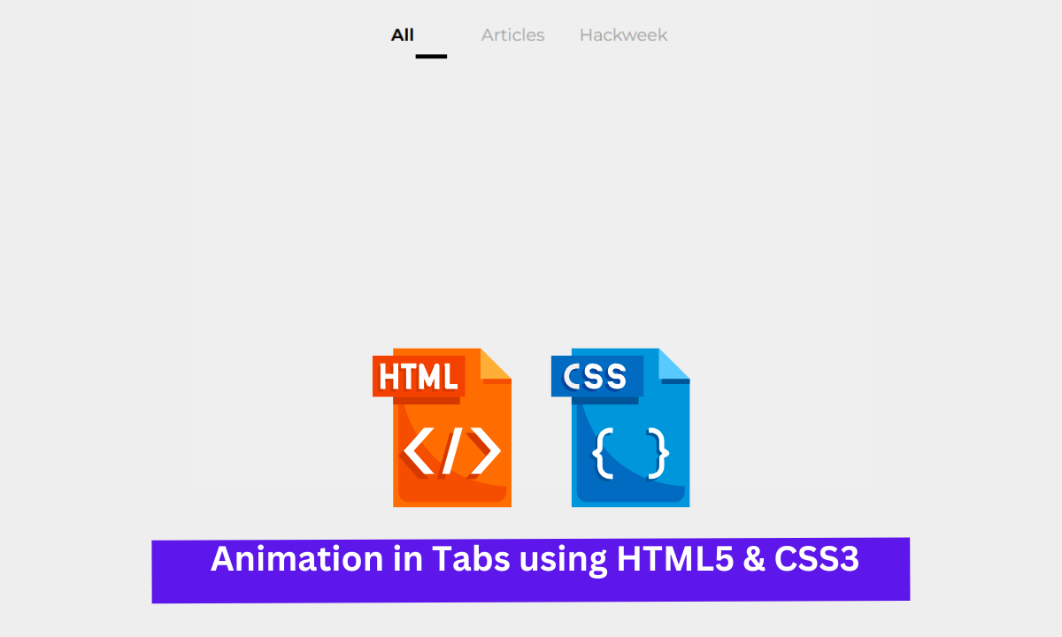
Final Output Animation in Tabs using HTML5 & CSS3
We have Successfully created our Animation in Tabs using HTML5 & CSS3 (Source Code) | Tab Animation You can use this project for your personal needs and the respective lines of code are given with the code pen link mentioned below.
If you find out this Blog helpful, then make sure to search code with random on google for Front End Projects with Source codes and make sure to Follow the Code with Random Instagram page.
Written By – Harsh Sawant
Code By – Naoise Boyle


