Hey Coder, Welcome To Our Codewithrandom Blog, In Today’s Blog We Are Going To See How To Create An Create Partial Border Using CSS.
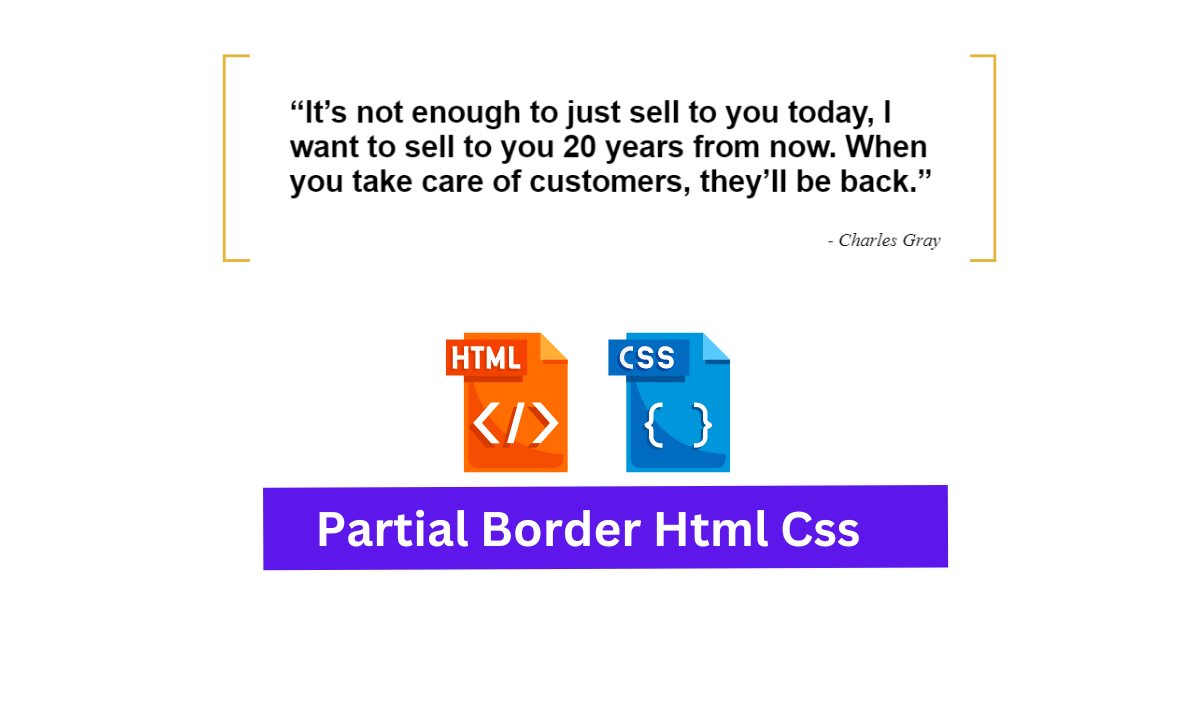
A partial border is an border which covers and left , right , top and bottom with stylish borders that have an gap in-between. Which impact used moreover in quotation lines. Like wise we are going to add these Partial Border with Css.

Create Partial Border Using CSS
So, Let’s Begin Our Partial Border Project By Adding The Source Codes. For That, First, We Are Using The Html Code.
50+ HTML, CSS and JavaScript Projects With Source Code
HTML Code For Partial Border:-
<div class="content-wrapper mobile-wrapper"> <blockquote> <p>“It’s not enough to just sell to you today, I want to sell to you 20 years from now.
When you take care of customers, they’ll be back.” </p> <cite>- Charles Gray</cite> </blockquote> </div>
Yeah ! , Now we have added out the HTML code. First we creating an div class with specific name on it. As we are adding quotes as an content so we using the blockquote tag to make it look like an quotes and inside the paragraph tag we were adding the quote with the help of cite tag for making it to represent like an respective author of the quotes by making it in right format.
Personal Portfolio Website Using HTML and CSS (Source Code)
And Now we closing our div tag and moving out to CSS part for making it attractive and adding the partial borders.
Partial Border Css Code:-
$brand-yellow: #E5B539;
.content-wrapper {
    width: 100%;
    max-width: 1024px;
    margin: 6em auto;
}
.mobile-wrapper {
    @media only screen and (max-width: 865px) {
        padding-left: 2%;
        padding-right: 2%;
    }
}
blockquote {
    border: 3px solid $brand-yellow;
    margin: 0 auto;
    padding-right: 0;
    padding-left: 20px;
    max-width: 636px;
    position: relative;
    p {
        font-family: Helvetica, Arial, Sans-Serif;
        font-size: 26px;
        font-weight: 700;
        padding: 0 34px;
    }
    &:before {
        content: "";
        display: block;
        position: absolute;
        width: 96%;
        top: -3px;
        left: 0;
        border: 3px solid white;
        position: inherit;
    }
    &:after {
        content: "";
        display: block;
        position: absolute;
        width: 96%;
        bottom: -3px;
        left: 0;
        border: 3px solid white;
        position: inherit;
    }
    cite {
        display: block;
        text-align: right;
        padding-right: 7%;
    }
}
Now We have added the respective CSS code. So let me explain this code in steps so it would be easy to understand.
Restaurant Website Using HTML And CSS With Source Code
STEP 1: First of all we are adding the color for border using SCSS single line color adder and then we calling out the first div name and adding the properties like width , margin and max-width for making to adjust on the required screen size which is an responsive.
Then again with the help of CSS media query we adding properties for the Tab screen size and make some small alignments in contents using the padding property.
$brand-yellow: #E5B539;
.content-wrapper {
    width: 100%;
    max-width: 1024px;
    margin: 6em auto;
}
.mobile-wrapper {
    @media only screen and (max-width: 865px) {
        padding-left: 2%;
        padding-right: 2%;
    }
}
STEP 2: Secondly , We started adding properties that would make attractive and quotes alignment for that we just calling out the blockquote tag and adding the properties like border with color , margin , padding , max-width for screens , and positions. for adding border color , making content to relative over other element , then adjusting it with margins and padding.
Then We calling out the paragraph tag and adding attractive font families , sizes , colors , weights and padding to make it big and attractive with correctly aligned.
blockquote{
    border: 3px solid $brand-yellow;
    margin: 0 auto;
    padding-right: 0;
    padding-left: 20px;
    max-width: 636px;
    position: relative;
    p{
        font-family: Helvetica, Arial, Sans-Serif;
        font-size: 26px;
        font-weight: 700;
        padding: 0 34px;
    }
}
STEP 3: Now We just calling the before and after properties and adding the exact elements that needs to be added on the before and after sections. The elements were display , position , width , top , left, bottom , and borders which were commonly added in both the properties and making some changes inn values for the required format.
&:before{
        content: '';
    display: block;
    position: absolute;
    width: 96%;
    top: -3px;
    left: 0;
    border: 3px solid white;
        position: inherit;
    }
    &:after{
        content: '';
        display: block;
        position: absolute;
        width: 96%;
        bottom: -3px;
        left: 0;
        border: 3px solid white;
        position: inherit;
    }
STEP 4: Now we came to last step , Here we just calling out the cite tag which contains author name and making it aligning using the text-align and padding properties with display format.
cite{
    display: block;
    text-align: right;
     padding-right: 7%;
}
}
Now We have Completed our Project By adding the required source codes. So we would now move on to making the preview of our project in the below Output Section.
Final Output Of Partial Border Using Css:-
ADVERTISEMENT
Now We have Successfully created our Partial Border Using CSS. You can use this project for your personnel needs and the respective lines of code are given with the code pen section above.
ADVERTISEMENT
If you find out this Blog helpful, then make sure to search Codewithrandom on Google for Front End Projects with Source codes and make sure to Follow the Code with Random Instagram page.
ADVERTISEMENT
REFER CODE – Matt Stele
ADVERTISEMENT
WRITTEN BY – Ragunathan S
ADVERTISEMENT


