How To Create an Email Newsletter with HTML & CSS
Hello programmers! In this article, we’ll show you how to make a responsive email newsletter. The newsletter’s structure will be created using HTML, and the layout will be designed using CSS. This project is ideal for beginners. We will gain knowledge about every concept we implemented to create our newsletter.
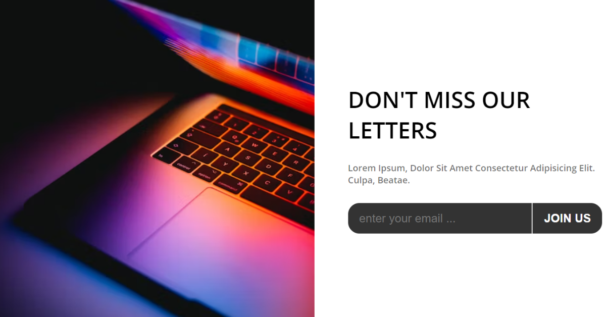
I’m hoping you have a general idea of what we’re going to make and you’re also interested in what and why a newsletter is required.
What is Email Newsletter?
Email newsletters are messages you send to your subscribers with regular updates or news about a website or business. Through emails, they will be informed of new content that has been published or updated, which helps them stay informed.
We all know that managing a code is important while building a project so that it will be easy for the user to use that code in future as well . So we will follow the same method we will be creating the different file for creating our project.
- index.html -defines the element structure that would be displayed on the page through the HTML layout.
- style.css- includes styling CSS code. We may style the various parts with CSS to improve the visual appeal.
- Index.js – includes JavaScript programming.The javascript concepts will helps us in adding the sliding value to the slider.
Step1: Adding Some Basic HTML.
HTML stands for HyperText Markup Language. This is a markup language. Its main job is to give our project structure. We will provide our project structure by utilising this markup language. So let’s look at our HTML code.
<!DOCTYPE html>
<html lang="en">

<head>
    <meta charset="UTF-8">
    <meta name="viewport" content="width=device-width, initial-scale=1.0">
    <meta http-equiv="X-UA-Compatible" content="ie=edge">
    <title>Newsletter Subscribe</title>
    <link rel="stylesheet" href="style.css">
</head>

<body>
    <section id="newsletter">
        <div class="picture"></div>
        <article class="welcome">
            <h2>don't miss our letters</h2>
            <p>Lorem ipsum, dolor sit amet consectetur adipisicing elit. Culpa, beatae.</p>
            <form action="">
                <input type="email" name="" id="" placeholder="enter your email ...">
                <input type="submit" value="join us">
            </form>
        </article>
    </section>
</body>

</html>
Before beginning to add structure to our price slider. We need to update some links. Because we utilised two distinct files for our HTML & CSS, in this project, we need to link them all together. To do this, please include the links for our CSS .
Portfolio Website using HTML and CSS (Source Code)
<link rel="stylesheet" href="style.css" /> //Add this link into the head section of our HTML.
- The “Newsletter” section will now be created. Now that we have a div with the class “photo,” we can use CSS to add images to it.
- We will now create a container for our newsletter form using the article tag.
- A headline for our newsletter will be added using the h2 tag, and a brief text area will be created using the paragraph tag.
- The form tag we built will now be used to create a form that will accept two forms of input: email and submit.
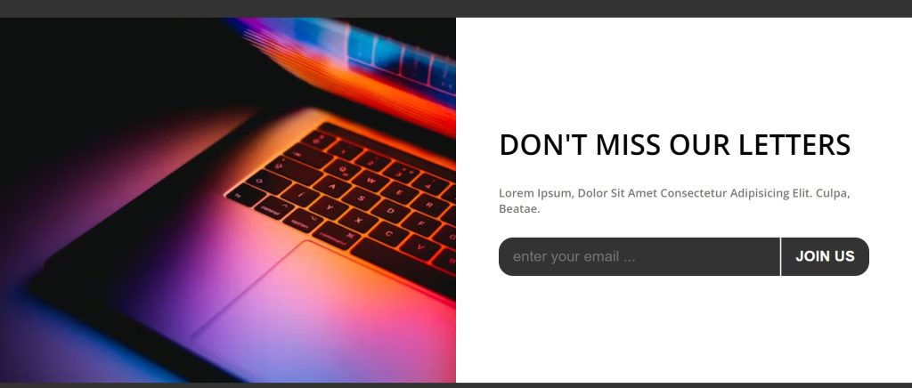
Now we have added a basic structure for our price slider webpage. Now let’s have a look at our price slider structure.
Output:
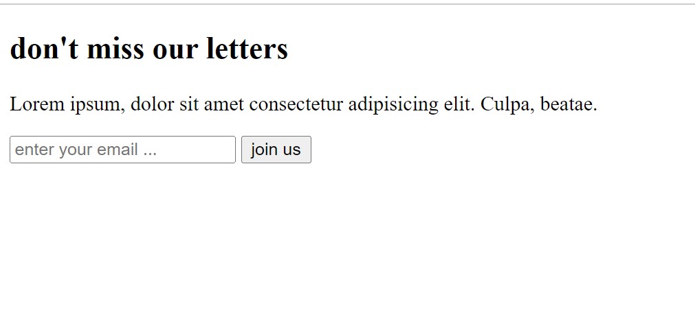
Step2: Adding the CSS Code.
Cascading Style Sheets (CSS) is a markup language for describing the presentation of a document written in HTML or XML. CSS, like HTML and JavaScript, is a key component of the World Wide Web.
Now we will look at our CSS code.
@import url("https://fonts.googleapis.com/css2?family=Open+Sans:wght@600&display=swap");
* {
  padding: 0;
  margin: 0;
  box-sizing: border-box;
}
body {
  background-color: #333;
  min-height: 100vh;
  display: flex;
  justify-content: center;
  align-items: center;
  font-family: "Open Sans", sans-serif;
}
#newsletter {
  /* min-height: 70vh; */
  width: 100%;
  display: flex;
  flex-direction: row;
  flex-wrap: wrap;
}
.picture {
  width: 50%;
  background: url(https://images.unsplash.com/photo-1525547719571-a2d4ac8945e2?ixid=MXwxMjA3fDB8MHxzZWFyY2h8NDJ8fGxhcHRvcHxlbnwwfHwwfA%3D%3D&ixlib=rb-1.2.1&auto=format&fit=crop&w=500&q=60)
    no-repeat center center/cover;
}
.welcome {
  background-color: #fff;
  width: 50%;
  padding: 150px 60px;
}
.welcome h2 {
  font-size: 2.5em;
  font-weight: bold;
  text-transform: uppercase;
  margin-bottom: 30px;
}
.welcome p {
  text-transform: capitalize;
  font-size: 1em;
  color: rgba(51, 51, 51, 0.7);
  margin-bottom: 30px;
}
.welcome form {
  background-color: #333;
  display: flex;
  /*justify-content: center;
    */
  border-radius: 20px;
  -webkit-border-radius: 20px;
  -moz-border-radius: 20px;
  -ms-border-radius: 20px;
  -o-border-radius: 20px;
}
input {
  border: none;
  outline: none;
  background-color: transparent;
  padding: 15px 20px;
  color: #fff;
  /* flex: 1; */
}
form input[type="email"] {
  flex: 1;
  font-size: 1.3em;
}
form input[type="submit"] {
  /* background-color: #fff; */
  color: #fff;
  border-left: 2px solid #f1f1f1;
  cursor: pointer;
  text-transform: uppercase;
  font-size: 1.3em;
  font-weight: bold;
}
form input[type="submit"]:hover {
  opacity: 0.7;
}

@media screen and (max-width: 1079px) {
  #newletter {
    flex-direction: column;
  }
  .picture {
    width: 100%;
    height: 300px;
  }
  .welcome {
    padding: 50px 20%;
    width: 100%;
    /* margin: 0 auto; */
  }
}

@media screen and (max-width: 775px) {
  form input[type="email"] {
    font-size: 1em;
  }
}
@media screen and (max-width: 600px) {
  .welcome {
    width: 100%;
    padding: 80px 30px;
  }
  .welcome form {
    background-color: transparent;
    display: flex;
    flex-wrap: wrap;
    flex-direction: column;
    border-radius: 0;
    -webkit-border-radius: 0px;
    -moz-border-radius: 0px;
    -ms-border-radius: 0px;
    -o-border-radius: 0px;
  }
  form input[type="email"] {
    font-size: 1em;
    border-bottom: 1px solid #333;
    color: #333;
  }
  ::placeholder {
    font-size: large;
    color: #333;
    opacity: 0.5;
  }
  form input[type="submit"] {
    color: #fff;
    border-left: none;
    background-color: #333;
    width: 100px;
    margin: 20px auto;
    font-size: 1em;
  }
}
After we’ve added the CSS code, we’ll go over it step by step. To save time, you can simply copy this code and paste it into your IDE. Let us now examine our code step by step.
Step1:We’ll start by including a Google Font called open sans with a 600 px font weight. The primary font family for our entire website will be this one. The box-sizing is set as “border-box”.
Now using the body tag we will style the body of our HTML . The background color is set as “black” and using the minium height property we will get a minimum height of 100vh . We will add font-family as “open-sans” and using the text-align property we will set them to the center.
How to Create a Weather App using JavaScript
@import url("https://fonts.googleapis.com/css2?family=Open+Sans:wght@600&display=swap");
* {
  padding: 0;
  margin: 0;
  box-sizing: border-box;
}
body {
  background-color: #333;
  min-height: 100vh;
  display: flex;
  justify-content: center;
  align-items: center;
  font-family: "Open Sans", sans-serif;
}
Step2: We will style our newsletter using the ID selector. The display is set to “flex” with a “row-wise” direction, and the width is set to “100%.” We will now include the picture in our newsletter. The width is set to 50%, and we’ll add the link to our image using the backdrop URL.
#newsletter {
  /* min-height: 70vh; */
  width: 100%;
  display: flex;
  flex-direction: row;
  flex-wrap: wrap;
}
.picture {
  width: 50%;
  background: url(https://images.unsplash.com/photo-1525547719571-a2d4ac8945e2?ixid=MXwxMjA3fDB8MHxzZWFyY2h8NDJ8fGxhcHRvcHxlbnwwfHwwfA%3D%3D&ixlib=rb-1.2.1&auto=format&fit=crop&w=500&q=60)
    no-repeat center center/cover;
}
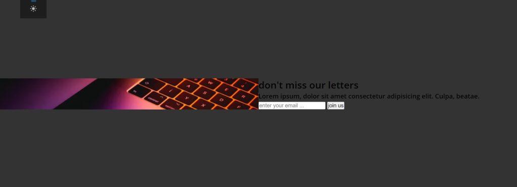
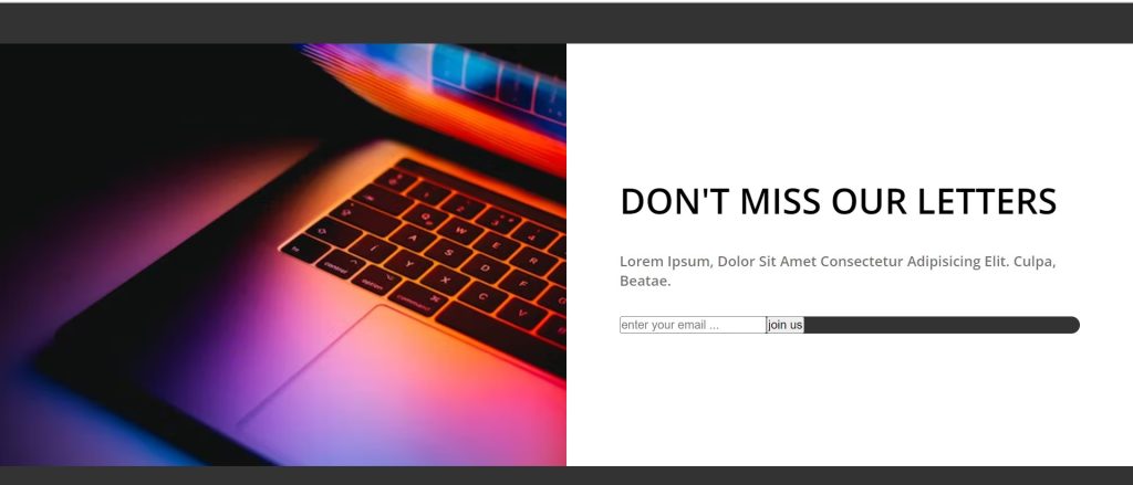
Step3: Using the class selector, we will now style the content (welcome). The “white” background colour has been selected. The width is set to 50%, and we also added padding to the top, bottom, and left and right of 150px each.
We will now style each component of our newsletter separately. Our header (h2) is formatted with a font size of 2.5 rem and a font weight of “bold.” We’ll change every letter in the heading to uppercase using the text-transform attribute.
Similarly we will add styling to all the elements of our newsletter.
.welcome {
  background-color: #fff;
  width: 50%;
  padding: 150px 60px;
}
.welcome h2 {
  font-size: 2.5em;
  font-weight: bold;
  text-transform: uppercase;
  margin-bottom: 30px;
}
.welcome p {
  text-transform: capitalize;
  font-size: 1em;
  color: rgba(51, 51, 51, 0.7);
  margin-bottom: 30px;
}
.welcome form {
  background-color: #333;
  display: flex;
  /*justify-content: center;
    */
  border-radius: 20px;
  -webkit-border-radius: 20px;
  -moz-border-radius: 20px;
  -ms-border-radius: 20px;
  -o-border-radius: 20px;
}
Step4: We’ll style the form elements right away. First, we choose “none” for the border and outline, and “white” for the font colour. The email font size is set to “1.3 rem.”
Similar to the styling for the input type “email,” the styling for our input type “submit” contains a border left of 2 px solid offwhite and a font size set to 1.3 rem. In order to alter the opacity on hover, we also implemented a hover property.
input {
  border: none;
  outline: none;
  background-color: transparent;
  padding: 15px 20px;
  color: #fff;
  /* flex: 1; */
}
form input[type="email"] {
  flex: 1;
  font-size: 1.3em;
}
form input[type="submit"] {
  /* background-color: #fff; */
  color: #fff;
  border-left: 2px solid #f1f1f1;
  cursor: pointer;
  text-transform: uppercase;
  font-size: 1.3em;
  font-weight: bold;
}
form input[type="submit"]:hover {
  opacity: 0.7;
}

Step5:The next important step is to make our website responsive. We will make our page more responsive by using the media query. A maximum width was added. The content inside the media query will change if the screen size is equal to or less than the set width.
@media screen and (max-width: 1079px) {
  #newletter {
    flex-direction: column;
  }
  .picture {
    width: 100%;
    height: 300px;
  }
  .welcome {
    padding: 50px 20%;
    width: 100%;
    /* margin: 0 auto; */
  }
}

@media screen and (max-width: 775px) {
  form input[type="email"] {
    font-size: 1em;
  }
}
@media screen and (max-width: 600px) {
  .welcome {
    width: 100%;
    padding: 80px 30px;
  }
  .welcome form {
    background-color: transparent;
    display: flex;
    flex-wrap: wrap;
    flex-direction: column;
    border-radius: 0;
    -webkit-border-radius: 0px;
    -moz-border-radius: 0px;
    -ms-border-radius: 0px;
    -o-border-radius: 0px;
  }
  form input[type="email"] {
    font-size: 1em;
    border-bottom: 1px solid #333;
    color: #333;
  }
  ::placeholder {
    font-size: large;
    color: #333;
    opacity: 0.5;
  }
  form input[type="submit"] {
    color: #fff;
    border-left: none;
    background-color: #333;
    width: 100px;
    margin: 20px auto;
    font-size: 1em;
  }
}
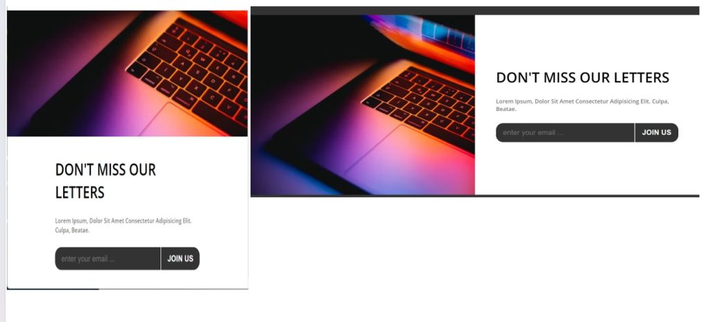
Now lets take a look at our video preview of our project.
ADVERTISEMENT
Output:
ADVERTISEMENT
Now We have Successfully created News letter using HTML , CSS & Javascript . You can use this project directly by copying into your IDE. WE hope you understood the project , If you any doubt feel free to comment!!
ADVERTISEMENT
If you find out this Blog helpful, then make sure to search code with random on google for Front End Projects with Source codes and make sure to Follow the Code with Random Instagram page.
ADVERTISEMENT
