How to Create a LightBox Using HTML & CSS?
A lightbox is a window overlay that shows up over a webpage, obstructing some of the content and obscuring and disabling the rest of the background. The visitor is prevented from interacting with additional website content unless they take some sort of action, such as clicking a button, completing a popup, or leaving the page. The centre of the screen is where a lightbox often appears, though it can appear elsewhere on the screen.
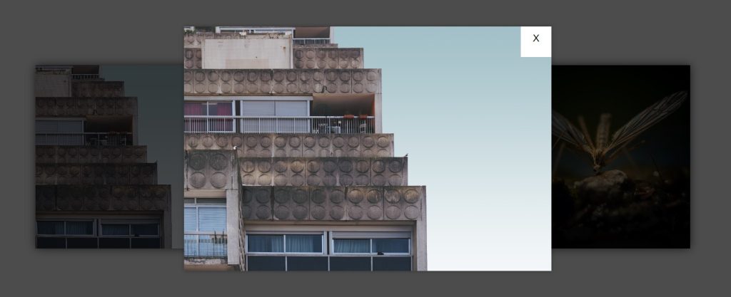
This tutorial will assist you if you wish to use HTML and CSS to make a Lightbox. Here, I’ll demonstrate how to create a straightforward CSS to Lightbox.
LightBox Using HTML & CSS
See the Pen
CSS Lightbox by Camilla Coronado (@CamillaCoronado)
on CodePen.
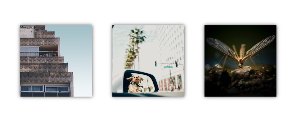
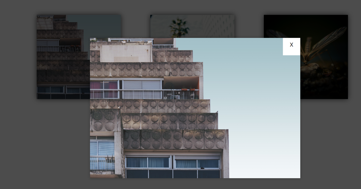
The homepage contains three images, and clicking one of them brings up the lightbox with the image you’ve chosen. The lightbox disappears when you click on the cross icon; it reappears when you click on the same image again.
Step1: Adding some basic HTML Code
HTML stands for HyperText Markup Language. This is a markup language. Its main job is to give our project structure. We will provide our project structure by utilising this markup language. So let’s look at our HTML code.
<html>

<head>
    <link rel="stylesheet" href="style.css">
    <title>lightbox </title>
</head>

<body>
    <div class="row">

        <a class="lightbox" href="#photo01">
            <figure class="photo01">
                <p>Photo 01</p>
            </figure>
        </a>

        <div class="lightbox-target" id="photo01">

            <div class="container">
                <img
                    src="https://images.unsplash.com/photo-1518360192974-cb111fe33162?ixlib=rb-0.3.5&q=85&fm=jpg&crop=entropy&cs=srgb&ixid=eyJhcHBfaWQiOjE0NTg5fQ&s=176a2e53640da93f024168ee870e4ab2">
                <a class="lightbox-close" href="#">X</a>
            </div>

        </div>

        <a class="lightbox" href="#photo02">
            <figure class="photo02">
                <p>Photo 02</p>
            </figure>
        </a>

        <div class="lightbox-target" id="photo02">
            <div class="container">
                <img
                    src="https://images.unsplash.com/photo-1524593216312-e3ea9ac26f97?ixlib=rb-0.3.5&q=85&fm=jpg&crop=entropy&cs=srgb&ixid=eyJhcHBfaWQiOjE0NTg5fQ&s=40ea56ea3a1751a2c61ce161705e4dc0">
                <a class="lightbox-close" href="#">X</a>
            </div>

        </div>

        <a class="lightbox" href="#photo03">
            <figure class="photo03">
                <p>Photo 03</p>
            </figure>
        </a>

        <div class="lightbox-target" id="photo03">
            <div class="container">
                <img
                    src="https://images.unsplash.com/photo-1511044231743-fa5f76110c08?ixlib=rb-0.3.5&q=85&fm=jpg&crop=entropy&cs=srgb&ixid=eyJhcHBfaWQiOjE0NTg5fQ&s=39af28e4d30f32989009e6f18fa8aac7">
                <a class="lightbox-close" href="#">X</a>
            </div>
        </div>

    </div>
</body>

</html>
Before beginning to add structure to our lightbox with a search box, We need to update some links. Because we used two separate files for our HTML and CSS in this project, we need to connect them all.To do this, please include the links to our CSS .
<link rel="stylesheet" href="style.css">
Now let’s Add the structure for our LightBox.
- We will create a container for our Lightbox using the div tag.
- We will now use the anchor <a> tag to include a link in our photo 1.
- We will now add a second div tag with a class (lightbox-target). We’ll make a div with a class (container) for our image inside of it. We’ll use the <img> tag to insert an image within that tag.
- We are going to include three photographs in our article. Therefore, we will use the same process to upload additional photos. The image and anchor link will simply be added inside of another div that we will simply build.
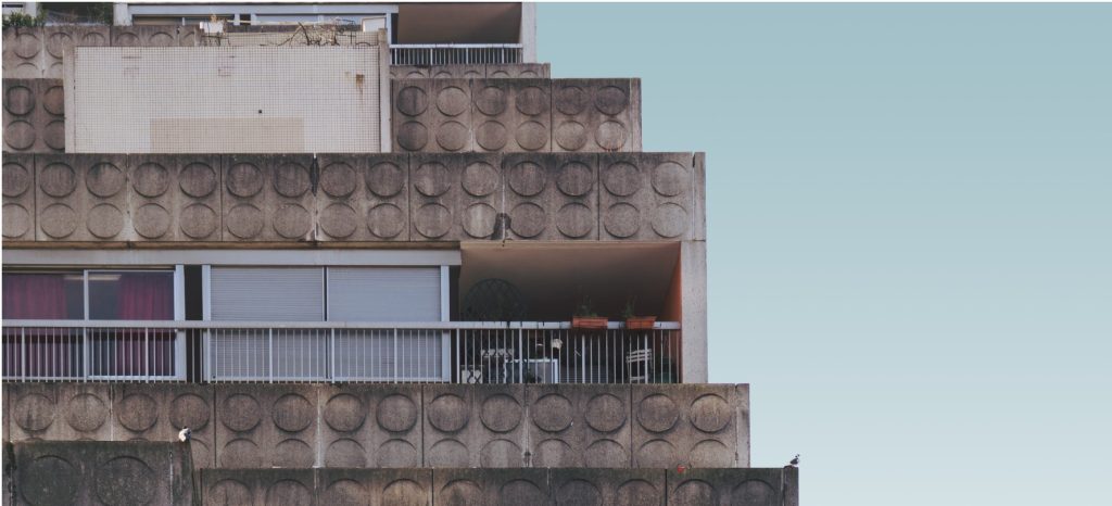
We have now added the basic structure of our webpage. Now we will be using our stylesheet to add styles to our Lightbox but first let’s take a look at our output.
Output:
Step2: Adding CSS Code
Cascading Style Sheets (CSS) is a markup language for describing the presentation of a document written in HTML or XML. CSS, like HTML and JavaScript, is a key component of the World Wide Web.
Now we will look at our CSS code.
Our project’s structure and the style we’ll be incorporating into it are comparable. This project is intended for total beginners and will assist you in strengthening your understanding of CSS fundamentals.
* {
  box-sizing: border-box;
}

body {
  background-color: white;
  font-family: "Roboto", sans-serif;
}

h1,
.row {
  text-align: center;
}

.row figure {
  height: 300px;
  width: 300px;
  margin: 0;
  top: 100px;
  background-size: cover;
  background-position: 50% 50%;
  box-shadow: 0 0 15px rgba(0, 0, 0, 0.7);
  transition: all 1s ease-in-out;
  background-repeat: no-repeat;
  z-index: 2;
  display: inline-block;
  position: relative;
}

.row a {
  display: inline-block;
  text-align: center;
  margin: 40px;
  text-decoration: none;
  color: white;
}

.row a p {
  position: absolute;
  opacity: 0;
  font-size: 20px;
  top: 45%;
  z-index: 100;
  left: 0;
  right: 0;
  margin: auto;
}

figure:hover p {
  opacity: 1;
}

figure:after {
  content: "";
  display: inline-block;
  height: 100%;
  width: 100%;
  background-color: #da291c;
  position: absolute;
  left: 0;
  bottom: 0;
  opacity: 0;
  transition: all 0.4s ease-in-out 0s;
  z-index: 99;
}

figure:hover:after {
  opacity: 0.7;
}

.photo01 {
  background-image: url("https://images.unsplash.com/photo-1518360192974-cb111fe33162?ixlib=rb-0.3.5&q=85&fm=jpg&crop=entropy&cs=srgb&ixid=eyJhcHBfaWQiOjE0NTg5fQ&s=176a2e53640da93f024168ee870e4ab2");
}

.photo02 {
  background-image: url("https://images.unsplash.com/photo-1524593216312-e3ea9ac26f97?ixlib=rb-0.3.5&q=85&fm=jpg&crop=entropy&cs=srgb&ixid=eyJhcHBfaWQiOjE0NTg5fQ&s=40ea56ea3a1751a2c61ce161705e4dc0");
}

.photo03 {
  background-image: url("https://images.unsplash.com/photo-1511044231743-fa5f76110c08?ixlib=rb-0.3.5&q=85&fm=jpg&crop=entropy&cs=srgb&ixid=eyJhcHBfaWQiOjE0NTg5fQ&s=39af28e4d30f32989009e6f18fa8aac7");
}

/* lightbox */

.lightbox-target {
  position: fixed;
  top: -100%;
  width: 100%;
  background: rgba(0, 0, 0, 0.7);
  width: 100%;
  opacity: 0;
  -webkit-transition: opacity 0.5s ease-in-out;
  -moz-transition: opacity 0.5s ease-in-out;
  -o-transition: opacity 0.5s ease-in-out;
  transition: opacity 0.5s ease-in-out;
  overflow: hidden;
  z-index: 300;
}

.lightbox-target .container {
  margin: auto;
  position: absolute;
  top: 50vh;
  left: 50vw;
  background-color: white;
  box-shadow: 0px 0px 8px rgba(0, 0, 0, 0.3);
  -webkit-transition: 0.5s ease-in-out;
  -moz-transition: 0.5s ease-in-out;
  -o-transition: 0.5s ease-in-out;
  transition: 0.5s ease-in-out;
  text-align: left;
  transform: translate3d(-50%, -50%, 0);
}

h3 {
  text-align: center;
}

.container .elements {
  display: inline-block;
  width: 40%;
  max-height: 425px;
}

ul {
  list-style-image: url("https://insider.ivanti.com/resources/statics/13067/Ivanti_rgb.png?a=1527884897521");
  overflow: hidden;
  overflow-y: auto;
  max-height: 369px;
  margin: 0;
}

li {
  margin-bottom: 10px;
}

a.lightbox-close {
  display: block;
  width: 50px;
  height: 50px;
  background: white;
  color: black;
  text-decoration: none;
  position: absolute;
  top: 0px;
  right: 0;
  margin: 0;
  padding-top: 10px;
}

.lightbox-target:target {
  opacity: 1;
  top: 0;
  bottom: 0;
}

.lightbox-target:target img {
  height: 400px;
  vertical-align: top;
}
After we’ve added the CSS code, we’ll go over it step by step. To save time, you can simply copy this code and paste it into your IDE. Let us now examine our code step by step.
50+ Html ,Css & Javascript Projects With Source Code
Step1: We will give our website styling by utilising the universal selector. Our website has “border-box” configured as the box-sizing.
We will give the body some styling by using the body tag. The background-color attribute will be used to add a white background colour. We’ll include a font-family “robot” in our lightbox’s body by using the font-family attribute.
* {
  box-sizing: border-box;
}

body {
  background-color: white;
  font-family: "Roboto", sans-serif;
}
Step2: The text inside the tag where the row class is defined will now have some style added to it using the row class. The text-align attribute will be used to add center alignment.
We will now add a 300px height and width using the child element select (figure). Furthermore, the margin is set to “0.” With the top attribute, we will have a top margin of 100 pixels. We can determine a photo’s cover size by using the background-size property. We enhanced our figure tag by including an ease-in/ease-out transition.
Additionally, we added a class to the anchor element inside our div (row). The text-align attribute will be used to apply a centre alignment to our text while the display is set to “inline-block.” The link style is set to “none” by using the text-decoration option.
We will increase the width and height to 100% using the::after selector, which also changes the background colour to red and sets the display to “inline-block”.
h1,
.row {
  text-align: center;
}

.row figure {
  height: 300px;
  width: 300px;
  margin: 0;
  top: 100px;
  background-size: cover;
  background-position: 50% 50%;
  box-shadow: 0 0 15px rgba(0, 0, 0, 0.7);
  transition: all 1s ease-in-out;
  background-repeat: no-repeat;
  z-index: 2;
  display: inline-block;
  position: relative;
}

.row a {
  display: inline-block;
  text-align: center;
  margin: 40px;
  text-decoration: none;
  color: white;
}

.row a p {
  position: absolute;
  opacity: 0;
  font-size: 20px;
  top: 45%;
  z-index: 100;
  left: 0;
  right: 0;
  margin: auto;
}

figure:hover p {
  opacity: 1;
}

figure:after {
  content: "";
  display: inline-block;
  height: 100%;
  width: 100%;
  background-color: #da291c;
  position: absolute;
  left: 0;
  bottom: 0;
  opacity: 0;
  transition: all 0.4s ease-in-out 0s;
  z-index: 99;
}

figure:hover:after {
  opacity: 0.7;
}
Step3: Using the photo class selector for images 1, 2, and 3. We will paste the link of the image we will use as the background for all three photos in the background-image attribute found inside the url.
.photo01 {
  background-image: url("https://images.unsplash.com/photo-1518360192974-cb111fe33162?ixlib=rb-0.3.5&q=85&fm=jpg&crop=entropy&cs=srgb&ixid=eyJhcHBfaWQiOjE0NTg5fQ&s=176a2e53640da93f024168ee870e4ab2");
}

.photo02 {
  background-image: url("https://images.unsplash.com/photo-1524593216312-e3ea9ac26f97?ixlib=rb-0.3.5&q=85&fm=jpg&crop=entropy&cs=srgb&ixid=eyJhcHBfaWQiOjE0NTg5fQ&s=40ea56ea3a1751a2c61ce161705e4dc0");
}

.photo03 {
  background-image: url("https://images.unsplash.com/photo-1511044231743-fa5f76110c08?ixlib=rb-0.3.5&q=85&fm=jpg&crop=entropy&cs=srgb&ixid=eyJhcHBfaWQiOjE0NTg5fQ&s=39af28e4d30f32989009e6f18fa8aac7");
}
Step4:Our lightbox project’s primary portion will now be styled. We have set the lightbox container’s position to “Fixed” using the (.lightbox-target) element. We will set both its position and width using the top property to 100% of the container’s distance from the element. By using a 0.5 second ease-in/out animation and the transition property, we will achieve opacity.
ADVERTISEMENT
Portfolio Website Using HTML ,CSS and Javascript Source Code
ADVERTISEMENT
/* lightbox */

.lightbox-target {
  position: fixed;
  top: -100%;
  width: 100%;
  background: rgba(0, 0, 0, 0.7);
  width: 100%;
  opacity: 0;
  -webkit-transition: opacity 0.5s ease-in-out;
  -moz-transition: opacity 0.5s ease-in-out;
  -o-transition: opacity 0.5s ease-in-out;
  transition: opacity 0.5s ease-in-out;
  overflow: hidden;
  z-index: 300;
}

.lightbox-target .container {
  margin: auto;
  position: absolute;
  top: 50vh;
  left: 50vw;
  background-color: white;
  box-shadow: 0px 0px 8px rgba(0, 0, 0, 0.3);
  -webkit-transition: 0.5s ease-in-out;
  -moz-transition: 0.5s ease-in-out;
  -o-transition: 0.5s ease-in-out;
  transition: 0.5s ease-in-out;
  text-align: left;
  transform: translate3d(-50%, -50%, 0);
}
ADVERTISEMENT
ADVERTISEMENT
Step5: We have almost finished styling our lightbox. We just need to add the photo maximise property so that the user can focus on one image at a time. Using the unorder list tag selector, we will add a list-image of a cross sign and then using the (.lightbox-close) we will set the display to be “block” and the width and height are set to 50px each . Also, the background is set to white . We also added a padding of 10px.
ADVERTISEMENT
Using the :target selector, as the user clicks over the target, the opacity will change to one and the top and bottom space will be set to “0”. The targeted image height is set to 400px and the vertical-align to the “top”.
h3 {
  text-align: center;
}

.container .elements {
  display: inline-block;
  width: 40%;
  max-height: 425px;
}

ul {
  list-style-image: url("https://insider.ivanti.com/resources/statics/13067/Ivanti_rgb.png?a=1527884897521");
  overflow: hidden;
  overflow-y: auto;
  max-height: 369px;
  margin: 0;
}

li {
  margin-bottom: 10px;
}

a.lightbox-close {
  display: block;
  width: 50px;
  height: 50px;
  background: white;
  color: black;
  text-decoration: none;
  position: absolute;
  top: 0px;
  right: 0;
  margin: 0;
  padding-top: 10px;
}

.lightbox-target:target {
  opacity: 1;
  top: 0;
  bottom: 0;
}

.lightbox-target:target img {
  height: 400px;
  vertical-align: top;
}
The project is now finished, we have completed LightBox using HTML & CSS. Now look at the live preview.
100+ JavaScript Projects With Source Code ( Beginners to Advanced)
Output:
you can use this project directly by copying into your IDE. WE hope you understood the project , If you any doubt feel free to comment!!
If you find out this Blog helpful, then make sure to search code with random on google for Front End Projects with Source codes and make sure to Follow the Code with Random Instagram page.
![34+ Tailwind CSS Forms Template [ Demo + Code ] Read more about the article 34+ Tailwind CSS Forms Template [ Demo + Code ]](https://www.codewithrandom.com/wp-content/uploads/2022/11/15-Bootstrap-login-forms127-300x157.png)
