Glassmorphism Debit/Credit Card Using HTML & CSS
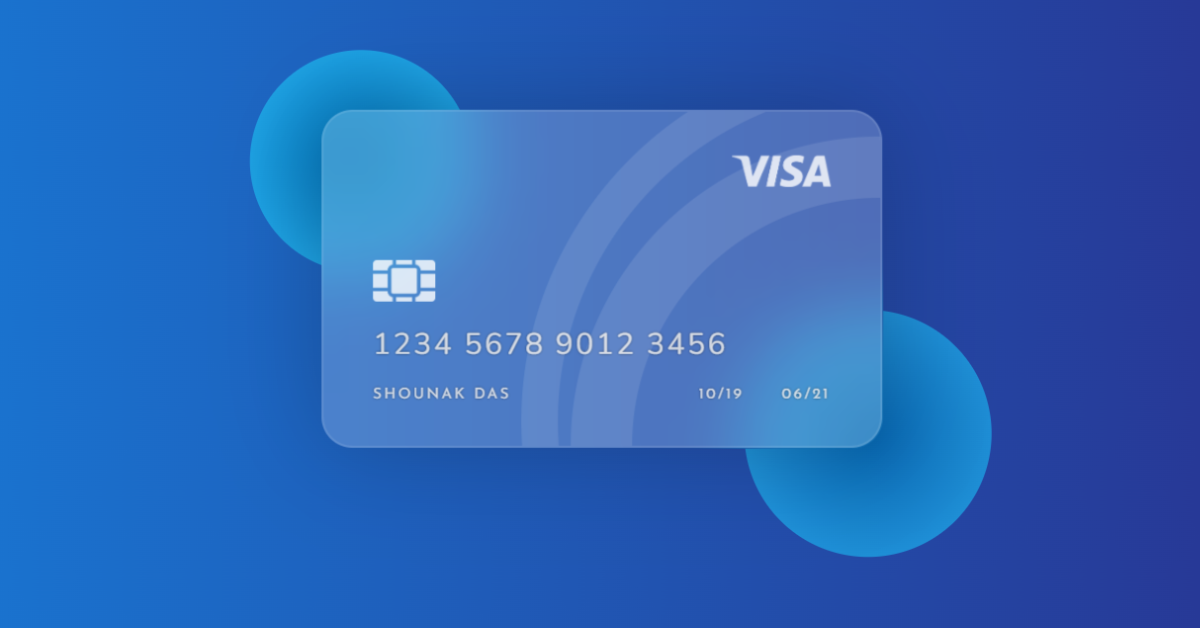
Welcome, Coders! In this article, we’ll use HTML and CSS to make a debit/credit card with a glassmorphism effect. The programmer will learn about the glass-morphism effect and how to make a virtual debit card that resembles a genuine card in this entire beginner’s project.

We need have a basic understanding of glassmorphism before starting our project, and we’ll see how to do so later on in this post.
What is glassmorphism?
Currently, the new design style known as glassmorphism is very well-liked. Even major corporations like Apple and Microsoft use it, as can be seen on websites like Dribbble. The basic feature of this trend is essentially a border and a semi-transparent background with a light shadow.
The background, however, has also had a blur added to it so that whatever is hidden behind it is beautifully “morphed” into the element itself. It all makes sense, right?
I hope you have a general idea of what the project entails. In our article, we will go over this project step by step.
Step1: Adding HTML Markup
<!DOCTYPE html>
<html lang="en">

<head>
    <meta charset="UTF-8" />
    <meta http-equiv="X-UA-Compatible" content="IE=edge" />
    <meta name="viewport" content="width=device-width, initial-scale=1.0" />
    <link rel="stylesheet" href="style.css" />
    <link rel="preconnect" href="https://fonts.gstatic.com">
    <link href="https://fonts.googleapis.com/css2?family=Josefin+Sans:wght@300;400&display=swap" rel="stylesheet">
    <link href="https://fonts.googleapis.com/css2?family=Nunito:wght@300;400&display=swap" rel="stylesheet">
    <title>Glassmorphism Debit Card</title>
</head>

<body>
    <div class="circles">
        <div class="circle circle-1"></div>
        <div class="circle circle-2"></div>
    </div>

    <div class="card-group">
        <div class="card">
            <div class="logo"><img
                    src="https://raw.githubusercontent.com/dasShounak/freeUseImages/main/Visa-Logo-PNG-Image.png"
                    alt="Visa"></div>
            <div class="chip"><img src="https://raw.githubusercontent.com/dasShounak/freeUseImages/main/chip.png"
                    alt="chip"></div>
            <div class="number">1234 5678 9012 3456</div>
            <div class="name">SHOUNAK DAS</div>
            <div class="from">10/19</div>
            <div class="to">06/21</div>
            <div class="ring"></div>
        </div>
    </div>
</body>

</html>
Every good programmer should understand how to manage a codebase since managing a codebase for a project is just as important as creating the project itself. The ideal way to organise the code is to make separate files for each language, so in this case we’ll make two separate files, one for HTML and one for CSS, and link them together to get the result we want. Since we utilised many fonts for this project, we must include the links to those fonts inside our header section in order to include them inside our project.
<link rel="stylesheet" href="style.css" />
<link href="https://fonts.googleapis.com/css2?family=Josefin+Sans:wght@300;400&display=swap" rel="stylesheet">
<link href="https://fonts.googleapis.com/css2?family=Nunito:wght@300;400&display=swap" rel="stylesheet">
Adding the Structure :
- We shall first make a div with the class circle. We’ll make two sub-divs inside of our div, then utilise those two sub-divs to make two circles around our debit card to give it a glass-morphism effect.
- The card logo and a picture of the chip will be added to a div we’ll create with the class “card-group” inside our <img> tag. The remaining card structure will be built using HTML elements at the block level and CSS concepts.
Let’s have a look at the structure.
Restaurant Website Using HTML and CSS
Output:

Step2: Adding CSS Code
In your stylesheet, copy and paste the CSS code provided below.
:root {
  font-size: 24px;
}

body {
  background: #1488cc;
  /* fallback for old browsers */
  background: linear-gradient(to left, #283593, #1976d2);
  height: 100vh;
  font-family: "Josefin Sans", sans-serif;
}

/* Background circles start */
.circle {
  position: absolute;
  border-radius: 50%;
  background: radial-gradient(#006db3, #29b6f6);
}
.circles {
  position: absolute;
  height: 270px;
  width: 450px;
  top: 50%;
  left: 50%;
  transform: translate(-50%, -50%);
}
.circle-1 {
  height: 180px;
  width: 180px;
  top: -50px;
  left: -60px;
}
.circle-2 {
  height: 200px;
  width: 200px;
  bottom: -90px;
  right: -90px;
  opacity: 0.8;
}
/* Background circles end */

.card-group {
  position: absolute;
  top: 50%;
  left: 50%;
  transform: translate(-50%, -50%);
}

.card {
  position: relative;
  height: 270px;
  width: 450px;
  border-radius: 25px;
  background: rgba(255, 255, 255, 0.2);
  backdrop-filter: blur(30px);
  border: 2px solid rgba(255, 255, 255, 0.1);
  box-shadow: 0 0 80px rgba(0, 0, 0, 0.2);
  overflow: hidden;
}

.logo img,
.chip img,
.number,
.name,
.from,
.to,
.ring {
  position: absolute; /* All items inside card should have absolute position */
}

.logo img {
  top: 35px;
  right: 40px;
  width: 80px;
  height: auto;
  opacity: 0.8;
}

.chip img {
  top: 120px;
  left: 40px;
  width: 50px;
  height: auto;
  opacity: 0.8;
}

.number,
.name,
.from,
.to {
  color: rgba(255, 255, 255, 0.8);
  font-weight: 400;
  letter-spacing: 2px;
  text-shadow: 0 0 2px rgba(0, 0, 0, 0.6);
}

.number {
  left: 40px;
  bottom: 65px;
  font-family: "Nunito", sans-serif;
}

.name {
  font-size: 0.5rem;
  left: 40px;
  bottom: 35px;
}

.from {
  font-size: 0.5rem;
  bottom: 35px;
  right: 110px;
}

.to {
  font-size: 0.5rem;
  bottom: 35px;
  right: 40px;
}

/* The two rings on the card background */
.ring {
  height: 500px;
  width: 500px;
  border-radius: 50%;
  background: transparent;
  border: 50px solid rgba(255, 255, 255, 0.1);
  bottom: -250px;
  right: -250px;
  box-sizing: border-box;
}

.ring::after {
  content: "";
  position: absolute;
  height: 600px;
  width: 600px;
  border-radius: 50%;
  background: transparent;
  border: 30px solid rgba(255, 255, 255, 0.1);
  bottom: -80px;
  right: -110px;
  box-sizing: border-box;
}
Step1: We will now establish a linear background for our body using the body selector and the background property, with the height set to 100 vh, and the font family set to “Josefin Sans” using the font-family property.
:root {
  font-size: 24px;
}

body {
  background: #1488cc;
  /* fallback for old browsers */
  background: linear-gradient(to left, #283593, #1976d2);
  height: 100vh;
  font-family: "Josefin Sans", sans-serif;
}
Step2:Now, using the class selector (.circle), we will build the circles for that. We will also set the position to “absolute,” and using the border radius property, we will give our div the appearance of a circle by using the border radius of “50%.” The position of both circles is controlled by the subclass selector, and their width and height are set to 270 and 450 pixels, respectively.
/* Background circles start */
.circle {
  position: absolute;
  border-radius: 50%;
  background: radial-gradient(#006db3, #29b6f6);
}
.circles {
  position: absolute;
  height: 270px;
  width: 450px;
  top: 50%;
  left: 50%;
  transform: translate(-50%, -50%);
}
.circle-1 {
  height: 180px;
  width: 180px;
  top: -50px;
  left: -60px;
}
.circle-2 {
  height: 200px;
  width: 200px;
  bottom: -90px;
  right: -90px;
  opacity: 0.8;
}
/* Background circles end */
Portfolio Website using HTML and CSS (Source Code)

Step3:We will now give our card group some style. We’ll use the top and left attributes to space it 50% from the top and 50% from the left, and we’ll set its position to “absolute.” The card has a light grey backdrop and an edged appearance thanks to the border-radius attribute and the settings of 270px and 450px for height and width, respectively.
Additionally, we’ll make sure that all of the card’s components are placed in an absolute position so that they all fit inside the card, and we’ll use the class selector to alter their width and height as well as the text’s colour.
.card {
  position: relative;
  height: 270px;
  width: 450px;
  border-radius: 25px;
  background: rgba(255, 255, 255, 0.2);
  backdrop-filter: blur(30px);
  border: 2px solid rgba(255, 255, 255, 0.1);
  box-shadow: 0 0 80px rgba(0, 0, 0, 0.2);
  overflow: hidden;
}

.logo img,
.chip img,
.number,
.name,
.from,
.to,
.ring {
  position: absolute; /* All items inside card should have absolute position */
}

.logo img {
  top: 35px;
  right: 40px;
  width: 80px;
  height: auto;
  opacity: 0.8;
}

.chip img {
  top: 120px;
  left: 40px;
  width: 50px;
  height: auto;
  opacity: 0.8;
}

.number,
.name,
.from,
.to {
  color: rgba(255, 255, 255, 0.8);
  font-weight: 400;
  letter-spacing: 2px;
  text-shadow: 0 0 2px rgba(0, 0, 0, 0.6);
}

.number {
  left: 40px;
  bottom: 65px;
  font-family: "Nunito", sans-serif;
}

.name {
  font-size: 0.5rem;
  left: 40px;
  bottom: 35px;
}

.from {
  font-size: 0.5rem;
  bottom: 35px;
  right: 110px;
}

.to {
  font-size: 0.5rem;
  bottom: 35px;
  right: 40px;
}

/* The two rings on the card background */
.ring {
  height: 500px;
  width: 500px;
  border-radius: 50%;
  background: transparent;
  border: 50px solid rgba(255, 255, 255, 0.1);
  bottom: -250px;
  right: -250px;
  box-sizing: border-box;
}

.ring::after {
  content: "";
  position: absolute;
  height: 600px;
  width: 600px;
  border-radius: 50%;
  background: transparent;
  border: 30px solid rgba(255, 255, 255, 0.1);
  bottom: -80px;
  right: -110px;
  box-sizing: border-box;
}
Now we’ve completed our glassmorphism debit card using html & css. I hope you understood the whole project. Let’s take a look at our Live Preview.
50+ HTML, CSS & JavaScript Projects With Source Code
Output:
Live Preview Of our glassmorphism debit card using html & css
Now We have Successfully created our glassmorphism debit card using html & css. You can use this project directly by copying into your IDE. WE hope you understood the project , If you any doubt feel free to comment!!
If you find out this Blog helpful, then make sure to search code with random on google for Front End Projects with Source codes and make sure to Follow the Code with Random Instagram page.
ADVERTISEMENT
