Create Bootstrap Responsive Navbar With Source Code
Hello friends, welcome to the codewithrandom blog! Today we learn how to create a Bootstrap Responsive Navbar with easy steps and explanations Of Bootstrap Navbar Code. So let us start coding.
A webpage’s navigation bar is a user interface component that has links to other webpage areas. Most frequently, a website’s navigation bar appears as a horizontal list of links at the top of each page. Similar to adding a new option to the navbar that will perform a database search, adding a search bar is simple. The placement of the search bar must be done with care.
Make sure it is displayed in the navbar separately. You’ll need HTML and CSS to make a navbar with a search bar. You may create a search bar by following the step-by-step instructions below
Responsive navbar bootstrap
If you go to the official Bootstrap website for the navbar you can find lots of navbars in different styles so we choose a Responsive navbar with a Hamburger menu let’s start with adding the cdn link of Bootstrap.
Bootstrap Cdn Links
<link rel="stylesheet" href="https://maxcdn.bootstrapcdn.com/bootstrap/4.5.2/css/bootstrap.min.css">
<script src="https://ajax.googleapis.com/ajax/libs/jquery/3.5.1/jquery.min.js"></script>
<script src="https://cdnjs.cloudflare.com/ajax/libs/popper.js/1.16.0/umd/popper.min.js"></script>
<script src="https://maxcdn.bootstrapcdn.com/bootstrap/4.5.2/js/bootstrap.min.js"></script>
These are all the connections to the bootstrap CDN. The CSS for Bootstrap is available in this website. The other three CDN links pertain to jQuery, Popper.js, and the final JavaScript; for more information on CDN links, see our piece on CDN links.
15+ Bootstrap Sidebar Menu [ Demo + Code ]
Bootstrap Responsive Navbar Code:-
<nav class="navbar navbar-expand-md navbar navbar-dark bg-primary">
<a class="navbar-brand" href="#">Navbar</a>
<button class="navbar-toggler" type="button" data-toggle="collapse" data-target="#collapsibleNavbar">
<span class="navbar-toggler-icon"></span>
</button>
<div class="collapse navbar-collapse" id="collapsibleNavbar">
<ul class="navbar-nav">
<li class="nav-item">
<a class="nav-link" href="#">Link</a>
</li>
<li class="nav-item">
<a class="nav-link" href="#">Link</a>
</li>
<li class="nav-item">
<a class="nav-link" href="#">Link</a>
</li>
</ul>
</div>
</nav>
For creating the navbar using the bootstrap we will use the bootstrap classes to add the structure for our navbar using the nav tag we will create the container for our bootstrap navbar and then using the <a> tag we will add the link for the navbar .
Using the button tag we will create a toggle button which willl help in expanding and collapsing of the navabar.Now using the unordered list tag we will create a multiple list item for our navbar and also we will make them as hypertext for adding the link to our navbar list items.
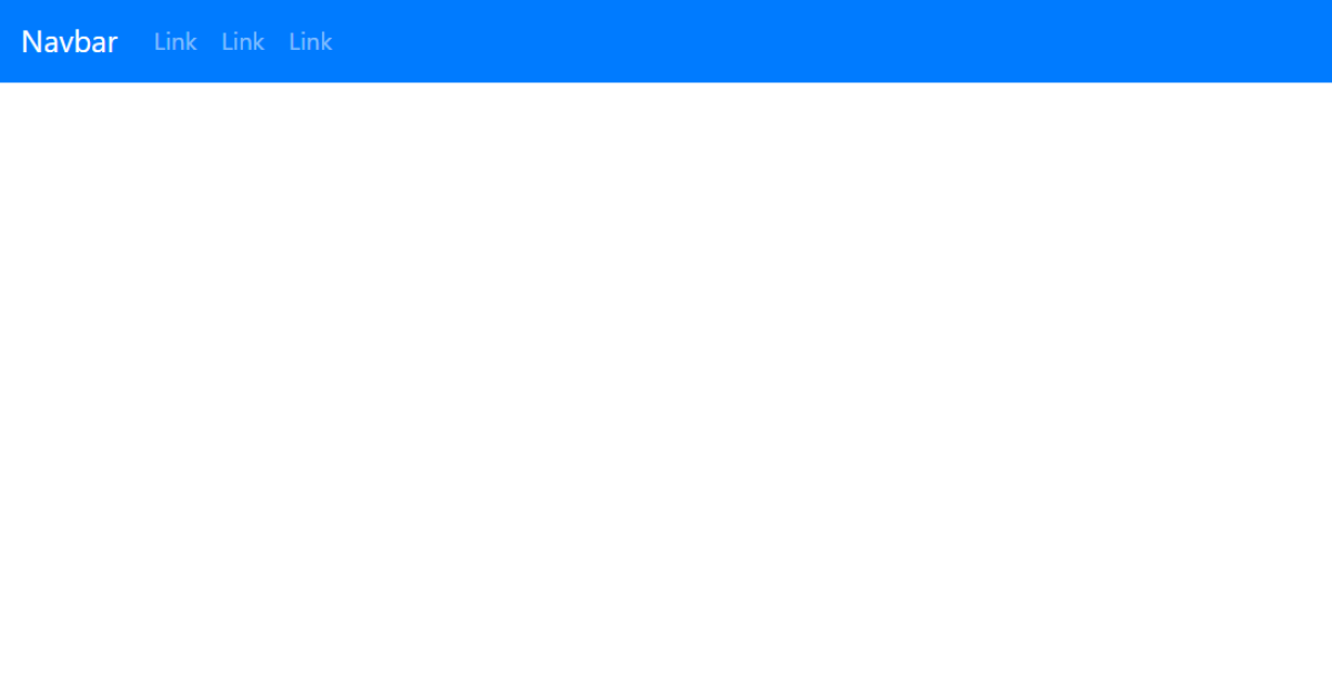
This is the complete code of a responsive bootstrap navbar so 1st see the output of our navbar then understand all bootstrap class what navbar, navbar-dark learn all classes.
50+ HTML, CSS & JavaScript Projects With Source Code
Bootstrap Navbar Output:-
This is our navbar when we have a desktop screen or on a laptop Or a bigger screen!
This is our mobile responsive bootstrap hamburger menu. So let’s understand all this code step by step.
Bootstrap navbar Class
Navbar class – basically navbar class used for creating a navigation skeleton.
Navbar expands class – we use navbar expand class for the desktop screen.
Gym Website Using HTML and CSS Source Code
Navbar toggler – we use the navbar toggler for the Hamburger menu and add activity In our responsive navbar.
Collapse navbar collapse – we use Collapse navbar collapse to hide our menu where screen resolution Change like mobile to desktop or desktop to mobile.
Navbar-dark – we use navbar dark for the dark color of any background. Bg-primary – we use bg primary for the blue color, you can easily see we create a blue background navbar.
Navbar-brand – we use the navbar brand as a heading in a name like a big name appearing in the navbar on one side so we create this heading(title) in the navbar with help of the navbar brand.
Weather App Using Html,Css And JavaScript
Final Output Of Bootstrap Responsive Navbar:
Codepen Preview:
In this article/post we learn how to create a bootstrap hamburger navbar, and hope you like this menu that we create in less code. Also, we use cdn links that we paste in the head tag and use this navbar code in the body tag and your navbar is ready. Thank you for reading.
If we did a mistake or any confusion please drop a comment so give a reply or help you in easy learning.
written by – code with random/Anki
What is a Navbar?
A website’s navigation header is represented graphically by a navigation bar, also referred to as a navbar. Typically, it includes links to the homepage, about page, contact page, and other key pages of a website. The navbar is typically a fixed element that is always visible regardless of how far down or up the user scrolls on a webpage
What is the use of Navbar?
The main purpose of the navbar is to move across the different sections of the website.
ADVERTISEMENT
Which tag is used for the navigation bar?
The <nav> tag defines a set of navigation links.
ADVERTISEMENT
