Create Image Flip Animation Using HTML and CSS
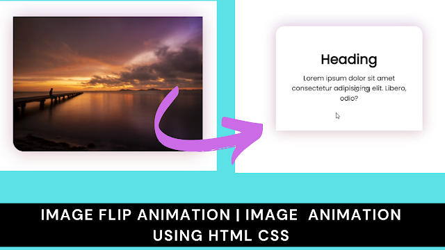
Welcome to the Codewithrandom blog. In this blog, We learn how to create an Image Flip Animation. We use HTML and CSS for this Image Flip Animation.
I hope you enjoy our blog so let’s start with a basic Html Structure for Image Flip Animation.
HTML Code For Image Flip Animation
<!DOCTYPE html>
<html lang="en">
<head>
<meta charset="UTF-8">
<meta http-equiv="X-UA-Compatible" content="IE=edge">
<meta name="viewport" content="width=device-width, initial-scale=1.0">
<title>Image Flip Animation</title>
<link rel="stylesheet" href="style.css">
</head>
<body>
<div class="box">
<div class="front">
<img src="main.jpg" alt="">
</div>
<div class="back">
<h1>Heading</h1>
<p>Lorem ipsum dolor sit amet consectetur adipisicing elit. Libero, odio?</p>
</div>
</div>
</body>
</html>
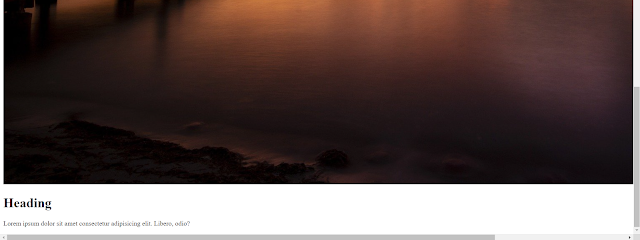
There is all the Html Code for the Image Flip Animation. Now, you can see output without CSS, then we write Css for our Image Flip Animation.
5+ HTML CSS Projects With Source Code
Html Code Output
@import url('https://fonts.googleapis.com/css2?family=Poppins&display=swap');
*{
margin: 0;
padding: 0;
box-sizing: border-box;
font-family: 'Poppins', sans-serif;
}
body{
display: flex;
justify-content: center;
align-items: center;
height: 100vh;
}
.box{
width: 350px;
height: 250px;
position: relative;
}
.box .front,
.box .back{
position: absolute;
width: 350px;
height: 250px;
background: white;
backface-visibility: hidden;
transform-style: preserve-3d;
cursor: pointer;
border-radius: 20px 20px 0 0;
border-radius: 20px;
box-shadow: 0 5px 30px rgba(163, 61, 21, 0.200 ),
0 -5px 30px rgba(115, 55, 212, 0.200);
transition: transform .4s;
}
.box .back{
display: flex;
justify-content: center;
align-items: center;
flex-direction: column;
transform: perspective(800px) rotateX(-180deg);
}
.box .back p{
margin: 10px 20px;
text-align: center;
}
.box .front img{
width: 100%;
height: 100%;
border-radius: 0 0 20px 20px;
position: absolute;
}
.box:hover .front{
transform: perspective(800px) rotateX(180deg);
}
.box:hover .back{
border-radius: 20px 20px 0 0;
transform: perspective(800px) rotateX(0);
}
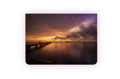
Now we have completed our Image Flip Animation, Here is our updated output HTML + CSS.
Ecommerce Website Using HTML, CSS, & JavaScript (Source Code)
Final Output Of Image Flip Animation
100+ JavaScript Projects With Source Code ( Beginners to Advanced)
Now we have completed our Image Flip Animation, Here is our updated output with HTML and CSS. Hope you like Image Flip Animation, you can see the output video and project screenshots. See our other blogs and gain knowledge in front-end development.
Thank you!
In this post, we learn how to Create Image Flip Animation Using HTML and CSS. If we made a mistake or any confusion, please drop a comment to reply or help you in easy learning.
Written by – Code With Random/Anki
