How To Create A Toggle Button In HTML & CSS
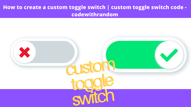
In this tutorial, we will explore how to make a Custom Toggle Button Switch using HTML and CSS. Toggle Button Switches are a form of the radio button that includes animation and color effects. This makes a toggle switch a lot more attractive and engaging than a standard radio button.
This design is used in various use cases, such as the website’s dark and bright mode buttons, to enable some features, and to select any of the many options.
Live Project Preview:
We will begin by making a radio button with HTML input for the Custom Toggle Switch Buttons. Next, we will use CSS to create a slider for the input field. Within that slider, we will make a small round button.
The toggle button is normally found on the left side of the screen. When you click on the button, it will shift to the right. Here’s a live demonstration to show you how it works.
Prerequisite To Create A Toggle Button:
All you need is a basic understanding of HTML and CSS to get started with this project.
Portfolio Website using HTML and CSS (Source Code)
Step 1: Create the basic HTML structure.
<div class="switch-container">
 </div>
Step 2: Use CSS to design the background and switch the container.
We are using a grid layout for this project, but you can use the toggle switch in any layout of your choice.
* {
    margin: 0;
    padding: 0;
    box-sizing: border-box;
}
body {
    display: grid;
    justify-content: center;
    align-items: center;
    height: 100vh;
}
Here we are giving the width = 24em and height = 10em to the container. Also, we are giving it a border of 10em and surrounding it using box-shadow to make it look more aesthetic.
We set the position of the container to be relative, to make the button slide relative to the container.
.switch-container {
    width: 24em;
    height: 10em;
    border-radius: 10em;
    box-shadow: 5px 5px 15px 5px #cfd8dc;
    position: relative;
}
Step 3: Create a radio button using the checkbox
Now we construct a custom radio button, using HTML < input type=”checkbox”>.
HTML input element is used for a variety of input such as text, passwords, buttons, files, and so on.
We will also create a div element (switch-color) to be used as a background of the toggle switch. This will change color according to the checkbox.
100+ JavaScript Projects With Source Code ( Beginners to Advanced)
<input type="checkbox" id="switch" />
<div class="switch-color"></div>
In CSS we will hide the input for now using display: none.
input { display: none; }Put z-index for switch-color equal to -1, this will move it to the background of the toggle switch. We will use absolute positioning to position it relative to its parent (i.e. switch-container).
.switch-color {
    width: 22em;
    height: 8em;
    left: 1em;
    top: 1em;
    background: #cfd8dc;
    border-radius: 10em;
    z-index: -1;
    position: absolute;
    transition: all 500ms cubic-bezier(0.34, 1.36, 0.2, 1);
}
Step 4: Create a Custom Toggle Switch in the slider
To make the sliding switch, we will add HTML label element to the switch container ( after checkbox input).
<label for="switch"> </label>
To make the Custom Toggle Switch round, we use border-radius: 50%. And add box-shadow to make it more appealing. Set z-index: 2, to make the switch more outwards then the rest of the surrounding.
10+ HTML CSS Projects For Beginners with Source Code
label {
    width: 8em;
    height: 8em;
    border-radius: 50%;
    background: white;
    position: absolute;
    top: 1em;
    left: 1em;
    box-shadow: 2px 2px 10px 2px #cfd8dc;
    z-index: 2;
    cursor: pointer;
}
Step 5: Activate the toggle button with CSS
The following codes were used to create this Toggle Switch.
ADVERTISEMENT
As previously stated, the switch is normally located to the left of the slider. This switch will move to the right of the slide whenever you click it.
ADVERTISEMENT
If you look at the demo above, you’ll see that there’s some sort of animation going on. The button will move 14em along the x-axis when you click on it. Moreover, the switch is not just moving but it is rotating during the motion.
ADVERTISEMENT
#switch:checked ~ label {
    transform: translatex(14em) rotatez(360deg);
}
Under regular lighting, the grey tone of this background can be seen. The backdrop color changes to green when you click the Toggle button, hence, check the checkbox.
ADVERTISEMENT
How To Create Movie App UI Using HTML & CSS
ADVERTISEMENT
To change color, we are creating a CSS block for the backdrop color to be green when the switch is checked. Here the element with class “switch-color” is set to have a green background.
#switch:checked ~ .switch-color {
    background: #00e676;
}
The animation is controlled using a cubic-bezier function that controls the transition timing. The entire transition is taking 1s for the movement of the toggle switch.
#switch ~ label {
    transition: all 1s cubic-bezier(0.34, 1.36, 0.2, 1);
}
Step 6: Add a cross mark to Switch using:: before
Now we use CSS to add different types of symbols to the switch, using before and after pseudo-elements.
‘::before’ aids in determining what will change before an element, while ‘::after’ aids in determining what will change after that element.
First, we will use before to control how the switch would look under regular circumstances (i.e. when unchecked). To display this sign, I used the content: “f00d” tag. The font-size: 5em and the color red and font-weight: 900.
Memory Pairs Game in JavaScript
label::before {
    font-family: "Font Awesome 5 Free";
    font-weight: 900;
    font-size: 5em;
    content: "f00d";
    position: absolute;
    left: 0.42em;
    top: 0.3em;
    color: #e9182a;
}
When the switch is checked, we change the opacity: 0 to make the “before icon” disappear.
#switch:checked ~ label::before {
    opacity: 0;
}
Step 7: Add a second symbol to the CSS Toggle Switch
We’ll now add the second sign using “::after” pseudo-element. To add the second sign, we will use content: “f00c”.
Under the regular conditions, we keep the opacity: 0, which indicates that this sign isn’t visible under normal circumstances (when the switch is off).
label::after {
    font-family: "Font Awesome 5 Free";
    font-weight: 900;
    font-size: 5em;
    content: "f00c";
    position: absolute;
    left: 0.3em;
    top: 0.3em;
    opacity: 0;
    color: #00e676;
}
Ecommerce Website Using HTML, CSS, & JavaScript (Source Code)
When the switch is checked, we change the opacity: 1, this indicates that the icon will only appear when the button is pressed.
#switch:checked ~ label::after {
    opacity: 1;
}
Our toggle switch is ready for use. You can add it to any webpage to have a custom toggle switch of your own.
Thanks For Reading!


