Pricing Table Examples With 3 Choices In an Easy Way

Hello, web dev warriors. Welcome to CodeWithRandom. Today we will learn to make a clean and modern pricing table that can use in any project without having to change most of the design. But, before rolling into the code, let’s understand what’s a pricing table.
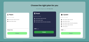
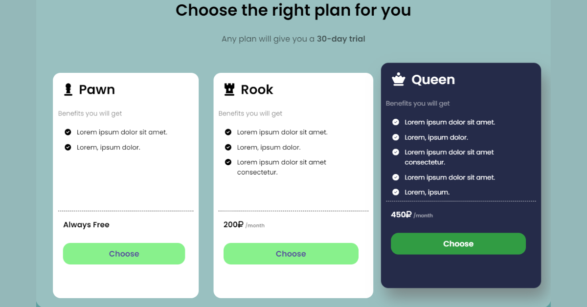
A pricing table is a general web template that is used by anyone providing a subscription to something. A pricing table can show choices ranging from free to purchase and the type of benefits. So, for any such website, it is necessary to have a pricing table like the one we see above.
Using CSS we present Pricing Table Examples With 3 Choices In an Easy Way Using Html and CSS projects with source code available for you to copy and paste directly into your own project.
Design Elements For A Pricing Table
In any pricing table, the following elements should be present.
- A section representing the different options as a card.
- Each card should have a title that represents the use of those options without reading the points.
- A set of bullet points that clearly tell the benefits.
- A price for each card.
- Button to choose that option and possibly link to another page where it is connected.
While these are the basic design elements, there are other things to remember like, we have to differentiate the option we selected from the rest using some sort of the change in the card. In this article, the change will the background color, text color, and the movement of the card. Now let’s begin the code.
Turning pages with CSS | Page Flip Animation Css Codepen
HTML code for pricing table
First I will give the code and then explain wherever necessary.
<!DOCTYPE html>
<html lang="en">

    <head>
        <meta charset="UTF-8">
        <meta http-equiv="X-UA-Compatible" content="IE=edge">
        <meta name="viewport" content="width=device-width, initial-scale=1.0">
        <title>Pricing Table</title>
        <link rel="stylesheet" href="style.css">
        <link rel="stylesheet" href="https://cdnjs.cloudflare.com/ajax/libs/font-awesome/6.2.0/css/all.min.css"
            integrity="sha512-xh6O/CkQoPOWDdYTDqeRdPCVd1SpvCA9XXcUnZS2FmJNp1coAFzvtCN9BmamE+4aHK8yyUHUSCcJHgXloTyT2A=="
            crossorigin="anonymous" referrerpolicy="no-referrer" />
    </head>

    <body>
        <main>
            <div class="text">
                <h1>Choose the right <b>plan</b> for you</h1>
                <p>Any plan will give you a <strong>30-day trial</strong></p>
            </div>
            <div class="cardSection">
                <div class="card">
                    <div class="title">
                        <i class="fa-solid fa-chess-pawn"></i>
                        Pawn
                    </div>
                    <p>Benefits you will get</p>
                    <div class="options">
                        <ul class="fa-ul">
                            <li><span class="fa-li"><i class="fa-solid fa-circle-check"></i></span> Lorem ipsum dolor
                                sit amet.</li>
                            <li><span class="fa-li"><i class="fa-solid fa-circle-check"></i></span> Lorem, ipsum dolor.
                            </li>

                        </ul>
                    </div>
                    <div class="pricing">
                        <h3>Always Free</h3>
                    </div>
                    <button class="btn--choose btn" onclick="selectBtn()">Choose</button>
                </div>
                <div class="card">
                    <div class="title">
                        <i class="fa-solid fa-chess-rook"></i>
                        Rook
                    </div>
                    <p>Benefits you will get</p>
                    <div class="options">
                        <ul class="fa-ul">
                            <li><span class="fa-li"><i class="fa-solid fa-circle-check"></i></span> Lorem ipsum dolor
                                sit amet.</li>
                            <li><span class="fa-li"><i class="fa-solid fa-circle-check"></i></span> Lorem, ipsum dolor.
                            </li>
                            <li><span class="fa-li"><i class="fa-solid fa-circle-check"></i></span> Lorem ipsum dolor
                                sit amet consectetur.</li>

                        </ul>
                    </div>
                    <div class="pricing">
                        <h3>200<i class="fa-solid fa-ruble-sign"></i> <span>/month</span></h3>
                    </div>
                    <button class="btn--choose btn" onclick="selectBtn()">Choose</button>
                </div>
                <div class="card">
                    <div class="title">
                        <i class="fa-solid fa-chess-queen"></i>
                        Queen
                    </div>
                    <p>Benefits you will get</p>
                    <div class="options">
                        <ul class="fa-ul">
                            <li><span class="fa-li"><i class="fa-solid fa-circle-check"></i></span> Lorem ipsum dolor
                                sit amet.</li>
                            <li><span class="fa-li"><i class="fa-solid fa-circle-check"></i></span> Lorem, ipsum dolor.
                            </li>
                            <li><span class="fa-li"><i class="fa-solid fa-circle-check"></i></span> Lorem ipsum dolor
                                sit amet consectetur.</li>
                            <li><span class="fa-li"><i class="fa-solid fa-circle-check"></i></span> Lorem ipsum dolor
                                sit amet.</li>
                            <li><span class="fa-li"><i class="fa-solid fa-circle-check"></i></span> Lorem, ipsum.</li>
                        </ul>
                    </div>
                    <div class="pricing">
                        <h3>450<i class="fa-solid fa-ruble-sign"></i> <span>/month</span></h3>
                    </div>
                    <button class="btn--choose btn" onclick="selectBtn()">Choose</button>
                </div>
            </div>
        </main>
    </body>

</html>
So, to summarize the HTML code, I made three div with a class card which is essentially the pricing card, and the div with class card section is what we call the pricing table. Each card has its own set of list items and so on and so forth with the other design elements explained. Let’s move on to the CSS part of the pricing table.
How To Make Simple Tip Calculator Using Javascript
CSS
Now, before writing the code, there is some explanation to be given on how we approach this design recreation given that, it should work for all devices and also be effective in terms of the design goals we had discussed. So, we will deal with the following.
- Layout for the cards
- Inner Design of cards
- Transformations on selection
So, let’s start with the layout of the cards. Now, As web developers, we must have heard of the mobile-first approach which is preferred by some, and some follow the generic approach. The Mobile first approach gives us the ease of writing the code first for mobile and then developing it for others. This is beneficial because converting a desktop variant code to mobiles is hectic as the elements overflow and we can’t always know which element is causing that.
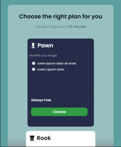
So, here we start with the mobile-first approach which will look like this.

The other card will look similar as we scroll through. So, to make this happen, we use the Grid Layout. If you are unfamiliar with it, there are a ton of super articles on code with random that can explain u it clearly. But, for now, think of grid layout as a 2-dimensional layout system that can arrange the items according to row and column, unlike the flexbox which is unidirectional. As we see the CSS code we will discuss the rest.
CSS code for pricing table
@import url('https://fonts.googleapis.com/css2?family=Poppins:wght@300;400;500;600&display=swap');

* {
    box-sizing: border-box;
    font-family: 'Poppins', sans-serif;
}

body {
    background-color: rgb(93, 159, 159);
    display: flex;
    justify-content: center;
}

main {
    background-color: rgba(234, 236, 237, 0.427);
    text-align: center;
    width: 90%;
    margin-top: 20px;
    border-radius: 20px;
    backdrop-filter: blur(30px);
}

main .text {
    padding: 20px;
}

.text p {
    opacity: 0.6;
}

.cardSection {
    display: grid;
    grid-template-columns: repeat(1, 1fr);
    grid-template-rows: repeat(3, 1fr);
    justify-items: center;
    padding: 20px;
    row-gap: 25px;
    column-gap: 15px;
}

.card {
    text-align: left;
    padding: 10px;
    border-radius: 15px;
    background-color: #fff;
    min-width: 55vw;
    max-width: 550px;
    height: 60vh;
}

.card .title {
    padding: 5px;
    font-size: 2em;
    font-weight: 700;
}

.title i {
    margin: 0 7px 0 7px;
}

.card p {
    opacity: 0.5;
}

.card .options {
    border-bottom: 1px dashed #010101;
    height: 40%;

}

.options ul li {
    list-style: none;
    padding: 5px;
}

.pricing {
    margin-left: 10px;
}

.pricing span {
    font-size: x-small;
    font-weight: 800;
    opacity: 0.5;
}

.card button {
    margin: 10px;
    padding: 10px;
    width: 90%;
    background-color: rgba(57, 232, 63, 0.6);
    border: none;
    cursor: pointer;
    color: rgba(79, 57, 157, 0.9);
    font-size: 1.2em;
    font-weight: 800;
    border-radius: 15px;
}

.active {
    background-color: #252b49;
    color: #fff;
    transition: background-color 1s ease, transform 1s ease;
}

.active>button {
    color: #fff;
}
Now, you might notice, in the end, there is a class called active. This is the class that deals with the transformation of the card when selected. But wait there is no HTML element with that class. This is because we add that dynamically with a little touch from JS.
The last part of CSS is left. This is to make the code responsive. First, let’s see the code.
@media screen and (min-width:768px) {

    .card {
        min-width: 45vw;
        max-width: 50vw;
    }
}

@media screen and (min-width:908px) {

    .card {
        max-width: 50vw;
    }

    .active {
        transform: translateY(-20px);
    }
}

@media screen and (min-width:1024px) {

    main {
        width: 92vw;
    }

    .cardSection {
        grid-template-columns: repeat(3, 1fr);
        grid-template-rows: repeat(1, 1fr);

    }

    .card {
        min-width: 26vw;
        min-height: 60vh;
        font-size: small;
    }
}
We used the condition min-width because we want to target the breakpoints as they grow. It means that min-width:768 px deals with a screen size greater than 768px. So, in that way, I applied three break points at 768px, 908px, and also 1024px. When we enter the laptop breakpoint we want all the items to be in the same row. So, we change grid-template rows to 1 and grid-template-columns to 3. This will result in the picture we have seen at the top. Now, Let’s see the JavaScript code.
Create Waterfall Layout using CSS | CSS waterfall page layout
JavaScript
Now, why do we need JavaScript for a simple pricing table? That’s because if I click on a card then the other two cards should be deselected. This is not possible without a few lines of JS and also we need to add the class activities as well.
JavaScript code for pricing table
let btn = document.getElementsByClassName("btn--choose")
           let card = document.getElementsByClassName("card")
           for (let i = 0; i < btn.length; i++) {
               btn[i].onclick = function () {
                   var ele = card[0]
                   while (ele) {
                       if (ele.tagName == "DIV") {
                           ele.classList.remove("active")
                       }

                       ele = ele.nextSibling
                   }
                   card[i].classList.add("active")

               }
           }
Conclusion
So, that’s it for today, folks. I will attach the codepen link as well for you all to interact with the code yourself. We can now merge the code with any project you are doing which needs a pricing table. For more such cool projects do checkout CodeWithRandom on Instagram as well.
In this blog post, we will discuss pricing Table Examples With 3 Choices In an Easy Way Using Html and CSS with complete source code so you can just copy and paste them into your own project. Happy exploring and learning !!
Links:
Codepen for the article
Instagram
Thank you all, see you next time with another cool article.
Aneesh Malapaka
ADVERTISEMENT

![15+ CSS Weather Widgets [ Code + Demo ] Read more about the article 15+ CSS Weather Widgets [ Code + Demo ]](https://www.codewithrandom.com/wp-content/uploads/2022/11/codewithrandom23-300x157.png)
