Responsive Accordion Using HTML and CSS
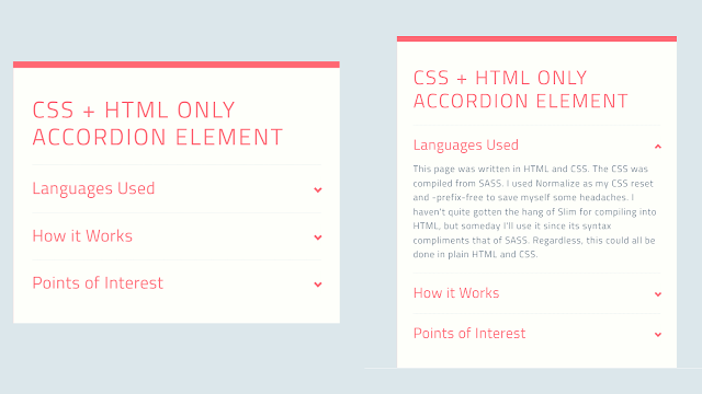
Welcome to the Codewithrandom blog. In this blog, We learn how to create a Responsive Accordion. We use HTML and CSS for Accordion. Accordion is like a dropdown paragraph, so it takes a short space on the page, and when we need we click on down and hide the content shown.
I hope you enjoy our blog so let’s start with a basic html structure for the Responsive accordion.
HTML Code For Accordion
<h1>CSS + HTML only Accordion Element</h1>
<ul>
  <li>
    <input type="checkbox" checked>
    <i></i>
    <h2>Languages Used</h2>
    <p>This page was written in HTML and CSS. The CSS was compiled from SASS. I used Normalize as my CSS reset and -prefix-free to save myself some headaches. I haven't quite gotten the hang of Slim for compiling into HTML, but someday I'll use it since its syntax compliments that of SASS. Regardless, this could all be done in plain HTML and CSS.</p>
  </li>
  <li>
    <input type="checkbox" checked>
    <i></i>
    <h2>How it Works</h2>
    <p>Using the sibling and checked selectors, we can determine the styling of sibling elements based on the checked state of the checkbox input element. One use, as demonstrated here, is an entirely CSS and HTML accordion element. Media queries are used to make the element responsive to different screen sizes.</p>
  </li>
  <li>
    <input type="checkbox" checked>
    <i></i>
    <h2>Points of Interest</h2>
    <p>By making the open state default for when :checked isn't detected, we can make this system accessable for browsers that don't recognize :checked. The fallback is simply an open accordion. The accordion can be manipulated with Javascript (if needed) by changing the "checked" property of the input element.</p>
  </li>
</ul>
There is all the html code for the accordion text. Now, you can see output without Css. Then we write Css for the Responsive accordion.
50+ HTML, CSS & JavaScript Projects With Source Code
Output
CSS Code For Accordion
.transition, ul li i:before, ul li i:after, p {
  transition: all 0.25s ease-in-out;
}

.flipIn, ul li, h1 {
  animation: flipdown 0.5s ease both;
}

.no-select, h2 {
  -webkit-tap-highlight-color: rgba(0, 0, 0, 0);
  -webkit-touch-callout: none;
  -webkit-user-select: none;
  -khtml-user-select: none;
  -moz-user-select: none;
  -ms-user-select: none;
  user-select: none;
}

html {
  width: 100%;
  height: 100%;
  perspective: 900;
  overflow-y: scroll;
  background-color: #dce7eb;
  font-family: "Titillium Web", sans-serif;
  color: rgba(48, 69, 92, 0.8);
}

body {
  min-height: 0;
  display: inline-block;
  position: relative;
  left: 50%;
  margin: 90px 0;
  transform: translate(-50%, 0);
  box-shadow: 0 10px 0 0 #ff6873 inset;
  background-color: #fefffa;
  max-width: 450px;
  padding: 30px;
}
@media (max-width: 550px) {
  body {
    box-sizing: border-box;
    transform: translate(0, 0);
    max-width: 100%;
    min-height: 100%;
    margin: 0;
    left: 0;
  }
}

h1, h2 {
  color: #ff6873;
}

h1 {
  text-transform: uppercase;
  font-size: 36px;
  line-height: 42px;
  letter-spacing: 3px;
  font-weight: 100;
}

h2 {
  font-size: 26px;
  line-height: 34px;
  font-weight: 300;
  letter-spacing: 1px;
  display: block;
  background-color: #fefffa;
  margin: 0;
  cursor: pointer;
}

p {
  color: rgba(48, 69, 92, 0.8);
  font-size: 17px;
  line-height: 26px;
  letter-spacing: 1px;
  position: relative;
  overflow: hidden;
  max-height: 800px;
  opacity: 1;
  transform: translate(0, 0);
  margin-top: 14px;
  z-index: 2;
}

ul {
  list-style: none;
  perspective: 900;
  padding: 0;
  margin: 0;
}
ul li {
  position: relative;
  padding: 0;
  margin: 0;
  padding-bottom: 4px;
  padding-top: 18px;
  border-top: 1px dotted #dce7eb;
}
ul li:nth-of-type(1) {
  animation-delay: 0.5s;
}
ul li:nth-of-type(2) {
  animation-delay: 0.75s;
}
ul li:nth-of-type(3) {
  animation-delay: 1s;
}
ul li:last-of-type {
  padding-bottom: 0;
}
ul li i {
  position: absolute;
  transform: translate(-6px, 0);
  margin-top: 16px;
  right: 0;
}
ul li i:before, ul li i:after {
  content: "";
  position: absolute;
  background-color: #ff6873;
  width: 3px;
  height: 9px;
}
ul li i:before {
  transform: translate(-2px, 0) rotate(45deg);
}
ul li i:after {
  transform: translate(2px, 0) rotate(-45deg);
}
ul li input[type=checkbox] {
  position: absolute;
  cursor: pointer;
  width: 100%;
  height: 100%;
  z-index: 1;
  opacity: 0;
}
ul li input[type=checkbox]:checked ~ p {
  margin-top: 0;
  max-height: 0;
  opacity: 0;
  transform: translate(0, 50%);
}
ul li input[type=checkbox]:checked ~ i:before {
  transform: translate(2px, 0) rotate(45deg);
}
ul li input[type=checkbox]:checked ~ i:after {
  transform: translate(-2px, 0) rotate(-45deg);
}

@keyframes flipdown {
  0% {
    opacity: 0;
    transform-origin: top center;
    transform: rotateX(-90deg);
  }
  5% {
    opacity: 1;
  }
  80% {
    transform: rotateX(8deg);
  }
  83% {
    transform: rotateX(6deg);
  }
  92% {
    transform: rotateX(-3deg);
  }
  100% {
    transform-origin: top center;
    transform: rotateX(0deg);
  }
}
Now we have completed our Responsive Accordion. Here is our final updated output CSS.
100+ JavaScript Projects With Source Code ( Beginners to Advanced)
Final Output Responsive Accordion Using HTML and CSS
Restaurant Website Using HTML And CSS With Source Code
I hope you like the Responsive accordion, you can see the output project screenshots. See our other blogs and gain knowledge in front-end development.
Thank you!
In this post, we learn how to create a Responsive Accordion Using HTML and CSS. If we made a mistake or any confusion, please drop a comment to reply or help you learn easily.
Written by – Code With Random/Anki
code by – Alex Bergin


