Create Flip Page Animation Using HTML,CSS and JavaScript Code
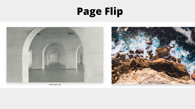
Welcome to the codewithrandom blog. In this article, We Create Flip Page Animation Using HTML, CSS, and JavaScript. In this Page Flip animation, we have 2 images but when the website load there is a full-screen 1 image shown when you click its flip like a book page flip, and the image change, and if you again click you see again book page flip effect and previous image come. so we create this Page Flip Animation Project.
I hope you enjoy our blog so let’s start with a basic html structure for a Page Flip Animation.
50+ HTML, CSS & JavaScript Projects With Source Code
| Code by | Jake Albaugh |
| Project Download | Link Available Below |
| Language used | HTML, CSS and JavaScript |
| External link / Dependencies | NO |
| Responsive | YES |
HTML Code For Page Flip animation
 <section>
  <div class="left next"></div>
  <div class="right next"></div>
  <div class="left current"></div>
  <div class="right current"></div>
 </section>
 <h1 id="title">tap the image to flip</h1>
This is all the code for Page Flip Animation. Now, you can see output without Css and Javascript, then we write Css & Javascript for the Page Flip Animation.
Restaurant Website Using HTML and CSS
Output page flip animation

CSS Code For Page Flip animation
 :root {
  --duration: 500ms;
  --ease-in: cubic-bezier(0.85, 0, 1, 1);
  --ease-out: cubic-bezier(0, 0, 0.3, 1);
  --ease-in-out: ease-in-out;
  --image-current: url(https://images.unsplash.com/photo-1630847911146-edd8828abf14?crop=entropy&cs=srgb&fm=jpg&ixid=MnwxNDU4OXwwfDF8cmFuZG9tfHx8fHx8fHx8MTYzMjUxMjQ0Ng&ixlib=rb-1.2.1&q=85);
  --image-next: url(https://images.unsplash.com/photo-1596774468032-915cdd39ea39?crop=entropy&cs=srgb&fm=jpg&ixid=MnwxNDU4OXwwfDF8cmFuZG9tfHx8fHx8fHx8MTYzMjUxMjg1MQ&ixlib=rb-1.2.1&q=85);
 }
 html, body, section {
  height: 100%;
 }
 @keyframes zoom-1 {
  0%, 100% { transform: scale(0.8); }
  50% { transform: scale(0.75); box-shadow: 0 1vh 3vh rgba(0, 0, 0, 0.1); }
 }
 @keyframes zoom-2 {
  0%, 100% { transform: scale(0.8); }
  50% { transform: scale(0.75); box-shadow: 0 1vh 3vh rgba(0, 0, 0, 0.1); }
 }
 section {
  animation: zoom-1 calc(var(--duration) * 2) var(--ease-in-out);
  border-radius: 1vh;
  box-shadow: 0 2vh 4vh rgba(0, 0, 0, 0.2);
  display: flex;
  perspective: 2000px;
  position: relative;
  transform: scale(0.8);
  width: 100%;
 }
 /* duplicating the animation to get it to fire again */
 section.flip {
  animation: zoom-2 calc(var(--duration) * 2) var(--ease-in-out);
 }
 .left,
 .right {
  backface-visibility: hidden;
  background-attachment: fixed;
  background-position: center center;
  background-size: cover;
  height: 100%;
  position: absolute;
  top: 0;
  transition-property: transform;
  transition-duration: var(--duration);
  width: 50%;
 }
 .current {
  background-image: var(--image-current);
 }
 .next {
  background-image: var(--image-next);
 }
 .left {
  border-radius: 1vh 0 0 1vh;
  left: 0;
  transform-origin: 100% 50%;
 }
 .right {
  border-radius: 0 1vh 1vh 0;
  right: 0;
  transform-origin: 0% 50%;
 }
 .next.left {
  transform: rotateY(90deg);
  transition-delay: 0ms;
  transition-timing-function: var(--ease-in);
  z-index: 9;
 }
 .current.right {
  transform: rotateY(0deg);
  transition-delay: var(--duration);
  transition-timing-function: var(--ease-out);
 }
 .flip .current.right {
  transform: rotateY(-90deg);
  transition-delay: 0ms;
  transition-timing-function: var(--ease-in);
 }
 .flip .next.left {
  transform: rotateY(0deg);
  transition-delay: var(--duration);
  transition-timing-function: var(--ease-out);
 }
 h1 {
  bottom: 3vh;
  font-size: 2vh;
  left: 0;
  position: absolute;
  text-align: center;
  transition: opacity 500ms var(--ease-out);
  width: 100%;
 }
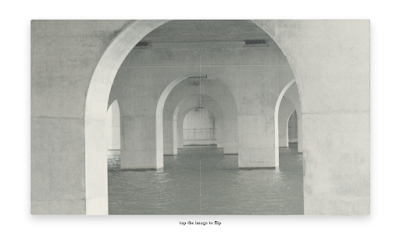
Here is our Updated Output Of Page Flip Animation CSS Code.
output
JavaScript Code For Page Flip animation
 const section = document.querySelector("section");
 let clicked = false;
 section.addEventListener("click", (e) => {
  section.classList.toggle("flip");
  if (!clicked) {
   clicked = true;
   document.getElementById("title").style.opacity = 0;
  }
 });
These few lines of JavaScript code for Page Flip Animation.
Final Output Of Flip Page Animation Using HTML, CSS and JavaScript
Below is the CodePen source code for the Flip page using HTML and CSS.

Animated Login Form Using HTML and CSS
Conclusion
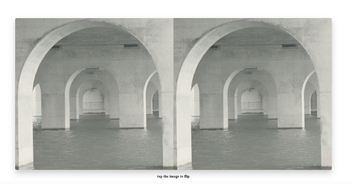
Now we have completed our javascript section for Page Flip Animation, Here is our updated output with javascript code. Hope you like the Page Flip animation.
you can see the output video and project screenshots. See our other blogs and gain knowledge in front-end development. Thank you!
In this post, we learn how to create a Page Flip animation using simple HTML & CSS, and javascript. If we made a mistake or any confusion, please drop a comment to reply or help you in easy learning.
Written by – Code With Random/Anki
Codepen by – Jake Albaugh
Which code editor do you use for this Page Flip Animation coding?
I personally recommend using VS Code Studio, it’s straightforward and easy to use.
is this project responsive or not?
YES! this is a responsive project
Do you use any external links to create this project?
No!

How to add more pictures?