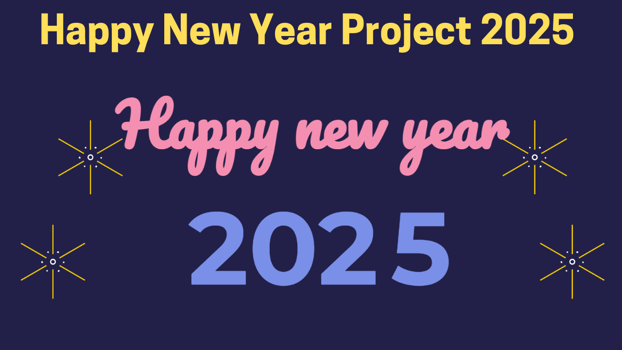
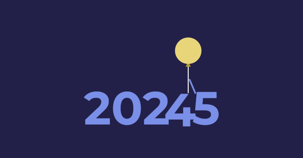
Hi Techies, Welcome again!! New day – New blog with a lot of learnings . Friends, as you all know that now 2024 is about to end and a new year is about to come and we all are waiting for it, that’s why we have also created a new year project for you in the joy of the new year coming, which is going to be very easy and beginners friendly. In this project, we have used some interesting animation which looks very good. Today in this article we will be creating a Happy New year 2025 wishing animation using HTML & CSS.
We will be using HTML for creating the base of this project , also to add styling we will be CSS concepts like background , animation and concept to add the moving function for smooth effects. So Guys , join us with this project and let’s create a beautiful wishing template for Happy New Year 2025 Using HTML & CSS.
Lets, Start The Project.

To make this project, we have taken the help of HTML and CSS, so this project is going to be easy for any new developer. And we are going to explain this project to you step by step, which will make it much easier for you to understand this project, so let’s go now, let’s explain about our project.
Video output:
New Year Project HTML Structure:
Friends, now we are going to save the code of HTML because with the help of HTML we will create the structure of our project which is going to be very easy.
- First of all, we have to add a title for our project which you can keep with the help of tag of HTML <title>Happy New Year 2025</tittle>.
- Right now we are creating the structure of our project but if we have to use CSSto design our project then we will have to use this tag <link rel=”stylesheet” href=”style.css”>.
- This is the <body> tag in which we write our HTML code. It has a closing tag </body>.
- Friends, you know that we are making a new year project, so we have added a heading in which we have added the text of Happy New Year <div class=”feliz”>Happy New Year</div>.
- We have created a separate div in which we have added the year number <div class=”no_novo”></div>.
- In this div where we are going to add the year number, we have added the year number <span>202</span> and this number will change via animation and this will happen only when you link the css.
- We have added balloons to our project which will change our year number through animation <div class=”balao”></div>.
- Then we have also created some fire effects which make our happy new year project beautiful <div class =”fagos”></div>.
<!DOCTYPE html>
<html lang="en">
<head>
    <meta charset="UTF-8">
    <meta http-equiv="X-UA-Compatible" content="IE=edge">
    <meta name="viewport" content="width=device-width, initial-scale=1.0">
    <title>Happy New Year 2023</title>
    <link rel="stylesheet" href="style.css">
</head>
<body>
    <div class="feliz">Happy new year</div>
<div class="ano_novo">
  <span>202</span>
  <span class="seis">4</span>
  <span class="sete">5</span>
  <div class="balao"></div>
</div>
<div class="fogos">
  <div class="f1">
    <span><i></i></span>
    <span><i></i></span>
    <span><i></i></span>
  </div>
  <div class="f2">
    <span><i></i></span>
    <span><i></i></span>
    <span><i></i></span>
  </div>
  <div class="f3">
    <span><i></i></span>
    <span><i></i></span>
    <span><i></i></span>
  </div>
  <div class="f4">
    <span><i></i></span>
    <span><i></i></span>
    <span><i></i></span>
  </div>
</div>
</body>
</html>
HTML Output:
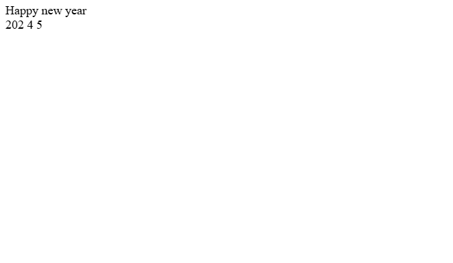
So friends, we have used this much code in HTML, now let us learn about CSS.
Style.css
Steps for Styling Happy New Year 2025 :
Friends, first of all we have created the structure of our project which is easily created with the help of HTML but now we have to take the help of CSS to make it look good and design it correctly, so let’s go now let’s understand about CSS that how we have used CSS.
- For any project, first of all it is important to have the right font, that is why we have used Google font @import url(‘https://fonts.googleapis.com/css?family=Montserrat:700|Pacifico’);.
- We have set the background of our Happy New Year project in this color Background: #222048; which looks like black.
- We have kept the width of the Happy New Year text as width: 100%; full.
- We have kept the font of the text in this font font-family: ‘Pacific’, Kursiwe; which looks perfect.
- We have kept the font size 100px font-size: 100px;.
- We have made the text a bit bold font-weight: 700; so that the user’s focus goes more on the text.
- We have kept the text color pink color: #f48fb1;.
- Friends, we have used animation in the text animation: wem_felliz 2s as-in-out 7s forwards; in this the text animates from bottom to top.
- Friends we have used balloon to change year number whose width is 100px; this is it.
- The height of the balloon was kept the same as its width so that both could be seen clearly.
- We have kept the background color of the balloon yellow background: #e8d57a;.
- Balloon border-radius: 50%; we have set it to 50% so that the balloon becomes round.
- We have placed the balloon at top: 50%; and margin-top at -165px;.
Friends, in this way we have used a lot of CSS in this new year project, like we have also used keyframe, with the help of which we have animated our year, as you know 2024 is about to come, so with the help of keyframe we have shown 5 instead of 4 and we have done all this work with the help of CSS keyframe, which is a very easy task to do.
@import url('https://fonts.googleapis.com/css?family=Montserrat:700|Pacifico');

*, *:after, *:before{
  box-sizing:border-box;
  margin:0;
  padding:0;
  -webkit-transition: all 100ms ease-in;
  transition: all 100ms ease-in;
}
html{
	background: #222048;
}
.feliz{
  width: 100%;
  font-family: 'Pacifico', cursive;
  font-size: 100px;
  font-weight: 700;
  color: #f48fb1;
  text-align: center;
  position: absolute;
  top: 50%;
  opacity: 0;
  animation: vem_feliz 2s ease-in-out 7s forwards;
}
.ano_novo{
  position: absolute;
  top: 0;
  left: 0;
  width: 100%;
  height: 100%;
  display: flex;
  flex-direction: row;
  justify-content: center;
  align-items: center;
  overflow: hidden;
  padding: 200px 100px 0px 0px;
}
.ano_novo>span{
  font-family: 'Montserrat', sans-serif;
  font-size: 175px;
  font-weight: 700;
  color: #7a8fe8;
}
span.seis{
  position: absolute;
  top: 50%;
  right: 50%;
  margin-right: -210px;
  animation: vai_2016 5s ease-in-out 5s forwards;
}
span.sete{
  position: absolute;
  right: 0%;
  margin-right: -237px;
  animation: vem_2017 6s ease-in-out forwards;
}
span.sete:before{
  content: '';
  width: 0px;
  height: 6px;
  display: block;
  border-radius: 3px;
  background: #7a8fe8;
  transform: rotate(0deg);
  transform-origin: left top;
  position: absolute;
  top: 55px;
  left: 10px;
  z-index: -1;
  animation: entrega_balao 1s ease-in-out 4s;
}
.balao{
  width: 100px;
  height: 100px;
  display: block;
  background: #e8d57a;
  border-radius: 50%;
  position: absolute;
  top: 50%;
  margin-top: -165px;
  right: 0%;
  margin-right: -200px;
  animation: vem_e_vai_balao 10s ease-in-out forwards;
}
.balao:before{
  content: '';
  width: 0;
  height: 0;
  border-style: solid;
  border-width: 0 10px 20px 10px;
  border-color: transparent transparent #b19b32 transparent;
  position: absolute;
  left: 50%;
  margin-left: -10px;
  bottom: -10px;
  z-index: -1;
}
.balao:after{
  content: '';
  width: 4px;
  height: 100px;
  display: block;
  background: #fff;
  border-radius: 0px 0px 3px 3px;
  position: absolute;
  left: 50%;
  margin-left: -2px;
  bottom: -110px;
}
.fogos{
  width: 100%;
  height: 100%;
  display: block;
  position: absolute;
  top: 0;
  left: 0;
  overflow: hidden;
}
.fogos>div{
  border: 2px solid #fff;
  position: absolute;
  opacity: 0;
  animation: solta_fogos 1.5s ease-in-out 8s forwards;
}
.fogos>div.f1{
  left: 20%;
  top: 40%;
}
.fogos>div.f2{
  left: 15%;
  top: 70%;
}
.fogos>div.f3{
  right: 20%;
  top: 40%;
}
.fogos>div.f4{
  right: 15%;
  top: 70%;
}
.fogos>div span{
  width: 6px;
  height: 6px;
  display: block;
  position: absolute;
  top: 0;
  left: 0;
  opacity: 0;
  animation: estoura_fogos 0.5s ease-in-out 9s forwards;
}
.fogos>div span:nth-child(1){
  transform: rotate(0deg);
}
.fogos>div span:nth-child(2){
  transform: rotate(120deg);
}
.fogos>div span:nth-child(3){
  transform: rotate(240deg);
}
.fogos>div span:before{
  content: '';
  width: 2px;
  height: 50px;
  display: block;
  background: #f5cc06;
  position: absolute;
  top: -60px;
  left: 2px;
}
.fogos>div span:after{
  content: '';
  width: 2px;
  height: 50px;
  display: block;
  background: #f5cc06;
  position: absolute;
  bottom: -60px;
  left: 2px;
}
.fogos>div span i:before{
  content: '';
  width: 3px;
  height: 3px;
  display: block;
  border-radius: 50%;
  background: #fff;
  position: absolute;
  top: -15px;
  left: 10px;
}
.fogos>div span i:after{
  content: '';
  width: 3px;
  height: 3px;
  display: block;
  border-radius: 50%;
  background: #fff;
  position: absolute;
  top: -15px;
  right: 10px;
}
a.author{
  font-size: 12px;
  text-decoration: none;
  color: #f47c7c;
  position: fixed;
  bottom: 10px;
  right: 10px;
}

@keyframes vem_2017 {
  0% {
    right: 0%;
  }
  66.6666% {
    right: 50%;
    margin-right: -300px;
  }
  90% {
    right: 50%;
    margin-right: -300px;
  }
  100% {
    right: 50%;
  }
}
@keyframes vem_e_vai_balao {
  0% {
    right: 0%;
  }
  40% {
    right: 50%;
    margin-right: -300px;
  }
  50% {
    right: 50%;
    margin-right: -200px;
    top: 50%;
  }
  100% {
    top: -100%;
    right: 50%;
  }
}
@keyframes entrega_balao {
  0% {
    transform: rotate(-30deg);
    width: 40px;
  }
  100% {
    transform: rotate(-150deg);
    width: 70px;
  }
}
@keyframes vai_2016 {
  0% {
    top: 50%;
  }
  100% {
    top: -100%;
  }
}
@keyframes vem_feliz {
  0% {
    margin-top: 0px;
    opacity: 0;
  }
  100% {
    margin-top: -200px;;
    opacity: 1;
  }
}
@keyframes solta_fogos {
  0% {
    margin-top: 100%;
    opacity: 0;
    width: 2px;
    height: 30px;
    display: block;
    border-radius: 50%;
  }
  75% {
    margin-top: 0%;
    opacity: 1;
    width: 2px;
    height: 30px;
    display: block;
    border-radius: 50%;
  }
  80%{
    margin-top: 0px;
    margin-left: 0px;
    opacity: 1;
    width: 10px;
    height: 10px;
    display: block;
    border-radius: 50%;
    transform: scale(0.2);
  }
  100%{
    opacity: 1;
    width: 10px;
    height: 10px;
    display: block;
    border-radius: 50%;
    transform: scale(1);
  }
}
@keyframes estoura_fogos {
  0% {
    opacity: 0;
  }
  100% {
    opacity: 1;
  }
}
Live Preview:-
Summary:
Congratulations!!! You’ve completed another mini-project using HTML and CSS. I hope you’ve understood the code structure and project workflow. This Happy New Year Animation 2025 Using HTML & CSS which will help you in build your skills on the CSS properties and HTML classes and Attributes.
If you face any difficulty while creating this project , feel free to comment down and we will help you in solving you problem .
if you like our article , don’t forget to follow us: Codewithrandom
Happy New Year 2025
HAPPY CODING!
Stay With Us😊
Stay Safe Stay Healthy🌹
